


![]() Roman Reigns Logo PNG
Roman Reigns Logo PNG
As Roman Reigns’ logo represents the wrestler himself, it reflects his personality, fighting style, and image. The sharp lines and acute angles symbolize his strength and aggression in the ring. In turn, the emblem’s abstract form highlights the uniqueness of his character.
Leati Joseph Anoaʻi, known as Roman Reigns, signed with World Wrestling Entertainment in 2010 after ending his football career, which included playing as a defensive lineman for the Georgia Tech Yellow Jackets at the Georgia Institute of Technology and brief stints with the Minnesota Vikings and Jacksonville Jaguars. Initially performing in WWE’s developmental territory NXT, he debuted on the main roster at Survivor Series as part of The Shield. This dominant group battled top stars like John Cena and quickly gained popularity. Following The Shield’s split on Raw, WWE positioned Reigns as a future main-event star, culminating in multiple WWE Championship reigns and victories over legends like The Undertaker. After overcoming leukemia, he returned as the “Tribal Chief” and established the powerful Bloodline faction. His reign included defeating high-profile opponents such as Brock Lesnar and John Cena and culminated at WrestleMania XL, where he lost to Cody Rhodes, ending his historic title run. As of March 2025, speculation about his return remains a major topic among wrestling fans.
Meaning and History
![]()
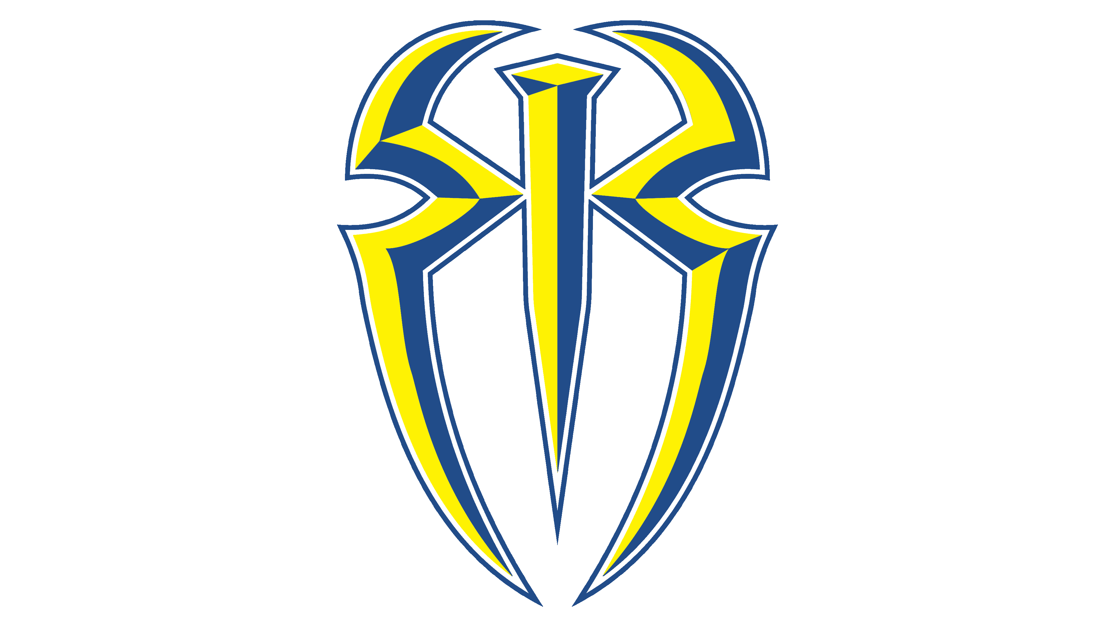
Leati Joseph Anoaʻi began using his famous pseudonym in 2012 when he debuted as part of a group of wrestlers called The Shield. This trio included Roman Reigns, Seth Rollins, and Dean Ambrose. Each wrestler had their logo, conveying the spirit of rivalry and excitement. After separating from the team, Reigns continued to follow the original style. He wears an original sign on his clothing, depicting a shield-like form composed of two mirror-reflected “R”s (a reference to the initials of his pseudonym).
What is Roman Reigns?
Roman Reigns is the pseudonym of American wrestler Leati Joseph Anoaʻi. He is famous for being the longest-reigning World Wrestling Entertainment champion since 1988. His professional debut occurred in 2010 when he signed a contract with WWE and first participated in the Royal Rumble match. Until 2012, he performed under the pseudonym Roman Leakee.
Today
![]()
Certainly, most fans see this emblem as an unsuccessful parody of the Spider-Man symbol because the protruding parts of the “R” with angles and curves resemble long spider legs. However, some wrestling fans believe that the almond-shaped form was inspired by the kite shield, which is rounded at the top and pointed at the bottom. It was designed for mounted cavalry: its wide part covered the rider’s torso, and the narrow part protected the leg. Although this origin theory of the logo is not official, the wrestler’s participation in the group The Shield could indeed have prompted him to use a shield as the main visual sign.
The emblem is composed of geometric shapes that form two stylized letters, “R,” joined by a common vertical stripe. One “R” faces right, while the other, as its mirror reflection, is turned in the opposite direction. It is quite challenging to recognize the letters, as their tops are open. Meanwhile, the lower strokes are smoothly curved inward instead of protruding forward. Due to this shape, they resemble spider legs or a beetle’s carapace.

The central part of the logo looks like a nail or spike pointed downward. WWE fans have debated what it might signify, but have not reached a consensus. One theory suggests that Roman Reigns was inspired by the image on Jeff Hardy’s shirt when he joined Matt Hardy. According to other rumors, the emblem is a modified Spider-Man symbol that represents agility, speed, strength, and other superhero qualities.
Despite its simple geometric structure, the logo does not appear flat. It has shadowed fragments that create an illusion of volume. These are not symmetrical: the patterns on the right and left sides do not match. This disproportion makes the drawing dynamic, especially when combined with the elongated lines.
Font and Colors
Although the Roman Reigns logo does not contain obvious inscriptions, it features two stylized letters, “R.” They are hand-drawn and have a unique design that makes them resemble a large insect. The gray colors match the professional wrestler’s severe, rugged style.