Each Itzy logo reflects the unique style and aesthetics of the South Korean musical group. The dynamic forms are associated with the youth, energy, and individuality of the South Korean singers. Thus, the emblem is an important visual element, emphasizing the recognizable image of the group members.
Itzy: Brand overview
Meaning and History
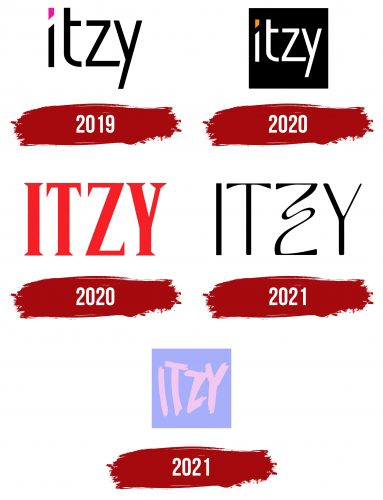
The group Itzy was formed in 2019 and quickly became commercially successful, releasing several singles, studio albums, and mini-albums. Different logos were used for them, linked by a common element – the music group’s name. It was chosen by Park Jin Young and actually has a hidden meaning. It refers to the Korean phrase “있지” (itji), the first part of which translates to “have,” and the second part as a rhetorical question “right?”. One of the idol group members explained that “Itzy” should be understood as: “We have everything you want.” Evidently, this refers to talent and beauty.
What is Itzy?
Itzy is a South Korean group formed in 2019 by the conglomerate of recording and entertainment companies, JYP Entertainment Corporation. It consists only of girls: Yuna, Chaeryeong, Ryujin, Lia, and Yeji. The group debuted, presenting its first single album, It’z Different. It was positively received by the public and won on the show M Countdown almost a week after its release. The group experiments with different styles, and its lyrics adhere to life-affirming themes related to the search for individuality and freedom.
2019
The cover of the debut single album It’z Different featured the inscription “itzy” with a pink dot over the “i.” This dot is neither round nor square – it has the shape of a rectangular trapezoid, turned with a sharp angle downwards. The vertical stroke of “i” also has a diagonal cut at the top. The letter “t” lacks the left fragment of the horizontal bar. In “z,” the lower horizontal line is elongated and cut at an angle. All letters are lowercase and black.
2019
When the group’s first mini-album, titled It’z Icy, was released, the logo design changed. Now, the word “itzy” is white, with a blue dot over the “i.” The individual font was retained, but the spacing between letters was reduced. It is noticeable that the shape of the glyphs was carefully selected to create a harmonious composition where the lines perfectly match.
2020
The cover of Itzy’s second mini-album, “It’z Me,” featured a version of the emblem with an orange dot over the “i.” The letters remained white to stand out against a dark background. The font style also remained unchanged, with its diagonal cuts and strokes of varying lengths.
2020
In 2020, the third mini-album – Not Shy – was released. The logo of that time contained a bright red inscription “ITZY” against a backdrop of gray hills. Now, all letters were uppercase and written in a font with triangular serifs.
2021
In 2021, the name of the music group became elegant and refined. Designers used a contrasting sans-serif font but with extensions on the ends of the horizontal part of “T.” The most extravagant-looking letter is “Z,” which has a middle stroke that is not straight and diagonal but curved, with wavy bends. This variant was created for the fourth mini-album – Guess Who.
2021
The first studio compilation album of the music group was released in 2021. The cover featured not only its title, Crazy in Love but also the word “ITZY,” styled in the same manner. The logo contained a pale pink inscription on a blue background. The uneven letters were drawn with sharp strokes of paint. They look messy and do not have a coordinated shape.
Font and Colors
In most of the logos of the South Korean group, individual fonts with different designs were used. But if in 2019 the inscriptions had clear geometry, by 2021 they became careless and uneven. This symbolizes that Itzy’s creativity is filled with bold experiments. The colors also constantly changed – from the classic combination of white and black to bright shades of red and orange. For the studio album Crazy in Love, an emblem in pastel tones of pink and blue was created.
