


![]() Jack Daniels Logo PNG
Jack Daniels Logo PNG
The Jack Daniels logo represents a vintage brand. The monograms and swirls of the emblem indicate the premium taste, long aging period, and ancient recipes for which this brand’s alcohol is famous. The drink is uplifting and leaves a pleasant aftertaste.
Meaning and History
![]()
The first distillery was called Jack Daniel Distillery. The Jack Daniel’s distillery came about after acquiring land next to the cave. There were valuable mineral springs from where the manufacturer drew water for the whiskey. Until about 1895, alcohol was bottled in large, round, narrow-necked bottles wrapped in plain gray paper bearing the brand’s name. Later, the famous square-shaped bottles were used. Jack wanted Old No. 7 to stand out not only in taste but also in appearance.
This manufacturer’s most recognizable whiskey is Black Label (it accounts for more than 95% of total sales). It is filtered through charcoal and then settled in handmade barrels. His label is considered a reference for logos because each Jack Daniel’s drink has its own design and elements. For example, Tennessee Honey is adorned with a bee emblem.
Even before Prohibition, the distillery began selling alcohol in bottles with a presentable black label. Then the foundation for the modern logo was laid, and it underwent several modifications. At the same time, the little-known regional brand Old No. 7 became an iconic brand and improved the way we make whiskey.
What is Jack Daniels?
Jack Daniel’s is considered one of the most popular whiskey brands, although it is more of a bourbon. The spirits are produced by Jack Daniel Distillery, which, in turn, is owned by Brown-Forman Corporation. The brand has been around since the late 19th century, when a teenage Jasper Newton “Jack” Daniel ran away from home and founded his distillery.
1950s – 1990s
![]()
The emblem of those times reflects Jack Daniel’s cultural and historical heritage. The name of the oldest distillery is written at the top and is shaped like an arch. It uses an elongated capital font, with the first “J” and “D” much higher than the other letters. At the bottom is the phrase “OLD TIME,” and below it is an authentic oval surrounded by a spiral pattern. Inside the oval is another inscription: “Old No. 7 BRAND “. It is divided into three lines and is complemented by two small dots on the sides.
The logo contains standard information the manufacturer deemed necessary to include on the label: product type, place of manufacture, owner’s name, and the year of the distillery’s founding. It is noteworthy that different fonts are used for all inscriptions. Most of them have serifs; only the word “Tennessee” is handwritten.
the 1990s – 2011
![]()
Shortly before the 21st century, Black Label bottles underwent a redesign. The manufacturer increased the phrase “JACK DANIEL’S” and decreased “OLD TIME” to highlight the distillery’s name visually. The oval spiral emblem also became compact, which affected the size of the “Old No. 7 BRAND.” The information at the bottom of the label was rearranged: the designers had to reduce the text size due to the many lines. The words “Tennessee” and “WHISKEY” remained large.
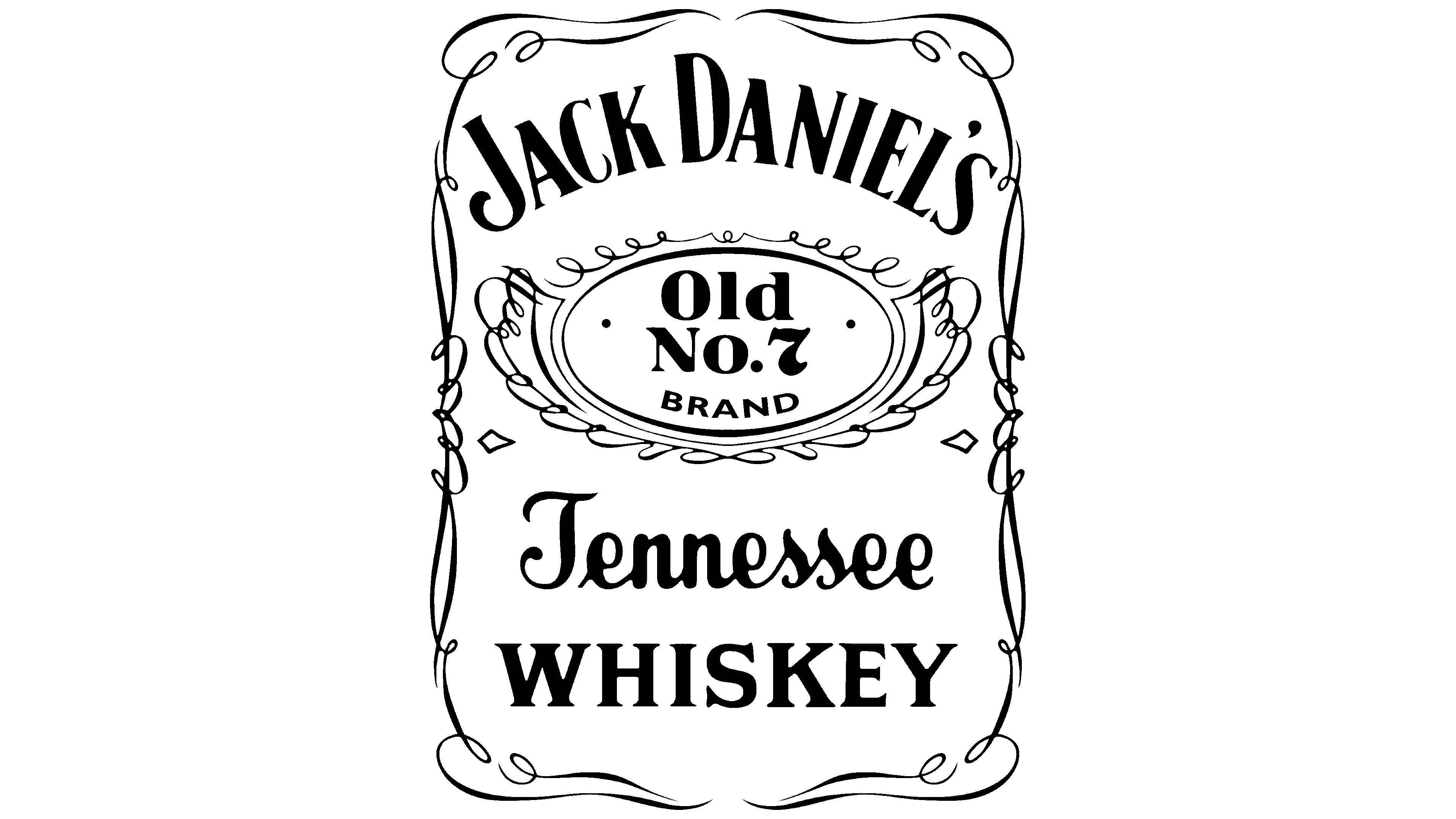
2011 – today
![]()
On May 16, 2011, the distillery announced that it was changing the iconic Black Label bottle. The redesign touched upon its shape and labels, but the alcohol recipe did not change. Representatives of the Cue branding company simplified the lettering, which had been too many before. So they decided to please the brand’s founder, a connoisseur of exquisite style.
They had to remove word clutter because the text distracted attention from the main thing: the logo with the manufacturer’s name. The phrase “OLD TIME” has been removed entirely. The two side dots inside the oval have disappeared. Moreover, in the phrase “Old No. 7 BRAND,” the emphasis shifted to “No. 7 “because the designers reduced the first and last words.
The inscriptions on the label itself also look new: the word “QUALITY” has disappeared, the handwritten “Tennessee” has become more legible, and the phrase “SOUR MASH” has been adorned with wavy lines on both the left and right. In addition, the creators of the new Black Label bottle removed some of the manufacturer information at the bottom.
Font and Colors
Connoisseurs of quality whiskey know Jack Daniel’s as one of the world’s most iconic brands, with a lot of text and few graphic elements on its label. The distillery has something to say, since its logo consists solely of inscriptions. The only non-typographic element is the decorative oval with a spiral border.
Part of the text has disappeared during evolution. The designers have removed information about the number of people living in Lynchburg. There used to be a postscript, “Pop. 361,” but it did not reflect reality, as more than 2000 people now live in this settlement.
The same goes for the year Jack Daniel’s was founded. It is not indicated on modern bottles, although the phrase “EST. & REG. IN 1866” first appeared in 2011. The inscription was removed because the data is controversial and has not been documented. The words “LEM MOTLOW, PROPRIETOR” are no longer relevant: the Brown-Forman Corporation has long owned the brand.

During the latest redesign of the Black Label bottle, the developers sought to make the labels clearer and more legible without changing the original design. The distillery’s name is, as always, in the Jasper font. The word “Tennessee” is in handwritten Lynchburg Script. In addition, the label includes other serif and sans-serif typefaces, both standard and enhanced versions.
The base of the logo is black, matching the label. The main elements are light, most often white, but there are options with a sandy tint. The logo may be black if the emblem is not on the bottle and the background is white.
FAQ
What is Jack Daniels’ slogan?
The company introduced the slogan “Make It Count” to inspire people to live a full life and appreciate every moment. This slogan encourages enjoying life fully and purposefully, just like one enjoys a good whiskey. The brand uses this simple yet powerful message to connect with its audience and encourage choices that improve lives.
What is the Jack Daniels font?
The Jack Daniel’s logo uses two main fonts: Jasper and Lynchburg Script.
Jasper Font: Inspired by the original logo lettering and named after the brand’s founder. It has bold serif letters that are easy to recognize. It is primarily used in the primary logo and other key branding elements to convey the whiskey’s strong heritage.
Lynchburg Script: This cursive font is inspired by the “Tennessee” on a whiskey label and has a sophisticated, friendly look. It is used for subtler aspects of the brand’s design, such as marketing materials, where a touch of elegance is required.
Who designed the Jack Daniels logo?
The designer of the original logo remains unknown, a common trait throughout the brand’s history. The agency Cue designed the latest logo in 2011. Alan Colvin, the creative director, and his team updated the logo, maintaining its classic look while adapting it to a modern style. This update helped preserve the well-known brand image.
What is the explanation for Jack Daniels’ logo?
The logo is an oval with swirling lines, symbolizing the cork that seals whiskey bottles and preserves the taste and aroma. A rectangular frame around it is shaped like a whiskey bottle, integrating the design with the product. The label’s black color adds a dark note. It is rumored that this color was chosen in memory of the founder, who passed away in 1911. This choice honors the founder and adds a layer of history and emotion to the brand.