


![]() Jameson Logo PNG
Jameson Logo PNG
The Jameson logo guarantees the whisky’s strength and quality. The products are prepared from natural ingredients and have a unique individual taste that distinguishes the brand. Therefore, the brand has many fans. What do the impressive elements of the emblem say?
Jameson began with John Jameson, a Scottish-born lawyer who entered distilling after marrying into a whisky family. In 1780, he moved to Dublin and joined the Bow Street distillery.
Late 18th-century Dublin was a major production hub, with over 100 distilleries. Jameson focused on grain selection, worker conditions, and controlled maturation to build a consistent product.
After tax changes in 1785, he experimented with mash composition, combining malted and unmalted barley. This approach shaped the Irish pot still style and strengthened demand. By the early 1800s, output reached about one million gallons annually.
In 1805, John Jameson II took over and led the business for four decades. By 1886, the Bow Street site covered five acres, housed 25,000 casks, and employed around 300 workers. In 1891, the company became John Jameson & Son Limited.
At the start of the 20th century, Jameson was a leading Irish whiskey globally. The following decades brought decline due to temperance campaigns, the Irish War of Independence in 1919–1921, trade restrictions, and US Prohibition in 1920, while Scotch gained ground.
In 1966, Jameson merged with Cork Distillers Company and John Power & Son to form Irish Distillers. In 1976, production moved to the New Midleton distillery, and Bow Street ceased operations.
In 1988, Pernod Ricard acquired Irish Distillers, outbidding Grand Metropolitan. Marketing investment increased, positioning Jameson for wider consumption.
Sales grew steadily, reaching 3 million cases in 2005, 4 million in 2010, and 8 million in 2019. The renovated Bow Street site reopened to visitors in 1997 as a major Dublin attraction.
Meaning and History
The company’s corporate identity consists of an emblem, a round label, and a rectangular label, which appeared almost simultaneously with the launch of the family business. Their design reflects the idea of individuality, authenticity, and high value of the product offered. Indeed, Irish whiskey has been admired for its sophisticated, unpretentious character throughout the centuries; therefore, it is recognized as an exclusive brand.
Daring visualization backed by exquisite taste. It is distinguished by outstanding attractiveness, provokes interest, and encourages the purchase of an elite drink. Father and son Jameson relied on it because they understood what a real logo should be. Hence, marketing is a key element of a corporate logo.
What is Jameson?
Jameson is a brand of whiskey produced on the island of Ireland by Irish Distillers, part of the French conglomerate Pernod Ricard. It got its name from Jameson Distillery Bow St., where the spirits were produced from 1780 to 1971. Then production was moved to the New Midleton Distillery complex.
The modern version is a timeless hallmark, one of the most recognizable in the alcohol industry. The unique symbolism confirms the products’ originality, conveying a clear interpretation of the recipe’s tradition and the continuity of generations. Designers have provided her with internal dynamics and her character.
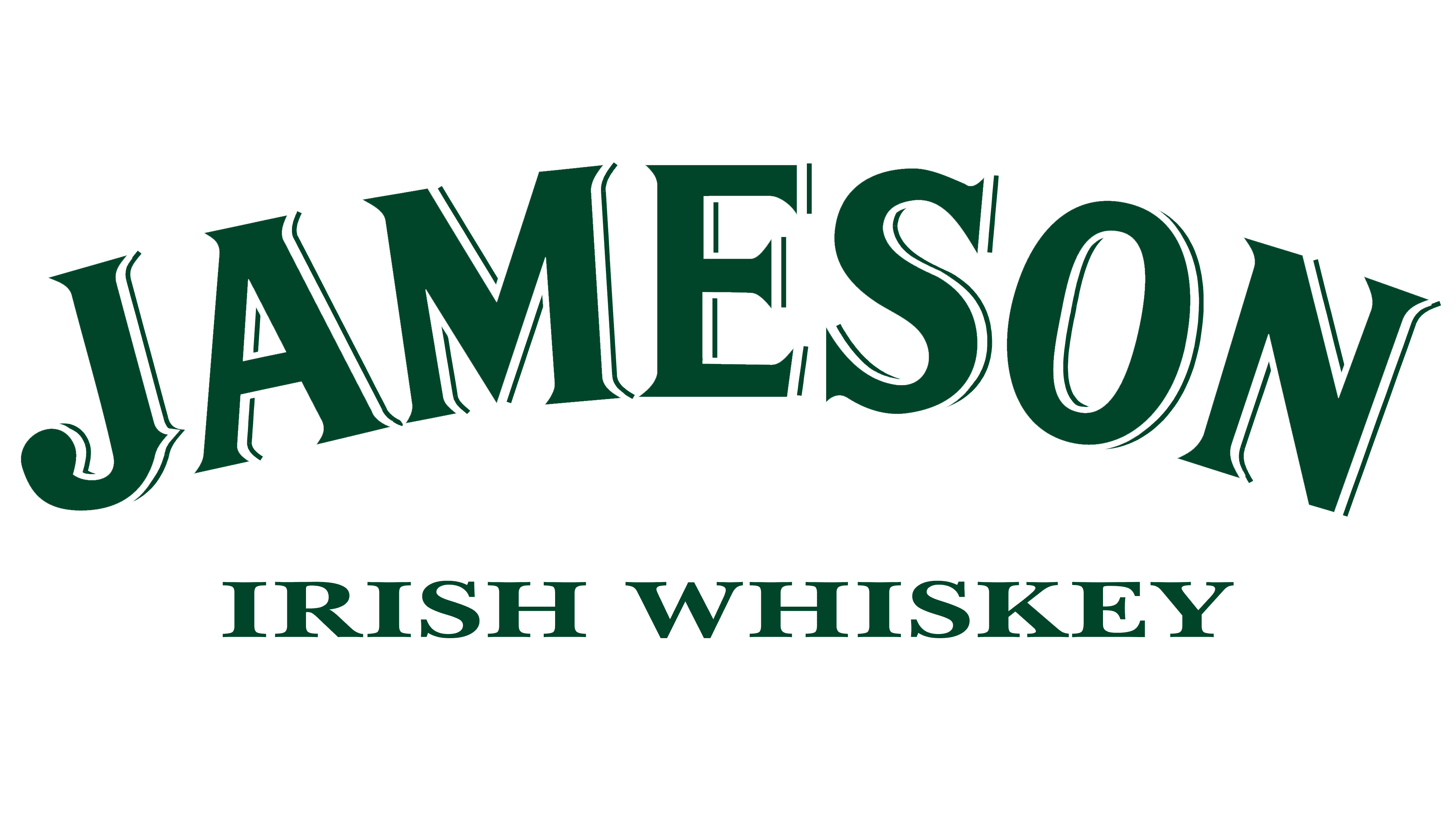
The Jameson logo is the generic coat of arms. A slogan, a detailed name, or some important dates in different versions accompany it. It all depends on where it is used – as a separate trademark, on a label, or in business papers.
The original version of the logo features Scottish heraldic elements. The head of the family received a distinctive coat of arms for opposing pirates off the coast in the 17th century. Therefore, it depicts a ship with inflated sails – a symbol of purposeful forward movement.
And there is also a shield, crossed by two wide stripes. In their gaps, there are two anchors (right and left) and a star (in the middle). A ribbon with the motto “Sine metu” is stretched under the coat of arms. It is written in block letters in upper case. Above them is the name “Jameson” in the form of an arch; below it is the phrase “Irish whiskey,” outlined by two straight lines.
Another variant (trademark) was developed by Robert Stradling, betting on a combination of handwritten and printed fonts, serif and sans serif, narrow and wide. There are two basic ones – Freebooter Script Font and ITC Stone Serif. Also, John Jameson’s signature (on the label) is sometimes used.
Regardless of the branding type, each version has one common touch: the semicircular shape of the Jameson lettering. It is written in capital letters, with a small shadow on the right, creating a 3D effect.
Font and Colors
Designer Robert Stradling, the logo maker, chose two font types for it: one serif and the other grotesque. The closest are ITC Stone Serif and Freebooter Script. The main field letters are wide, slightly curved, and pointed at the ends; on the central icon, the letters are even, smooth, and thin. The “J” has a spike-like projection at the bottom, as in the Old English sign.
The color palette is bright, making the drink well recognizable. The corporate grids include creamy yellow (background, central letters), balanced green (main captions), and deep burgundy (round icon).
FAQ
What color is the Jameson logo?
The logo uses a specific color scheme that follows the global Jameson color ratio. The main colors are Jameson Cream and Jameson Green, with Jameson Burgundy as an accent.
Jameson Cream is the dominant color. It provides a neutral, classic background that highlights the brand’s heritage and quality. This cream color is used for the text and main elements of the logo, giving it a clean and timeless look.
Jameson Green is another major color. This rich, deep green is linked to the brand’s Irish heritage and the natural landscapes of Ireland.
Jameson Burgundy is used as an accent color. This bold, deep red adds contrast and highlights certain elements, making the logo more visually striking and memorable.
What is the motto of Jameson whiskey?
The motto of whiskey is “Sine Metu,” which means “without fear.” This phrase is central to the brand’s identity and appears on all Jameson labels.
“Sine Metu” was given to the Jameson family as a mark of honor for their bravery. It reflects their bold spirit and willingness to take risks, which has driven the brand’s success. The motto is a reminder of the Jameson family’s legacy and their lasting impact on the whiskey world. This motto, found on all labels, captures the brand’s spirit.
Why is Jameson called Jameson?
The brand is named after John Jameson, a Scotsman who greatly influenced the brand’s history. The distillery, now known as Jameson, originally opened in 1780 as “The Steins Family Bow Street Distillery.” The name changed when John Jameson arrived in Ireland.
John Jameson married Margaret Haig, who was related to the Stein family, which was key in whiskey distilling. John Jameson joined the family business, and his dedication and innovative methods boosted the industry. His focus on quality helped the distillery earn a reputation for fine Irish whiskey.
Under his leadership, the distillery expanded and improved, setting new standards for whiskey production. His name became associated with high-quality Irish whiskey, and the distillery was renamed in his honor. Over time, the brand became known for exceptional craftsmanship and rich heritage.
What does the Jameson logo mean?
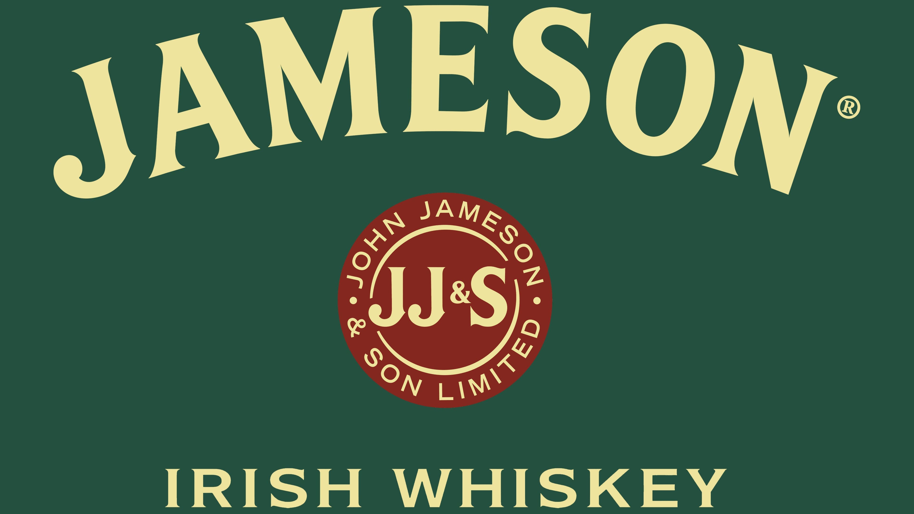
The logo resembles a traditional wax seal, a symbol used to certify the authenticity of documents and to seal vessels.
The logo includes “JOHN JAMESON & SON LIMITED” and the initials “JJ&S,” resembling an old seal. This detail honors the brand’s rich heritage and commitment to producing genuine, high-quality Irish whiskey.
The use of a wax seal in the logo conveys tradition and craftsmanship. It reminds customers of the careful process involved in making the whiskey. This symbolism reinforces the idea that each bottle promises authenticity and excellence, much like the old wax seals guaranteed integrity.
The brand’s logo draws on historical elements to connect the past to the present, showcasing a legacy of quality and trust.
What font is the Jameson logo?
The logo uses a custom font that makes its key elements stand out. The word “JAMESON” and the abbreviation “JJ&S” are in a font similar to ITC Stone Serif. This font gives the text a classic, timeless look, highlighting the brand’s tradition and quality.
For “IRISH WHISKEY,” the designers used a modified typeface with short, sharp serifs. This adds elegance and precision to the logo’s design.
The lettering inside the circle uses a subtle, grotesque typeface. This simple, clean font balances the other elements, making the logo visually appealing.
The mix of classic and modern fonts helps the brand stay strong and recognizable in the market.