The Jawa logo is harmonious, fast, and purposeful. Like a bright exotic bird, the emblem spreads its wings and rises to new heights. The company continues to grow while maintaining its commitment to two-wheeled transportation.
Jawa: Brand overview
Emerging from Czechoslovakia in 1929, Jawa Motorcycles was the brainchild of František Janeček. This venture was birthed when Janeček amalgamated the motorcycle segment of Wanderer with his own business, crafting the brand name ‘Jawa’ by blending the initial letters of both Janeček and Wanderer.
Jawa quickly rose to prominence in the European motorcycle arena during the 1930s and 1940s. By the end of 1938, they had rolled out over half a million bikes. The 350 Pérák of 1937 stood out among its many models, creating a revolutionary frame design that would influence future motorcycles.
However, post-World War II, Jawa’s trajectory took a different direction when it came under state control during the communist era. The company’s strategy shifted towards creating economical, utilitarian 2-stroke motorcycles. The 1950s witnessed the release of the Jawa 350 model, cemented the brand’s reputation in the homeland, and made waves on the international front.
Moving into the 1970s, Jawa drew inspiration from the West Coast chopper style and unveiled the eye-catching 353 Californian model. Yet, the tides turned after the 1989 Velvet Revolution, pushing Jawa into a challenging phase of stiff competition and diminishing sales. This culminated in its bankruptcy in the early 1990s.
However, the Jawa legacy didn’t end there. In 1997, Jihostroj initiated a resurgence, rejuvenating the Jawa brand and resurrecting motorcycle production in the Czech Republic. Today, Jawa persists in its journey, masterfully weaving together retro aesthetics with a fusion of contemporary and traditional technology in its bikes.
Meaning and History
What is Jawa?
Jawa, a distinguished Czech motorcycle manufacturer, is celebrated for its timeless and sturdy bikes. With a heritage in the early 20th century, Jawa has a legacy of crafting motorcycles that seamlessly blend classic design with dependable performance. The brand is famed for its solid engineering and has cultivated a devoted fan base among motorcycle enthusiasts.
1929 – 1931
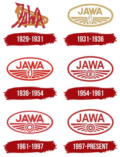
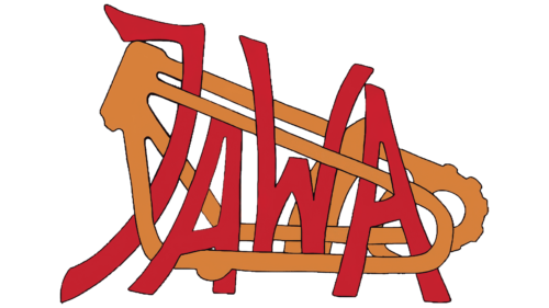
The first logo of the Jawa brand is a unique and unusual design. The letters of the brand name are skillfully integrated into the motorcycle frame, giving the impression that they are part of the structure. This approach makes the logo distinctive, though it may appear somewhat cluttered and “messy” in terms of spelling and visual organization. This feeling arises because the inscription looks repeatedly crossed out as if each letter was written several times over another.
Despite the apparent chaos, the logo evokes positive emotions due to the chosen color scheme. The orange color highlights the comfort and functionality of Jawa motorcycles, while the red symbolizes the novelty and shine of the products. These colors balance practicality and aesthetics, reflecting the company’s philosophy.
The name Jawa is formed from the first syllables of the founder’s two companies – Janeček and Wanderer. This name unites the legacy of both companies and symbolizes the fusion of tradition and innovation, visible in every motorcycle produced under this brand.
1931 – 1936
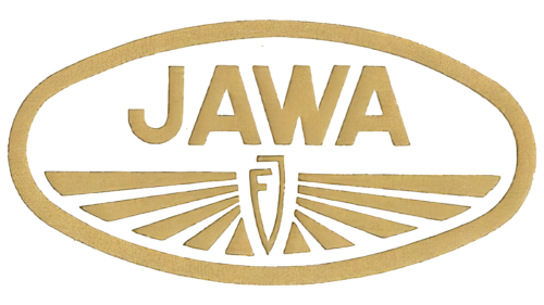
When the JAWA 175 model was released, the brand’s emblem received a modern look. The new logo, shaped like a motorcycle tank, represented the company’s popular models for many years. The use of gold highlighted the product’s special qualities, such as its ability to save fuel while maintaining high speed. This characteristic made the motorcycle popular, ranking it first among all the company’s developments.
The lines radiating from the center of the emblem symbolized wings, representing high-speed travel and freedom of movement. These lines gave the impression that JAWA motorcycles could fly, reflecting their high performance and reliability.
In the center of the emblem, a figure formed by the connection of the two capital letters of the founder’s name, František Janeček, emphasizes the founder’s connection with the company and his contribution to its development.
1936 – 1954
When JAWA’s previous logo changed to red, it symbolized every motorcycle’s energy, passion, and dynamism. This color change reflects the company’s commitment to continuous development and innovation, which are the core of its philosophy.
The company actively adopts advanced technologies, which is evident in its products and customer interactions. For example, JAWA offers unique experiences like test rides with instructors during exhibitions. This allows potential buyers to become familiar with the motorcycles, experience them firsthand, and receive professional advice on their use.
The logo’s lines have become thinner and more elegant, emphasizing the refinement and lightness of the brand’s motorcycles. These fine lines make the logo visually appealing and convey attention to detail and high-quality craftsmanship.
1954 – 1961
With the release of the new motorcycles JAWA-250 and JAWA-350, the emblem changed to a darker shade. This change symbolized the brand’s maturity and highlighted the power and reliability of the new engines. The dark color added seriousness and expressiveness to the logo, reflecting the advanced technologies in the new models.
A significant change occurred in the center of the emblem: instead of the founder’s initials, a circle with the letters CZ appeared. These letters pointed to the Czech enterprise Česká zbrojovka Strakonice, with which JAWA began joint production of new motorcycles. The CZ logo became an important part of the updated design, symbolizing the combined efforts of two well-known manufacturers and their pursuit of excellence.
The new image on the emblem emphasized the importance of the partnership with Česká zbrojovka Strakonice and reflected their shared contribution to creating advanced motorcycles. The logo of Česká zbrojovka Strakonice became an integral element of the JAWA brand, demonstrating the close cooperation and synergy that brought the products to a new level of quality and performance.
1961 – 1997
With the merger with motorcycle manufacturer ESO, the emblem underwent a new transformation. The logo’s color became lighter, reflecting the start of a new phase and fresh ideas brought by the partnership. The light shade symbolized renewal and readiness for new achievements, highlighting positive changes and innovations.
In the logo’s center, a symbol resembling a circle within a circle appeared, indicating the process of absorbing a competitor. This element emphasized the integration of the two companies, marking the merging of their capabilities and resources.
1997 – today
The emblem kept its main image, but its color became darker, giving it a more serious and expressive look. The edges of the feathers on the wings are now fully drawn, making them visible and adding overall harmony to the design. The central circles of the emblem resemble a dartboard, highlighting the brand’s focus on precision and achieving its goals with each new model.
