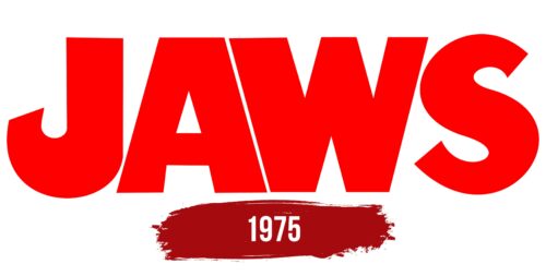
When the Jaws logo is on a movie poster, it gives off an oppressive impression. The designers intended it to symbolize hopelessness and looming danger, upon which the plot is based. But the emblem itself doesn’t have any scary elements and is universal.
Jaws: Brand overview
| Founded: | 1975 |
| Founder: | Universal Pictures |
| Headquarters: | United States |
| Website: | jawsmovie.com |
Meaning and History
The Jaws logo is best known for its iconic movie poster, which appears as an ominous omen of danger looming over a swimmer. In this case, the blood-red inscription balances the image of a shark rising from the ocean floor. But the poster wasn’t created from scratch – the book cover design came first and was similar. Paul Bacon is the author of the original idea. He proposed to write the word “JAWS” in huge bold letters to take up nearly a third of the space. He also suggested making the “J” and “S” curved ends cut at a slight angle.
Roger Kastel improved the cover art and balanced the book title. This version of the inscription formed the basis of the word mark on the Jaws movie poster; only it was repainted in an aggressive red color. It perfectly characterizes the blockbuster and conveys its tense atmosphere.
What is Jaws?
Jaws is a horror film directed by Steven Spielberg. It was released in 1975 and is a film adaptation of a novel by American writer Peter Bradford Benchley. The plot is based on a gripping story about a shark terrorizing a coastal town and forcing the locals to hunt it down. Despite this thriller being made long ago, it is still mentioned by film critics as one of the best films of recent decades.
1975
The logo of the cult thriller seems very simple at first glance: the word, set in clear and understandable letters, does not imply any ambiguities. However, it has symbolic elements that hint at the movie’s plot. For instance, the “J,” which looks like a fishing hook, is not a coincidence – the main intrigue of Jaws is the shark hunt, and this point is crucial in the final events. The bright red color is reminiscent of blood, as there’s much of it in the story about the aquatic predator. Narrow letter spacing creates a feeling of enclosed space and hopelessness. Although the ocean is limitless, it has become a deadly trap for people.
Font and Colors
The same bold, serif-less font was chosen for the Jaws logo as was used on the book cover. In this case, the massive letters symbolize the certainty of danger. The design of the inscription can be reproduced using the Amity Jack typeface developed by AJ Paglia. It’s based on the wordmark of the movie and was named after the town where the key events unfold. The bright red color of the emblem looks dangerous as it reminds one of arterial blood.
Jaws color codes
| Red | Hex color: | #ff0000 |
|---|---|---|
| RGB: | 255 0 0 | |
| CMYK: | 0 100 100 0 | |
| Pantone: | PMS 1655 C |


