![]() Joann Logo PNG
Joann Logo PNG
The Joann logo visually conveys the brand’s specialization in crafting, sewing, and creative supplies. Its simple design highlights product accessibility and orientation toward a broad consumer audience.
Joann started in 1943 in Cleveland, Ohio, when German immigrants opened a small fabric store called Cleveland Fabric Shop. During wartime, the store supplied fabrics to meet local clothing needs and later expanded its product range to include Swiss cheese.
Following the war, the business expanded, opening stores outside Ohio and becoming a corporation in 1951. The name Jo-Ann was adopted during the expansion into Pittsburgh to honor the owners’ children, Joan Zimmerman and Jacqueline Ann Rosskamm. In 1969, Jo-Ann went public on the American Stock Exchange.
In the 1970s, Joann Stores gained popularity among crafting enthusiasts, expanding to over 600 stores in 33 states. From the mid-1980s, intense competition and financial struggles led the company to acquire several competitors. In 1998, the chain was fully rebranded as Jo-Ann Fabrics.
During the 2010s, the company underwent multiple changes in ownership and leadership, attempting to diversify its operations. However, Joann filed for bankruptcy in both 2024 and 2025 and permanently closed in 2025.
Meaning and History
![]()
What is Joann?
It is America’s largest retail chain for craft and sewing supplies. Products range from budget to premium fabrics, yarns, threads, sewing machines, and embroidery accessories. Frequent promotions and discounts attract customers. Stores regularly host workshops on various crafting techniques, with special emphasis on seasonal products and holiday décor.
1963 – 1974
![]()
After the merger of two companies, Cleveland Fabric Shops and The Fabric Shop, a new retail brand, Jo-Ann Fabric and Craft Stores, was officially established in 1955 and entered the US Midwest textile market. The brand name combined the names of the owners’ daughters, Joan and Jacqueline, emphasizing the family nature of the business and generational continuity. The launch of the new brand marked the chain’s growth, expanding its stores beyond Ohio and establishing a presence in neighboring regions.
The Jo-Ann Fabric Shops logo reflected the store’s specifics through a symbolic image: the text was placed over a figure resembling rolled-up fabric, a symbol of sewing, crafts, and the textile industry.
The visual composition combined two different typographic styles, each carrying its own meaning. The word “Fabric” was presented in italics, with smooth lines and a slight slant, conveying softness, flexibility, and a handmade quality. The dynamic writing of “Fabric” emphasized associations with textiles’ pliable properties, evoking ideas of coziness, comfort, and care associated with home sewing and crafting.
The names “Jo-Ann” and the word “Shops” had a different stylistic presentation: the font was straight, even, and proportional, closely resembling Franklin Gothic but with slight adaptations to letter contours and softened corners.
The color palette and graphic details emphasized the store’s practical focus, reinforcing the brand’s reputation as a reliable supplier of fabrics and craft accessories. The entire composition of the logo, from the stylized roll to the fine-tuned typography, was designed to reinforce the store’s image as a family business, close to its customers and oriented toward the everyday needs of textile and craft enthusiasts.
1974 – 1991
![]()
The Jo-Ann Fabrics logo reflects the stage of brand renewal following the successful expansion of the store chain from regional to national. The previous visual image, featuring an illustration of a fabric roll, gave way to a simple text composition that aligns with the company’s new ambitions.
The company name consists of two visually contrasting parts. The first part, executed by Jo-Ann, is written in smooth calligraphic script with a distinctive leftward slant. The letters have refined, light contours ending with an elongated decorative tail of the letter “n,” whose line smoothly transitions into a linking decorative detail between the two elements of the name. The calligraphy is perceived as a reference to the softness and tactility of textiles, creating an emotional impression of craftsmanship and warmth in customer relations.
The second part, the word FABRICS, is rendered in a geometric sans-serif in large capital letters, with dense, massive strokes and rounded forms. The word conveys the company’s reliability and underscores the brand’s status as a major player in the textile retail market.
The visual contrast between the soft calligraphy of the first part and the stable geometry of the second part symbolizes the dual nature of the company: on the one hand, support for the traditions of handicraft and textile creativity, and on the other, the transition to a modern commercial model and a nationwide retail format.
1991 – 1993
![]()
Between 1991 and 1993, Jo-Ann Fabrics conducted a brief experiment in modernizing its style, moving away from the previous complex calligraphic elements and adopting minimalist typography. The company name was arranged in a single line of capital letters in a strict sans-serif typeface, with all symbols tightly joined, forming a monolithic, balanced structure.
The font was a geometric sans serif, with no serifs or decorative elements. The thickness of the letter strokes was uniform across the entire height of the symbols. The glyph edges were smoothly rounded, softening the inscription’s appearance and making it seem less formal than traditional, rigid fonts of the same family.
The compact composition and letter density emphasized the brand’s stability. They expressed the company’s confidence in its positioning. Instead of the earlier image associated with the business’s creative, artisanal nature, this logo demonstrated the company’s intention to present itself as a practical, function-oriented organization.
1993 – 1996
![]()
The addition of the word “Crafts” to the Jo-Ann Fabrics & Crafts name reflected the store’s transition to an expanded product range that now included not only fabrics and sewing supplies but also general handicraft goods. The introduction of the new product category necessitated a complete redesign of the logo, while maintaining a connection to the brand’s previous traditions.
The new logo consisted of two elements, visually distinct in both style and proportion. The name “Jo-Ann” was displayed in lowercase letters (except for the first letter “J”), executed in a rounded typeface with smooth contours and an organic, fluid line quality, evoking the natural plasticity of textiles and the handmade process. The intermediate hyphen remained in place, ensuring brand recognition and continuity with earlier versions. The letters were characterized by slightly rounded glyphs and thin strokes, which softened their appearance and created a sense of lightness and tactility.
The second element, the words “Fabrics & Crafts,” placed to the right and divided into two lines, was executed in a strict, concise sans-serif font. This part of the inscription was smaller in scale compared to the main name and contrasted with it through strict geometry and even, uniform lines, symbolizing orderliness, variety, and the versatility of the store’s assortment.
The division between softness and precision, organic forms and geometry, emphasized the contrast between the emotionally expressive brand name and the functional descriptive part of its identity. The introduction of the “Crafts” category marked Jo-Ann Fabrics & Crafts’ transition from a narrow specialization to a broader range of goods for handicrafts and home creativity.
1996 – 2017
![]()
In 1996, Jo-Ann Fabric and Craft Stores updated its visual identity following the merger of two previously independent chains: Jo-Ann Fabrics and Cloth World. The merger was accompanied by the development of a unified design composition, presented with a new logo intended to emphasize the brand’s scale and renewed national positioning.
The result was a two-level typographic composition, where the dominant element was the brand name “JO-ANN,” set in large capital letters with adapted decorative serifs. The distinctive feature of the composition was the unique wave-like connection between the letters “O” and “A,” whose line resembled the smooth curve of fabric or fiber, metaphorically evoking the handmade nature of the company’s products.
The slogan “fabric and craft stores,” placed below the main name, was set in lowercase, contrasting with the logo’s upper part through a bold sans-serif font. The typeface, stylistically close to the Futura or Avenir families, featured even stroke thickness and strict, slightly geometric shapes. The lower inscription visually balanced the composition and conveyed the breadth of the product assortment.
The logo appeared in a very dark green palette, emphasizing the natural origin of the materials the company worked with. The green tone symbolized nature, growth, and the successful development of the store chain, contributing to the brand’s perception as a stable and authoritative retailer in the fabric and craft goods market.
2017
![]()
At the end of 2017, the Joann brand underwent a major rebrand, abandoning its previous hyphenated name and taglines and introducing an updated visual identity. This accompanied a key shift in the company’s positioning: it was no longer seen solely as a seller of fabric and craft goods. Still, it became a hub for the DIY community, bringing together creative enthusiasts and makers.
As part of the transition, the company briefly tested an intermediate version of the logo: a simple inscription “Joann” without decorative curves, executed in a serif font but lacking the distinctive decorative elements of the previous version. The shade of green at this stage was muted, light, and calm, creating an impression of lightness and minimalism. This transitional stage lasted for several months, after which the brand finalized the main version.
The wordmark was created in a modified serif typeface with enlarged serifs and smoothly rounded contours. The letter spacing was expanded, giving the inscription a sense of lightness and openness. The font was based on typefaces such as Belizio or Sentinel but was extensively customized for the company’s needs. Its roundness and softness visually emphasized the brand’s accessibility and its focus on a younger generation of shoppers seeking creative experimentation.
The change in palette influenced the brand’s perception. Dark green was replaced with a bright lime green, conveying energy, activity, freshness, and environmental awareness. The new color was designed to foster more emotional communication with customers, highlighting the brand’s renewed identity as a platform for creative individuals, where inspiration and artistic development take center stage.
2017 – 2025
![]()
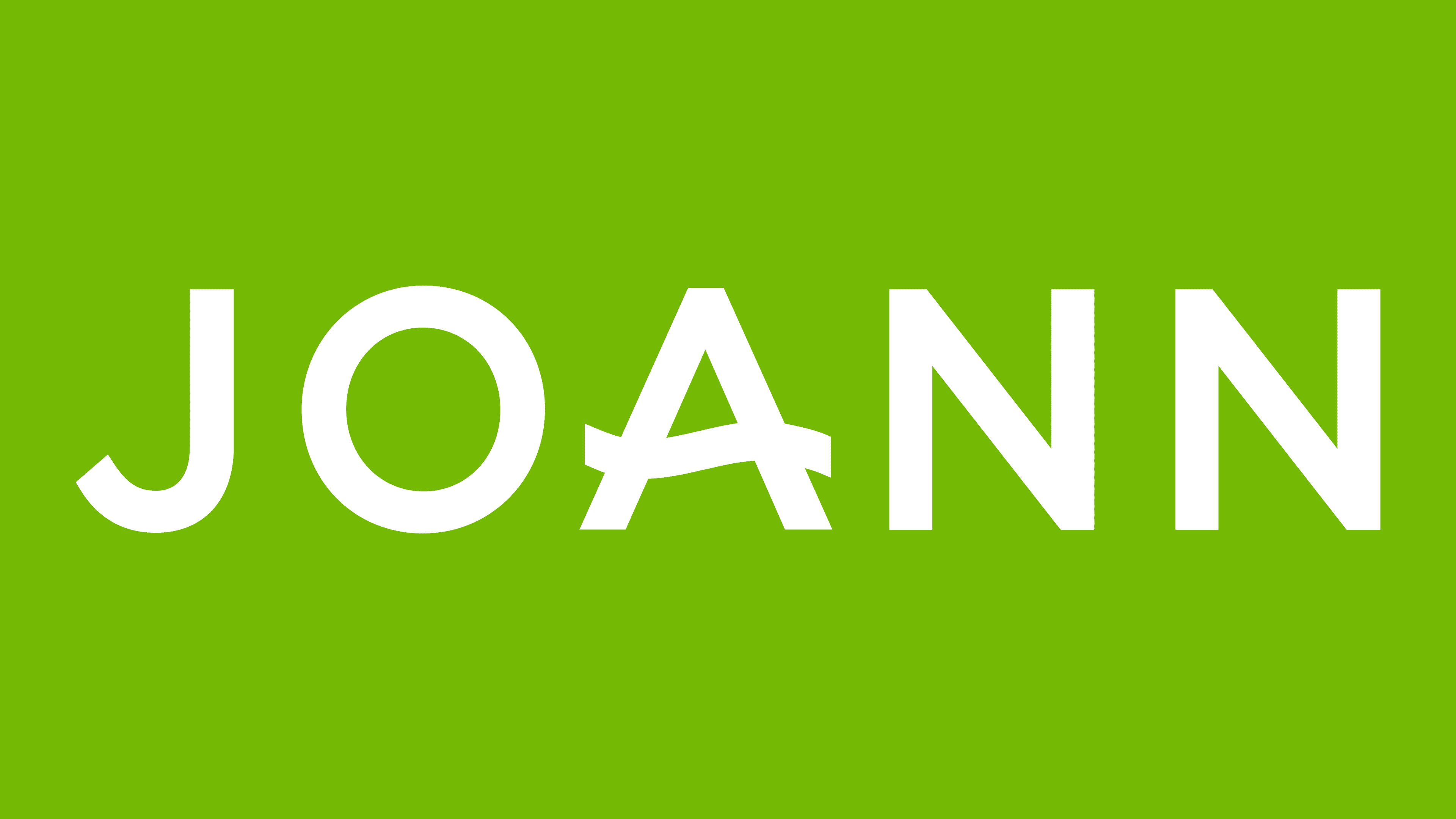
The launch of the JOANN logo in 2017 was part of the brand’s transformation strategy, as it evolved from a retail chain focused primarily on fabrics and sewing materials into an online platform and a hub for the DIY community. The company changed the direction of its development and therefore abandoned its previous visual style, opting for an extreme minimalist, simple approach.
The updated design was developed by the agency CBX, known for creating identities for major retailers and chain brands. As a result of the identity work, a typographic composition was created using a geometric sans-serif, similar to Avenir Next and Circular. Although the style of a well-known typeface served as the foundation, it included custom modifications, most evident in the letter “A,” whose horizontal bar was rendered as a wavy line. As before, this element alluded to a fabric-cutting edge or the motion of scissors, symbolizing the brand’s artisanal essence and its orientation toward makers and craft enthusiasts.
The name was set in uppercase letters, even and proportional, characterized by strict geometry and the mechanistic qualities typical of modern digital brands. The emphasized uniformity of stroke thickness reinforced the sense of order and technological precision. At the same time, the wavy bar of the letter “A” made the entire composition appear soft and friendly, evoking associations with calmness and creative inspiration.
The color palette retained continuity with the 2017 rebranding, staying within a light green shade reminiscent of lime. This tone enhanced positive emotions and was associated with eco-friendliness, growth, and the creative energy necessary for a modern DIY brand.
Despite the positive changes, by early 2025, the company faced serious difficulties. In February, it was announced that all retail locations would gradually close. By the end of April, 255 stores had shut down. The remaining 535 stores closed permanently on May 30.
On June 5, 2025, Michaels officially acquired Joann’s intellectual property and website, but declined to purchase its physical stores. This occurred against the backdrop of rising interest among Michaels’ customers in the fabric category, prompting the integration of the Joann brand into this chain’s product range.
The final Joann logo symbolized a significant turning point in the company’s history and its last attempt to redefine itself in the digital DIY space, culminating in the brand’s transition under the control of another major player in the creative goods market.