 Pearle Vision Logo PNG
The Pearle Vision logo reflects a brand philosophy in which eyewear is both a medical accessory and a part of individual style. The chain originated from cozy optical shops where each customer was served without rush or formality.
Pearle Vision began in Savannah, Georgia, in 1961, when optometrist Stanley Pearle opened a store combining eye examinations with eyewear sales. American patients usually received a prescription in one location and bought glasses elsewhere. Pearle placed both services under one roof, allowing customers to complete the process in a single visit.
The company expanded beyond Georgia during the 1960s. In the 1970s, it accelerated growth by acquiring existing optical chains, including Hillman-Kohan, rather than building every location from scratch. LensCrafters later became a direct competitor through a similar full-service format and in-store production. Pearle Vision introduced franchising in 1981 and expanded across the United States. The model allowed independent operators to open stores in new markets while the parent company limited direct investment.
British conglomerate Grand Metropolitan purchased the chain in the mid-1980s. In 1996, Cole National Corporation took ownership and operated optical departments inside Target and Sears stores. Cole therefore managed both freestanding Pearle Vision locations and optical counters within major retail chains.
Luxottica acquired Cole National and Pearle Vision in 2004, placing the brand in a portfolio that included former rival LensCrafters. In 2018, Luxottica merged with French lens producer Essilor. Pearle Vision entered the combined group while retaining the name and franchise system established in 1981.
Meaning and History
What is Pearle Vision?
It is a well-known optical retail chain in North America that provides eye exams and prescriptions for glasses or contact lenses. Most locations are owned by local optometrists, ensuring personalized service and regular promotional offers.
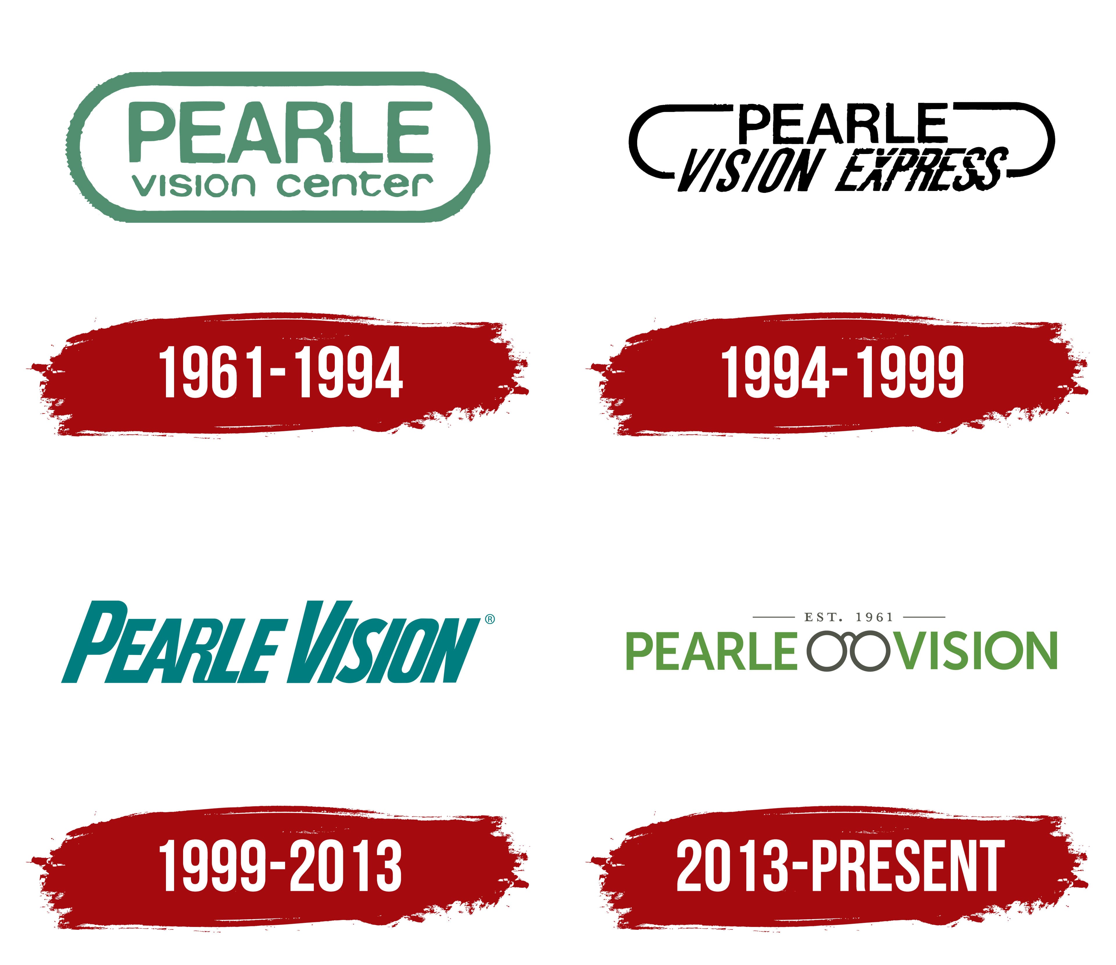
1961 – 1994
The original Pearle Vision logo emphasized simplicity. Founder Dr. Stanley Pearle wanted a brand image associated with eye health and vision care, personally overseeing the design. The green color represented medical care and professional trust.
The word “PEARLE” appeared in uppercase Helvetica Rounded within an oval outline. Below, “vision center” appeared in lowercase letters, matching the width of the upper line.
This simple design became a brand advantage. Changes were avoided for a long time because Dr. Pearle considered the logo successful at reflecting care, quality, and reliability.
1994 – 1999
Between 1994 and 1999, Pearle Vision underwent rebranding, becoming “Pearle Vision Express.” The new design adopted an elongated, cursive, handwritten font. The addition of “Express” highlighted the company’s emphasis on fast optical services.
The green color changed to classic black, shifting away from medical associations and towards a universal commercial image, reflecting the company’s new direction toward quick, affordable optical care.
1999 – 2013
The third logo restored the brand’s traditional green color, which is linked to medical care, and consciously returned to Dr. Stanley Pearle’s original concept. The green shade deepened, emphasizing health and well-being.
Typography also changed, with the use of the Compacta Italic font. Letters became sharply defined, narrow, and tightly spaced.
Rebranding reflected shifts in corporate strategy toward simplified customer service and the expansion of store locations.
2013 – today
Pearle Vision updated its logo to highlight its business, namely the retail sale of eyeglasses, contact lenses, and related services. The identity adopted a friendlier, calmer style associated with the medical and eye care fields.
The first change concerned the typeface of the name. Instead of the previous slanted version, the company applied a straight geometric sans-serif typeface. The font is similar to popular typefaces such as Avenir and Proxima Nova. The entire text is set in capital letters, uniform in size and spacing.
The color was also changed. Instead of bright turquoise, a soft, natural shade of green was introduced, evoking associations with health and naturalness. The new color is more pleasing to the eye and emphasizes the business’s medical focus.
Between the two words, an eye symbol appeared in the center, depicted as two circles connected by a thin bridge. The symbol is positioned between the words PEARLE and VISION, visually separating them and reinforcing the company’s activity. The frame is styled concisely and minimally, with contours rendered in dark gray that harmoniously complement the green letters.
Above the main part is a neat inscription “EST. 1961,” indicating the brand’s founding date. The small letters are set in a classic serif typeface and highlighted in a gray shade. On both sides of the date are thin horizontal lines that balance the composition and give the logo a finished appearance.
As a result of this update, the brand received an image that combines medical seriousness with friendliness and a focus on customer attention.