The iconic ShopRite logo brings together multiple supermarket chains. It has a generalized design because the stores offer a wide range of products – from food and flowers to medicine and cosmetics. The emblem embodies the joy of great purchases. Its optimistic color palette and vibrant images are chosen to inspire trust in customers.
ShopRite: Brand overview
| Founded: | 1946 |
| Founder: | Wakefern Food Corporation |
| Headquarters: | Keasbey, New Jersey, U.S. |
| Website: | shoprite.com |
Meaning and History
ShopRite’s logos have evolved as the cooperative grew: the bigger and more popular it became, the more attractive its emblems turned out. Partly this was due to new design trends, as the organization had to adapt its identity to consumers. Hence, the modern logo appears much more colorful and balanced than the previous ones.
The shopping cart has traditionally been the brand’s symbol. Initially, it was depicted next to a woman, but later, the cart became the logo’s star. The cart playfully jumps along with the products, aiming to infuse ShopRite customers with optimism and make shopping seem like a joyful event. Bright colors, such as yellow and red, are used for the same purpose.
What is ShopRite?
ShopRite is a cooperative of stores headquartered in Keasbey, New Jersey. It has existed since 1946 and is a subsidiary of Wakefern Food Corporation. The supermarket chains operate in six states: Pennsylvania, New York, New Jersey, Maryland, Delaware, and Connecticut. The brand has a website selling food, cosmetics, baby products, and much more.
1946 – 1975
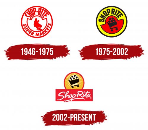
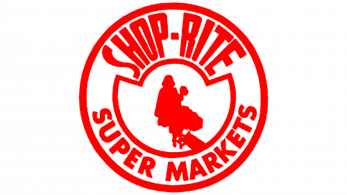
This logo started being used in 1951 when the ShopRite brand was established. It contains a simplified image of a woman pushing a shopping cart filled with various goods. Artists chose not to detail the image but instead presented it as a single red spot. It’s placed within a semi-circular frame with a decorative top. The phrase “SUPER MARKETS” is written next to it. It had to be added to the emblem since the cooperative wasn’t famous yet. The brand’s name is spelled with elongated letters arranged in a fan shape. There’s a short dash between “SHOP” and “RITE.”
1975 – 2002
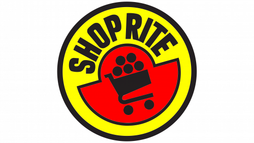
The mid-1970s were challenging for ShopRite: the cooperative had to recover after a major member left. However, it passed this test remarkably well and even updated its logo – perhaps as a symbol of shedding all that was old and unnecessary. From a designer’s perspective, the woman’s silhouette, which cluttered the emblem’s center, was deemed redundant.
Now the shopping cart has a standard look: two wheels, a basket, a handle, and a frame. Inside are goods depicted as five circles. The black drawing is in the center of a red structure of two semi-circles of different sizes. The outer space of the logo contains the word “SHOPRITE” on a yellow background. The font has changed, but still looks as unconventional as before. The sign is slightly tilted to the left, reminiscent of a haphazardly placed stamp. Although this emblem is no longer official, it can still be seen in some places.
2002 – today
The grocery cart “flies” in the center of an orange circle, bordered by a red stripe. Behind it is a white sun with numerous pointed rays. Hence, the black color of the cart is justified: it’s visible from the unlit side. From the basket, goods scatter in all directions like mini-circles and quadrilaterals. The “ShopRite” inscription is painted white and placed in a separate rectangle at the bottom. An uneven stripe underscores the middle of the phrase.
Font and Colors
The cooperative’s name is typed in a unique font that resembles a messy handwriting imitation with bold glyphs. The rounded shape of the letters symbolizes warmth, friendliness, and homeliness. A special Shop, Rite TrueType font, was developed based on the logo.
At first glance, the emblem colors might seem contradictory. In reality, black, white, red, and orange create a striking contrast to showcase the brand’s energy and appeal.
