John Felix Anthony Cena Jr. positions himself as a successful musician, actor, and wrestler, so he uses an emblem for his brand that he considers cool enough. The John Cena logo loudly proclaims his leadership qualities, ambition, and desire to be on top of fame.
John Cena: Brand overview
| Founded: | November 5, 1999 |
| Founder: | John Felix Anthony Cena Jr. |
| Headquarters: | United States |
John Cena (John Cena) is a famous actor, wrestler, and TV presenter who was born in America in 1977. In the past, he also composed rap and gave small performances. The film career of the star began relatively recently. The first film debut occurred in 2006 when the film “The Marine” appeared on the screens. Until that moment, John Cena had been a professional wrestler. In this sport, he achieved impressive results and won prize titles.
The celebrity also has his creative logo. This is a bright, massive icon that looks incredibly voluminous. It shows the bright features of the character of a famous wrestler – brutality, strength, confidence, and energy. Harmonious colors with a predominantly green color also emphasize calmness, balance, and balance in everything. This is how John Cena positions itself, perfectly combining careers in different areas, and each of them achieves success.
Meaning and History
John Cena is a multifaceted personality. He managed to build a career as a brave fighter, a successful film actor, and a professional TV presenter. At a certain period, he also tried himself in the musical field. These achievements perfectly characterize the celebrity. They demonstrate his determination, incredible strength, and talent. John Cena was especially successful in wrestling. He repeatedly won championship titles and defeated incredibly strong wrestlers.
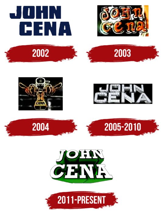
Changes in visual identity have always accompanied every significant change in the life of a star. The very first John Cena logo appeared in 2002. After that, it was updated and redrawn several times. Each new version reflected the mood of the actor and his aspirations. It all started with a simple massive badge, showing friendliness and assertiveness. In subsequent versions, chic, brutality, vigor, success, and other features were visible.
What is John Cena?
John Cina is a famous wrestler and actor who has had a career in both fields. The celebrity is the star of popular films (including The Peacemaker, Bumblebee, Furious 9, etc.) and the world champion in several categories of wrestling. At the moment, he continues to engage in wrestling but devotes most of his time to filming.
2002
The earliest version of the logo appeared in 2002. It was a simple rectangle, inside which the name and surname of the star were located. John Cena’s words were written in large, thick letters, showing confidence, strength, and power. This message symbolized the special achievements of John Cena in wrestling. The wrestler has already defeated many famous athletes and become one of the best in this sport.
His mood was also emphasized by a bright variety of colors, which included green and blue hues. They harmonized perfectly with each other and carried a special message. These colors are symbols of friendliness, courage, perseverance, and courage. The lettering was done in the ExtraBold style, which suggests straight lines and traditional contours.
2003
In 2003, John Cena updated the logo. The new concept is fundamentally different from the previous version. It focuses on brutality, dynamics, and vigor. These traits are manifested in the expressive color palette, intricate type design, and an unusual arrangement of elements. The background of the updated logo is completely painted in a contrasting black and white palette, on which bright orange letters of the name and surname look good.
John Cena is marked with a smooth rounded font with unusual serifs. This format was a cross between classical and modern styles. Another feature is the arrangement of letters. Some of them are at an angle. The original design symbolized some of the changes in John Cena’s life. He gradually won more and more new wrestling awards and continued to develop in other areas.
2004
In 2004, John Cena again decided to change the visual concept. As a result of the updates, the text logo was replaced with the original picture, which depicts a cartoon figure of a wrestler. During this period, the athlete was especially interested in wrestling, so he decided to make a bright accent on this type of activity and add identity by placing the Cena inscription.
The surname of the wrestler was located on a massive pendant that hung around the man’s neck. It was not fully visible. As conceived by the designers, the picture shows a face and two hands, the fingers showing a victory sign. For the design, thick and fuzzy outlines were used, which added playfulness to the logo. Contrasting colors also complemented a funny picture. It combined classic black and elite golden hues.
2005 – 2010
In 2005, John Cena reached the final of the PPV Royal Rumble 2005 and also managed to achieve success in other competitions. Achievements inspired the wrestler for another update of the emblem. Instead of a funny man, he began to use a luxurious three-dimensional badge decorated with figures resembling crystals. They were located on the name and surname of a celebrity.
The words differed in rather voluminous forms and different sizes. John was at the top and Cena at the bottom. The lower word had a larger size and was complemented by a small glare, creating a shining effect. The letters were decorated in a metallic gray, which looked perfect against a strictly black background. This badge perfectly reflected the image of a celebrity at that time.
2011 – today
Another rebranding took place already in 2011. At that moment, a completely new modern version of the logo was formed, which the famous actor still uses. This is a clear, expressive, and massive inscription consisting of two levels. The basis is still two words – John Cena. But, this time, the famous wrestler abandoned the luxurious crystal inlay and returned to a simpler concept.
Its main feature is an incredibly voluminous green shadow, which creates the effect of a voluminous two-level inscription. This design decision emphasized confidence, progress, growth, and development. In addition, massive serif letters have become a symbol of success and brutal character. A rather assertive design is balanced by a light shade in which the letters are painted. They stand out against the green shadow and have subtle black outlines.
Font and Colors
The basis for the visual identity of the famous actor John Cena is an expressive two-level inscription. It harmoniously combines light and eye-pleasing coloring and incredibly bold font. The letters are made in the traditional bold format, demonstrating the strength of mind, calmness, and poise.
An additional feature of this font is the presence of serifs. This element is associated with reliability, respect, and prestige. In general, the inscription looks brutal and memorable, directly symbolizing the actor’s activity. The designers have also successfully chosen a color scheme that makes the logo easy to read.
The letters have a light color, which makes them stand out from the shadow’s background and symbolizes honesty and openness. Each of them is decorated with thin, elegant contours in black. This shade also carries a special message, which is prestige and status. But, most of the inscription is still painted in bright green. He demonstrates the confidence, calmness, natural energy, and desire for the development of the famous wrestler.
John Cena color codes
| Lime Green | Hex color: | #10db0a |
|---|---|---|
| RGB: | 16 219 10 | |
| CMYK: | 93 0 95 14 | |
| Pantone: | PMS 802 C |
| Black | Hex color: | #000000 |
|---|---|---|
| RGB: | 0 0 0 | |
| CMYK: | 0 0 0 100 | |
| Pantone: | PMS Process Black C |
