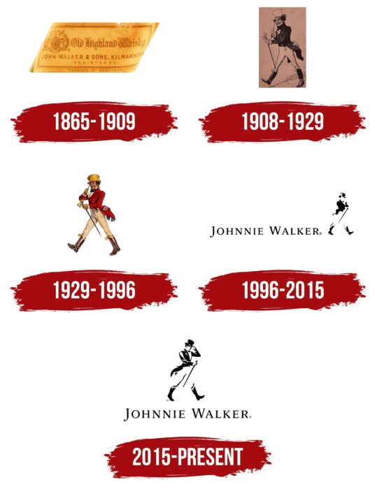
The Johnnie Walker logo is in motion. Appearing in Scotland, whiskey roams the planet at a light walking pace and finds admirers in the most remote corners. The emblem shows that the drink is welcome everywhere, like an old friend.
Johnnie Walker: Brand overview
| Founded: | 1865 |
| Founder: | Diageo |
| Headquarters: | Scotland |
| Website: | johnniewalker.com |
Meaning and History
The brand’s evolution began with a small grocery store of the Walker family in Ayrshire. John’s parents were farmers, and when his father died, he was only 14 years old. To feed the family, the mother sold the rural house along with the farm and, with this money, bought a warehouse, a grocery store, and an alcohol store in the nearest town. The young man was first engaged in mixing tea and then moved to the segment of wines and spirits: he sold rum, brandy, whiskey, and gin.
Gradually, the young man focused on selling blended whiskey since the law regarding it was relaxed, and now several varieties could be mixed. He did it to his taste and by order of clients. At that time, he did not label the goods in any way – the bottles did not have labels. They appeared a little later when John Walker, nicknamed Johnnie, decided to promote his store. He called the spirit drink Walker’s Kilmarnock Whisky, indicating this with the inscription on the first (unofficial) logo.
After the founder of the trademark died in 1857, the business passed to his son, who made a huge contribution to the development of the trademark. The first thing Alexander “Alec” Walker did was change the bottle’s shape and design. He made it iconic: flat and rectangular. So much more containers with Scotch whiskey were placed in one box, and tightly packed containers did not break during transportation.
His second innovation concerned marking: on each copy, there was a sticker superimposed at an angle of 24 degrees. This was also a cunning marketing ploy: buyers immediately distinguished blended whiskey because it could be seen even from a distance. In addition, there was enough space for the name, so the inscription became clear and large.
The founder’s grandsons, George and Alexander Walker II did a lot for the brand. They expanded the assortment due to the taste and added the names of the flowers. In 1908, the winery was rebranded, as a result of which, she got a new name. The bottles were adorned with the inscription “Johnnie Walker Whiskey” and not “Walker’s Kilmarnock Whisky.” At the same time, a large-scale advertising campaign was launched, which contributed to the widespread distribution of the Scottish alcoholic drink.
Another innovation in the redesign touched on the corporate logo. During that period, a walking gentleman in a bowler hat and with a cane appeared on the label. The manufacturer has been using this image for over a century. Thus, the marketing strategy allowed the Walker family to take the business to a higher level, and now their products are well recognized worldwide. Indeed, under this brand, not only valuable perennial drinks are produced, but also inexpensive whiskey less than three years old.
1865 – 1909
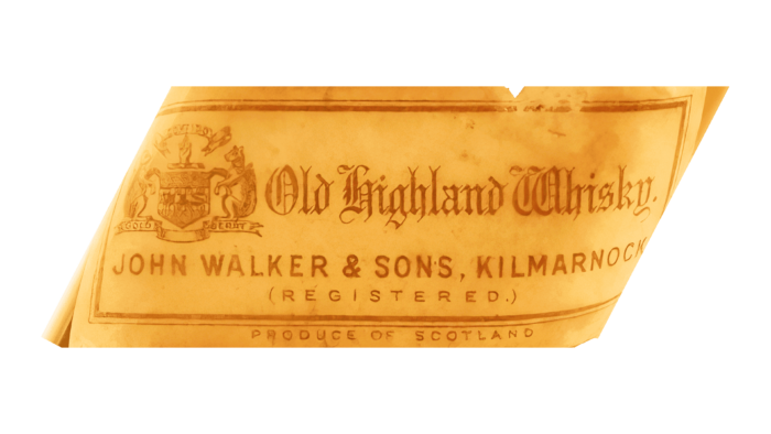
The first genuine Scotch whiskey label was labeled “Old Highland Whisky.” The letters were in the Old English style – with decorations, curls, and curly elements. The classic inscription occupied the second line, made in strict printed characters in upper case and without serifs. The manufacturer (John Walker & Sons) and the place of manufacture of the liquor (Kilmarnock) were listed there. On the left side was a coat of arms with a shield and several ribbons. A rectangular frame surrounded all elements.
1908 – 1929
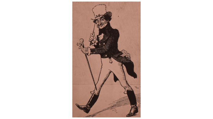
In 1908, the company organized a powerful advertising campaign, in which the Striding Man played the main role. Having become recognizable, it remained on the logo, replacing all the inscriptions. The label showed a gentleman walking to the left. He was dressed in the fashion of the 19th century, which proclaimed: I was born in the last century, but I still look great. He wore a tailcoat with long flowing tails, a tall white bowler hat, gloves, and high-top black boots. In one hand, he held a pince-nez, in the other a cane. The man smiled, showing a wonderful mood.
1929 – 1996
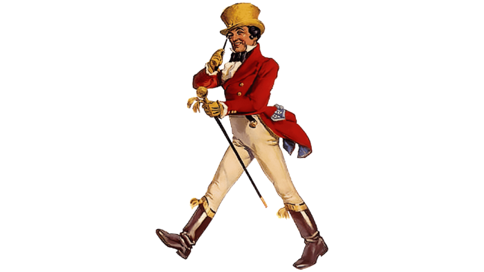
Although it still featured the same Striding Man, this logo differed from the previous one in terms of color and style. Designers added realism to it and made every detail natural. The jacket was dyed a deep red. The character now has golden buttons, gloves, a knob, a hat, and a boot trim. The white shirt-front was distinguished. At the same time, the style of the boots was changed, the tails were reduced, and the man himself began to look younger.
1996 – 2015
The artist who worked on the new image in the logo turned the man in the opposite direction so that he walked not to the left but the right. He also added mystery to him, depicting the figure with jerky lines and incomplete strokes. As a result, the silhouette seemed to emerge from negative space: only high boots, a cane, a tailcoat, a bow tie, and a bowler hat on his head were visible as dark spots. The developer made the sophisticated gentleman chic, turning him into a true dandy. Nearby (on the left side) was placed the name of the Scottish distillery brand.
From 1996 to 2015, the logo of the iconic brand Johnnie Walker underwent significant changes that allowed the brand to attract a new, younger audience. The information we often see on other websites names John Geary as the author of these changes. Geary worked at the Michael Peters studio, which is known for its work on a multitude of major brands.
Recently, we were contacted by Cush (Andrew) Cuschieri, an experienced designer who also worked at the Michael Peters studio in the late nineties. Cush asserts that he is the actual author of the reimagining of the Johnnie Walker logo in 1996.
According to Cush, his goal was to create an iconic symbol that would reflect the dynamism and freshness of a younger generation. This was a significant step for the brand, a departure from traditional illustration.
John Geary was then given the task of creating several variations based on Cush’s design; however, none of them were chosen. Instead, it was Cush’s original design that became the new symbol of Johnnie Walker.
This work brought Cush a prestigious award – The London International Award, which he received for implementing a new visual identity for the brand.
Although many sources continue to attribute the authorship of this design to John Geary, it is important to consider this side of the story. We thank Cush for sharing his experience and possibly unveiling the true author of this significant change in the visual identity of Johnnie Walker.
2015 – today
After some tweaks, another gentleman appeared on the logo – with distinct lines emphasizing a smiling face and highlighting the leg, arms, hair, detailed jacket. Buttons also appeared on the shirt and tailcoat of the gentleman, and the tails became much longer and sharper at the ends. The man is now standing on the inscription, the letters of which are slightly higher than before. But the monochrome was completely preserved.
Font and Colors
The main character featured in the Johnny Walker logos is the Striding Man. At different times, of course, he had a different look to match the concept of an alcohol brand but remained a modern dandy. Moreover, the development of the image (and with it the emblem) moved from complex and heavy forms to simple and light ones. Therefore, now the man looks weightless due to thin strokes and underdrawn black spots. This forms an energetic, young, and extraordinary aesthetics.
The first artist to offer such an image character is Tom Browne. He chose it for an associative reference to a walking person because the name of the brand’s founder means “walker,” “one who walks.” Then other designers had a hand in it, including Clive Upton, John Geary, Gary Redford. The latter option is good because it reflects the brand’s personality even in miniature sizes, which is advantageous for small Scotch whiskey labels.
The early emblem was dominated by the grotesque and the Old English style. In the later ones, serifs with sharp serifs appeared. It adds sophistication to the logo and makes it perfect for a sophisticated dandy look. The color palette is mostly black and white. For some period, it was also red-gold.
Johnnie Walker color codes
| Black | Hex color: | #000000 |
|---|---|---|
| RGB: | 0 0 0 | |
| CMYK: | 0 0 0 100 | |
| Pantone: | PMS Process Black C |

