


 Juicy Fruit Logo PNG
The Juicy Fruit logo resembles a sweet, fruity capsule, attracting attention with its friendliness and childlike simplicity. The emblem evokes associations with a smile and highlights the variety of flavors the brand offers.
Juicy Fruit entered the American market in 1893 through William Wrigley Jr., founder of Wm. Wrigley Jr. Company. He first sold baking powder and soap, adding chewing gum as a bonus. Still, the gum became more popular than the original goods. The product stood out for its fruit flavor, while the exact recipe remained a trade secret. Its yellow wrapper became one of the brand’s main visual markers.
During World War II, production was limited because of ingredient shortages, yet the company kept supplying gum to U.S. servicemen. In the 1950s and 1960s, Juicy Fruit became tied to American popular culture through radio and television advertising. The slogan “The taste is gonna move ya” helped promote its strong fruit taste.
In the 1970s, the brand moved into international markets and adapted to local tastes. The company tested larger family packs, multipacks, new forms, and methods for keeping flavor fresh longer. In the 2000s, Juicy Fruit remained a key product, with marketing aimed at younger buyers and added flavors such as watermelon and strawberry. In 2008, Mars acquired the company and its gum brands.
The 2010s and 2020s brought sugar-free and reduced-sugar versions, limited flavors, and new lines. Starburst Fusion appeared in 2015, followed by Flavor Collisions in 2017. The classic line was relaunched in 2019 with updated packaging and the familiar yellow color. Later launches included new sugar-free flavors in 2020, Naturals in 2022, and Boost in 2023 with vitamins and minerals.
Meaning and History
What is Juicy Fruit?
It is a classic brand of chewing gum produced by the Wrigley Company, a subsidiary of Mars, Incorporated. Known for its distinctive sweet, fruity flavor, it has been a favorite among chewing gum lovers for generations. The exact flavor profile of the chewing gum is kept a closely guarded secret, often described as a combination of banana and pineapple. However, the company has never officially confirmed the specific ingredients. The brand comes in various formats, including traditional chewing gum, tablet chewing gum, and bubble gum. Over time, the brand has expanded its product line to include sugar-free options and different flavor variations while maintaining its core original flavor. Recognizable for its bright yellow packaging and long-lasting flavor, the brand has replaced the iconic American chewing gum brand. Its widespread popularity and instantly recognizable flavor have made it a staple in stores, supermarkets, and vending machines throughout the United States and many other countries.
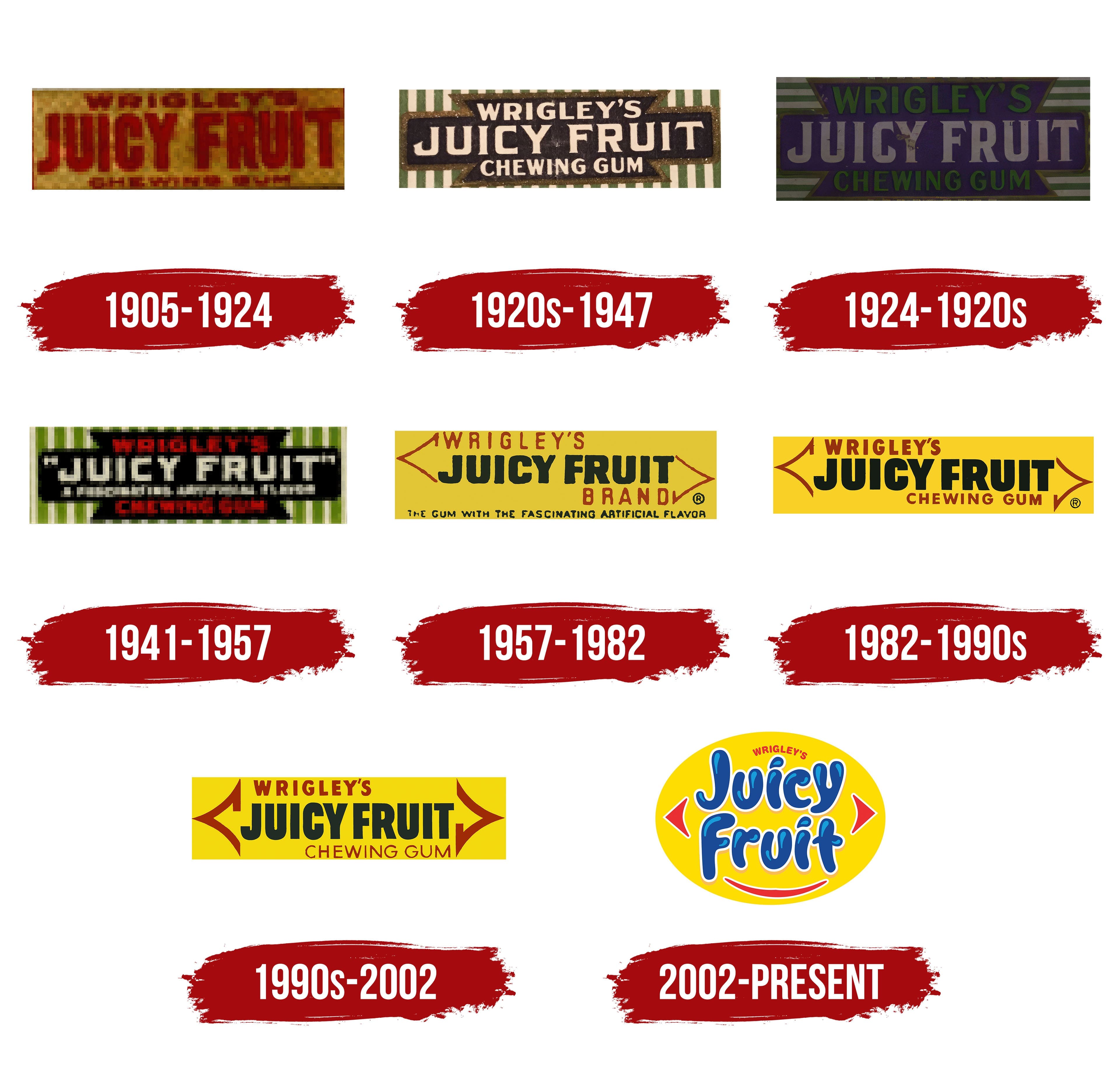
1905 – 1924
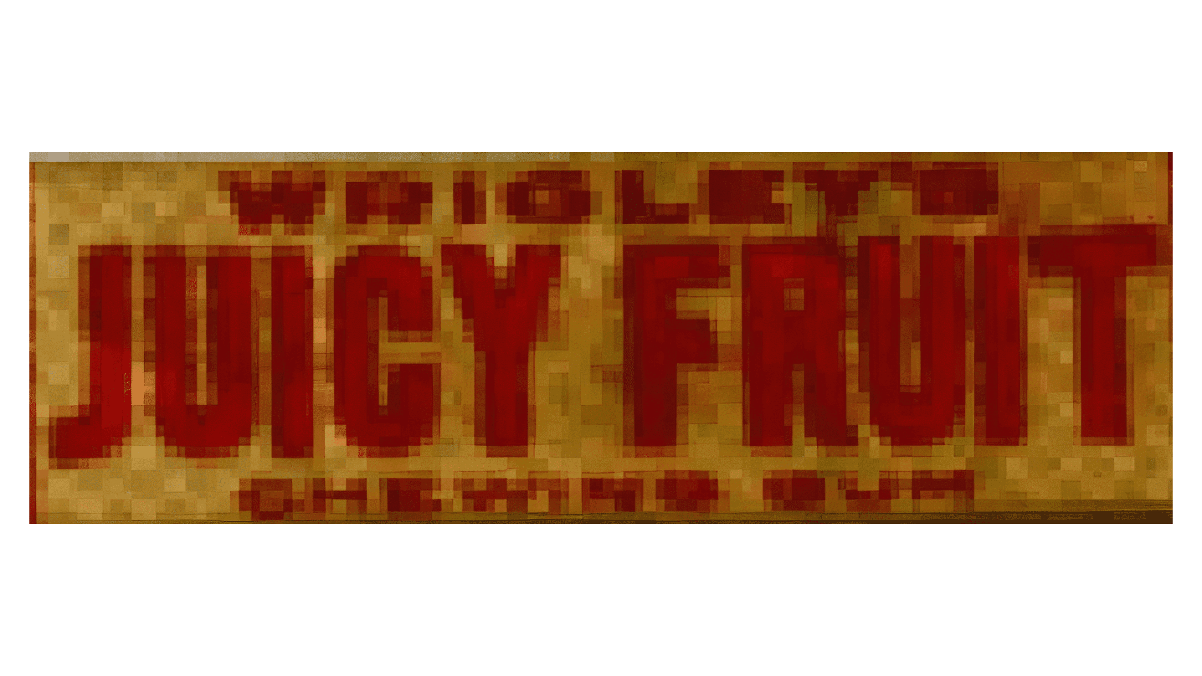
The first logo was simple and informative. It featured the brand name and the manufacturer. The red letters grabbed attention, highlighting the flavor’s novelty and boldness, which made it a unique offering in the market.
1920s – 1947
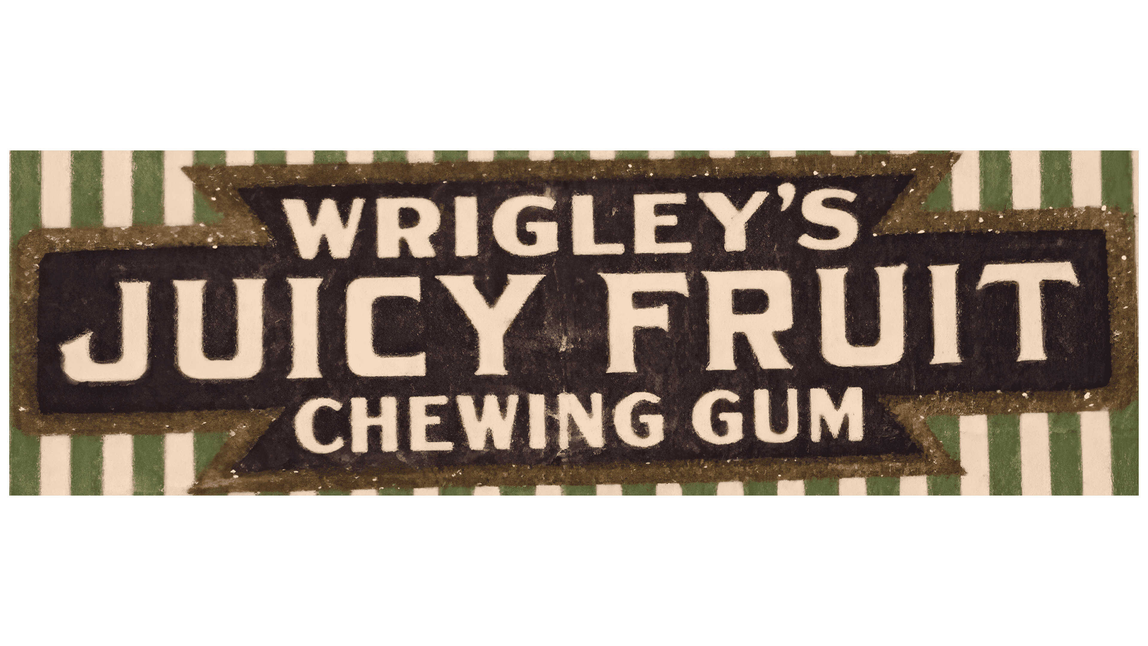
As the product’s popularity grew, a new packaging design was created. The logo adopted a striped look with vertical white and green lines, emphasizing the product’s uniqueness: individual chewing gum strips wrapped in paper. The green color symbolized the gum’s natural ingredients and refreshing taste. The name “Wrigley’s Juicy Fruit” was placed on a thin black plate shaped like a Maltese cross, making the logo recognizable and memorable.
1924 – 1920s
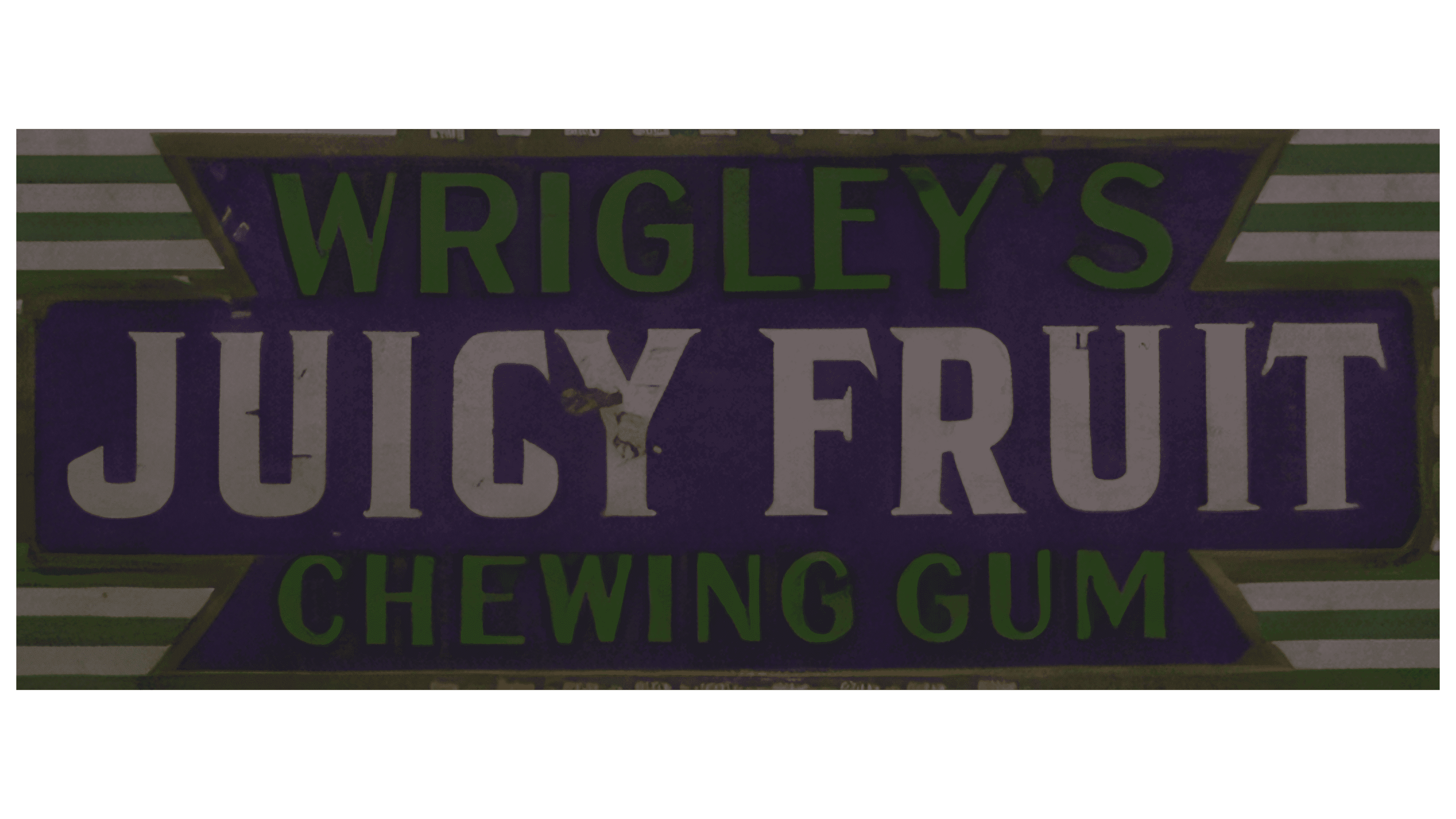
The vertical stripes in the logo were replaced with horizontal ones, more accurately reflecting the placement of the gum in the packaging. The change in color scheme brought the design closer to natural themes and associated it with the minty flavors of other Wrigley’s products.
1941 – 1957
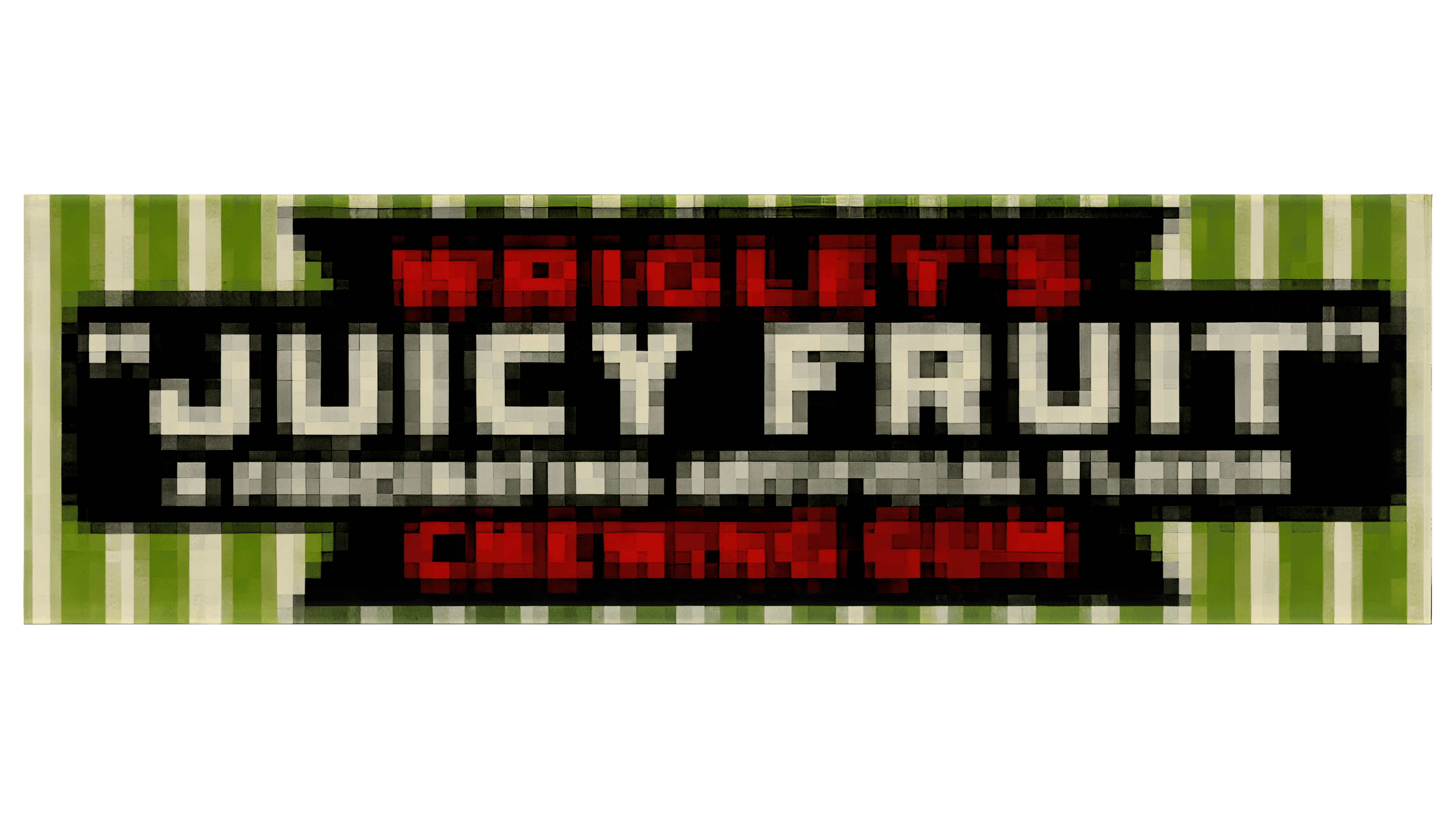
During this period, the wrapper returned to the design from the early 1920s with vertical stripes, but the color scheme was updated. A message about the “Fascinating artificial flavor” was added, and the company name and product category were red to stand out against the new multicolored palette.
1957 – 1982
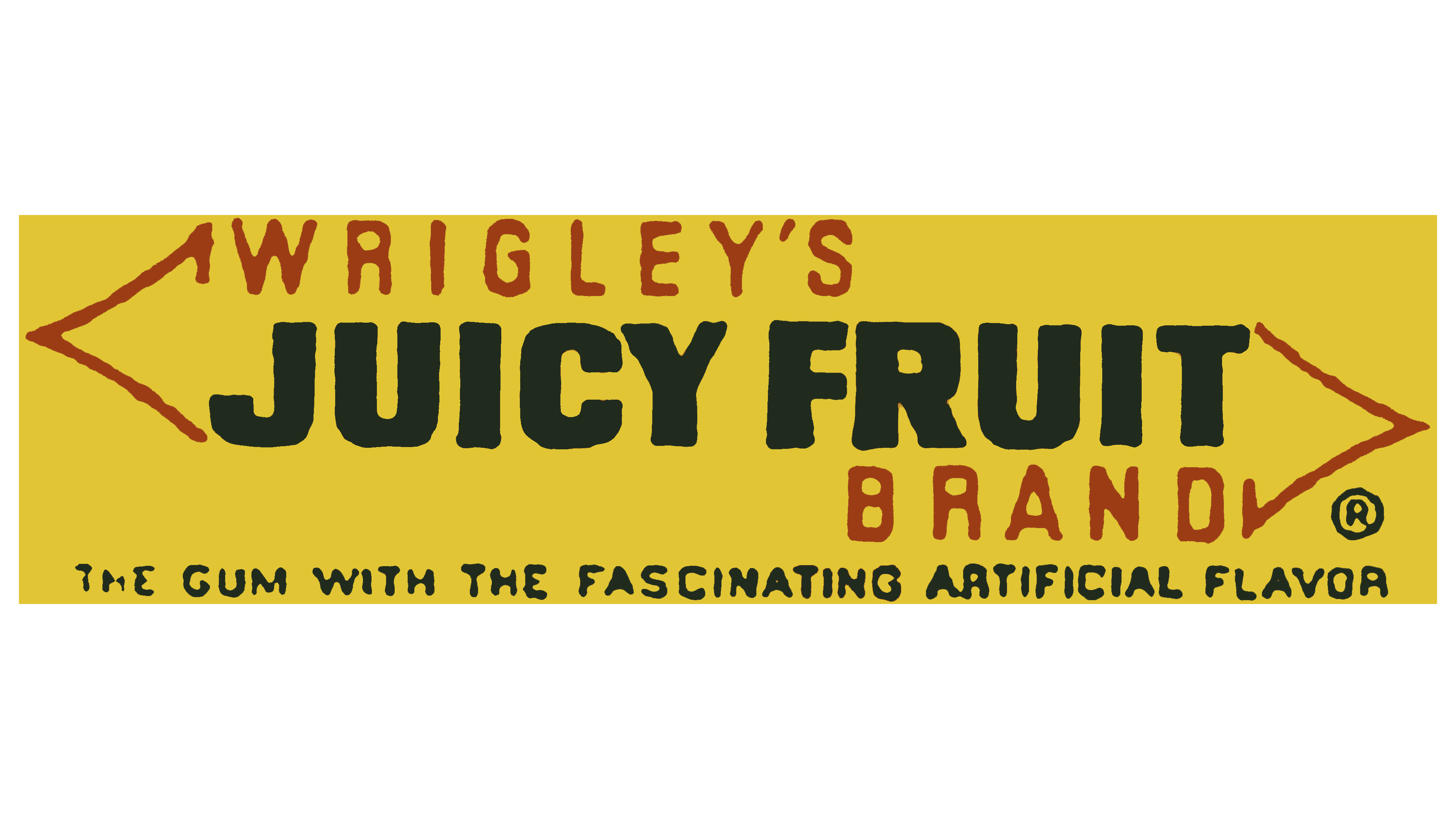
In 1957, Juicy Fruit Gum introduced an arrow design that became recognizable to consumers worldwide. The manufacturers aimed to standardize the packaging across all company products, and the arrows on the logo symbolized the ease of removing a strip from the wrapper. The yellow background highlighted the fruity flavor and aroma, while the bold black letters of the brand name stood out in contrast against the light background. Additional text was written in a thin red font, framing the main part of the logo and giving it a finished look.
1982 – 1990s
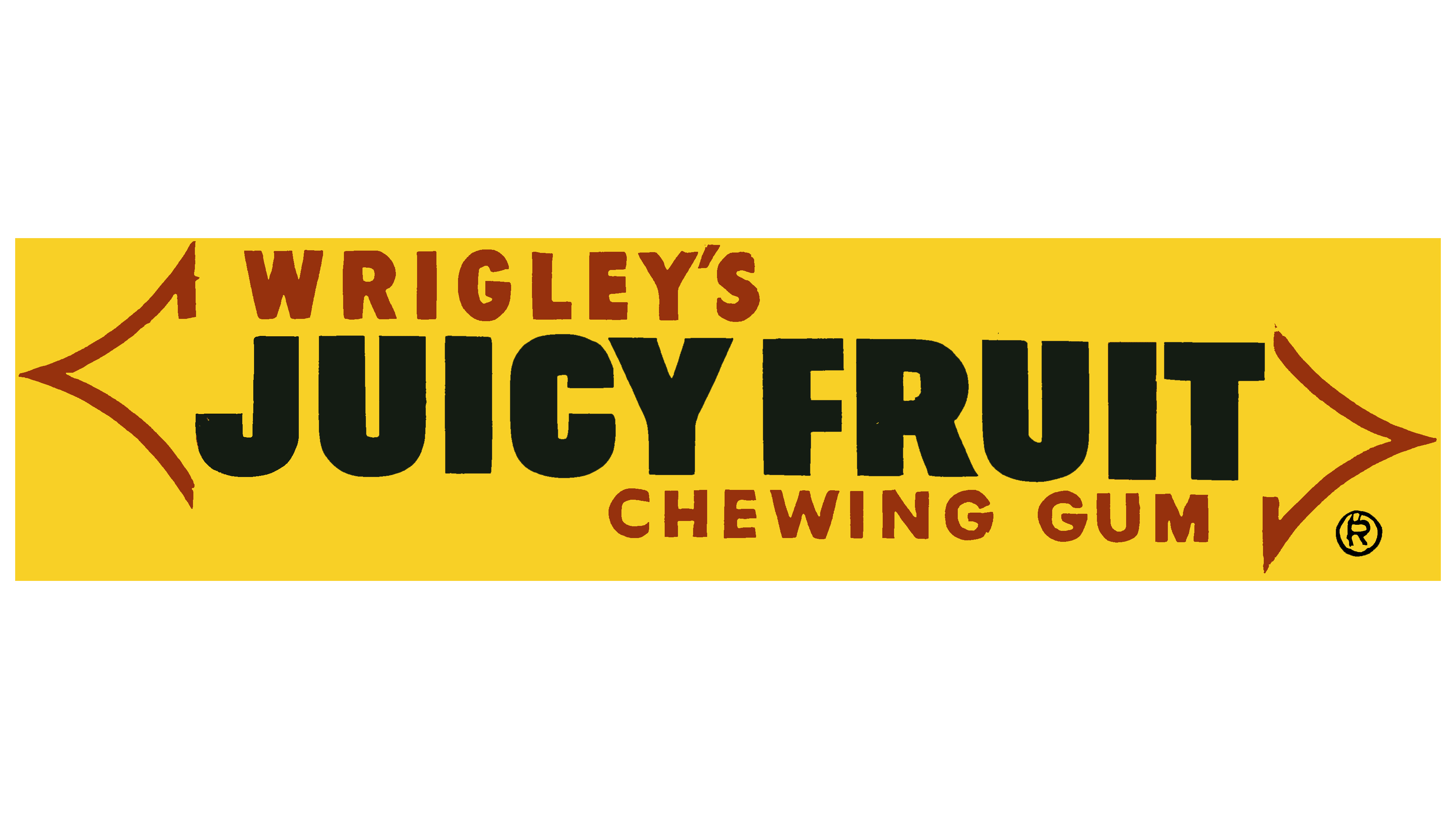
The logo’s transformation in 1982 made the lettering more balanced and harmonious. The thickness and width of the letters were carefully adjusted to better fill the background, while the brighter yellow base added extra appeal and freshness to the logo.
1990s – 2002
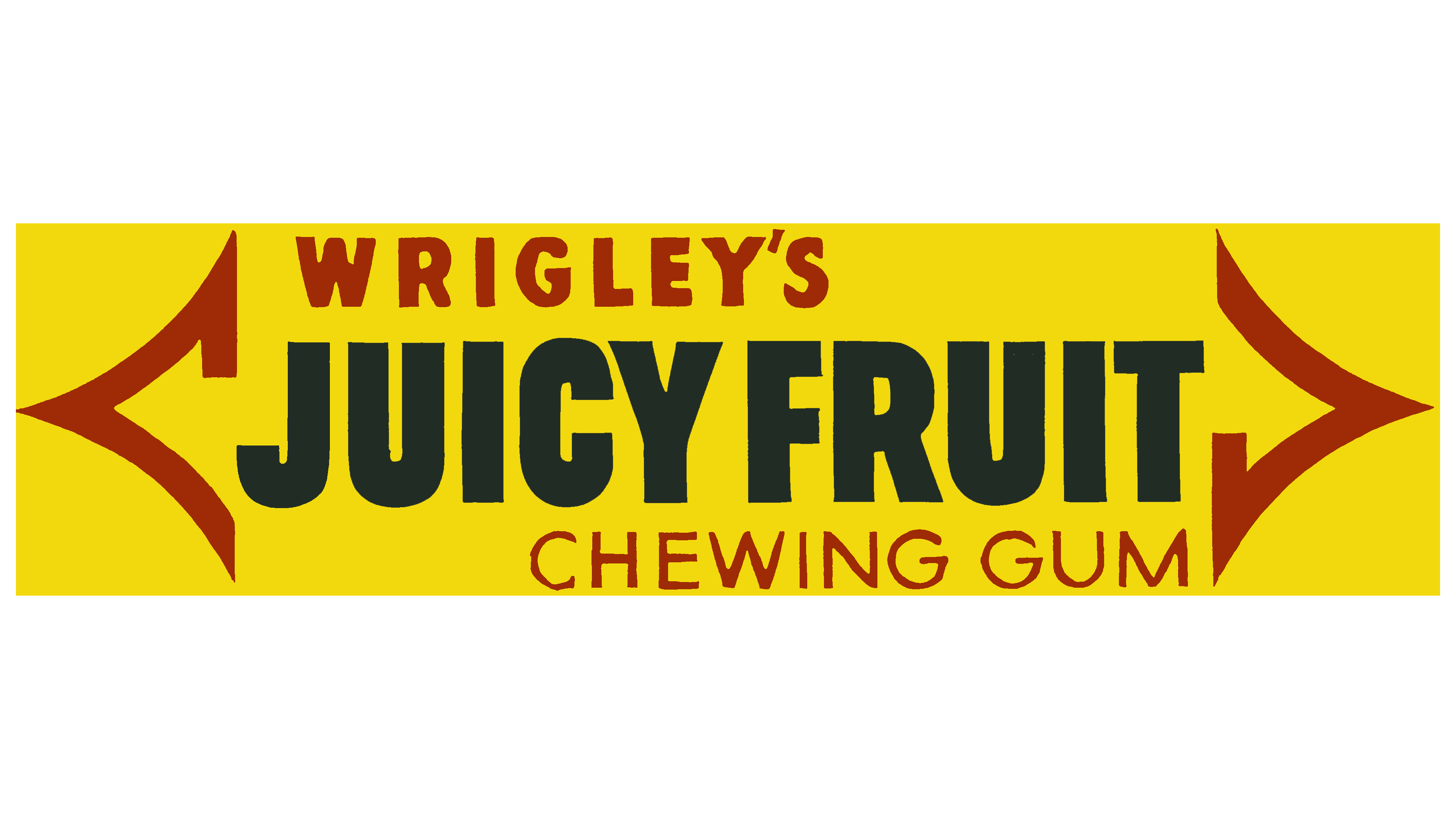
During this period, the Juicy Fruit logo underwent significant changes to improve symmetry and clarity. The arrows became thicker and evenly spaced, enhancing the sense of dynamism. The letters in the brand name were elongated, creating an association with the long strip of chewing gum. The lighter background made the text more contrasted, improving its readability and sharpness.
2002 – today
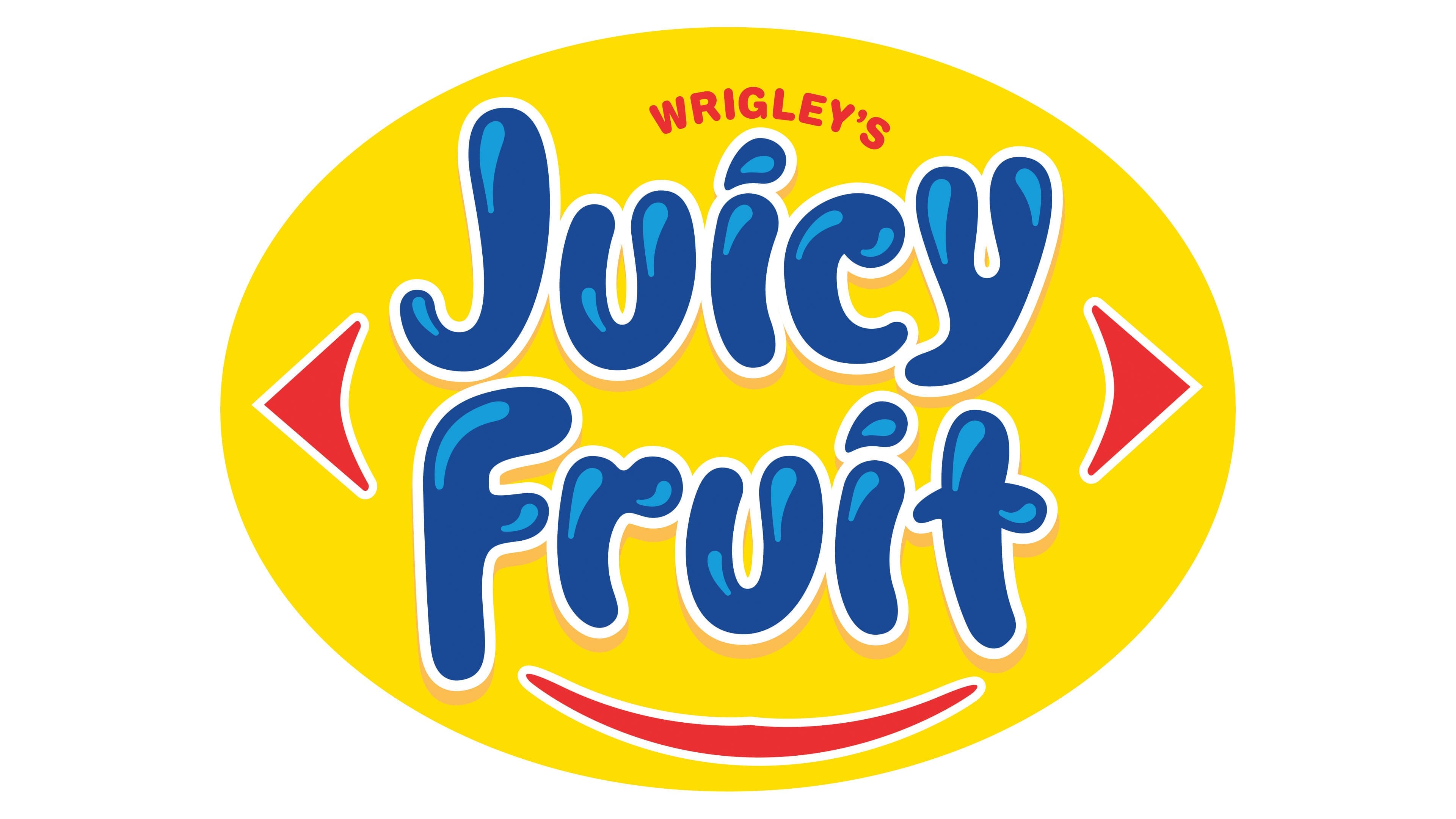
The new Juicy Fruit logo is a bright, cheerful symbol that instantly evokes fruity freshness and sweet flavor. The round shape of the emblem, reminiscent of an orange or lemon, immerses you in the atmosphere of a juicy fruit and enhances the feeling of freshness that the chewing gum offers.
The blue, bold letters used in the name resemble drops of juice. This association makes the logo visually dynamic as if it’s shimmering and playing in the light. Thanks to this design choice, the text reads as a word and has a nearly tactile effect, as if each character is filled with the juiciness and energy the product promises.
The red arrows, retained in the new design, have taken on a more cartoonish appearance, adding an element of playfulness and fun. These arrows hint at movement, highlighting the product’s brightness and dynamism. They draw attention and create a sense of direction, inviting you to follow them and try chewing gum.
A special feature is the lower line of the emblem, transformed into a smile. This element gives the logo a friendly, positive character, making it resemble a smiley face from a distance. The smile flirts with the audience, evoking warm and joyful emotions. This design choice is particularly effective in attracting a younger audience, for whom such details are important and memorable. The smile invites you to try Juicy Fruit, promising fun and enjoyment with every piece.
The logo’s bright yellow background evokes sunlight and warmth, complementing the juiciness and fruity delight concept. The yellow color evokes positive emotions, such as joy and optimism.
The modern design of the visual identity has preserved elements recognizable and loved by many generations while adapting them to the new realities and preferences of the audience. As a result, the brand remains relevant, continuing to delight consumers with its energy and flavor.