The KAMAZ logo represents a strong and spirited iron horse. Energetic, bold, and unstoppable. The emblem is filled with freedom. The brand’s vehicles are indifferent to roads, traveling freely to places without paths. Thanks to advanced technology and quality construction, the vehicles possess exceptional endurance.
KAMAZ: Brand overview
KAMAZ was founded in 1969 in Naberezhnye Chelny, Tatarstan, to meet the growing demand for powerful trucks in the Soviet Union. The following year, KAMAZ’s huge production complex was laid out, requiring an investment of over 900 million rubles and showing its importance in that era.
The plant began operations in 1976, and the first truck models – chassis 5511 and 4310 – rolled off its assembly line. From the 1980s to the 1990s, the enterprise expanded its production capabilities in the following decades, becoming the main supplier of heavy trucks throughout the USSR.
The post-Soviet era brought difficulties that required organizational restructuring, but KAMAZ managed to maintain its significant presence in Russia and CIS countries. Modern KAMAZ vehicles, such as the 43118 and 65117 models, are known for their durability and reliability.
Entering the 21st century, the company has carried out significant modernization and expanded its presence in the global market, focusing on emerging economies. As a reputable enterprise in the Russian industry, KAMAZ is often referred to as a source of national pride and the embodiment of the Russian automotive industry on the world stage. Over more than half a century, KAMAZ has developed new industries, such as buses and diesel engines, diversifying its portfolio.
Meaning and History
1969 – 1970
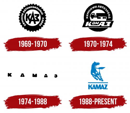
The KAMAZ company logo, created between 1969 and 1970, features a tire from heavy machinery, clearly indicating the brand’s focus. This design highlighted the factory’s specialization in producing trucks. Around the tire, the full name of the enterprise, KamAZ (Kama Automobile Plant), was written in white letters. This name framed the central part of the logo, where the abbreviation KAMAZ was placed.
The letter “A” in the center of the abbreviation was given special attention. It was made particularly large to emphasize the word “automobile.” This emphasis symbolized the factory’s main focus on truck production and highlighted its key role in the industry.
The logo’s circular and symmetrical forms conveyed the precision of the designs and the strength of the powerful giants produced at the factory. The symmetry and harmony of the logo’s elements reflected the engineering precision and high-quality standards KAMAZ upheld.
1970 – 1974
The spikes on the KAMAZ logo’s tire were smoothed out, reflecting the company’s expanded product range, which includes trucks and other types of machinery with new types of rubber. The name of the enterprise was shortened to two words – Kama Automobile Plant, retaining the white lettering to highlight the company’s production capabilities and innovative developments.
In the center of the logo, a truck symbolizes the scale and power of the machinery produced at the factory. This image indicates that the company’s assembly lines produce large, reliable trucks.
Beneath the truck, the abbreviation KAMAZ was written rectangularly, eventually becoming the brand’s recognizable name. The new logo used three letters from “Kama,” creating a more compact and memorable name while preserving its essence.
1974 – 1988
The company chose a concise and memorable “KAMAZ” sign in black letters. The wide spacing between the symbols represented the complex of automobile factories planned by the USSR leadership.
The location on the Kama River was designated a Komsomol construction site, attracting young people from across the country. Here, the Repair and Tool Plant, the Foundry Plant, and the KAMAZ Thermal Power Plant were built, each playing a crucial role in supporting and developing the company’s production capabilities.
Each letter in the sign symbolized the future giant of the automotive industry. “K” stood for a quality approach to production, “A” emphasized the enterprise’s autonomy and self-sufficiency, “M” represented the power and mechanical strength of the machinery created, “A” highlighted the automation of processes and continuous technological improvement, and “Z” signified the completion and high standard of the finished products.
1988 – today
The KAMAZ logo features a running horse, symbolizing power and speed, which aligns with the company’s reputation for reliable commercial vehicles. The horse silhouette is blue with white inserts, giving it a three-dimensional look. Below the horse, the company name is displayed, separated by a horizontal line, with the letters spaced so closely they almost merge.
The running horse effectively communicates dynamism and forward motion, key traits of heavy machinery. The detailed design, including the tight spacing of the letters and the white inserts on the horse, adds a touch of sophistication, reflecting the company’s commitment to quality and precision.
The three-dimensional effect of the white inserts makes the horse appear more lifelike and dynamic, emphasizing the brand’s focus on strength and performance. The close spacing of the letters in the company name suggests unity and cohesion, reinforcing the idea of a well-integrated and reliable manufacturer. The bold blue color of the horse and the text convey trust and stability, key attributes of KAMAZ’s brand identity.


