


Keith Wilson’s name and portrait remained part of Keith’s Cacao’s identity following its early 2025 redesign. Buenos Aires-based Kinoto Studio reworked the brand while retaining a connection to the previous logo’s decorative lettering. Designer Fer Cozzi created the new wordmark, with agency Caveat also participating in the project.
The company began in 2003 around the practice of Wilson, a geologist, herbalist, and cacao ceremony facilitator known as “The Chocolate Shaman.” His gatherings in San Marcos La Laguna, Guatemala, grew into an international community. Keith’s Cacao is named after its founder. Wilson died on January 14, 2024, and the brand continues to produce 100% pure cacao for drinks and ceremonies.
The head office and workshop are in San Marcos La Laguna. The company operates in Guatemala and the United States, sources Guatemalan Criollo beans, and works with local artisans to make its products by hand. Many employees studied with Wilson. For Kinoto, the founder’s identity, the cacao’s origins, and the local community’s involvement formed the project’s foundation. The studio needed to bring the materials into a consistent system while preserving the identity longtime customers knew.
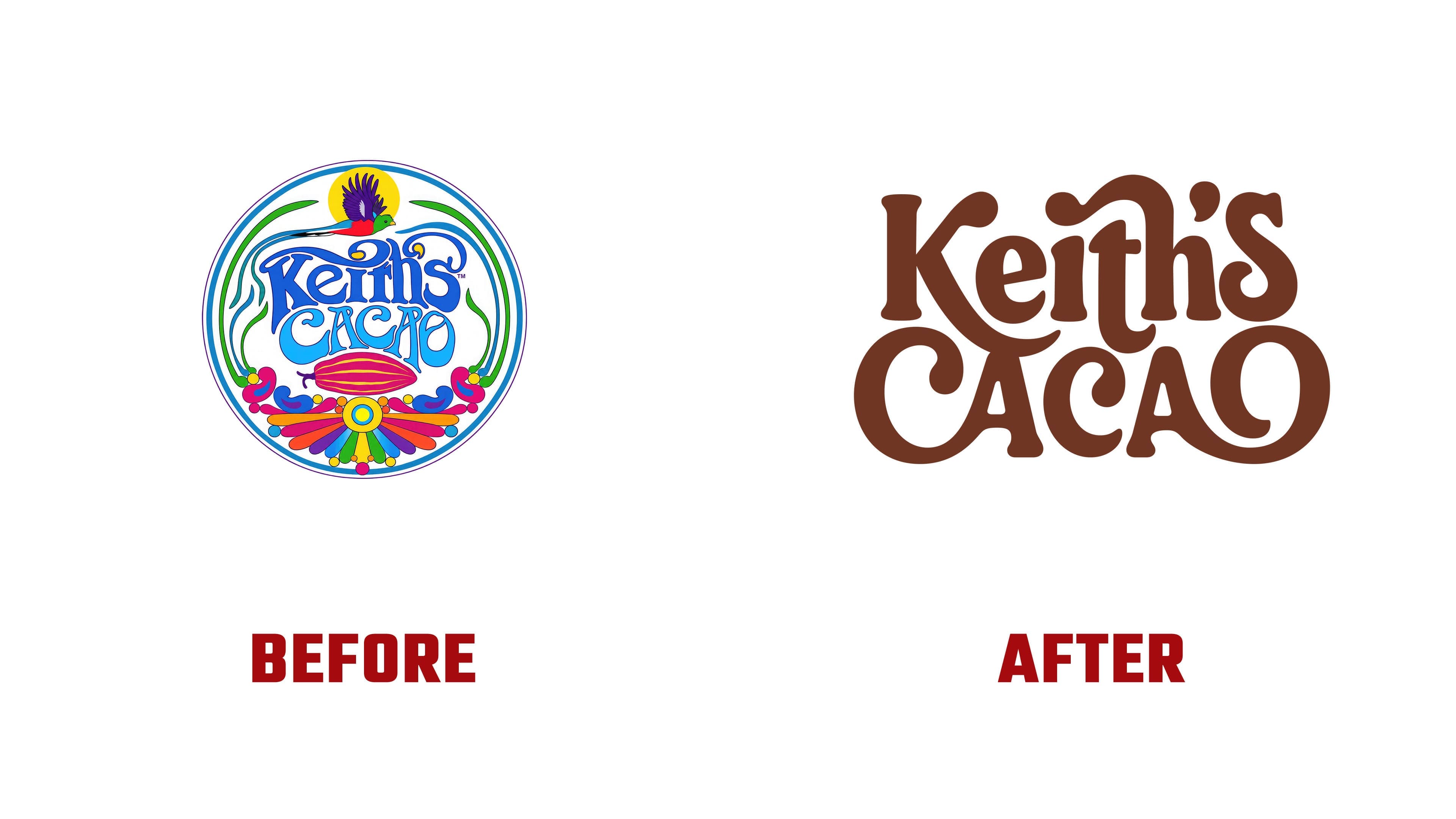
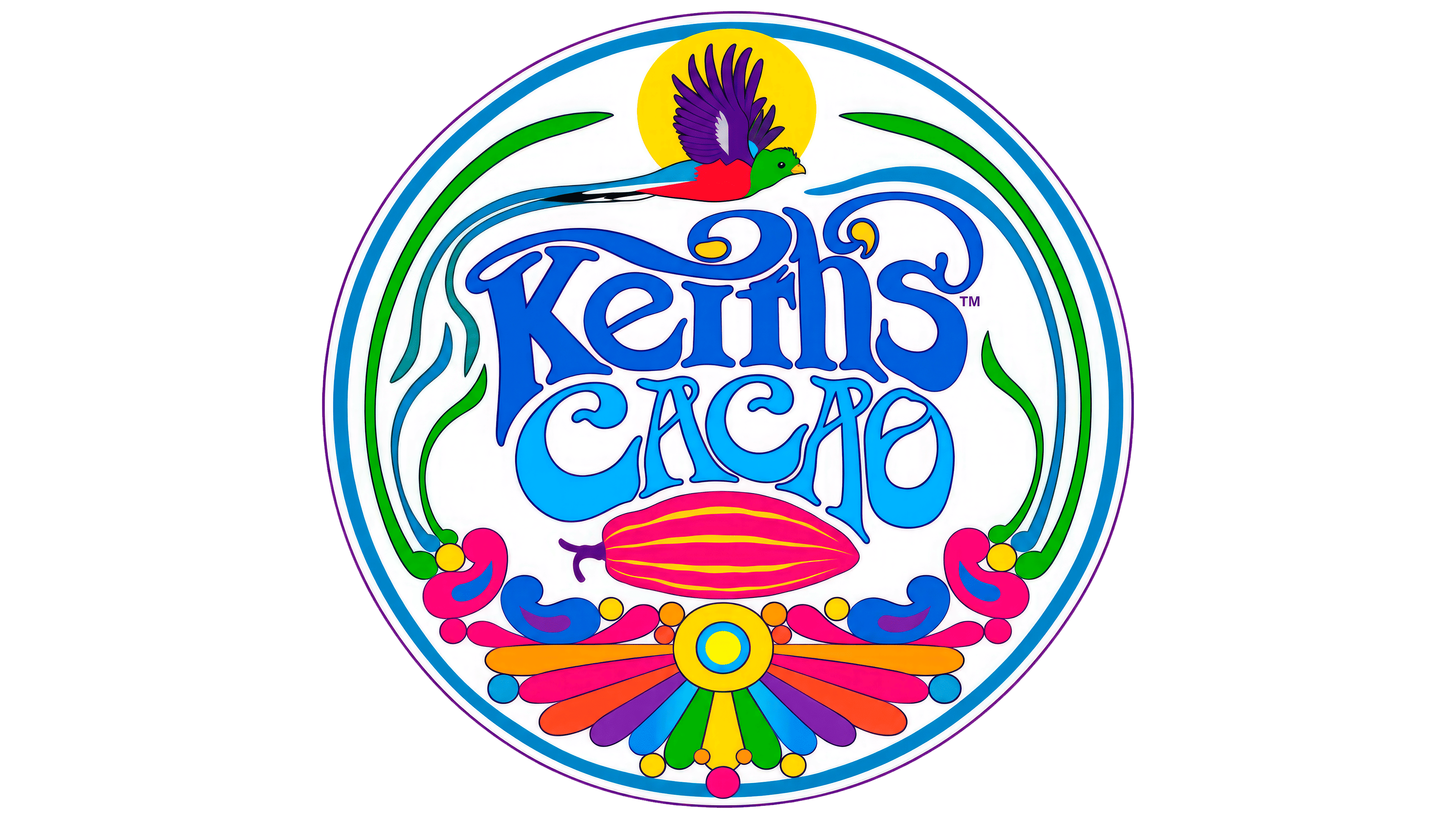
The previous logo combined thin purple outlines with light blue and lilac fills. Keith’s sat above CACAO, surrounded by long terminals and large flourishes. A multicolored, long-tailed bird flew above the name, with a pink cacao pod below. Colorful botanical ornamentation continued the decorative theme across other materials.
Fer Cozzi retained the two-line arrangement, refining letter density and connections. Solid fills replaced thin outlines, and the flourishes became heavy, rounded strokes. In the upper line, a capital “K” is followed by lowercase letters, while CACAO remains entirely uppercase below. The case difference separates the founder’s name from the product name.
In Keith’s, the long lower leg of the “K” curves beneath the “e.” The tall stroke of the “h” curls above neighboring letters, while a connection around the “i” and “h” forms a raised join. Below, rounded “C” and “O” letters sit beside heavy “A” letters, forming a compact block. The wordmark retains its Art Nouveau references. Its swirling forms suggest stirring cacao, connecting the lettering to drink preparation.
A small cacao pod accompanies the name. Wilson’s portrait has a separate role in the identity. The line drawing depicts his long hair, beard, and glasses. On the front of the package, it sits beneath the logo between short blocks of text. In advertising, the portrait also appears on its own, referencing the history of the Keith’s Cacao community.
The kraft paper remains, while a colorful, shaped label replaces the previous white sticker. Its wavy top edge, narrowed sides, and rounded bottom echo the wordmark’s curves. Brown text appears against yellow, orange, lilac, and green backgrounds, with the paper exposed around the edges. The colors, portrait, and new lettering extend to the website and advertising materials.