The Kenvue logo symbolizes health and well-being and is made accessible through the company’s products. The brand seamlessly integrates into the everyday lives of its customers, offering solutions that help with daily self-care. The emblem represents effective medications and beneficial supplements to restore and maintain excellent health. It is a sign that reflects the brand’s primary mission of caring for its customers and their well-being, accompanying people on their journey to a better quality of life.
Kenvue: Brand overview
The Kenvue story began in 2021 when Johnson & Johnson announced plans to split into two independent, publicly traded companies. This decision followed extensive research and planning, aiming to streamline operations and improve the performance of both business units.
The new company started with Johnson & Johnson establishing a separate division to manage its well-known consumer brands with a worldwide long-standing presence. In November 2021, Johnson & Johnson officially introduced the name of the new company overseeing the consumer division: Kenvue. This name was chosen to honor Johnson & Johnson’s legacy while reflecting a fresh start and a distinct identity for the new entity.
Throughout 2022, the newly formed entity focused on preparing for its separation. The company began building its organizational structure, which included hiring key executives and appointing a board of directors. This complex process required careful planning to ensure a smooth transition. At the same time, the company worked on establishing its own business strategy and company culture. Although it inherited powerful brands and industry expertise from Johnson & Johnson, this new business needed to develop its identity as an independent company.
A major milestone was the development of its brand portfolio, which included well-known names like Band-Aid, Listerine, Neutrogena, and Tylenol. These brands already had strong reputations and loyal customer bases, providing the new company with a solid foundation.
By late 2022, the company was preparing for its initial public offering (IPO). This involved crafting an investor relations strategy, conducting audits, and organizing financial documentation.
As 2023 began, the company actively pursued its IPO plans, presenting its growth strategy and financial performance to potential investors. The IPO was a significant moment in the company’s journey, marking its official status as an independent, publicly traded company.
On May 4, 2023, the company completed its New York Stock Exchange IPO. This event represented the official separation from Johnson & Johnson and the start of its path as a stand-alone enterprise.
The IPO was one of the largest in the U.S. in 2023. The company raised substantial capital, which it planned to use for business expansion, investments in innovation, and further global growth.
Following the IPO, the company began operating fully as an independent entity. This required setting up its departments for finance, human resources, IT, and other previously integrated functions within Johnson & Johnson.
The new company focused on executing its growth strategy in the months following the IPO. This included investing in its iconic brands, expanding into emerging markets, and developing innovative consumer health products.
By the end of 2023, the company had firmly established itself in the consumer health sector. It continued to build on its strong legacy while adapting to market changes and evolving customer preferences. Although the company’s history is relatively short compared to others, its successful separation from Johnson & Johnson is an example of effective strategic planning and change management in a global business setting.
Meaning and History
What is Kenvue?
This American company specializes in creating consumer health products. Millions of people depend on the company’s range of products daily. The brand offers essentials ranging from Listerine mouthwash to Neutrogena skincare products, Band-Aid bandages, and Tylenol pain relievers. The company focuses primarily on over-the-counter medications, personal care products, and consumer goods.
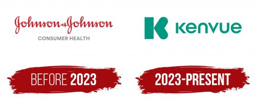
Before 2023
Before the division was spun off from the Johnson & Johnson structure, the brand’s logo was part of the parent company’s overall emblem. The cursive font used in the logo emphasized the uniqueness of the products and the brand’s special approach, focused on understanding human relationships and the needs of customers. This font choice created the impression that a real person was behind the brand, strengthening the connection between the company and its consumers. It is important to note that three brothers founded the brand, and the cursive font became a key element of their signature style, symbolizing their noble intentions and sense of responsibility toward their clients.
At the bottom of the logo, a strict, restrained inscription in gray letters indicated the company’s division—Consumer Health. This monochromatic inscription, done formally, underscored the careful and professional approach to product manufacturing, hinting at the high standards of quality and responsibility the company adhered to in its operations.
2023 – today
The Kenvue logo is minimalist and modern, accurately reflecting the mission of the company launched in 2023. The emblem is visually divided into a graphic symbol and a textual part with the company’s name. The name itself is a combination of two words: the Scottish “ken,” meaning “knowledge,” and “view,” which can be translated as “perspective.” Thus, the brand can be interpreted as an “informed perspective,” highlighting the company’s competence and commitment to understanding customer needs.
The graphic symbol, shaped like the letter “K,” looks stylish and modern. Notably, the side legs of the letter “K” are replaced with a heart, symbolizing the company’s care and genuine attitude towards its consumers. This choice emphasizes the brand’s core value—focusing on the health and well-being of people. The heart as a symbol enhances the impression of the company as one that cares for every user of its products.
The color green is traditionally associated with nature, health, and naturalness. In the brand context, this shade symbolizes the company’s commitment to using safe, high-quality ingredients to improve people’s health and well-being. The logo, executed in green, evokes a sense of reliability, growth, and prosperity, which aligns with the company’s philosophy.
The font is simple, without unnecessary decorative elements, which underscores the professionalism and clarity of the brand’s mission. It also helps make the emblem easily recognizable and memorable, which is important for a new company just beginning to build its audience.
The logo and name symbolize a new era in the brand’s development, emphasizing its innovative approach and care for people.
