The KG Mobility logo represents a brand that has written many chapters in the history of automotive engineering. The emblem highlights the company’s creative spirit and pursuit of dreams. It also showcases the uniqueness and original design of its vehicles.
KG Mobility: Brand overview
Founded in 1954 as Ha Dong-Hwan Motor Workshop, this South Korean company specializes in producing trucks and buses. In 1986, it was transformed into the SsangYong Group and renamed SsangYong Motor Company. In the 1990s, the company focused on producing Jeeps, SUVs, and sedans, among which models such as Musso and Korando stood out.
Things changed again in 1998 when Daewoo Motors became the major shareholder. However, this relationship was short-lived: after Daewoo’s financial collapse in 2004, SsangYong was taken over by Shanghai Automotive Industry Corporation (SAIC). By 2011, Indian auto giant Mahindra & Mahindra had taken over the company and had been in charge for over a decade.
The “roller coaster” did not end there. In 2022, SsangYong was again on the verge of financial collapse and eventually became part of the South Korean conglomerate KG Group, which specializes in steel production. In March 2023, the company was renamed KG Mobility to reflect this change and match its new focus.
Today, operating out of production facilities in Pyeongtaek, South Korea, KG Mobility continues to produce diverse vehicles, from SUVs and electric vehicles to commercial vehicles.
Meaning and History
1954 – 1963
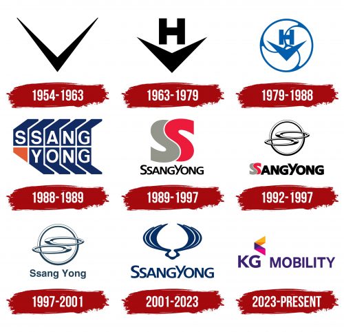
The KG Mobility emblem is directly linked to one of the brand’s future founders, Ha Dong-hwan Motor Workshop. At that time, the company specialized in vehicle repairs, and its logo, featuring a checkmark, symbolized a completed order. This simple and memorable symbol conveyed the company’s key values: quality and speed of service.
The emblem was chosen purposefully. The checkmark reflected the company’s commitment to high-level service as a sign of completion and reliability. Customers could trust that their vehicles would be repaired quickly and efficiently. This approach helped build the company’s reputation and establish trust among clients.
The KG Mobility logo symbolizes their dedication to quality and reliability, helping the company stand out in the market and gain recognition.
1963 – 1979
The merger with Dongbang Motor Co and the creation of Ha Dong-hwan Motor Co marked a significant milestone in the company’s history, representing substantial expansion and growth. This move showcased a focus on increasing its global market presence and influence. The black letter “H” above the checkmark indicated the company’s English name, highlighting its readiness for international expansion. This choice was deliberate and aimed at entering the American market. The company achieved this in 1964, establishing its presence in a new and promising market.
1979 – 1988
The brand changed its name to Dong-A Motor and updated its logo, keeping key elements that had become its hallmark. The letter “H” and the checkmark remained, maintaining its recognizability and traditions. A circle was added, symbolizing a wheel, reflecting movement and progress. Inside the circle, the figure was divided into three parts by internal blades, each representing one of the company’s main work areas: buses, trucks, and special equipment.
These three parts highlighted the product range’s variety and breadth, emphasizing each segment’s importance. The curves of the partitions formed a union of yin and yang, symbolizing harmony and balance, similar to the Korean flag. This approach conveyed the idea of balanced and successful growth, where each activity area thrives equally.
1988 – 1989
After the brand became part of the SsangYong Business Group and was renamed SsangYong Motor, the brand identity changed completely, reflecting a new era in the company’s history. The new logo symbolizes power and reliability. Its design resembles tire tracks from a large vehicle, indicating the start of SUV production and emphasizing stability and strength.
Each letter of the name is placed in a separate rectangle, casting shadows above and below. This design creates a sense of grandeur and stability, highlighting the importance of each model in the brand’s lineup. Each model represents a step toward success, embodying the company’s commitment to innovation and quality.
An orange figure at the bottom adds originality to the logo and conveys a sense of warmth, symbolizing the brand’s care for its customers. This element brings an emotional aspect to the identity, showing that SsangYong Motor values its clients and aims to create a positive brand experience.
1989 – 1997
A unique emblem features two interwoven “S” letters. The brand’s name translates to “two dragons,” symbolizing the merger in 1988. The letters appear as the bodies of two powerful mythical creatures entwined in creating new, perfect cars.
The red and gray colors symbolize speed, strength, and technical excellence. Red represents dynamism and power, while gray emphasizes the technological and reliable nature of the products. Together, these colors create an impression of swiftness and engineering skills, which are the brand’s foundation.
Below the symbol, the company’s full name is written in a simple black font, adding a sense of formality and professionalism. The combination of red and gray with the black font creates a pleasant contrast, enhancing the emblem’s visual appeal and making it memorable. The logo conveys a sense of elegant beauty and strength, reflecting the company’s core values and its pursuit of perfection in every detail.
1992 – 1997
The large metallic circle on the emblem points to the Daimler-Benz logo, marking the start of a productive partnership. This collaboration opened new opportunities for technological and production growth. Two ovals intersecting the circle hint at the two “S” letters, symbolizing the SsangYong name and emphasizing the brand’s dual nature.
The emblem was created for the launch of the Musso SUV, a significant milestone in expanding the company’s model lineup. The Musso SUV, developed with Daimler-Benz’s support, showcased SsangYong’s ability to produce modern, high-tech vehicles.
Through this partnership with a major and respected company, SsangYong significantly expanded its reach and introduced more advanced vehicles, meeting high standards of quality and reliability.
1997 – 2001
In 1997, the SsangYong emblem adopted a new, pleasant blue-green shade. This color choice highlighted the brand’s growth and development after a significant event in the company’s history — Daewoo Motors’ purchase of a stake in SsangYong. The new shade symbolized renewal and hope for the future and reflected the company’s fresh outlook on its development.
2001 – 2023
After parting ways with Daewoo Motors and gaining independence, SsangYong chose a new logo to symbolize a new era in its development. Wings were selected as the main element of the logo, representing a flying dragon and reflecting the brand’s strength and power. The wings curve to form an oval shape, demonstrating harmony and the pursuit of perfection.
2023 – today
In 2023, SsangYong rebranded to KG Mobility, leading to a new logo. The name “KG Mobility” is in bold, clean, purple font. All letters are capitalized, with the “K” and “G” slightly larger. A geometric pattern of five triangles in dark pink, purple, blue, orange, and yellow accompanies the text, forming a shape like an opening corner brace.
The various colors in the triangles represent the company’s versatility and adaptability. The opening corner brace shape symbolizes the company’s openness to new opportunities, aligning with its mission and new direction. The purple text conveys innovation and sophistication, highlighting the brand’s focus on the high-end market.
The bold, clean font choice emphasizes clarity and strength. The larger initials emphasize the brand’s new identity. The geometric pattern adds visual interest and reflects the brand’s dynamic, forward-thinking approach.
Each triangle color has its significance: dark pink for creativity, purple for innovation, blue for trust, orange for energy, and yellow for optimism. These colors create a vibrant, diverse palette that captures KG Mobility’s brand values.
The logo’s design communicates the company’s new vision by combining bold typography with a colorful geometric pattern. The purple text and multicolored triangles create a modern, sophisticated image.
