


![]() Kika (TV) Logo PNG
Kika (TV) Logo PNG
The children’s TV channel is characterized by bright, expressive identity elements that may appeal to the target audience. Therefore, the Kika (TV) logo expresses joy, optimism, and inexhaustible energy, which children usually like. This is a symbol of a good mood.
KiKA emerged from a debate on German television in the early 1990s. Commercial channels such as RTL and Sat.1 were moving children’s programming into weaker time slots. At the same time, Nickelodeon expanded in Europe, and Super RTL launched in 1993 as a joint venture between RTL and Disney. Public broadcasters ARD and ZDF responded by creating a joint children’s channel funded without advertising.
In 1995, ARD and ZDF agreed on the project, with nine ARD regional broadcasters and ZDF involved. The headquarters were placed in Erfurt, and MDR handled technical broadcasting. On January 1, 1997, Der Kinderkanal von ARD und ZDF went on air at 6 a.m. Its model differed from Super RTL and Nickelodeon: no ads, no commercial pressure, and programming aimed at children and parents.
The early schedule used many existing ARD and ZDF programs, including Tabaluga tivi, archive cartoons, Augsburger Puppenkiste, Unser Sandmännchen, and foreign animated series. On May 1, 2000, the channel was renamed KI.KA, with a new identity by Dutch agency N+T Vision.
In 2000, KiKA introduced Bernd das Brot, a gloomy bread puppet first used during off-air night loops after 9 p.m. The character unexpectedly became popular among adults and later became the channel’s mascot. On October 1, 2005, the name changed to KiKA, with a refreshed style by Ingo Steinacker. In 2009, the preschool mascot Kikaninchen appeared, while original shows such as “KI.KA LIVE” helped the channel build its own production base.
Meaning and History
![]()
Today, Kika is one of Germany’s leading children’s TV channels. Initially, the broadcasts were conducted in the usual mode, and only over time did the channel upgrade the quality to HD. The innovation allowed watching programs in high definition with good detail. Such improvements have made Kika quite popular and also significantly increased its rating.
The channel has changed its visual identity several times throughout its existence. This is due not only to gradual development but also to changes in brand design. Kika’s management periodically updated the logo to reflect current design trends, so each icon was beautiful and recognizable. This also applies to the modern emblem, which demonstrates cheerfulness and a positive attitude.
What is Kika (TV)?
Kika is an exciting children’s channel broadcasting programs throughout Germany. The organization ARD and the federal government agency ZDF took part in the formation. The channel operates around the clock, but the programs are broadcast from 6.00 to 21.00. TV games, cartoons, TV series, feature films, fairy tales, TV magazines, and other programs are aired.
1996 – 1999
![]()
In 1996, the channel adopted its first logo, combining wordmarks and graphic elements. In the center was a large, powerful letter H. Above it was a symbol resembling a ladder’s steps. Under the letter was the inscription Club House. All this emphasized the homely, cozy atmosphere, which helped to create exciting programs for the Kika TV channel.
The stylized staircase directly symbolizes the house, warmth, and relaxation. The massive letter H is a stylish graphic addition that evokes positive emotions and joy. In addition, the sign’s massive, thick lines make the logo look more confident, reinforcing the TV channel’s position.
He is among the best in Germany, so he steadfastly holds his position against competitors. Another important element is the inscription. It is designed in small letters in a funny format. This typeface is distinguished by rather smooth, rounded lines and the absence of serifs. The chosen style makes the design more modern and stylish.
1997 – 2000
![]()
The official launch of the TV channel Kika (then Der Kinderkanal) took place in 1997. At this point, management decided to change the logo. The old version did not fit the channel’s new concept. The result was a logo that was radically different from its predecessor. The new version featured bright graphic elements and a figure bearing the channel’s name.
In the background, two interconnected X letters are placed. It looks like two figures are holding hands. In the middle is an elongated thin oval, inside of which there is an inscription. The updated design best reflects the channel’s philosophy and values.
Two figures symbolized friendliness and positivity, while the inscription served an informational function. An additional element of the visual identity was bright, expressive colors. The logo’s colors are blue (trust), white (purity), yellow (fun), and red (energy). Together, they reflected Kika’s main characteristics.
2000 – 2012
![]()
In 2000, the management decided to rebrand again. The old logo was replaced with a more perfect and stylish version. The main feature of the new version was the preservation of the colors and the sign in the form of the letter X. In addition, the channel name became more vivid and expressive. The Kika lettering became the centerpiece. Letters were presented in large, sans-serif type.
Among the inscription’s characteristics, one can single out massive straight lines that demonstrate adherence to principles and steadfastness. However, the strict lines were softened by an unusual slope in the letter I. It was out of the general concept and made the emblem quite funny. Near it was a blue circle with an X inside. The badge favorably emphasized the contrasting colors and complemented them.
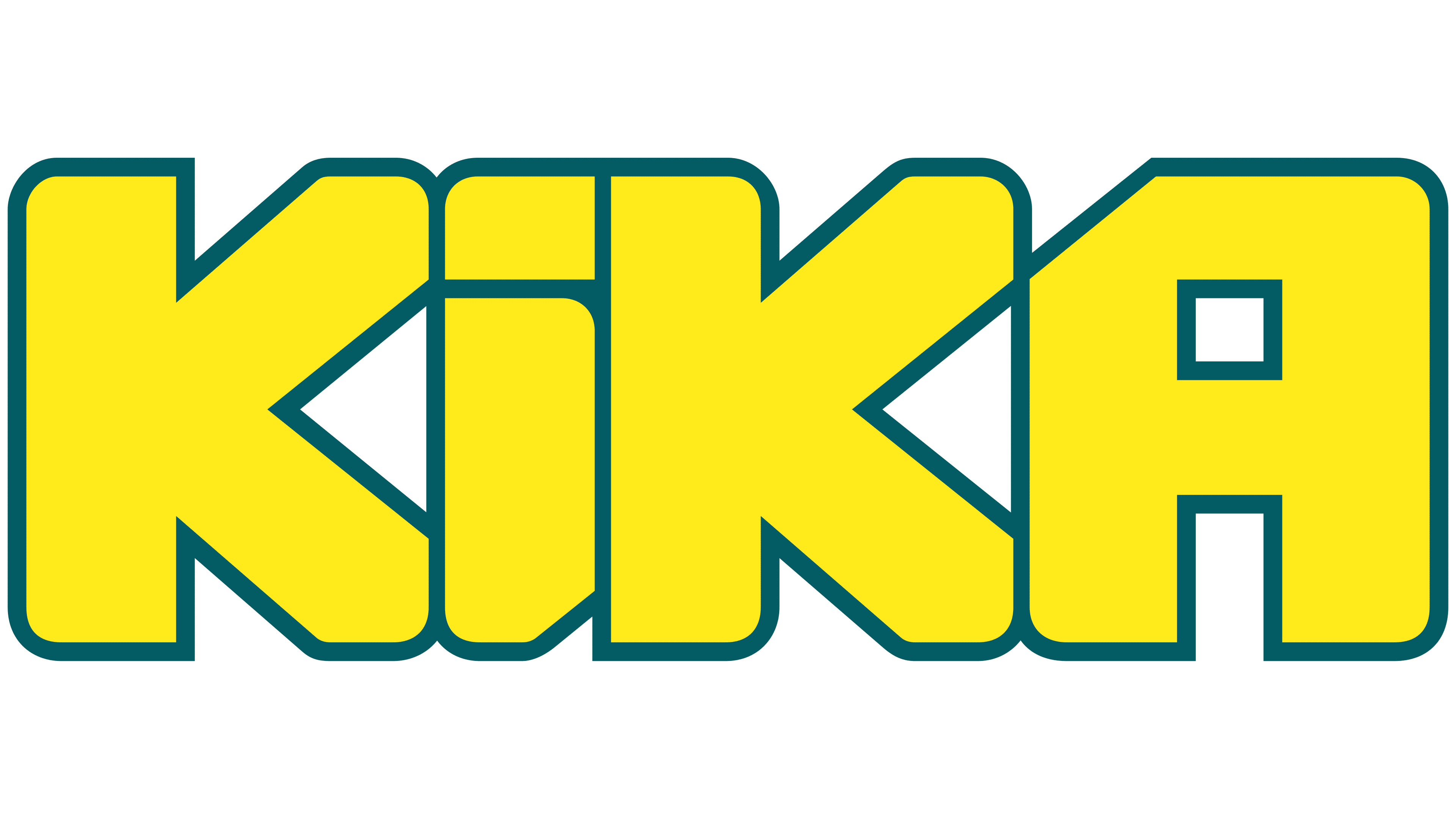
2012 – today
![]()
In 2012, Kika received a new logo, which is still used today. It was a demonstrative departure from the old visual concept and a new level in the channel’s development. One clear reason for that year’s logo change was the broadcast’s move to the more advanced HD mode. In this regard, the designers developed a beautiful and powerful emblem that showed incredible achievements and prosperity.
It was still based on the inscription indicating the channel’s name, but in a different format and with an addition. Below it was the phrase “von ARD und ZDF,” denoting the broadcast organizers. The Kika letters have been changed to a more massive and expressive format and complemented by a neat, thin outline. Unlike the previous version, they were all located exactly, which symbolized stability in everything.
In this case, playfulness was achieved through unusual cuts that gave the letters bizarre shapes. The lower inscription is set in a stricter, thinner font. Straight lines, clear cuts, and no serifs distinguished it. Both typefaces fall into the category of new modern variations that symbolize style, renewal, and progressiveness.
Font and Colors
The Kika logo impresses with its large shapes and bright colors. This is a classic example of the expressive style that famous TV channels use for decoration. The letters of the name and the contrasting lower phrase stand out, and the background and colors are in absolute harmony. The main component is the name of the children’s TV channel. It is set in a massive, soft font, with original, smooth cuts of different shapes.
This feature makes the letters especially attractive and memorable. In addition, this form demonstrates goodwill, coziness, and comfort. The lower inscription is in smaller letters. For this, a simple, concise font was used, which is highly readable. Straight lines with regular cuts are visible here. Another feature of the visual identity is a well-chosen color scheme.
The name is painted in two colors at once. A bright yellow tint is used as the main color, filling the entire space of the letters, and thin contours are painted in a muted blue. The lower inscription is decorated in the same shade. Yellow is a positive symbol; muted blue is associated with trust, professionalism, and calmness.