
KISS is bringing the energy of clubs, messages, and late-night radio back into its identity. The brand began in 1985 as the pirate station Kiss FM in South London. It later grew into a major British music platform. The history of KISS includes soul, hip-hop, house, the dance scene, youth culture, broadcast radio, digital channels, live events, and the stations KISStory, KISS Dance, and KISS XTRA.
The redesign by NOT Wieden+Kennedy came after twenty years of the previous look. The old mark, with a rounded sans serif and an abstract “K,” kept the brand familiar for a long time, but increasingly recalled the aesthetics of the 2000s. For a station built around youth music and fast digital formats, the previous image no longer conveyed the club tempo or the audience’s way of communicating.
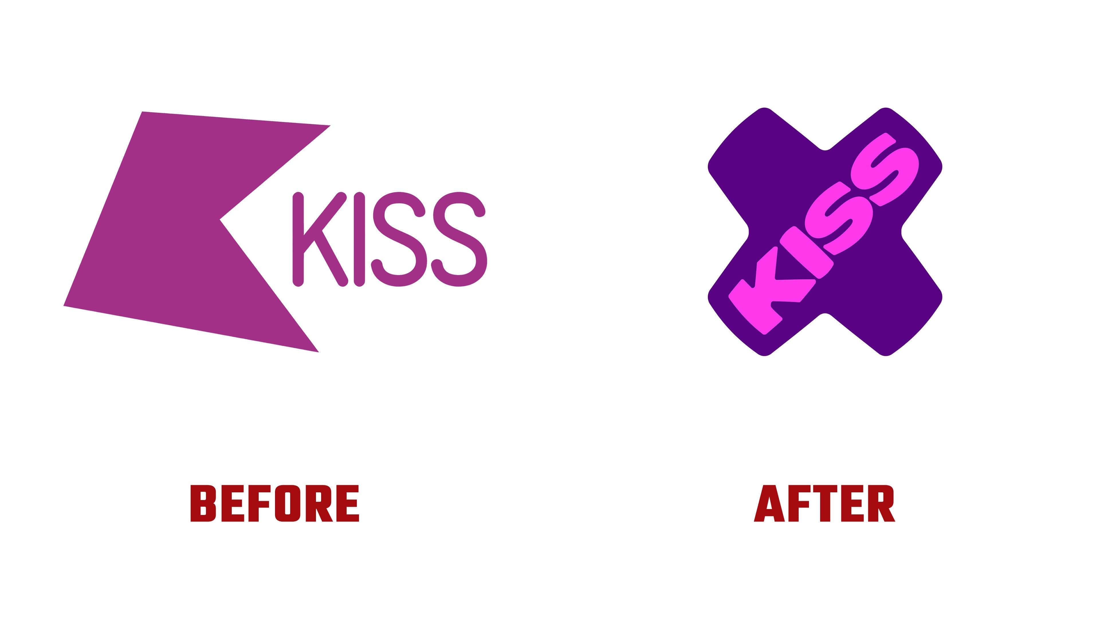
The new logo is built around the shape of an “x,” the sign of a kiss in messages. For KISS, this symbol is connected with the name, digital speech, flirting, a short gesture, and emotion. Instead of a separate icon and a separate word, the brand received one unified symbol. The name KISS is placed inside an inflated “x” shape.
The form resembles a sticker, a club tag, or a sign on a phone screen. It has softness, density, and a slight edge.
The typography has become heavy and rounded. The letters sit tightly inside the “x” and support the feeling of loud, physical sound. In animation, the mark compresses, inflates, and reacts to the beat. The kiss becomes a musical gesture. KISS connects the logo to the feeling of a track, a party, and audience contact.
The bright pink color brings energy back to the brand. The system extends to KISStory, KISStory R&B, KISS Dance, KISS XTRA, and other areas. The subbrands have their own color sets and icons, while the “x” remains the shared foundation.
The new KISS identity moves away from a static radio mark toward a more flexible image for a music brand. The logo combines the name, a kiss, digital slang, and club culture into a single image. For a station with London underground roots, the mark helps it sound closer again to a generation for whom music lives in messages, short visual signals, and the nighttime scene.