The KitKat logo symbolizes simplicity and enjoyment. The bold background and large letters create a sense of energy and dynamism, while the rounded shapes evoke a feeling of lightness. This emblem encourages consumers to associate the product with taking a break and enjoying a brief moment of relaxation. The color scheme is appetizing and emotionally connects consumers to the brand.
Kit Kat: Brand overview
The H.B. Reese Candy Company, then a division of Hershey, was granted a license by Rowntree’s to produce and distribute Kit Kat in the United States, marking the beginning of the product’s history in this country. Rowntree’s made this decision to enter the large American confectionery industry.
In 1970, Hershey began manufacturing the popular wafer bar for the American market. The company used its chocolate to adjust the recipe to American tastes, resulting in a flavor slightly different from the original British version.
In 1988, an important event impacted the future of this product in the United States. Nestlé, a Swiss company, acquired Rowntree’s and took over the brand globally, except in the US. Under the terms of the previous licensing agreement, Hershey retained the rights to produce and market the wafer bar in the United States.
The product received extensive promotion in the US during the 1990s. Hershey invested heavily in advertising, using the slogan, “Give me a break, give me a Kit Kat!” This campaign significantly improved the brand’s popularity with American consumers.
In the 2000s, Hershey began experimenting with new flavors for the American market. 2003, they introduced a white chocolate version, which quickly gained popularity. Other flavors followed, including dark chocolate and mint.
In 2007, Kit Kat Senses, a premium version of the classic bar, was introduced in the United States. It featured a more complex flavor profile and targeted gourmet candy enthusiasts and adults.
Hershey developed smaller versions of the iconic bars, known as Minis, in 2013. These became popular with consumers seeking easy-to-eat snack options.
In 2014, the brand made headlines in the US. Hershey opened the first chocolatery in New York City, offering customized products and special flavors and helping the company engage more with its customers.
In response to consumer demand for larger portions, Hershey introduced Big Kat, a larger version of the classic bar, to the American market in 2017.
In 2019, Hershey announced that Kit Kat would now be made with 100% natural vanilla, becoming the company’s second product after Hershey’s Kisses to adopt this change. This decision followed the growing demand for candy made with more natural ingredients.
In 2020 and 2021, Hershey continued experimenting with new flavors, launching varieties like Thins, a slimmer version of the original, and Duos Mint + Dark Chocolate.
As of 2023, the wafer bar remains one of the most popular chocolate treats in the US. Hershey continues to invest in the brand, introducing new flavors and formats to match the evolving tastes of American consumers.
Under Hershey’s management, the product has evolved from a simple chocolate bar into a diverse product line that caters to a wide range of American consumers’ interests and preferences.
Meaning and History
What is Kit Kat?
This chocolate-covered wafer bar has become an integral part of American snack culture. Produced by the Hershey Company under license from Nestlé, it offers a unique flavor profile that sets it apart from similar products worldwide. The bar, consisting of four connected wafer sticks, invites consumers to “break off a piece” and share. The brand is known for its classic milk chocolate and its variety of bold, limited-edition flavors — from seasonal offerings to unexpected combinations that capture the attention of American consumers.
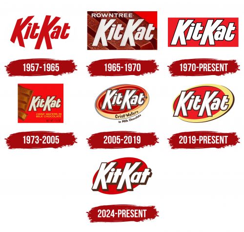
1957 – 1965
1965 – 1970
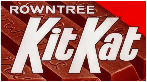
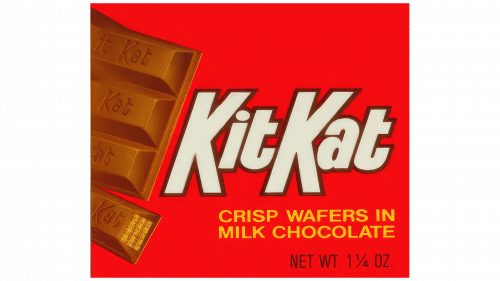
This is a version of the logo from when the brand still belonged to Rowntree. Even then, the brand was associated with a short break; a rest people could afford in their busy schedules. The emblem seems to emphasize this idea—a simple yet convincing design.
The first thing to note is the company name “Rowntree” positioned at the top of the logo. This was a symbol of the time when the British chocolate giant was still actively promoting its brands. The name was important because consumers associated the quality of the chocolate directly with this company. Over time, the brand became strong enough that “Rowntree” receded into the background, but it still plays a role in this logo.
The font is bold and angular, yet it looks very confident. The letters are large, clear, and white, contrasting with the chocolate background, creating a sense of depth. Looking at the font, you notice slight imperfections and a gentle tilt, adding dynamism. This was the style of the time—presenting the product as something solid, stable, and yet “alive,” helping it stand out among competitors on store shelves.
The visual mark’s background is shaped like chocolate bars, which are both a design element and a clever marketing tool. The chocolate was textured with visible letters on the bars, emphasizing the product’s signature quality. This technique was important in the 1960s when consumers increasingly paid attention to brand recognition and quality guarantees.
The background is red. Red has always been associated with energy, passion, and cravings. In the context of KitKat, this craving symbolizes a break, a rest that is necessary during the workday. Against the grayness of everyday life, these bright elements made the product noticeable and desirable.
1970 – today
1973 – 2005
2005 – 2019
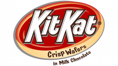
This logo belongs to a time when brands aimed for a brighter, more dynamic look to maintain consumer interest.
The most prominent feature is the KitKat name, written in bold white letters with a subtle three-dimensional shadow. The letters appear as if they were carved out of chocolate, clearly associating the logo with the company’s main product. It gives the buyer a clear understanding that they are looking at a chocolate bar. The font remains true to the classic style, with rounded shapes and clean lines, but it feels like a modern touch has been added.
The oval surrounding the name is a bright red background, which creates contrast and helps the emblem look more dynamic. The shape of the oval emphasizes motion and energy as if the logo is rotating or moving forward, which was characteristic of design during that time. In the mid-2000s, many brands incorporated dynamic elements in their logos to appear more “alive” and progressive.
The outline of the oval, transitioning from yellow to beige, adds a sense of volume and depth. It’s a decorative element, hinting at the chocolate packaging, creating the effect of a curved edge, as if the visual mark is part of the wrapper itself. Visually, this makes the image even more “appetizing,” reminding consumers of the milk chocolate inside the package.
The phrase “Crisp Wafers in Milk Chocolate” beneath the name is a marketing tactic that clearly states what’s being sold. It highlights the key feature of the product—crisp wafers coated in milk chocolate. In the 2000s, consumers were increasingly focused on product descriptions, and such elements played a role in building trust with the brand. It was important to showcase the logo while reminding customers of the quality and characteristics of the product itself.
Design elements such as three-dimensional letters, smooth gradients, and a dynamic oval reflect an era when brands sought to become more vibrant and noticeable on store shelves.
2019 – today
2024 – today
The KitKat logo is a fitting choice for a company that has been associated with lightness, a pleasant break, and a good mood for decades.
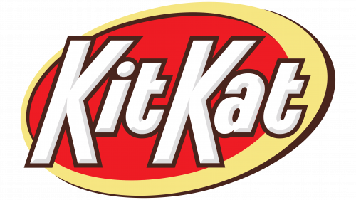
The first thing that stands out is the font. It looks bold, confident, and friendly at the same time. Unlike previous versions, where the letters were slightly whimsical, the font has become more straightforward and clean. The letter “a” is now single-story; the “t” has lost its usual flourish at the bottom. These changes give the logo a more modern look, yet they still evoke a sense of old-school charm, as if the emblem dates back to the 1980s or earlier. This approach makes the brand appeal to younger audiences and those who remember it from past decades.
The letters are now closer, as if they have come together as a strong, united team. Previously, there was more space between the letters, giving them a somewhat scattered appearance. The logo looks much more cohesive as if each part complements the other.
The visual mark’s background is an ellipse tilted at an angle. It is done in rich red, connecting this logo to previous versions and enhancing the brand’s recognizability. There used to be a swoosh element that added dynamism, but now it has been replaced by a simple oval. This change has made the image more stable and serious.
The colors have remained true to the classic look. Red has always been KitKat’s signature color, symbolizing passion, energy, and emotion. The white color used for the letters adds lightness and purity. The brown shadow surrounding the letters gives them depth and a retro feel, harking back to older logos when three-dimensional elements were popular.
Interestingly, these changes occurred while the brand was working to maintain its market position. KitKat has always symbolized simple, everyday pleasure, something easy and accessible. In a time when many companies strive to be ultra-modern and experiment with design, KitKat takes a more restrained approach with retro touches. This shows that the brand values its history and traditions while still being unafraid to refresh its look to stay relevant.
The new KitKat logo doesn’t feel like a drastic departure from the past. It’s more of an evolution, highlighting stability, history, and comfort.
