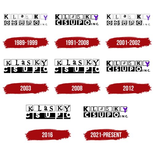
The Klasky Csupo logo is done in a handmade style. The emblem reflects the creative nature of the studio owners and the creative ideas that fill their cartoons. The sign catches the eye and makes you look closely at each series.
Klasky Csupo: Brand overview
| Founded: | 1982 |
| Founder: | Arlene Klasky, Gábor Csupó |
| Headquarters: | Los Angeles, California, U.S |
| Website: | klaskycsupo.com |
Meaning and History
The studio was founded in 1982, but it only got its first logo seven years later. Initially, the enterprise was based in the kitchen of a married couple. Their first activities did not involve cartoons. The newlyweds were involved in advertising, creating designs for names and signs. It was not until 1987 that they were asked to animate their first cartoons about the Simpsons, each one-minute long.
The immense popularity of the series led to the studio’s renown and the need for its own identity. The logo turned out to be original. It is based on the creative peculiarities and roles of Klasky and Csupo in their pair and working tandem. That’s why the founders did not aspire to radical changes in the emblem in the future. All rebrandings are merely minor variations of the first sign.
What is Klasky Csupo?
It’s an animation studio that gave audiences the first three seasons of The Simpsons, the Rugrats, and All Grown Up! series, about 300 commercials, five feature films, two web series, and dozens of smaller projects. It was created by the animator couple Klasky-Csupo, who divorced in 1995, but continued their creative collaboration. The headquarters are located in Los Angeles.
1989 – 1999
The couple chose their last names for the project’s name. The studio’s logo consists of squares arranged in two levels: white for the woman’s surname – on top and black for the man’s surname – below. Inside each element is one letter.
Together, the dark and light levels embody the union of two opposites, harmony. The shape of the squares at the top and bottom demonstrates commonality, indicating a married couple.
The letters of the male name are confident and strong. The symbols are all of the same size and occupy the entire height of the squares. The placement in the lower part and uniformity of the inscription indicates the stability of Gábor Csupó. In the pair and joint team, he plays the role of an anchor, a reliable foundation. In the first setups, the designer was named the main director and executive producer.
The white color of the letters in the name Csupó speaks of interesting ideas, the ability to highlight the main thing and the personal kindness of the screenwriter.
On the contrary, the Klasky inscription differs in special creativity. Each symbol is placed in different places of the squares and made in a particular manner – bold, thin, hatched, prickly, etc. It’s as if each letter represents a character trait of Arlene Phyllis, her versatility or change of mood. This method indicates the developed imagination of the animator and the role of the ideologist. It was Klasky who provided ideas for Rugrats episodes based on observations of her own sons.
In the entire composition, there is only one colored sign – the letter Y at the end of Klasky. It is the woman in this family and studio who creates the atmosphere, sets the tone, and makes life festive and animation unforgettable.
Interestingly, there is another studio in the American media space, the logo of which is very close to the construction of the Klasky Csupo emblem. It’s Cartoon Network: the same two levels, black and white squares with letters in each. The difference in creating emblems is only three years. Therefore, even though different people worked on the signs, there is a sense of plagiarism on the part of CN.
1991 – 2008
In 1991, Klasky Csupo started working with Nickelodeon on the Rugrats show. They updated the logo for this new project. The elements of the sign became thicker and more confident. The letters are clearer. The toning of the squares became more even. In general, the inscription is easier to read and looks more professional. By this time, the studio was already famous, based in Hollywood, and had received a Primetime Emmy Award for The Simpsons. The emblem reflects these changes. The logo was used for all seasons of Rugrats until the contract was terminated.
2001 – 2002
In 2001, shooting began for a new series, All Grown Up!, as a continuation of Rugrats. For the tenth anniversary of the infant show, Klasky Csupo presented an episode in which the babies turned ten years old. The premiere was so popular that Nickelodeon decided to develop the idea.
During the work on the new series, the studio turned to its first logo. This move showed a return to roots, finding inspiration in the past, and the start of a new global project.
2003
In 2003, Klasky Csupo and Nickelodeon had disagreements. The production of Rugrats was stopped, and other shows were put on hold. Even though the broadcast of All Grown Up! started, Klasky Csupo switched to collaborating with Cartoon Network and other studios.
The emblem of the period got even more creative. Elements seemed to double, and behind them, pieces of twins could be seen. A rectangle was separated from the inscription by straight lines. The figure split the top A in half and cut off “upo” from Csupo.
Fragmentation and doubling demonstrate:
- saying goodbye to usual work,
- the team’s cooperation with new clients,
- the simultaneous creation of music, clips, and movies.
The sign seems to bear some pain, a hint of a broken heart, losing ground underfoot. Nickelodeon’s producers hinted that they were tired of the team’s monotonous style. Moreover, new projects turned out to be short-term, and the big movie The Way the Dead Love, which the studio decided to participate in 2003, was not completed.
2008
In 2008, the permanent contract with Nickelodeon was finally broken, and the studio closed for four years. The logo from 2003 was used for the already-released programs.
2012
In 2012, the owners got their second wind, and work resumed. The idea of computer animation for Rugrats and other projects appeared. For the “second take,” they used the most successful logo – from 1991, to bring good luck.
2016
In 2016, the premiere of the digital webcomic RoboSplaat! took place, which became an entirely new genre for the studio. For the new animation, they chose the 2003 logo, which was designed for projects outside of Nickelodeon.
2021 – today
In 2021, the presentation of the updated Rugrats finally took place, with their classic constant 1991 logo and a colorful Y. This work marked the beginning of a new life for the famous duo.
Font and Colors
All company logos are built on the contrast of black and white. The colors represent masculinity and femininity, yin and yang, creativity, and order. The only colored accent of the logo is purple. The shade speaks of creativity.
The font of the inscription is unique. Each element is a work of art. It demonstrates the variety of styles in which the team works.
Klasky Csupo color codes
| Black | Hex color: | #000000 |
|---|---|---|
| RGB: | 0 0 0 | |
| CMYK: | 0 0 0 100 | |
| Pantone: | PMS Process Black C |
| Grape | Hex color: | #6100c4 |
|---|---|---|
| RGB: | 97 0 196 | |
| CMYK: | 51 100 0 23 | |
| Pantone: | PMS Violet C |


