The KLM logo is one of the most recognizable airlines in the world. It consists of several elements, each with a symbolic meaning. KLM’s values include the responsibility to customers, employees, and society, innovation and improved service, long-term sustainability, and profitability.
KLM: Brand overview
KLM is a large Dutch company founded in 1919. It owns 110 aircraft serving 145 routes in 78 countries. Its net profit exceeds 450 million euros. 2004, it merged with the French carrier to form Air France–KLM. It is part of the SkyTeam alliance.
KLM (Koninklijke Luchtvaart Maatschappij) is the oldest airline in the world, and it still operates under its original name.
Founded in The Hague on October 7, 1919, by a group of Dutch investors, the company began its storied journey in aviation.
On May 17, 1920, the brand launched its first commercial flight, connecting London to Amsterdam using a leased De Havilland DH.16 aircraft.
On October 1, 1924, the airline flew from Amsterdam to Jakarta (then Batavia), Indonesia, marking its first intercontinental journey.
In 1935, the air operator initiated regular transatlantic services to Curaçao, utilizing the Fokker F.XVIII aircraft.
From 1940 to 1945, during World War II, the aviation firm maintained limited operations out of London and the Caribbean.
After the war, the company was the first European airline to resume regular flights to New York in 1946.
In 1960, the airliner entered the jet age by acquiring its first Douglas DC-8, drastically reducing travel time on long-haul routes.
The introduction of the Boeing 747 into the fleet in 1971 marked a significant advancement in capacity and service.
In 1989, the aviation firm purchased a 20% stake in the American airline Northwest Airlines, initiating a close collaboration between the carriers.
In 1991, the airline and Northwest Airlines pioneered the first major international airline alliance, setting a precedent for future partnerships.
A major milestone was reached in 2004 when the brand merged with Air France, forming the Air France-KLM Group, though it retained its brand and operational independence.
In 2007, the aviation company became a SkyTeam global airline alliance member.
Celebrating its 90th anniversary in 2009, the brand reaffirmed its legacy as the oldest continuously operating airline in the world.
The company made history again in 2011 by conducting the world’s first commercial biofuel-powered commercial flight.
The aviation firm continued its fleet modernization and introduced the Boeing 787 Dreamliner in 2015.
The brand celebrated its centennial anniversary 2019, becoming the first airline to reach this 100-year milestone.
Meaning and History
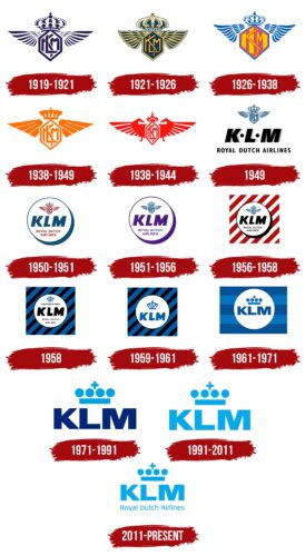
KLM is a company with vast experience. Throughout its centennial history, its visual symbols have been updated numerous times. However, the main symbols of the logo remain remarkably constant. The carrier has never changed its name, so all its emblems include the abbreviation KLM. As with Royal Airlines, the company is patronized by the crown. Therefore, the presence of the monarchy’s symbol in the emblems is unchanging. Wings are significant in most logos, symbolizing flight – the company’s primary function.
What is KLM?
This is the national carrier of the Netherlands and the oldest continuously operating airline in the world, based in Amsterdam. The company offers an extensive global route network, covering numerous destinations in Europe, Asia, Africa, and North and South America. It focuses on long-haul flights from its hub at Schiphol Airport. The airline operates a modern and diverse fleet consisting of wide-body and narrow-body aircraft, including Boeing 777, Boeing 787 Dreamliner, Airbus A330, and Boeing 737, ensuring high levels of comfort and efficiency for its passengers.
1919 – 1921
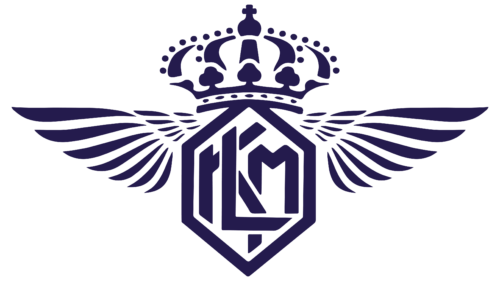
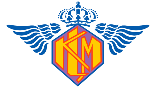
The company’s first logo was filled with beauty and grace: a hexagon with the KLM monogram letters interlaced within. Above the figure is an image of a crown. On either side, two spread wings are made up of separate feathers arranged in three rows.
The letters of the inscription are decoded as Koninklijke Luchtvaart Maatschappij, meaning Royal Aviation Company. The carrier was founded under the patronage of Queen Wilhelmina, who supported the idea of Dutch business people and bestowed the future enterprise with the title of Royal a month before the company’s registration.
Thanks to the queQueen’snevolence, the crown of the Queen of the Netherlands topped the company’s emblem.
The wings in the symbol represent the aspiration to fly. Even though KLM started with rented planes and initially flew on demand, it gradually managed to stand on its feet and “soar into the sky.”
1921 – 1926
The first regular flights took off in 1921. They marked the beginning as a real carrier by updating the logo.
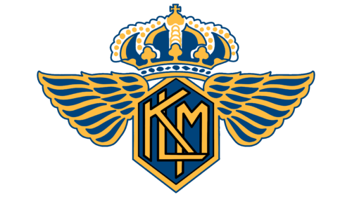
Yellow elements were added to the original image, detailing the crown and golden decorations. They also added gold to the feathers and the hexagon. This moved the emblem’s color scheme closer to the royal coat of arms of the Netherlands in blue and gold tones.
The combination of gold and noble blue indicated the company’s special position. It foretold its prosperity and enrichment. The yellow hinted at the sun, in whose rays the airplanes would now fly.
1926 – 1938
By 1926, the company had mastered intercontinental flights. Planes flew to the Netherlands’ colony in Indonesia, which was the longest distance for regular transportation, a fact KLM took great pride in.
This achievement was reflected in the company’s emblem, which added bright colors corresponding to the warm climate of the Dutch East Indies. The monogram letters received a bright red outline. The background of the hexagon turned purple. The blue hues of the crown and wings symbolized the ocean over which the Fokker gliders had to fly.
1938 – 1949
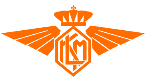
From 1938, KLM updated its fleet to Douglas DC-3 and was the first to launch commercial flights to the new Manchester – Ringway airport.
The carrier’s leadership positions transformed the logo into the orange colors of Manchester’s red-orange flag. For the first time, the wings in the emblem’s design became schematic and resembled gold plates. The symbol appears surrounded by rays of sunlight, basking in them.
1938 – 1944
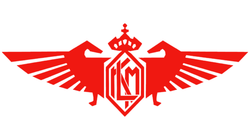
With the onset of the war, the company’s airplanes were painted orange to distinguish between military and commercial aviation. The wartime emblem was blood-red. The wings in the design transformed and resembled:
- The hands of a strong man. The gesture demonstrated the company’s strength and readiness to face difficulties. Flights over Europe were restricted, and detour maneuvers were necessary.
- Two Pegasus horses. They peeked out from behind a hexagon, spreading their wings and turning their muzzles toward each other. The horses symbolized rapid delivery and bravery.
The hexagon stretched upwards as if wanting to become less noticeable so that airplanes could easily and quickly enter the necessary airports.
1949
After the end of the war, KLM had to deal with the restoration of its network, as most planes were scattered around the world or destroyed along with their crews. The process was completed by 1948. Additionally, the company began to serve Africa and the Caribbean and established flights to both Americas.
Having survived a second rebirth, KLM completely revised its visual identity, leaving royal regalia and wings only as a small symbol at the top of the logo to show that society’s previous lifestyle is receding into the past. In 1948, the last colony of the Netherlands, Indonesia, gained independence, and the country lost its former greatness. The working class was more popular than the aristocracy.
The main part of the image was occupied by three large, massive black letters KLM. Below is an addition: Royal Dutch Airlines. The inscription underlined that the airline remains a leader in the country.
1950 – 1951
In 1950, KLM chose a round medallion for its representation. Широкая голубая тень показывала, что эмблема поднимается над поверхностью и словно парит в воздухе. Inside the circle, all the designations of the previous logo were retained.
1951 – 1956
The logo changed its shades from blue and red to purple. The color showed that KLM embarked on internal reorganization and developing its global mission.
1956 – 1958
The first and permanent director of the company died, and the Dutch government partially nationalized KLM, buying 2/3 of the shares.
The previous logo was dressed in black mourning and was placed on a square, painted in diagonal red and white stripes. The background color scheme points to the flag of the Netherlands to underline the company’s transition into national ownership.
1958
The route to Tokyo via the North Pole was opened. The progress and expansion of flights were shown in the logo by adding the inscription The World Over. The color of the stripes was changed to blue and black to emphasize the cold areas through which the planes had to fly, hinting at the danger of the journey and the courage of the pilots. Each flight was supplied with warm survival kits in case of a crash. The previous icon with wings and a hexagon was reduced to a blue crown, which seemed forged from ice.
1959 – 1961
The emblem was slightly modified, reducing all inscriptions to the acronym KLM. The logo became clear and memorable.
1961 – 1971
The company suffered losses, and the leadership was changed to improve the situation. As part of a series of rescue measures, the new director, Ernst van der Beugel, updated the visual identity. The logo’s background now more resembled the flag of Holland with its elongated form. The striped pattern hinted at airport runways. The crown became schematic, as royal patronage was more of a historical than real nature.
1971 – 1991
By 1971, KLM had eliminated the government’s predominance, becoming private again. The new owners immediately removed the heavy picture flag from the visual identity. Letters and a crown of dots and light lines gained freedom and airiness.
1991 – 2011
In 1991, Pieter Bouw came to the leadership. He changed the logo’s colors to sky-blue, allowing the symbol to soar virtually to the heavens.
2011 – today
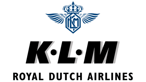
In 2011, KLM agreed with InselAir, expanding its routes and organizing joint flights with InselAir. To make new customers immediately understand whose emblem was before them, the symbol was given back the inscription: Royal Dutch Airlines.
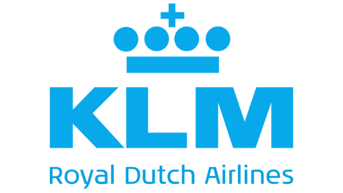
The abbreviation KLM, written in large, bold blue letters, is in the logo’s center. Blue symbolizes the sky and infinity and conveys a sense of reliability and professionalism.
Above the acronym is a crown, the symbol of the Royal Dutch Airline. This emphasizes the company’s association with the royal house and its long history.
At the bottom of the logo, the company name is written in English, “Royal Dutch Airlines.” This reflects the connection between the Royal House of Holland and the company’s past.
In addition, all emblem elements are the same color, creating a unified and coherent image. This underlines the company’s clarity and organization.
Font and Colors
Blue and its shades dominate in all the company’s emblems. They personify the atmosphere. The blue color of the last sign seems to say that the sky is our element. The company’s planes easily soar upward, and flights on them only bring pleasant impressions.
The strict, even letters of the inscription suit many fonts. The symbols show reliability and consistency.
