KPN: Brand overview
KPN originated in 1989 as the Dutch state-owned postal, telegraph, and telephone service. A transformation took place when the state-owned company, then known as PTT, was privatized and given a new name, Koninklijke PTT Nederland (KPN).
The liberalization of the telecommunications sector in the 1990s opened up favorable conditions for KPN to diversify. Taking advantage of this opportunity, the company began to develop mobile, Internet, and television services. In the following decade, KPN began active acquisition activities: Dutch mobile operator Telfort and German E-Plus, as well as other companies, were taken over.
In 2006, KPN merged with Belgian operator Belgacom, but this partnership was later terminated as KPN decided to exit the Belgian business. Refocusing its efforts on the foundational market of the Netherlands, the company has invested heavily in fiber optic infrastructure in recent years.
KPN is now the leading telecommunications operator in the Netherlands, providing individual and commercial customers with a full range of services, including mobile, broadband, TV, and IT solutions. In 2019, the company’s headquarters were relocated to Rotterdam, and its workforce exceeds 10,000 employees.
Although the Dutch government initially sold its entire stake in the privatization, it retains a minority stake in the company. KPN is a public company, and its shares are listed on the Amsterdam Stock Exchange.
Meaning and History
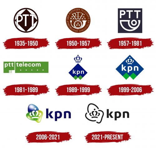
1935 – 1950
1950 – 1957
1957 – 1981
1981 – 1989
1989 – 1999
1999 – 2006
2006 – 2021
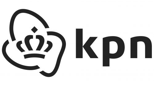
2021 – today
The Dutch telecommunications company went through a long search for its unique visual identity and finally settled on a two-dimensional and monochrome logo. The three multicolored spots from the past have disappeared, and now only outlines take their place. They are drawn in black strokes of medium thickness and have the form of elongated brackets or high arches. In the center is the main symbol of royalty – the crown. It consists of 6 geometric figures repeating the design of the letters of the brief inscription. The glyphs are bold, rounded (except k), smooth, and grotesque.
The crown in the center gives a royal connotation as if to say that their services are of royal standard. The elongated brackets or arches resemble signals or connections, which is appropriate since this is a telecommunications company. The glyphs are flat and bold, just as a solid phone call should be: clear and strong.
KPN color codes
| Dark Navy Blue | Hex color: | #0d0d62 |
|---|---|---|
| RGB: | 13 13 98 | |
| CMYK: | 87 87 0 62 | |
| Pantone: | PMS 2745 C |
| Blue | Hex color: | #368bbd |
|---|---|---|
| RGB: | 54 139 189 | |
| CMYK: | 71 26 0 26 | |
| Pantone: | PMS 7704 C |
| Islamic Green | Hex color: | #459e26 |
|---|---|---|
| RGB: | 69 158 38 | |
| CMYK: | 56 0 76 38 | |
| Pantone: | PMS 354 C |
| Acid Green | Hex color: | #bdca32 |
|---|---|---|
| RGB: | 189 202 50 | |
| CMYK: | 6 0 75 21 | |
| Pantone: | PMS 583 C |
