


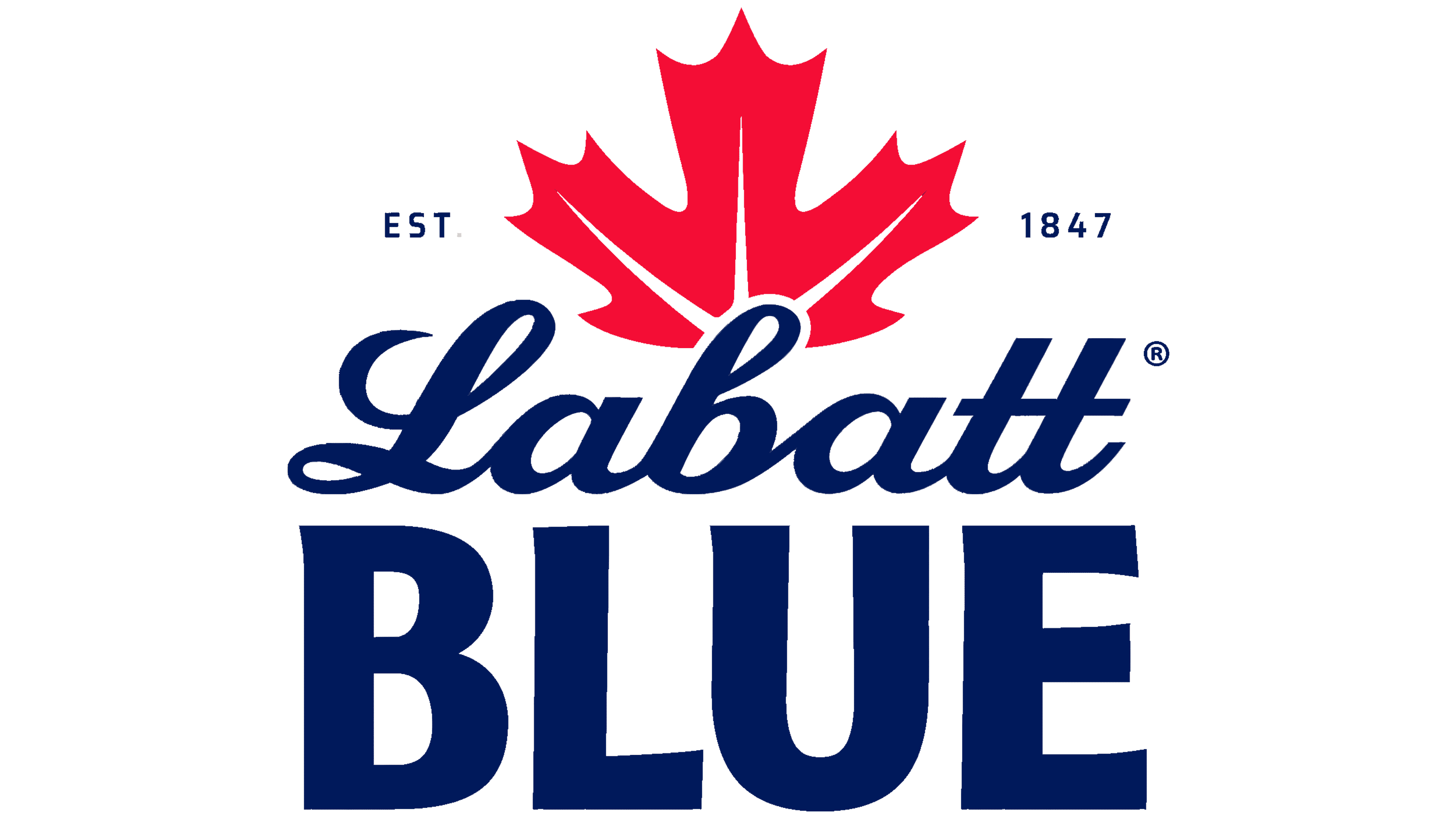
Labatt Blue’s new U.S. identity gives the brewery’s name more prominence than the beer’s. Introduced in May 2026, the redesign was developed by Brooklyn agency Sister Mary with the FIFCO USA team to encourage customers to ask for Labatt by name. Because many drinkers are used to ordering a Blue, the team enlarged the Labatt lettering and the red maple leaf above it.
The two parts of the name have different histories. The brewery dates to 1847, while the beer launched in 1951 as Pilsener Lager. The nickname Blue came from the bottle’s blue labeling and the brand’s support for the Winnipeg Blue Bombers football team. Over time, customers came to identify the beer primarily by that name. Sister Mary’s task was to bring the brewery name to the forefront while preserving the product’s familiar appearance.
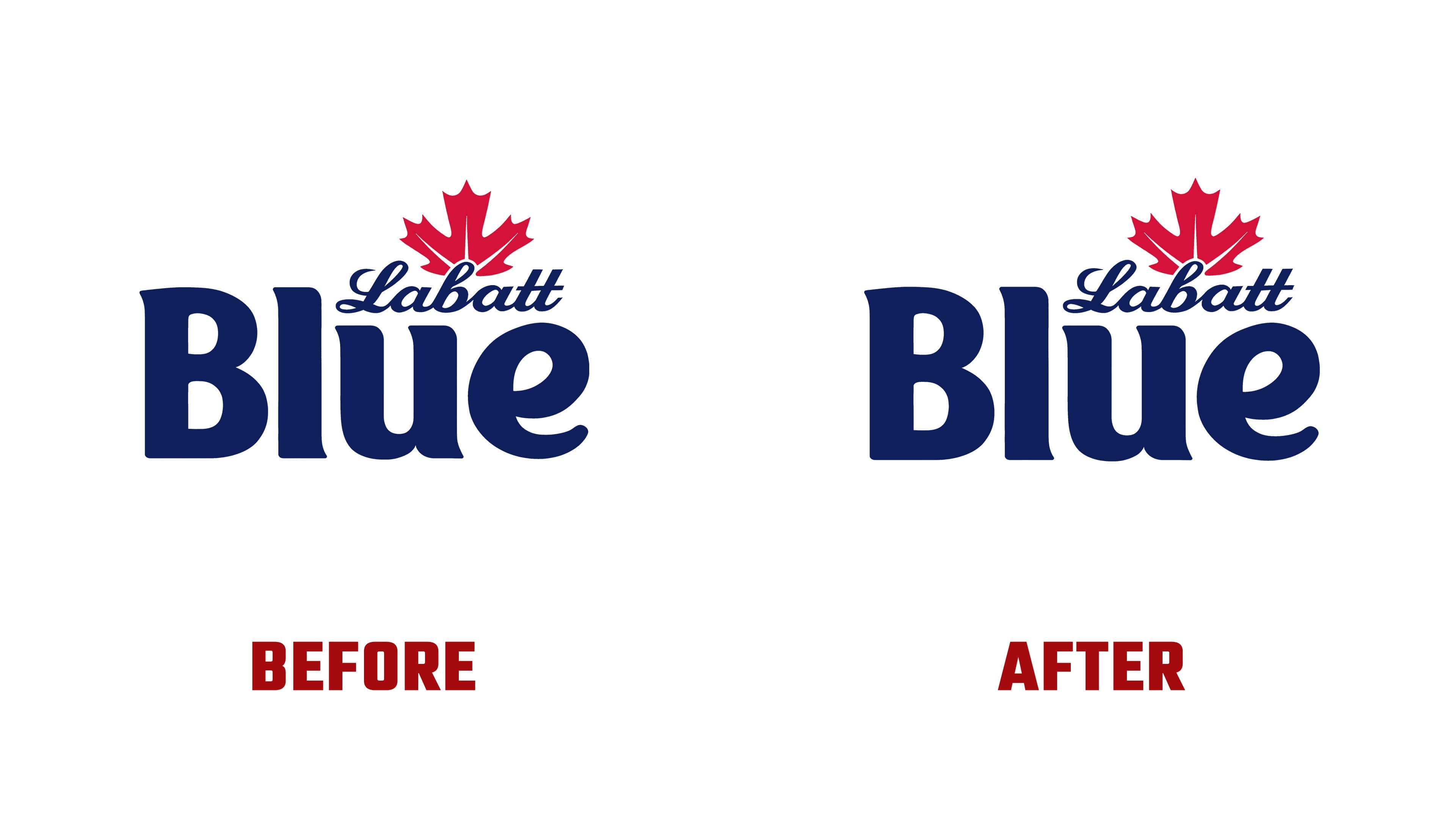
Previously, the word “Blue” dominated the logo. A large capital “B” led into rounded lowercase letters, with the “e” ending in a sweeping flourish to the right. A small Labatt script and maple leaf sat above the right side of the word. The brewery name now spans nearly the full width of the logo, with BLUE beneath it. An enlarged leaf rises above the name, flanked by EST. and 1847 to indicate the founding year.
The Labatt script retains its slant, connected letters, looped capital “L,” and tall strokes in the “b” and double “t.” For BLUE, the agency created bold, compact sans-serif capitals. The rounded lettering of the previous version gives way to nearly vertical sides, large counters, and slightly angled terminals on the “L” and “E.” The lower line provides a base for the script above. The BLUE LIGHT version follows the same structure.
The red maple leaf references the brand’s Canadian origins. Enlarged, its pointed lobes and deep cuts between them take up a substantial portion of the emblem. White lettering and a dark blue background maintain the existing color combination. Competitors, including Bud Light, also use blue, but for Labatt, the color ties to the history of the Blue name. Sister Mary retained it, adding gold accents and giving the Canadian imagery a more prominent role.
The U.S. beer is brewed in New York State. The agency brought together the brand’s Canadian roots and U.S. production through the friendly rivalry between the neighboring countries. The phrase “Best Frenemies from the North” plays on sports rivalries and friendly banter. It appears alongside “Born in Canada” and “Brewed in the USA.” A maple leaf replaces the “O” in “Born,” while a star replaces the second “E” in “Brewed.” Diagonal dividers echo the logo’s slant and, according to the designers, reference both the border and the connection between Canada and the United States.
The John Labatt signature and a north-pointing arrow returned from the archives. Both were reworked for use alongside the main logo. On the cans, the signature appears in gold, a historic emblem serves as a background image, and gold bands frame the top and bottom edges. “Pristine Pilsener” was replaced with “Canadian Style Pilsener” to identify the Canadian style of the U.S.-brewed beer.