The Labello logo exudes professionalism. Outstanding experts in cosmetology and biochemistry are engaged in creating ideal lip care products. Therefore, the emblem looks smooth and soft, just like fabrics treated with balms.
Labello: Brand overview
| Founded: | 1909 |
| Founder: | Beiersdorf AG |
| Headquarters: | Germany |
| Website: | labello.com |
Meaning and History
Labello produces hygienic lipsticks with various additives that affect their color, fragrance, and care qualities. The basis of the assortment are balms-sticks for moisturizing, nutrition, treatment, and sun protection. And all because the company Beiersdorf AG, which manufactures these products, is sure: beauty cannot exist without health. Even the name of the trademark hints at the brand concept because it is formed from two words: “la” – from “labium” (“lip”) and “bell” – from “bellus” (“beautiful”). The last “o” is used for harmonic sounding, to get a pronunciation in the French manner.
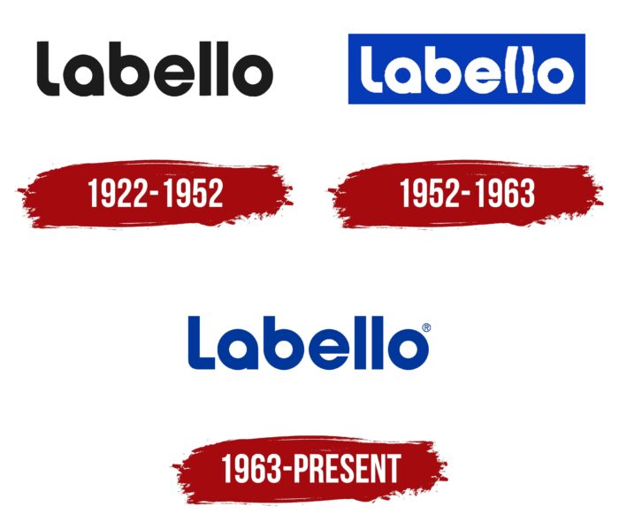
The name Labello, which has Latin roots, inspired the designers for the logo of this brand. In total, three almost identical word marks were created. The first and third differ only in the shape of the initial letter “L.”
What is Labello?
Labello is the brand that the German company Beiersdorf AG uses to sell its lip balm stick. It was first introduced in 1909, which speaks of its rich historical heritage. The product line includes lip care products and glosses designed for cosmetic purposes.
1922 – 1952
The name of the trademark gave the beginning of the logo. It is this that is used as a key element. In this case, the word “labello” is compound and comes from two Latin stems: “lip” (labium) and “beautiful” (bellus). Symbology developers are designers from Juliasys Studio.
The personal identification mark of the Labello brand is its name. It was always present on the logo and represented a minimalistic version of the spelling. There are no serifs or curly elements in it – just a single word. Almost all letters are streamlined and rounded, except the two lowercase “ll.” They look like hygienic lipstick tubes – elongated, wide, rectangular. The first “L” differs from them because it is capitalized.
An individual typeface of the same name for the Labello trademark was developed by the studio Juliasys from Berlin. To do this, she used the Universalschrift font of the teacher Bauhaus Herbert Bayer. The color scheme of the logo depends on the background. If the label is light, the letters are dark blue; if dark, they are white.
1952 – 1963
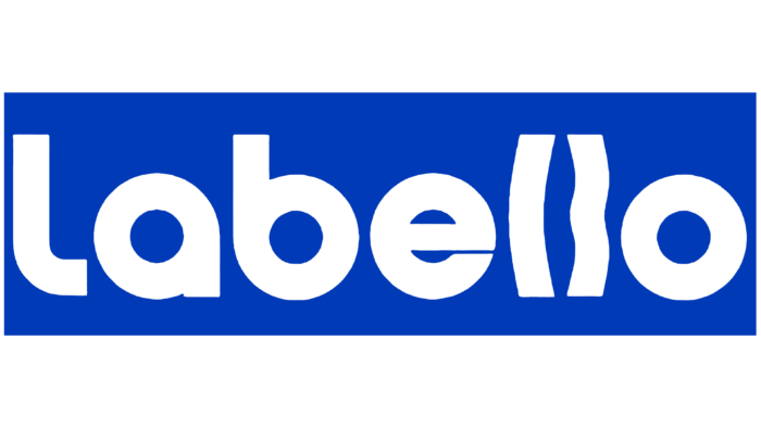
In 1952, the inscription became white and was inside a dark blue horizontal rectangle. The designers decided to play with the double “ll” interestingly, so they stylized them under the lips. They curved the first “l” into an open parenthesis and made the second letter sinuous, adding a depression in the center. The font remained the same: bold geometric grotesque with rounded glyphs.
1963 – today
In the early 1960s, The authors of the logo slightly corrected it to make the inscription more readable. To do this, they reflected the colors, so now the brand name is dark blue, and the background, on the contrary, is light. The letter spacing has become a little wider. Again, the two lowercase “l” s look standard, like vertically elongated rectangles. And the capital “L,” located the very first, has acquired an updated look: its horizontal stroke is noticeably lengthened in the current version. Moreover, the inner side of the fold has the shape of a right angle.
Labello: Interesting Facts
Labello is a well-known brand for lip care products, and its history started in the early 20th century. Owned by Beiersdorf AG, the same company behind NIVEA, Labello has been a leader in lip balm innovation and quality.
- Start: Labello was launched in 1909 by Oscar Troplowitz, who also created NIVEA Creme. The name combines Latin words for “lip” and “beautiful,” showing the brand’s focus on keeping lips healthy and good-looking.
- Innovation: Labello was the first to introduce a lip balm stick, changing how people use lip care products by offering a cleaner, more convenient option.
- Packaging Evolution: Initially, Labello balm came in a metal tube with a sliding mechanism. In the 1960s, they switched to the twist mechanism we’re familiar with today.
- Variety: The brand has developed many formulas, including moisturizing, tinted, and SPF options, to meet various lip care needs.
- Global Reach: Labello is known in many European countries and is called different names in other areas, such as NIVEA, in some places.
- Quality Focus: The brand prioritizes high-quality ingredients and always seeks to innovate and improve its products for better lip care.
- Sustainability: As part of Beiersdorf AG’s eco-friendly efforts, Labello works to reduce waste and use responsibly sourced materials.
- Iconic Status: With its recognizable blue and white packaging, Labello has become a well-known name in personal care, trusted by users worldwide.
- Research-Backed: Backed by Beiersdorf AG’s research, Labello products are scientifically formulated to meet the unique needs of lip skin.
- Giving Back: The brand participates in charitable activities, focusing on health, wellness, and the environment, showing its commitment to the community.
Labello’s long history of innovation, commitment to quality, and sustainability efforts have made it a favorite for those looking for reliable lip care solutions.
Font and Colors
As a result of the evolution of the Labello logo, its font has hardly changed. The bold sans serif is still used today, mixing mid-20th-century typographic sans-serifs with Universalschrift-style glyphs. The author of the latter is the Austrian graphic designer Herbert Bayer. Based on the wordmark, a typeface called Labello was created. Juliasys developed it in collaboration with the Beiersdorf Brand Management team.
The color scheme also remains stable: it combines white and dark blue. But if the white inscription was on a blue background earlier, the opposite is true. This was done to improve the readability of the text.
Labello color codes
| Dark Powder Blue | Hex color: | #00379a |
|---|---|---|
| RGB: | 0 55 154 | |
| CMYK: | 100 64 0 40 | |
| Pantone: | PMS 286 C |
