![]() Lapierre Logo PNG
Lapierre Logo PNG
The Lapierre Logo captures the spirit of road and adventure embodied in bikes designed for speed, comfort, and fun. Road, mountain, gravel, and e-bikes highlight the craftsmanship and passion for cycling, opening up new horizons for every ride.
Lapierre’s history began in 1946 when Gaston Lapierre founded the company in Dijon, France. Starting with classic city bicycles, Gaston quickly became known for his careful craftsmanship. Later, his son Jacqui Lapierre transformed the small business into a well-known name by embracing new technology and introducing racing bicycles. Soon, the company began sponsoring professional cycling teams, which helped push the innovation of its first specialized road bike models. As mountain biking emerged, Lapierre quickly responded, becoming one of the first European brands in the segment. The introduction of aluminum alloy frames enhanced bike performance, and it was the first to offer full-suspension mountain bikes. Later, joining the Dutch Accell Group gave the brand resources while preserving its creative independence. Carbon frame technology became a focus, offering popular lightweight designs for professionals and enthusiasts. The global reach expanded as Lapierre opened offices internationally and entered the electric bicycle market with its first e-bike models. Continuous improvement led to innovative road bike models and advanced suspension systems that meet the needs of diverse cyclists. Today, Lapierre remains among Europe’s top bicycle manufacturers, still driven by Gaston’s passion for quality and innovation.
Meaning and History
What is Lapierre?
This company produces bicycles for various riding styles, including mountain, road, and urban models. Starting with a small workshop, it has grown into a well-known brand that uses modern technologies and high-quality materials. Professional athletes and those who love an active lifestyle often choose bicycles. The products undergo strict quality control and testing to ensure the bikes are reliable, comfortable, and ready for any road.
1946 – today
![]()
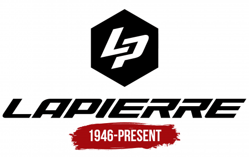
LAPIERRE is a French company that manufactures sports, road, and mountain bikes. Their logo perfectly aligns with the spirit of sports and speed, without being too soft, yet with a clear sense of motion.
A black, confident, and reliable hexagon without gradients or compromises. Two letters are placed inside the hexagon: “L” and “P.” These letters appear slightly tilted forward as if they’re about to take off and race ahead. Dynamic and sporty, it suits a company that produces bicycles and accessories for those who enjoy staying active and on the move.
The name “LAPIERRE” is positioned below, packed with energy. The letters are large, with a noticeable forward slant that creates a sense of speed, almost like lettering on a racing bike frame. Smooth lines and the absence of serifs in the font emphasize the brand’s technological and athletic style.
The color scheme is minimalistic, strictly black and white. It doesn’t distract or add anything unnecessary, keeping all the focus on shape, lines, and the dynamic motion of the letters. The company continues to evolve, releasing models sought after in international competitions and the daily lives of sports enthusiasts. The logo also speaks of speed and movement.