


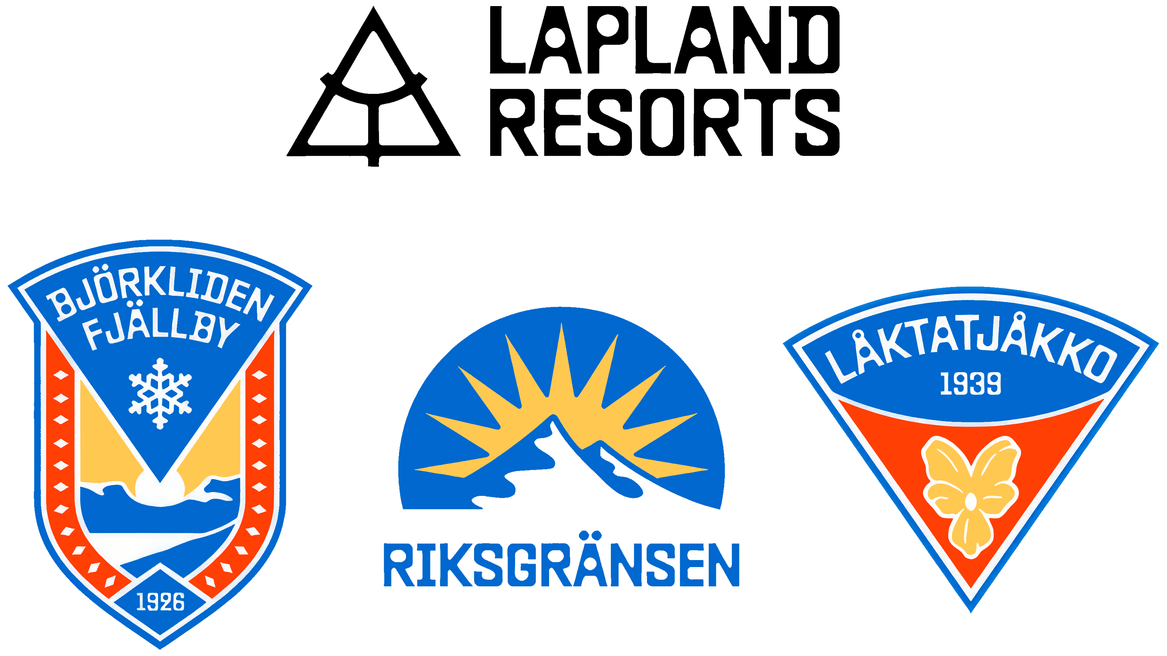
Lapland Resorts and its three destinations now share a unified logo system. Swedish agency Kolossal unveiled the update on June 25, 2026. The parent company received a mountain emblem, while Björkliden, Riksgränsen, and Låktatjåkko retained revised versions of their historic designs. A single typeface unites the names, with coordinated colors across the resorts.
The Malmö-based agency needed to distinguish the group’s roles. Lapland Resorts handles operations, resort development, and employee working conditions. For travelers, the individual destinations remain the primary focus. Each has its own history, audience, and seasonal offerings, though they are often promoted together. The identity needed to convey their connection to the parent company while preserving their individuality.
The Lapland Resorts logo changed entirely. A gray, single-line serif wordmark was replaced with an uppercase name arranged across two lines. A mountain outline sits to the left. Inside the triangle, an arc meets a vertical line that descends from its midpoint and extends beyond the base. This creates three sections, one for each destination. Rounded interior corners echo the letterforms.
All four names are set in Baste by Lift Type, an experimental geometric sans-serif typeface. Its heavy strokes combine rounded counters with angular outer contours. In the parent company’s logo, the lettering forms a compact block. The resort names follow the structure of their historic emblems, curving along an arc or sitting beneath an image.
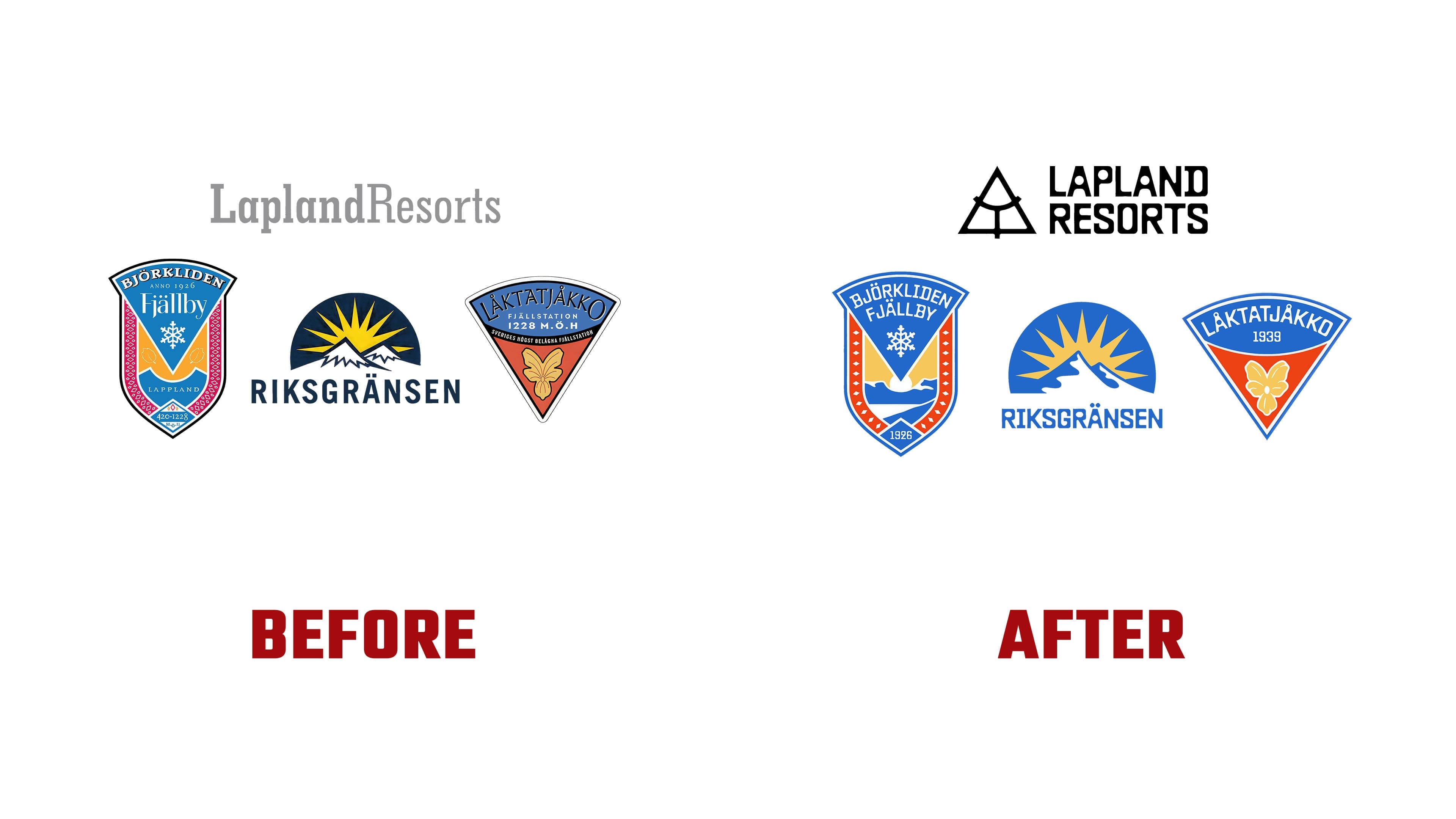
Låktatjåkko retained its inverted triangular badge with a yellow flower. The upper field is now blue and the lower field red, framed by blue-and-white outlines. The name follows the curve of the upper edge. The flower is larger, with fewer small petals and internal lines. Descriptive text and the elevation marker have been replaced with 1939, the year the mountain station was built. At 1,228 meters above sea level, it is Sweden’s highest mountain lodge.
Within the elongated Björkliden Fjällby shield, 1926 marks the move to the lower point. The date marks when Gammelgården and two neighboring buildings began welcoming tourists. The resort celebrates its centennial in 2026. It sits 250 kilometers north of the Arctic Circle. The emblem retains its snowflake and colored side stripes. Fine ornamentation in the red sections has been replaced with more widely spaced light-colored shapes, and a large mountain image has been added at the bottom. The name is now set in uppercase letters.
Riksgränsen retained its semicircular emblem, with a sun and long rays above snow-covered peaks. A large white silhouette with blue sections replaces several intricately drawn mountains. The background is lighter, and the name appears beneath the image in heavy, angular lettering. The sun and mountains carry forward the theme of Sweden’s northernmost ski resort. Riksgränsen is known for off-piste skiing, recreation under the midnight sun, and the country’s oldest ski school.
Shared colors help connect the differently shaped emblems. Blue and yellow are brighter, while Björkliden and Låktatjåkko use the same shade of red. Riksgränsen retains its blue-and-yellow combination with white areas. Its connection to the other destinations comes through the typeface and shared colors. When displayed together, the semicircular emblem occupies…
The three Lapland Resorts destinations share an identity built around their historic emblems. Swedish agency Kolossal unveiled the project on June 25, 2026. The designers reworked familiar imagery for Björkliden, Riksgränsen, and Låktatjåkko and created a mountain symbol for the parent company. The Baste typeface and coordinated colors tie the names together.
The Malmö-based agency needed to communicate the group’s structure. Lapland Resorts handles operations, resort development, and employee working conditions. Travelers focus on the destinations, each with a different history, audience, and seasonal offering. Since the destinations are often promoted together, the identity needed to preserve their individuality while showing their connection to the parent company.
The Lapland Resorts logo has been completely redesigned. Previously, the name appeared in gray serif lettering on a single line. Uppercase letters now sit across two lines, with a mountain outline to the left. An arc runs inside the triangle. A vertical line descends from its midpoint and extends beyond the base. The resulting three sections correspond to the group’s three destinations. Rounded interior corners echo the letterforms.
All four names use Baste by Lift Type, an experimental geometric sans-serif typeface. It combines heavy strokes, rounded counters, and angular outer edges. In the parent company’s logo, the wordmark forms a compact two-line block. The resort names fit within the existing emblems, following an arc or sitting beneath the image.
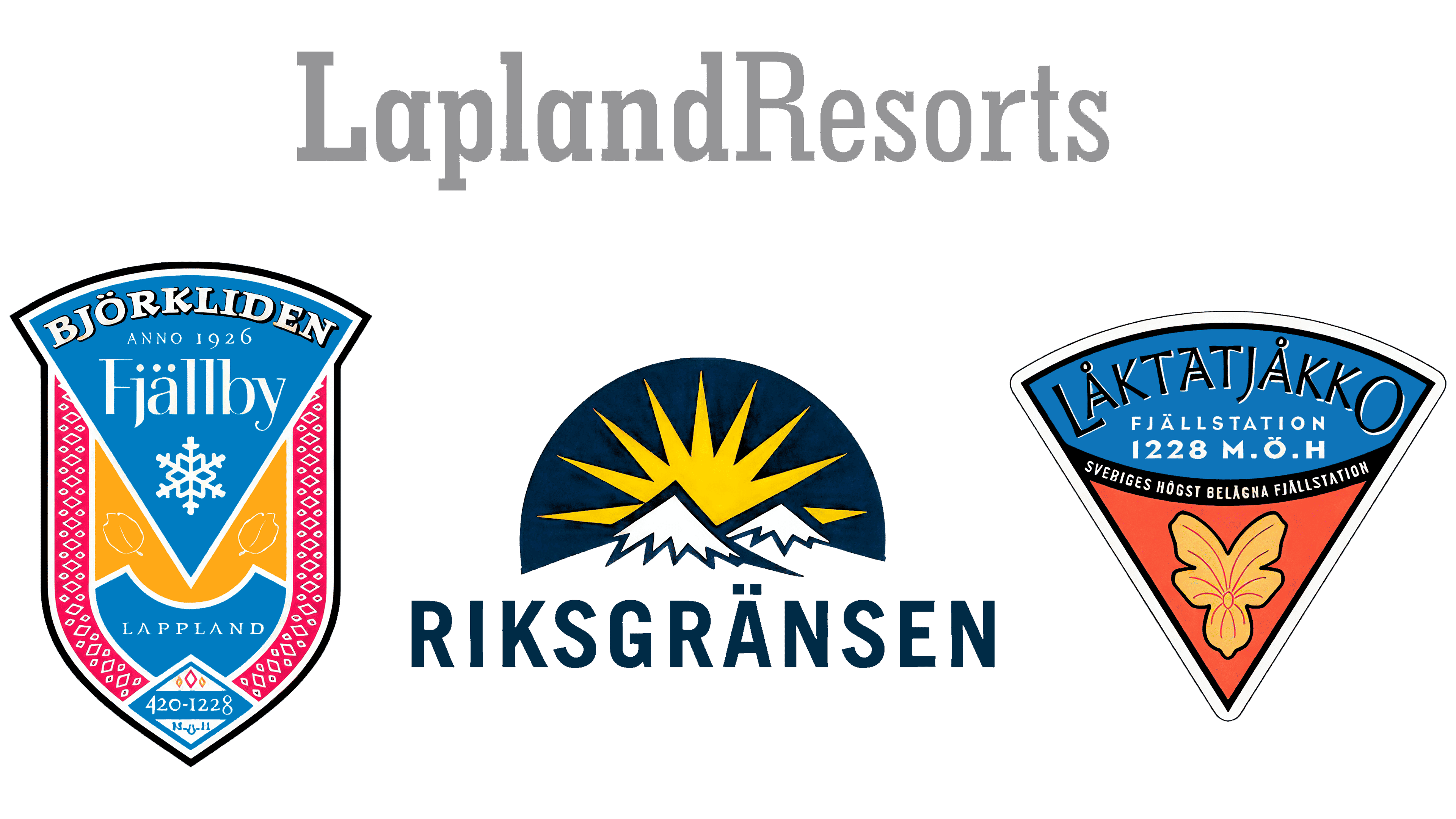
Låktatjåkko retained its inverted triangular badge with a yellow flower. The upper section is blue and the lower section red, with blue and white outlines around the edge. The name follows the curve of the upper edge. The flower is larger, with small petal sections merged and fewer internal lines. The descriptive text and elevation have been replaced by 1939, the year the mountain station was built. At 1,228 meters above sea level, it is Sweden’s highest mountain lodge.
In the Björkliden Fjällby emblem, the historic date 1926 has moved to the lower point of the elongated shield. It marks the year Gammelgården and two neighboring buildings began serving tourists. The resort is 250 kilometers north of the Arctic Circle and celebrates its centennial in 2026. The shield retains its snowflake and colored side stripes. Fine ornamentation in the red sections has been replaced with widely spaced light-colored shapes, and a large mountain image now appears at the bottom. The name is set in uppercase letters.
Riksgränsen continues to use a semicircular emblem with a sun above snowy peaks. The long rays remain, while a large white silhouette with blue sections replaces several intricately drawn mountains. The background is lighter. Heavy, angular lettering sits beneath the image. The sun and mountains connect the identity to Sweden’s northernmost ski resort. Riksgränsen is known for off-piste skiing, recreation under the midnight sun, and the country’s oldest ski school.
The designers used color to bring the emblems closer together. Blue and yellow are brighter, and Björkliden and Låktatjåkko share a common shade of red. The Riksgränsen identity uses blue, yellow, and white. A shared typeface and recurring colors convey its place within the group. When the three emblems appear side by side, the Riksgränsen semicircle sits between the other two destinations’ elongated shields.
The logos have appeared on apparel, backpacks, stickers, vehicles, and information boards. We created four websites for the parent company and its three destinations using a shared technical platform. Kolossal handled the design, while KRENG and Oh My carried out the technical development.