![]() Libero Logo PNG
Libero Logo PNG
The Libero logo conveys a sense of volume and softness, highlighting the product’s excellent quality and care for the baby’s skin. The emblem represents products that absorb moisture well and the company that understands children and their parents.
Libero’s history begins with SCA, founded in 1929 by Ivar Kreuger through the consolidation of several forestry firms in northern Sweden. The group controlled a major share of pulp exports before Kreuger’s collapse in 1932, when control passed to Handelsbanken. For decades, SCA remained tied to the forest industry.
A turning point came in 1972 under CEO Bo Rydin. In 1975, SCA acquired Mölnlycke AB, a company that had shifted from textiles to disposable hygiene products by the 1950s. The deal increased sales and introduced diapers, feminine hygiene products, and medical supplies into the portfolio, forming the base for Libero.
In 1980, Libero was launched as a separate diaper brand within SCA. By the mid-1980s, Mölnlycke held leading positions in Scandinavia and the Benelux and had become a major supplier of disposable medical products. At the same time, competition from Pampers by Procter & Gamble and Huggies by Kimberly-Clark intensified, especially outside the Nordic region.
In 1988, SCA acquired Peaudouce, a leading French diaper manufacturer, strengthening its position in continental Europe. In the 1990s, Libero expanded its product range to include wet wipes and baby skincare products, becoming a broader baby-care brand.
In the 2000s, SCA continued global expansion through acquisitions, including Copamex in 2010 and Pro Descart in 2011, reinforcing its hygiene division in Latin America and emerging markets.
In 2017, SCA split into two companies, creating Essity as an independent hygiene group. Libero, along with TENA and Tork, moved under the new structure, which, by 2024, operated in 150 countries and saw large-scale daily usage.
Meaning and History
![]()
Libero hygiene products were produced by Svenska Cellulosa AB, a timber industry company that owns vast areas of tree plantations in Sweden, Estonia, and Latvia. But in 2017, this brand became part of Essity, which acquired SCA and took over some of its brands. So now, all Libero products are made exclusively at Essity factories. And there is quite a lot of it, as the assortment includes diapers in all sizes and types, as well as children’s care products. The latter includes, for example, emollient creams and cleansing wipes.
Products of this brand are marked with a recognizable logo. It contains only the word “Libero,” presented in the signature purple color. Until 2010, the text sign looked a little different: previously, a different font was used, associated with lightness and dynamism. But the changes have allowed the brand to rediscover its original style and move away from the standard inscription design.
What is Libero?
Libero is a brand of children’s products owned by the Swiss manufacturer Essity AB, which also manufactures medical and hygiene products. The brand’s main assortment includes diapers for children of different ages (from birth to 3 years and older), as well as shampoos, lotions, creams, and wipes.
1990 – 2010
![]()
The first Libero logo was all black, and its background color depended on the visual context. The designers conveyed the brand name in cursive script with a slight rightward slant. They visually split the word into two parts, leaving the letters “b” and “e” unrelated. At the same time, other glyphs were connected by smooth lines. Almost all corners were rounded, which created a favorable impression of the brand as a source of safe children’s products. As a result, the inscription was associated with softness, tenderness, and parental care.
2010 – today
![]()
The original logo dates back to the launch of children’s products, as until then, the Swedish company Essity had a different direction. As soon as it appeared, the Libero emblem contained the original “L,” while the rest of the letters remained standard. This feature is typical of all the following logo variants.
A brand’s personal identification mark consists of a name. The word “Libero” is represented as a combination of uppercase and lowercase letters. The “L” is handwritten: the top has a large loop, and the bottom has a small loop. The leg is expressively curved and superimposed on the adjacent “i” with a large dot. From the outside, it is perceived as if mom or dad is hugging their child.
Font and Colors
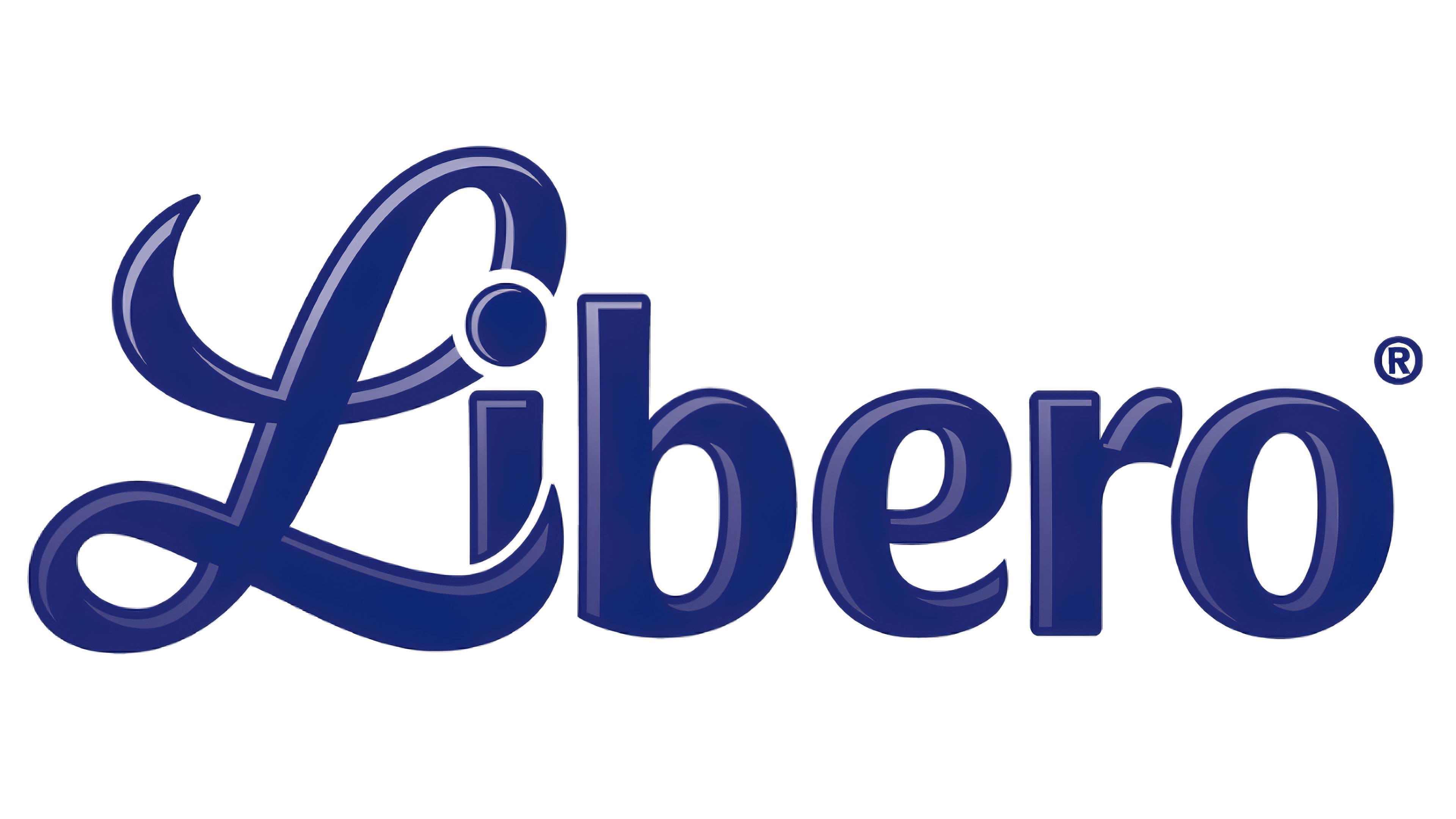
The typeface used in the logo is unique: it combines handwritten and printed characters. This design is consistent across all brand logos. The dark blue letters have a blue border on the left side. The background is white.