The strict and massive Liebherr logo is a symbol of inviolability, fundamental approach, and confidence in the quality of their work. The task of the emblem is to evoke associations with the reliable and durable equipment of the company.
Liebherr: Brand overview
| Founded: | 1949 |
| Founder: | Hans Liebherr |
| Headquarters: | Bulle, Switzerland |
| Website: | liebherr.com |
Meaning and History
The logo of a manufacturer of equipment from Germany did not immediately gain wide recognition. The company first had to work hard, increasing the quality of products because it is with it that this heavy, heavy, and bulky sign is associated. Since 1949, the German brand only had one emblem in two versions. They appeared sequentially, one after another, as a result of the redesign. This symbol, like the cars it decorates, is known to consumers in many countries of the world.
What is Liebherr?
Liebherr is a conglomerate consisting of manufacturers of heavy-duty vehicles and household appliances. It was founded in Germany in 1949, but its headquarters are located in Switzerland. Initially, the company produced only tower cranes and later began to manufacture aircraft parts, refrigerators, freezers, food processing equipment, trucks, drilling rigs, excavators, and much more.
Old logo
The Liebherr Group entered the market in 1949. In the same year, it introduced its debut logo: the simple, democratic Liebherr lettering. The word is made in a strict font, vaguely reminiscent of Bottle Kaps (by Alex Kaczun) or similar Koloss SB (developed by Jakob Erbar).
Sans serif letters, bold and wide. Because of this, it seems as if the name of the manufacturer is “heavy.” The designers tried to create an impression to focus on the company’s products, their durability, and reliability.
New logo
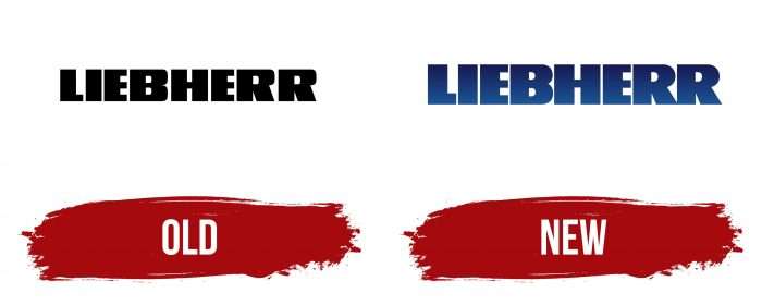
The debut emblem was monochrome: the black lettering was on a completely white background. Later, the developers corrected this omission by offering many versions with new palettes. For example, they repainted the word blue using several shades at once. The smooth gradient allowed for three-dimensional perception. There were also variants with a black “Liebherr” inside a bright yellow rectangle.
As for the evolution of the typeface, it went unnoticed. Initially, letter-spacing was of medium width. Then the typographers shifted the letters, and the inscription became quite compact. But the experimenters did not stop there and reduced the gaps between the signs so much that they complicated the logo’s visual perception.
Nevertheless, this can be called a distinctive feature of the Liebherr Group. Thanks to this effect, the emblem is very recognizable. Someone thinks that it even symbolizes the high quality of branded technology.
Liebherr: Interesting Facts
Liebherr is an interesting company with a long history and a wide range of products, from big machines to home appliances.
- Start and Growth: Liebherr began in 1949 in Germany thanks to Hans Liebherr’s invention of an easy-to-build, affordable tower crane. The company didn’t take long to grow, making everything from construction equipment to household appliances and even aerospace and transportation systems.
- Worldwide Operations: Although it started in Germany, Liebherr now has its main office in Switzerland. The company operates worldwide, with over 130 companies on every continent, showing its important role in the global market.
- Family Ownership: The Liebherr family still owns the company, which is now run by the second generation. This has helped the company focus on long-term goals like stability and growth, which is quite special in the fast-paced business world.
- Varied Products: Liebherr makes many different things. They produce cranes, mining gear, maritime cranes, aerospace and transportation systems, and more for heavy equipment. They also make high-end fridges and freezers.
- Refrigeration Innovation: Liebherr is known for its cutting-edge fridge technology, with features that keep food fresh longer and fridges that are good for the environment.
- Aerospace Contributions: In aerospace, Liebherr supplies systems for commercial and military aircraft, including air management and flight control. This shows the company’s wide-ranging expertise.
- Focus on Sustainability: Liebherr aims to make better products for the planet, such as more efficient machines and appliances and uses renewable energy.
- Impressive Machines: Liebherr has made some of the world’s biggest and most powerful machines, like the T 282 C dump truck and the LTM 11200-9.1 crane, showing their ability to meet heavy industry needs.
From its beginnings after World War II to becoming a major international company, Liebherr’s commitment to innovation, quality, and diversity has made it a leader in industrial and home markets.
Font and Colors
Reliability, stability, massiveness, and practicality are fundamental principles that the Liebherr management reflected in their logo. The company chose a wordmark to express the concept. Although there are no graphics in it, its role is played by text, so each letter is perceived as a separate drawn element, most reminiscent of a geometric figure.
The symbols are so wide that their sides look like vertical rectangles, not the legs of letters. Despite the massiveness, the internal gaps are visible because the designers chose a contrasting background. This can be seen especially well in the current version, where the signs are rounded and streamlined.
A unique typeface is used in the emblem, which has no analogs, although outwardly it has something in common with two types of fonts. It resembles Bottle Kaps in size of sides and Koloss SB in style. From the first option, it has width and massiveness, and from the second – rigor and evenness. Both concepts are reflected in the logo.
The palette of letters is consistently dark. Mostly black is used on a white background. Blue with a gradient transition is rare and depends mainly on the shade of neighboring elements.
Liebherr color codes
| Royal Blue | Hex color: | #161d55 |
|---|---|---|
| RGB: | 22 29 85 | |
| CMYK: | 74 66 0 67 | |
| Pantone: | PMS 274 C |
| Medium Electric Blue | Hex color: | #1a5193 |
|---|---|---|
| RGB: | 26 81 147 | |
| CMYK: | 82 45 0 42 | |
| Pantone: | PMS 2945 C |
