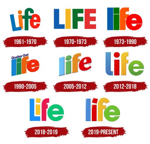
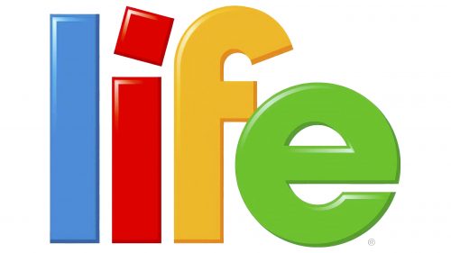
The Life Cereal logo symbolizes life in its vibrant expression. Each product reflects the company’s core philosophy: a high-quality product is the key to health. Therefore, natural and harmonious colors are used in the logo. The glossy texture of the letters indicates perfection, reflecting the full value of healthy breakfasts.
Life Cereal: Brand overview
When Quaker Oats decided to broaden the selection of morning cereals, Life Cereal’s history got underway in 1961. Life Cereal was created to provide a healthy option for sugar-filled cereals monopolizing the market. Compared to most competitors, the product had less sugar and was made with whole grains.
To highlight the product’s nutritional content and part in a healthy lifestyle, the name “Life” was selected. At first, the brand was promoted as a breakfast option suitable for all family members, not only kids.
The cereal did not have much commercial success in the initial years following its debut. The brand did not distinguish itself from the many competing breakfast cereals, and sales were low. However, the well-known “Mikey Likes It” ad campaign helped to alter the situation in 1972 drastically.
The product’s history underwent a sea change after the release of the “Mikey Likes It” commercial. In the commercial, two older brothers talk about a new cereal and decide to try it for their younger brother, Mikey, who is notorious for not loving anything. They are shocked to see Mikey enjoyably consume the cereal. After airing for over a decade, this commercial became one of American television’s most popular and longest-running.
The cereal sales significantly increased due to the popularity of the “Mikey Likes It” campaign. Customers in America started to recognize and adore the brand. Quaker Oats kept expanding the product line under the Life brand in the ensuing years.
A new product, Cinnamon Life, was released in 1978. This version gave the traditional cereal a cinnamon taste, which was profitable and brought in additional clients.
The brand saw additional expansion and development during the 1980s. By maintaining its position as a healthier option to many of its rivals, the product solidified its place in the breakfast cereal industry. The business also experimented with different flavors and package designs throughout this period.
The cereal continued highlighting its nutritional advantages in the 1990s when enthusiasm for eating healthily increased. The company aggressively marketed the product’s whole grains, vital vitamins, and minerals.
The brand faced additional difficulties in the 2000s as the market for breakfast cereal grew more competitive. As a result, Quaker Oats kept introducing new ideas to the lineup. A new variant called Vanilla Yogurt Crunch was released in 2002, and it had yogurt bits mixed in with traditional cereal.
The company adjusted to shifting consumer preferences in the 2010s. The brand emphasized using natural products and the lack of artificial tastes and colors. To make the product more appealing to contemporary consumers, improvements were also made to the packaging.
The cereal commemorated its 60th anniversary in 2020. The company celebrated this achievement by releasing a limited vintage-style packaging that returned memories of the product’s early years. This promotion made customers nostalgic and also highlighted the brand’s lengthy history.
The brand underwent a major update in 2021. The company unveiled a new recipe for its traditional cereal with more nutritious grains and less added sugar. This modification addressed the increasing need for healthier breakfast options.
In 2022, the company introduced a new cereal, Life Strawberry, to broaden its product lineup. These flakes blended natural strawberry flavor with the timeless Life taste. The goal of the new product was to broaden the brand’s flavor profile and draw in a younger consumer base.
One of the most important products in the Quaker Oats lineup, the cereal stayed relevant by adjusting to its customers’ shifting requirements and tastes while retaining its fundamental appeal as a satisfying and wholesome breakfast option for the whole family.
Meaning and History
Since 1969, Quaker Oats has offered children and adults a delicious dry breakfast from high-quality whole grains. The packaging of these treats can be found in every kitchen and pantry, making the original classic sweet flavor a cherished childhood treat.
The manufacturer keeps pace with the times, updating the product line. Cinnamon, vanilla, and other refined additions expand the range, offering customers choices for health and culinary enjoyment. The production does not stop at popular flavors; customers always look forward to exciting new offerings.
What is Life Cereal?
It is a brand of Quaker Oats Company, which is a subsidiary of PepsiCo. It specializes in breakfast cereals, known for its lightly sweetened whole grain oatmeal squares. The brand emphasizes on providing nutritious and healthy breakfast options. It offers a variety of flavors including Original, Cinnamon, and Vanilla, catering to different taste preferences. The company’s products are widely recognized for their balance of flavor, making them popular among both children and adults.
1961 – 1970
The new product’s presentation, specifically its first market appearance, was accompanied by introducing a logo—a symbol that was impossible to overlook. A variety of bright colors were used to individualize the lettering. This separation of textual elements within a single inscription was almost unheard of among competitors. The even and strict letters in different shades conveyed that life is a celebration and that high-quality food every morning guarantees good health.
Blue, orange, green, and red — this alternation of colors was used by the producer of the tastiest dry breakfasts. The bright and vibrant colors embodied the quality of the products.
1970 – 1973
The company’s initial presentation logo focused on playfulness and dynamic lettering. In the updated version, restraint and precision prevail. Horizontal letter placement became the main style, and the color alternation changed starting with the second vowel, shifting the visual priority.
The letters became wider, and the spacing between them decreased. The white background remained, creating a classic look. How did these transformations reflect on the product? Each year, it became tastier, as children excitedly told their parents. Adults, in turn, happily bought breakfasts with high nutritional value.
1973 – 1990
In 1973, the brand underwent a transformation that affected all logo elements. The tone became more concise, and the motifs adopted a more naturalistic character. The shapes changed, and geometry became critically important.
The first two letters were rendered in bright blue and green tones, a departure from the previous alternation of warm and cool colors. Blue, green, orange, and red coexist in a new combination. The first two letters are perfectly straight, with a noticeable smooth texture. The other two letters have rounded corners and a sense of dynamism. The uniqueness of the design is evident in all elements, highlighting the company’s pursuit of perfection.
1990 – 2005
The styling of the new presentation element provided customers with additional information. Just one phrase indicated superior taste and a wide variety of offerings. The textual element “Quaker Oat” highlighted the brand’s high competitiveness and stood out against the four letters arranged in a row at an angle customers know well.
The format of the verbal content in the logo was readable and noticeable, ensuring the product always caught the attention of grocery store shelves. Designers used more blue, making the color scheme multifaceted. Different shades of the first, perfectly straight letter “L” harmonized with the rich tone of the phrase “Quaker Oat.” Green, orange, and red are used for the other three letters, reflecting the brand’s consistency and the naturalness of its products.
The new logo can be described in a few words: it spoke of product quality and unique flavors. The connection between the brand and the company was emphasized by the word “Quaker.” Playfulness, ease, and simplicity of elements contributed to good product recall.
2005 – 2012
In 2005, there was a certain return to the past. The development of the brand showed that the company did not deviate from its traditions and adhered to a unified philosophy of caring for customers and their physical well-being. This was always demonstrated to the target audience through various logo formats.
One of the most informative logo versions, which lasted for seven years, was a design considered one of the simplest of all periods. The brand’s four letters were written at an angle and gained a new three-dimensional form. Their size was increased, enhancing visual impact and readability. The shades shifted from bright to contrasting. The sequence blue, green, orange, and red was used for a clearer word expression.
The distance between the letters “L,” “I,” “F,” and “E” increased due to deep edges, adding volume and enhanced visual appeal to the logo.
2012 – 2018
The letters’ shape transitioned to soft lines with rounded elements in the new period. Retaining features of its predecessor indicates tradition and reliability. The geometry of the shapes looks massive and visually striking. The disappearance of the company name and the removal of additions enhanced the visual effect.
Blue and red became accent tones, drawing attention and creating a desire to read the entire text. The shadow became an innovative addition, giving the text significance. Yellow and green colors were used for the letters “f” and “e” for the first time, adding freshness and variety to the logo.
2018 – 2019
The new logo, introduced in 2018, results from changes and significant shifts in brand identity design. Parallelism became less interesting, so the first two letters were combined for the first time in the brand’s history. This adjacency symbolized that beloved cereals should always be within reach.
The first two letters maintain their proper form, while the others are smooth, similar, and rounded. The new design’s readability proved optimal, highlighting its innovation and modernity.
2019 – today
In 2019, the overall concept of the logo changed. The logo that lasted only a year was replaced by a new one that utilizes the maximum number of visual effects.
The letters became glossy and smooth, emphasizing the company’s main focus: creating perfect quality breakfasts for the health of people of all ages and professions. Shadows play and shimmer in the sunlight, highlighting the superior taste quality of the products.
The colors are bright, aligning with highly competitive food products. The smooth shapes symbolize the company’s stability, while the slightly tilted square on the letter “i” adds playfulness and dynamism that appeal to modern customers.
