The Ligier logo is like a light shadow of the past and the great victories the company has achieved in motorsports. The emblem keeps the origins of the modern brand and its challenging journey in mind. The symbol highlights the ability to create new from the remnants of the past.
Ligier: Brand overview
In 1968, former racer and rugby player Guy Ligier founded a company, a French automobile manufacturer with a passion for creating sports cars designed for endurance racing. The Ligier JS1, the company’s inaugural car, roared onto the scene in 1970. Success followed with models like the Ligier JS2 and Ligier JS3, which competed in prestigious events such as the 24 Hours of Le Mans.
The company made a bold leap into Formula 1 in 1976 with the Ligier JS5. Victory arrived swiftly, with Jacques Laffite clinching the team’s first win in 1977. Over its F1 tenure, the company secured nine wins and 50 podiums and finished second in the Constructors’ Championship in 1980. The team featured renowned drivers like Jacques Laffite, Patrick Depailler, and Olivier Panis.
Beyond the racetrack, the company ventured into limited series road cars, producing high-performance models such as the Ligier JS2 and Ligier JS4. The company also explored the microcar market with the Ligier JS6 and collaborated with Citroën on light commercial vehicles.
In 1992, the company joined the French conglomerate Groupe Dassault. The company transitioned from motorsport to focus on microcars and quadricycles, many of which are electric or low-emission. Today, the company is a leading manufacturer of these vehicles in France and Europe.
Although no longer competing in Formula 1, the company’s racing legacy continues to inspire. The company’s F1 and endurance racing successes left an indelible mark on international motorsport and motivated generations of French racers and enthusiasts.
The company now produces various microcars, quadricycles, and light commercial vehicles, prioritizing environmentally friendly and accessible transportation solutions. The company is also exploring new frontiers in autonomous and connected vehicles, aiming to lead the future of mobility technology.
Meaning and History
What is Ligier?
Ligier is a French automaker specializing in producing microcars and compact commercial vehicles. Known for its eco-friendly and space-efficient designs, Ligier offers practical and sustainable transportation options particularly suited for urban areas.
1968 – 1976
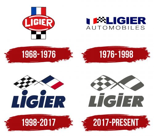
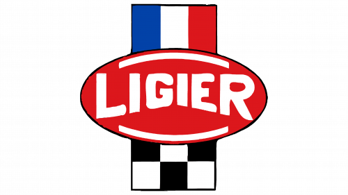
Ligier’s first logo is designed as a winner’s belt, symbolizing achievement and success. The central oval buckle features the company’s name, derived from its founder, Guy Ligier. This element emphasizes the brand’s connection to its creator, a racer who invested his passion and expertise into the company’s development.
The upper section of the belt displays the French flag, reflecting national pride and the company’s connection to France. The lower part of the belt is formed by a black and white checkered racing flag, symbolizing the company’s racing heritage and track successes. These elements highlight that a racer founded the company, and its first car was built for racing.
The logo’s composition also hints at the Ligier JS2 model, crafted in French and based on a race car designed for city driving. This element underscores the company’s commitment to creating high-performance vehicles that combine racing characteristics with everyday usability.
1976 – 1998
Ligier shifted its focus to producing microcars that can be driven without a license. The logo from this period maintains a connection to the company’s racing past. Two flags waving behind the name symbolize forward movement and the pursuit of new achievements. Each capital letter in the logo resembles a separate Ligier car, representing the diversity and innovation of Ligier’s products.
1976, the company entered its team in Formula 1 races, marking a significant historical event. This explains the continued presence of the racing and French flags in the logo. These elements highlight the importance of racing participation and national pride.
1998 – 2017
The brand ended its participation in Formula 1, after which the team came under the management of another businessman. The logo retained the racing theme, symbolizing the importance of this phase in the company’s history. Two crossed flags indicate the end of the race, creating a link to its racing past.
Below the logo, the manufacturer’s name is written in large blue letters, emphasizing the brand’s significant contribution to the development of French motorsports. The blue color represents the continuation of work in engineering and vehicle design.
After leaving Formula 1, Ligier focused on producing small cars and quadricycles. This direction became the company’s main focus, reflecting its commitment to quality and innovation in the automotive industry.
2017 – today
The company introduced a driverless electric bus, marking a new stage in automotive development. The new logo symbolizes progress and a commitment to innovation. The gray color of the emblem highlights the use of safe energy sources, aligning with modern environmental standards. This shade also recalls the company’s racing past, now a part of its history.
Memories of past years remain in the brand’s identity and continue to influence its development. The gray color of the logo connects the past and the future, showing that the brand moves forward while staying true to its roots.
