


![]() Limp Bizkit Logo PNG
Limp Bizkit Logo PNG
The unusual and pretentious nature of the Limp Bizkit logo echoes the band’s scandal and fame. The bright colors in the visual mark convey the powerful energy of the melodies and the tendency to combine different musical styles.
Limp Bizkit formed in 1994 in Jacksonville, Florida. The lineup brought together Fred Durst, Sam Rivers, John Otto, Wes Borland, and DJ Lethal from House of Pain. Early activity stayed within the local underground, with no label support.
A shift came through Korn, who heard the demo and invited the band on tour. In 1997, after signing with Flip Records, an Interscope Records imprint, Limp Bizkit released Three Dollar Bill, Y’all, and toured with Faith No More, drawing mixed reactions from audiences.
In 1999, Significant Other debuted at No.1 on the Billboard 200 with over 643,000 copies sold in its first week. The single “Nookie” drove rotation, while payola claims involving Universal Music Group circulated. Their performance at Woodstock 1999 became associated with crowd unrest.
In 2000, Chocolate Starfish and the Hot Dog Flavored Water sold over 1 million copies in its first week. Tracks like “Rollin'” and “My Way” gained exposure, including use at WrestleMania X-Seven. The Back to Basics tour was backed by Napster. In 2001, Wes Borland left the band. The same year, a fatal crowd incident occurred during Big Day Out in Sydney, increasing scrutiny. The 2003 album Results May Vary, recorded with Mike Smith, did not match earlier sales.
Borland returned in 2004, followed by the 2005 EP The Unquestionable Truth (Part 1) and a pause in activity. The original lineup reunited in 2009 and released Gold Cobra in 2011. After leaving Interscope for Cash Money Records, the planned album was never released.
In 2021, Limp Bizkit issued Still Sucks independently. Compared to Korn, whose releases followed a steadier cycle, Limp Bizkit’s history involved breaks and controversies. In October 2025, Sam Rivers died. Total sales reached about 40 million records, with three Grammy nominations.
Meaning and History
![]()
The logo designers made it a marketing tool, placing the group’s name at the center. The phrase “Limp Bizkit” was coined by vocalist William Frederick “Fred” Durst. Before that, the musicians discussed for a long time which version to choose. They wanted to choose something bright, associated with 1990s heavy metal artists. For example, Bitch Piglet, Split Dickslit, or Gimp Disco. Ultimately, someone said that, due to prolonged arguments, his brain had become like a “flabby cookie.”
Fred Durst picked up an unexpected idea. The frontman changed the spelling of the second word to “Bizkit,” making “Limp Bizkit” the band’s name. This phrase was then added to the emblem and has not been removed since.
What is Limp Bizkit?
Limp Bizkit is an American rock band that emerged in the mid-1990s. They gained fame for their unique blend of genres, including nu-metal, hip-hop, rap, and hardcore. Energetic performances complement their distinctive sound. Many of the band’s albums have become hits, selling millions of copies. The group’s frontman is William Frederick Durst.
1999 – 2003
![]()
In 1999, an American group used an aggressive logo with hellish lettering. The Gothic font is originally stylized. Sharp serifs, spikes, and elegant curves complement the symbols. The base “z” is so long that it reaches up to the “t.” Many letters merge or overlap. There is no space between them, so both words look like one large monogram.
The graphic sign’s palette resembles the fire element. The irregular gradients of red, yellow, and orange evoke dancing flames. The shades are arranged so that the center is light, and the edges, on the contrary, are darker.
2003 – 2011, 2013 – today
![]()
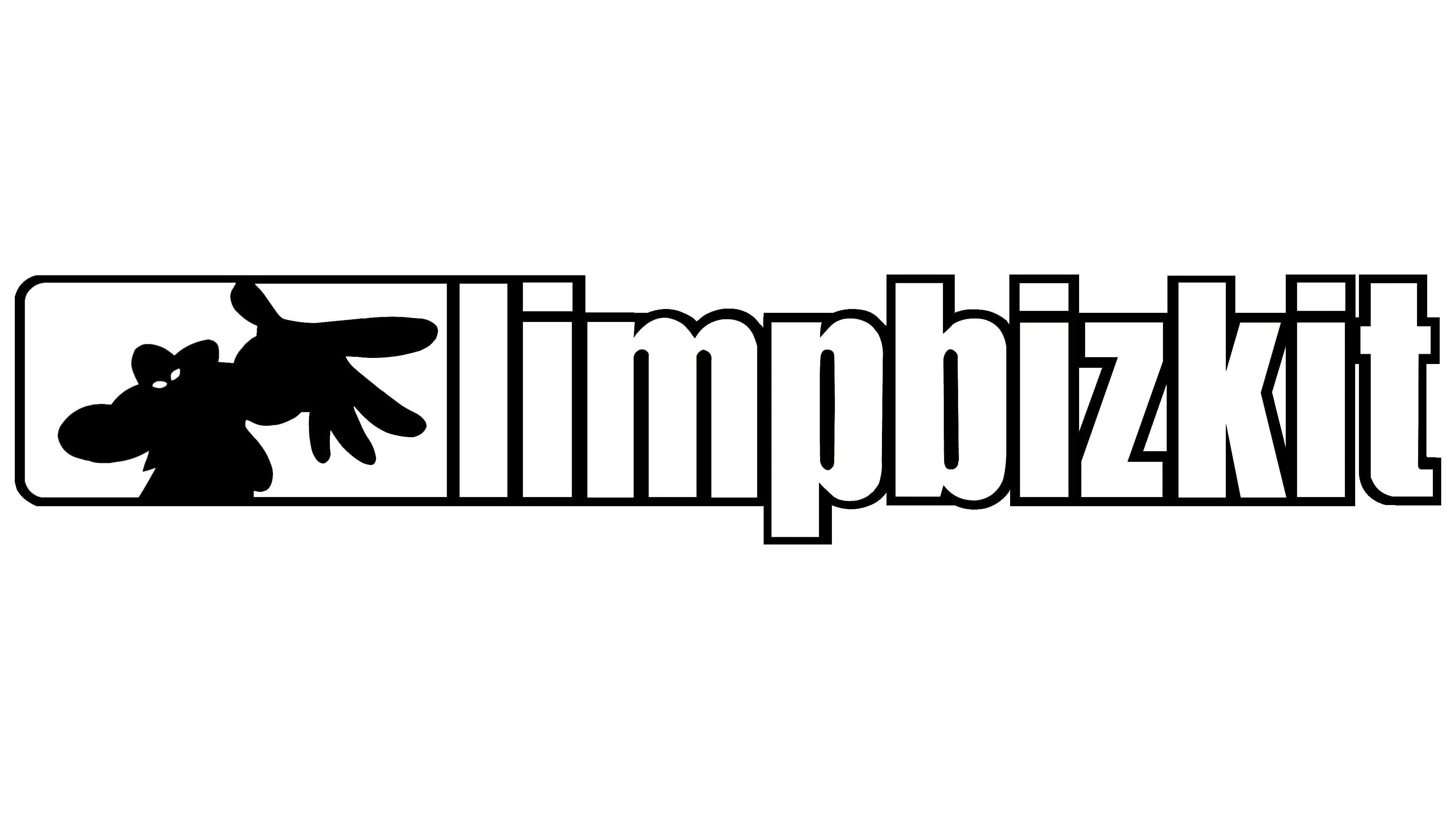
In 2003, the designers completely changed their style. They designed the emblem from scratch, writing the phrase “Limp Bizkit” in bold Plakette-Heavy typeface. All letters are lowercase and vertically compressed. The developers have added an original drawing on the left: a white ghost holding out his hand in an open palm, an inviting gesture.
The phantom silhouette is depicted against a two-color rectangle. The left side of the geometric shape is blue with rounded corners. The right one is black, as the band’s name suggests.
Font and Colors
The modern logo format aligns with current musical trends and reflects the band members’ worldview. Therefore, they gradually moved away from the gothic monogram format, opting for a clear, geometric style. It fits perfectly into the format of their fourth album, Results May Vary.
The letters on the logo are even, smooth, elongated, without thorns and sharp elements. The ghost icon, located to the left of the text, adds a friendly touch. It is a rectangle with rounded left corners but not rounded right corners. The ghost extends his hand forward, inviting him to join him. The phantom’s torso is on the dark side of the rectangle (blue or black), and the hand is on the red side.
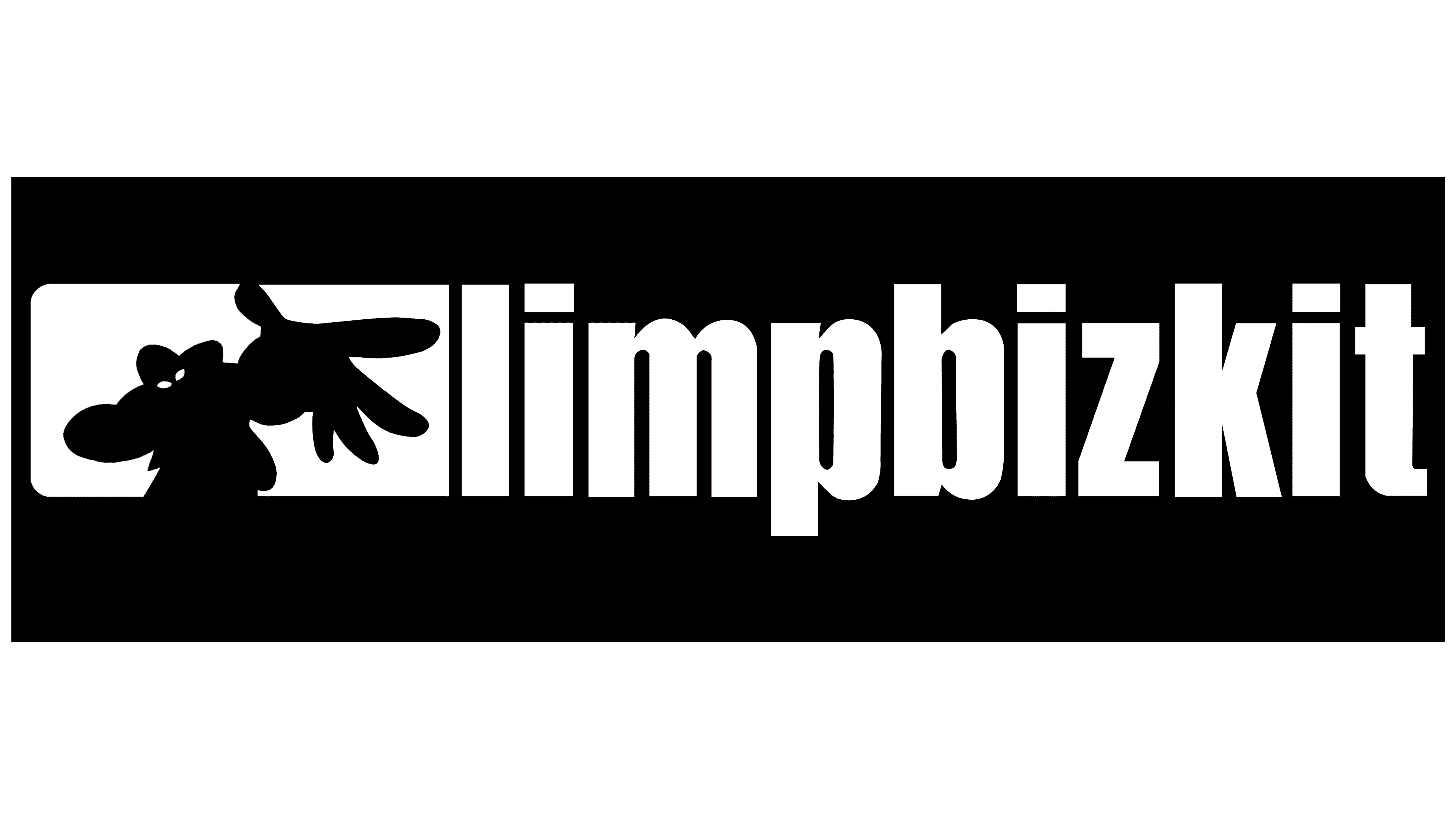
The letters squeezed on both sides are written close to the Plakette-Heavy typeface. They are the same, strictly vertical, but with wide legs, which makes them unshakable, confident, and stable. The design reinforces this: the phrase “limpbizkit” is set in a continuous format.
The logo palette includes the following colors: red (for the letters and the right side of the icon), white (for the ghost that divides the rectangle in two), and blue or black (for the left side of the two-part sign).