The Lion Air logo showcases the company’s vast capabilities, emphasizes its authentic origins, and highlights its high status in the aviation market. It communicates that the airline is ready to provide passengers with comfort and safety during their flight.
Lion Air: Brand overview
Lion Air, an Indonesian airline based in Jakarta, was founded on November 15, 1999. It was founded by brothers Rusdi and Kusnan Kirana, who envisioned creating a low-cost carrier to serve Indonesia’s rapidly growing demand for air travel. On June 30, 2000, the band embarked on its inaugural flight, connecting Jakarta to Pontianak with a leased Boeing 737-200.
From 2001 to 2005, the company aggressively expanded its domestic route network across Indonesia. During this period, the airline began acquiring its aircraft, primarily Boeing 737-300 and 737-400 models, to support its growing operations. This phase of rapid growth laid the groundwork for future ambitions.
In 2006, the air operator made headlines by placing a substantial order for 30 Boeing 737-900ER aircraft, marking the largest aircraft order in Southeast Asia’s history. This significant investment demonstrated the brand’s commitment to expanding its fleet and enhancing its service offerings.
The year 2007 marked the company’s foray into the international aviation market. The airline commenced its first international service, flying from Jakarta to Singapore. This expansion signaled the brand’s intent to become a major player domestically and internationally.
In 2011, the airliner set a new industry record with a groundbreaking order of 201 Boeing 737 MAX and 29 Boeing 737-900ER aircraft. This massive order underscored the company’s growth strategy and its confidence in the future of air travel in the region.
Further expanding its footprint in Southeast Asia, the group established Malindo Air in Malaysia in 2012. This move allowed the group to tap into the Malaysian market and offer enhanced regional connectivity.
However, on April 13, 2013, a Lion Air aircraft faced a significant challenge. The plane landed in the sea near Ngurah Rai Airport in Bali. Miraculously, all passengers and crew members were rescued without any fatalities.
In 2015, the group expanded its operations into Thailand by founding Thai Lion Air. This subsidiary aimed to capture the burgeoning Thai market and strengthen the group’s presence in Southeast Asia.
In 2017, the air operator ordered 50 Airbus A330neo aircraft, a strategic move to expand its long-haul capabilities and cater to a broader international market.
Tragedy struck on October 29, 2018, when Flight 610, operated by a Boeing 737 MAX 8, crashed shortly after takeoff from Jakarta, resulting in the loss of all 189 passengers and crew. This incident, followed by another 737 MAX crash involving Ethiopian Airlines, led to a worldwide grounding of the Boeing 737 MAX fleet. In response, the brand canceled its remaining orders for the 737 MAX, reflecting the broader industry crisis.
Meaning and History
What is Lion Air?
This is a major Indonesian low-cost airline based in Jakarta. It offers affordable flights across an extensive route network covering numerous destinations throughout the country’s vast archipelago and international flights to select cities in Southeast Asia, China, and Saudi Arabia. The company operates one of the region’s largest and fastest-growing fleets of narrow-body aircraft, primarily consisting of Boeing 737 and Airbus A320, optimized for high utilization and efficiency.
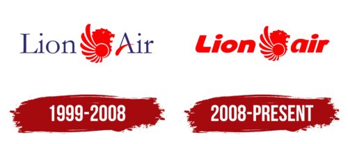
1999 – 2008
The Lion Air logo perfectly aligns with the aviation company’s concept, even though a lion is a terrestrial animal. In this case, it represents a griffin, a mythical flying creature that guards planes, crew, and passengers. According to legend, it wards off misfortune, protects from danger, and promotes prosperity. The lion adorns the livery of every plane in the Indonesian airline’s fleet, instilling confidence and strengthening the spirit. It symbolizes strength, determination, limitless potential, and high responsibility towards clients.
The powerful head profile is so impressive that looking at the emblem leaves no doubt about its professionalism, as the lion is the mighty king of beasts. This symbol suggests that the company can set any rules within its “territory,” including low ticket prices, for which it is well-known.
Part of the space is occupied by fan-shaped feathers, representing wings and significantly impacting travelers because they:
- Attract attention with their unique combination with the lion’s head.
- Demonstrate the airline’s impeccable professionalism.
- Indicate flight comfort and safety.
- Inspire trust in the company by associating it with a bird.
- Emphasize the authenticity of the Indonesian brand.
- Visually enhance the internal dynamics.
The logo is a distinctive mark of reliability, quality, and speed. It conveys Lion Air’s values, advantages, energy, and drive to move forward. The emblem is ideally complemented by red, a color of heightened dynamism. This palette enhances the sense of power and balances well with the blue of the text.
The inscription is divided into two parts and executed in a classical serif font. Long, thin serifs add elegance and conservatism to the logo. This implies that the airline strictly adheres to all technical standards and regulations, guaranteeing passengers an easy and safe flight. The glyphs are narrow and graceful, mostly lowercase, with only the first letters of the words capitalized. Notably, the “A” features a smoothly flying feather instead of a crossbar, symbolizing a soft landing.
2008 – today
An aviation company redesigned and changed the typography of its logo. Through this process, it:
- Made the emblem dynamic
- Showed reliability, strength, and vast capabilities
- Visually harmonized graphic elements
- Demonstrated drive and determination
- Highlighted its professionalism
This was achieved by replacing thin glyphs with bold letters. Each letter symbolizes unity in work, a successful blend of technical foundation and employee knowledge, contributing to increased passenger comfort.
The font style is monolithic and rounded. Despite the large size, all components of the name appear light. Rounded corners indicate smooth problem-solving and the absence of obstacles. Upper and lower case letters are standardized, so the “L” aligns with the height of the “i.”
The slanted glyphs represent great speed, power, and freedom. Thus, clients can fully trust the airline and expect safety and convenience. The bold italics perfectly complement the head of a majestic lion, depicted as an authentic creature from Indonesian mythology.


