Ethiopian Airlines’ logo symbolizes its role as a gateway to Africa and a connector between continents. This emblem reflects Ethiopia’s heritage as the cradle of humanity and its rich history, positioning the airline as a messenger of cultural diversity and historical wealth.
Ethiopian Airlines: Brand overview
Ethiopian Airlines, a national emblem of Ethiopia, operates from its headquarters in Addis Ababa and is the largest airline on the African continent. This prestigious establishment dates back to 1945, making it one of the world’s longest-serving airlines. With its service network extending to over 120 international passenger and cargo destinations, it plays a significant role in global aviation.
The primary operational base of Ethiopian Airlines is situated at Bole International Airport in Addis Ababa. From here, the airline effectively serves an extensive network spanning the entire African continent. Its impressive fleet, which exceeds 130 aircraft, features advanced planes such as the Airbus A350 and Boeing 787 Dreamliner, marking it a modern operator in the industry.
Ethiopian Airlines is an exception in the African aviation market, boasting consistent profitability amidst a rapidly expanding operation. The airline’s ownership lies entirely with the Ethiopian government. However, it is primarily run as a commercially oriented entity with minimal governmental management interference.
With strategic affiliations with ASKY Airlines, Malawi Airlines, and South African Airways, Ethiopian Airlines has expanded its reach and influence. As a member of the Star Alliance, it not only rubs shoulders with global aviation leaders but also holds codeshare agreements with several international airlines.
Besides ferrying passengers, Ethiopian Airlines has diversified its services to include cargo transport, aerospace manufacturing, and aviation training. Its relentless growth, operational efficiency, high service standards, and role in bridging Africa with the rest of the world have been well acknowledged and appreciated globally.
Meaning and History
What is Ethiopian Airlines?
Ethiopia’s national flagship carrier, based in Addis Ababa, is one of Africa’s largest and most established airlines. It operates an extensive network of domestic and international flights, serving destinations in Africa, Europe, Asia, America, and the Middle East. The company is known for its modern fleet and is a member of the Star Alliance.
1950s
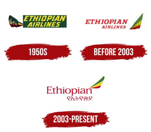
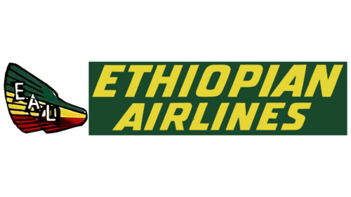
Ethiopian Airlines, the distinguished national carrier of Ethiopia, was founded in the 1950s. The design of its initial logo was meticulously planned to reflect the country’s cultural heritage and national symbols. The emblem featured an airplane depicted in the national colors of Ethiopia: green, yellow, and red. These colors were chosen to promote recognition and evoke pride in the national carrier.
On the left side of the logo, two corrugated wings evoked the feathers of a mythical bird poised for flight. These stylized wings symbolized a desire for freedom and progress, resonating with many passengers and Ethiopian citizens.
The wings displayed the letters “EAL,” the abbreviation for Ethiopian Air Lines. Placing the letters on elements associated with flight strengthened the connection between aviation and freedom of movement.
The green rectangle in the design symbolizes Ethiopia’s endless evergreen forests and savannas, filling the logo with a sense of the nation’s natural beauty and fertile lands. Against this background, the airline’s name, Ethiopian Airlines, was emblazoned in shining golden letters, giving the image a regal and distinguished look.
The vibrant colors and carefully chosen elements of the first Ethiopian Airlines logo conveyed the essence and culture of Ethiopia and demonstrated the airline’s profound connection to its national heritage.
Before 2003
Ethiopian Airlines’ 2000s logo, a vital part of its brand identity, proudly features a two-tiered name. This aesthetically pleasing and meaningful design highlights the company’s history and development.
The first tier displays the word “Ethiopian” in a large, noticeable font. The passionate red color of this inscription is deliberate—it symbolizes the dynamism, passion, and rapid development that has characterized the airline for decades. This color emphasizes the greatness and power of the airline, making its name memorable and striking.
The second tier features “Airlines,” reminding us of an important change in the company’s history. Since 1965, when the airline changed its name from Ethiopian Air Lines to Ethiopian Airlines, this word has become a central element of its identity. Placing this part of the inscription on the second tier highlights the brand’s longevity and stability.
On the right side of the logo, the tail of an airplane peeks out, painted in the colors of the Ethiopian flag: green, yellow, and red. This element symbolizes the airline’s readiness for new heights and achievements. The tail, depicted on the logo, creates a sense of movement and freedom, focusing on the international nature of the company’s activities.
The logo is set against a clean white background, enhancing the red color’s brightness and clarity and making the image concise and elegant. The white background helps the logo be perceived as a symbol of the reliability and high quality of airline services.
2003 – today
The logo of Ethiopian Airlines, designed at the turn of the millennium, features two tiers of inscriptions in both English and Amharic, rendered in bright red. This color choice is deliberate—it symbolizes passion and dynamic development, highlighting the importance and stability of the brand on a global scale. The inscriptions, placed one above the other, create a harmonious dialogue between two cultures, emphasizing the multicultural and international character of the company. This design element reflects a deep respect for national roots and pride in representing Ethiopia internationally.
As the company celebrated its 60th anniversary, it aimed to emphasize its commitment to Ethiopia’s historical and cultural values, a commitment reflected in the design of its corporate emblem. This logo has become a symbol of continuing tradition while striving for innovation and new achievements.
Three lush feathers stand out to the right of the inscriptions, colored in the Ethiopian national flag’s green, yellow, and red. These feathers are not merely decorative; they seem to unfurl in a dance, symbolizing freedom, ease, and the company’s aspiration toward new horizons.


