The Lipton logo radiates sunlight, which shimmers with bright rays against the background of a circle with a yellow gradient. On the other hand, the emblem represents a sparkling drink and resembles an overhead view of a cup of freshly brewed tea or even a slice of lemon. Whatever this symbol means, it looks positive and friendly.
Lipton: Brand overview
| Founded: | 1890 |
| Founder: | Ekaterra |
| Headquarters: | United Kingdom |
| Website: | lipton.com |
Meaning and History
“Straight from the plantation into a cup” is the first slogan Lipton came up with to make such drinks affordable for ordinary people but without losing quality.
Queen Victoria herself appreciated this tea. She called it “the English lifestyle.” Thomas Lipton got a resounding success for “tea bags” due to his market flair and experiments in advertising campaigns.
The emblem represents the country as a state with deep tea traditions.
The very first symbolism was in the form of yellow silhouettes of sailing ships. In this way, tea clippers delivered solar tea from about – Ceylon to the British, where Thomas Lipton was the owner of the tea plantations.
Now the logo has been slightly modified. And the main element of the designers put a shining sun disk, without any boundaries. Residents of Great Britain, where the sun is a rare guest, liked this bright symbol. The last logo change was made in March 2014.
What is Lipton?
It is a manufacturer of cold drinks that contain tea and various flavors. The assortment of the company also includes instant soups.
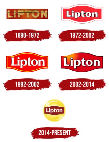
1890 – 1972
At first, the founder of the brand was given the central place in the corporate logo. His portrait, painted in dark red, is on the right. Under it was the personal signature of the tea manufacturer. The left area was occupied by the phrase “Known All Over the World for its Supreme Quality.” The proposal was divided into several fragments and placed in a column that reached the same height as the portrait.
The legal owner of the trademark and its official status was indicated next to it in small print. All these elements took center stage against the lemon yellow background. Above and below, there was a wide red stripe indicating the type of tea and the brand name. That is, it was an advertising and informational logo that adorned cans and packaging.
1972 – 2002
Since the second half of the 20th century, the emblem has changed dramatically. During the redesign, the developers removed most of the text data, leaving only the word “Lipton.” They placed white lettering with black shadows on a horizontal scarlet rectangle. The figure had an arcuate extension in the center, the convex sides of which looked up and down. There was a double edging along the edges – a thickened white stripe (inner) and a thin red (outer). Thanks to the dark shadows added to the letters’ right side, the lettering looked three-dimensional, with a 3D effect.
1992 – 2002
After the revision, the curly base of the logo became more elegant, for which the designers increased the bulges on both sides. And it was also repainted in bright red and got a yellow line drawn along the edge, repeating all the curves. The designers supplemented the white letters with uneven brown shadows to make the inscription stand out better against the scarlet background. For the word “Lipton,” a custom bold font was used with concave strokes of various thicknesses, disproportionate cuts, and graceful curves.
2002 – 2014
Another adjustment made the logo much simpler. The double stroke has disappeared from it. Only the inscription on the convex rectangle remains. Moreover, the signs changed their style – they acquired serifs and some elongation. The background color has changed from scarlet to burgundy.
2014 – today
Leaving the basic elements in place, the designers added a yellow-solar circle. They moved the red shape to the center, and removed all the black strokes, made the letters rounded with sharp serifs at the ends. The background was chosen yellow with gradient transitions and crescent-shaped highlights. It also has round reflections – bright sunbeams, which make the logo welcoming and friendly.
Lipton: Interesting Facts
Lipton, known worldwide for tea, started over a century ago by Sir Thomas Lipton.
- Starting Small: Sir Thomas Lipton opened grocery stores before diving into the tea business. He aimed to make good, affordable tea for everyone, a new idea back then.
- Buying Tea Gardens: In the 1890s, Sir Thomas bought tea gardens in Ceylon (now Sri Lanka) to cut out middlemen and lower prices. This allowed him to oversee everything from growing to selling the tea, ensuring it was good and affordable.
- Yachting and the Lipton Cup: Sir Thomas loved yachting and tried to win the America’s Cup, a big sailing trophy. He never won, but he’s remembered for his spirit and love for the sport. The Lipton Cup, a yachting prize, honors him.
- Innovative Packaging: Lipton was the first to pack tea in sealed, lead-lined boxes. This kept the tea fresh longer by protecting it from moisture and dirt.
- Tea Bags: While Lipton didn’t invent the tea bag, it helped make it popular. Introduced in the 20th century, tea bags made drinking tea more convenient and helped Lipton grow worldwide.
- Worldwide Reach: Lipton sells all sorts of tea, like black, green, and herbal, in over 100 countries. They adjust their flavors to fit what people in different places like.
- Sustainability: Lipton is working on being more eco-friendly, especially regarding how it gets its tea. It’s ensuring its tea comes from places that are good for the environment and the people working there.
- Part of Unilever: In the late 20th century, Lipton joined Unilever, a big company that owns many brands. This helped Lipton do more research and sell their products better.
- Focusing on Health: Lipton is promoting tea’s health benefits, such as its antioxidants, more these days. They’re researching how tea can be good for us.
- Cultural Role: Lipton is more than just tea; it’s part of many cultures worldwide. The brand supports big events and community projects, making it a familiar name in many places.
From its humble beginnings to becoming a major global brand, Lipton’s success is about innovation, commitment to quality, and Sir Thomas Lipton’s lasting legacy.
Font and Colors
The first logos were with a dark green background. This stood out the tea leaf’s color, and the yellow disc was depicted in the distance. Then the green color was slightly dimmed, and the yellow glow of the sun increased. Today, depending on the type of tea, the logo’s background varies from dark green to yellow.
In the 19th century, it never occurred to anyone to think about such an element as a font. And the first one to order a special design for tea packaging was Thomas Lipton. The hundred-year history of this tea has not changed the completely restrained, conservative letters.
FAQ
What does the Lipton logo mean?
The first Lipton tea logo featured yellow silhouettes of sailboats called tea clippers, which brought tea from Ceylon to the UK. It also included a small sun, symbolizing warmth and energy.
Today, the logo features a radiant solar disc. The sun’s boundaries are so vague that they blend into the entire package. This design represents warmth, energy, and the bright, uplifting experience of drinking tea. The sun symbolizes positivity and refreshment.
This symbol has created a strong visual uniqueness for the brand, making it easy to recognize tea drinkers worldwide.
What font does Lipton use?
Lipton uses the Intro Script font, part of the Fontfabric type family. This font is part of the Intro type system and is used in the brand’s packaging. Intro Script’s stylish and modern look fits the brand’s vibrant image.
The choice of this font helps create a distinctive and recognizable visual uniqueness for the brand. The script’s flowing lines and elegant design add sophistication to the packaging, making it appealing to consumers.
Combining this elegant font and the iconic sun logo ensures the brand remains easily recognizable and stands out on store shelves.
What are the elements of the Lipton brand?
The brand is based on the Innocent archetype, promoting positivity, optimism, and thoughtfulness. This creates a sense of trust and comfort for consumers. The brand includes elements of the Jester archetype, emphasizing fun, joy, and living in the moment. These playful aspects make the brand more engaging and relatable.
A key element of the brand is the color yellow, representing warmth, energy, and happiness. This color captures the brand’s spirit of positivity and joy, making products stand out on shelves and conveying a sense of sunshine and refreshment.
Combining these elements—Innocent and Jester archetypes with the prominent use of yellow—creates a unique and recognizable brand identity.
Is Lipton Israel a product?
Lipton tea is sold in Israel but is not an Israeli product. It is a British brand founded by Sir Thomas Lipton. The brand has become a globally recognized name in the tea industry.
Though available in many countries, including Israel, the brand remains a British brand owned by Unilever. The brand sources its tea from various regions worldwide to ensure high quality.
In Israel, the brand is popular and widely available. It is important to note its British origins and global reach. The brand’s strong presence in Israel is part of its extensive international market.
Is Lipton tea being discontinued?
The brand sometimes discontinues certain products and introduces new ones, but the brand itself is not leaving the market.
Some flavors or packaging options might be phased out to make way for new offerings, keeping the brand relevant and appealing. Core products like classic black tea and green tea remain available.
The brand focuses on maintaining quality and introducing new varieties to satisfy diverse tastes. Despite changes in specific products, the brand is committed to offering its customers a wide range of teas.
What is the logo of Lipton Tea?
The logo has a yellow sun circle as its base. Inside this circle is a red plate shaped like a rectangle with curved top and bottom edges. The brand name is displayed in white letters on this red plate.
This design represents warmth, energy, and positivity, matching the brand’s values. The yellow sun stands for brightness and a refreshing experience. The red plate adds contrast, making the logo stand out. The white letters are clear and easy to read.
This combination of elements creates a vibrant and memorable logo. The bright colors and simple shapes make the logo appealing and effectively convey the brand’s message.
Does Unilever own Lipton?
The company is co-owned by Unilever and PepsiCo. Unilever manages the marketing and distribution of hot tea products, while PepsiCo handles ready-to-drink beverages.
This partnership helps the company expand its global market presence. Unilever brings expertise in product development and marketing, ensuring the teas stay high quality and appealing. PepsiCo uses its extensive distribution network to make Lipton’s ready-to-drink products widely available.
Together, these companies keep the brand a leading name in the tea industry. They offer a wide range of products to consumers worldwide.
