The brand strives to show that it is ancient and its products are based on the legendary formula, so the trademark uses the Lite Beer logo in the old English style. He convinced consumers of his idea thanks to their identity, although the beer recipe was developed in the 20th century. The concept of the trademark emblem is an attraction to the classics of the genre.
Lite Beer: Brand overview
The light beer we know today traces back to 1967 when Rheingold Breweries launched Gablinger’s Diet Beer. This innovative brew, developed by biochemist Joseph Owades, offered fewer calories and carbs than traditional beers. However, its lackluster taste prevented it from gaining popularity.
In 1972, Owades, then working at Meister Brau Brewery in Chicago, refined his brewing process to remove starch from grain before fermentation. This breakthrough produced a beer that was lower in calories and carbs and had a more appealing taste than Gablinger’s. Despite this improvement, Meister Brau’s financial troubles hindered the promotion of the new beer.
The game-changer came in 1973 when Miller Brewing Company acquired the formula and rights from Meister Brau. Miller rebranded the beer as “Miller Lite” and launched it with an aggressive national marketing campaign. Using the slogan “Everything you always wanted in a beer. And less.” and featuring celebrities like John Madden and Mickey Mantle, the campaign dramatically boosted Miller Lite’s sales. This success prompted other beer giants, such as Anheuser-Busch with Bud Light, Coors with Coors Light, and Schlitz with Schlitz Light, to introduce their versions of light beer in the late 1970s and 1980s.
These launches significantly expanded the light beer market, establishing it as an essential beer category. As consumer preferences shifted towards healthier options in the 1980s and 1990s, the popularity of light beer surged, with Bud Light eventually becoming America’s best-selling beer.
Despite facing new challenges from the craft beer movement and the emergence of hard seltzers in the 2000s, light beer has maintained its relevance in the beer market. Breweries continue to innovate by offering light versions of diverse beer styles, including IPAs, lagers, and more, catering to the evolving tastes of health-conscious consumers.
Meaning and History
Good beer has always been highly prized in America. Therefore, high-quality varieties of well-known brands easily won the buyer’s attention, and the distribution geography across the states was rapidly expanding. This also happened with the Miller Lite Beer products.
It is an unremarkable name, simple but poignant. Behind this name stands quality, a powerful advertising campaign, and bright graphic design.
Miller Lite was the first light beer in the United States. In 1970, even professional athletes began to drink it. The brand was introduced nationally in 1975. In 1977, Miller Lite reached # 2 on the list of the most popular light beer brands in the US market.
The name was originally “Lite Beer from Miller,” which persisted into the late 90s. The idea came from a simple recipe from chemistry professor and biochemist Joseph L. Owades in 1967 to the Chicago-based Peter Hand Brewing Company. A group of investors, Peter Hand Brewing, was interested in the proposal to produce this beer. Then, the first production capacities, the first financial problems, and the first expansions appeared. In 1972, financial difficulties ended, and the group Meister Brau Brewing transferred the ownership of the Miller labels. In the late 90s, massive advertising campaigns began, and the brand began sponsoring sports firms such as NASCAR.
The Miller Brewing Company brand logo was a white italicized Miller lettering, slightly raised and underlined. Irregular triangle shape. Rather, it looked like a hoist or an arrow carrying letters upward. It should be noted that the letters are made in medieval graphic style. In the background is a bald eagle with open copper wings, and in its paws, it holds spikelets. It is depicted in the center of the frame with a red center, at the very bottom of which there is the year of the beginning of the production of intoxicating drinks – 1988. The frame seems to lie on the spikelets and heads of hops. The small letter “r” indicates that the mark is registered. In general, the logo resembles the graphic motifs of the ancient Romans.
It is important to note that Miller releases different products under its name, so the Lite Beer logo has a way of improving and becoming more recognized by the public.
What is Lite Beer?
Lite Beer is the same as Miller Lite, one of Molson Coors Beverage Company’s beer brands. This brand produces several varieties of North American pilsner-style lager. It was introduced in 1975, but brewer Joseph Lawrence Owades developed the original drink recipe eight years earlier. On the labels of light alcohol, its first name, Lite, was first written. And in 1998, it was renamed Miller Lite and received the corresponding logo.
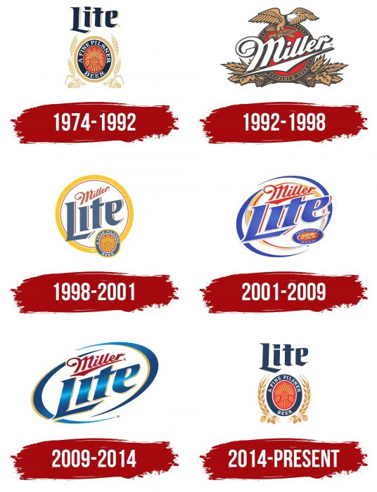
1974 – 1992
Large letters in a dark shade with a white border on the right have formed the graphic “Lite.” A light gold circle with spikelets growing on the sides. A red oval insert is in the middle with the inscription “A Fine Pilsner Beer.” The words are highlighted in white, and a bundle of spikelets is depicted in a red oval. The logo represents an eclectic image that averages the medieval tradition of calligraphy and the modern interpretation of writing and drawing.
1992 – 1998
The logo has undergone a radical change. In the first place, the inscription “Miller” was displayed in large letters. Above the inscription is a large eagle with wings spread to the side.
1998 – 2001
The new logo from 1998: the lettering does not change the font, but changes color – to gray – and a three-dimensional outline of the letters in muted red and white “Lite” appears. Above, in a soft red, as if faded, in italic calligraphic type, “Miller.” All this is outlined in a yellow circular outline, wide enough and noticeable. And on the bottom right is a label with a bundle of spikelets, as it was before. This is now a more complex logo image, which is more credible due to the details.
2001 – 2009
The logo seemed to be crushed, pulled, and unfolded. Dynamics appear; the Middle Ages are gone. Now, the logo reflects speed, reaction, and impulsiveness. Vivid reds and blues appear in the image. An irregularly shaped triangle underlines the inscription “Miller”; the former font has ceased to carry the spirit of past centuries; it already looks like a flying inscription. The blue color unambiguously adds lightness of perception and purity, even freshness and coolness—great associations with cold beer, especially on a hot summer day. Competent logo modification paid off – the company’s profits grew again.
2009 – 2014
These are almost the same colors, only more saturated and juicy. The blue took on an ultramarine gradient that looked good on labels. From an early circular logo, this elongated oval was born. It is formed from deformed hemispheres; in the center, there are two words, as before, but visually, there is white space, which gives a feeling of lightness and not congestion of perception.
2014 – today
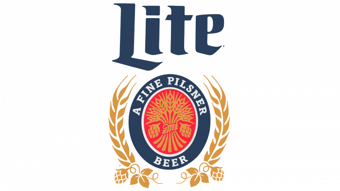
Return to the old forgotten logo. Like in the Middle Ages, a serif typeface centered on the word “Lite” now without shadow outlines. Below is a dark blue oval with a gold rim, spikelets, and hops. As before, a red oval with wheat is also inside the logo.
Lite Beer: Interesting Facts
Miller Lite, first known as “Lite Beer from Miller,” is a trailblazer in the light beer scene, changing how beer is marketed and enjoyed. Since its launch in 1975, it’s become a favorite for those wanting a beer that’s light on calories and alcohol but still tastes good.
- Starting: Introduced by Miller Brewing Company, Miller Lite quickly emerged as one of the first light beers in the U.S., attracting drinkers looking for a healthier option without losing out on flavor.
- Iconic Ad Campaign: Miller Lite’s ads’ “Tastes Great, Less Filling” slogan became legendary. It featured debates among celebrities and athletes about the beer’s best features, making it a marketing success.
- Changing the Game: Miller Lite created the light beer category, encouraging other companies to offer their versions of light beer, transforming the beer world.
- Health Appeal: Its lower calorie and carbohydrate content made it a hit with health-conscious drinkers, offering a lighter alternative without sacrificing alcohol content.
- Cultural Staple: Miller Lite has made its mark on American culture, sponsoring sports events and becoming a regular sight in bars and games. It symbolizes friendship and good times.
- Innovative Packaging: The brand has introduced unique packaging, such as the vortex bottle and punch-top can, which enhances the drinking experience.
- Brewing Excellence: Known for its brewing process with a special hop blend, Miller Lite delivers a light but flavorful beer that pleases those who want a lighter option without compromising taste.
- Award-Winning: Despite some skepticism from craft beer lovers, Miller Lite has earned awards, including gold medals at the Great American Beer Festival, proving its quality.
- Staying Popular: Decades later, Miller Lite remains a top-selling beer in the U.S., adapting to new tastes while keeping its classic light beer identity.
Miller Lite’s journey reflects its role in pioneering a new beer category, backed by smart marketing and a focus on taste and quality, making it a lasting favorite among beer drinkers.
Font and Colors
The main palette is dark blue, red, golden wheat, and white. In 2005, Michael Hagmann created the typeface Draft Beer.
FAQ
What is the Miller Lite slogan?
The Miller Lite slogan “Great Taste, Less Filling” became popular in the 1970s. It effectively communicated that their beer offers a rich flavor without causing the drinker to feel overly full. The slogan suggested a beer that was ideal for those wanting healthier options. Miller Lite’s advertisements featured celebrities debating whether the beer’s appeal was its flavor or lightness, making the slogan even more memorable. This marketing strategy positioned Miller Lite as a leading choice among light beers, showing that reducing calorie intake doesn’t mean sacrificing taste. Despite Miller Lite introducing other slogans over the years, “Great Taste, Less Filling” continues to be closely associated with the brand, emphasizing the ability to enjoy a flavorful light beer without drawbacks.
What was the original Lite beer?
In 1967, Rheingold Brewery in New York introduced Gablinger’s Diet Beer. This beer had fewer calories, a concept created by Dr. Hersch Gablinger from Switzerland in 1964. He developed a way to brew light and flavorful beer aimed at people who were conscious about their health but still wanted to enjoy a beer. Initially, Gablinger’s Diet Beer didn’t attract many buyers because the idea of a “diet beer” was new and not widely accepted. However, this beer laid the groundwork for the light beer category, which has since become popular for those looking to reduce calorie intake without sacrificing taste. Although Gablinger’s wasn’t a success initially, it paved the way for a market allowing beer enthusiasts to enjoy lighter options.
What is the difference between Lite and light beer?
“Lite” and “light” mean different things in beer. “Lite” is a unique spelling used by certain brands, such as Miller Lite, to show their beer has fewer calories but still tastes great. “Light” beer is any beer designed to have fewer calories and carbs than standard beers, regardless of the brand. “Lite” focuses on specific brands with a unique spelling, whereas “light” beer offers a lower-calorie option across various brands. Both types provide a way to enjoy a beer with fewer calories.
What type of beer is Miller Lite?
Miller Lite is a light beer that has been around since 1975. This beer, produced by Molson Coors in Chicago, was one of the earliest light beers in the United States. It offers a milder flavor and fewer calories compared to traditional beers. This choice quickly gained favor among those who prefer an easy-to-drink beer without extra calories. It sparked the trend towards light beers, encouraging other companies to create their versions. Despite the presence of beers like Miller Genuine Draft and Miller High Life in the market, Miller Lite is notable for its lighter yet satisfying taste. It has become a preferred choice among many beer enthusiasts, demonstrating that light beers can be equally enjoyable as their fuller counterparts.
What is the meaning of the Lite Beer Logo?
The Lite Beer logo is designed to convey much information quickly, emphasizing that it is a lighter beer with fewer calories. The word “Lite” is prominently featured, highlighting that this beer offers great taste with fewer calories. It also identifies itself as a “FINE PILSNER BEER,” indicating that it’s a golden and crisp pilsner, not just light beer. The presence of hop cones and grains in the logo signals the use of real, natural ingredients, ensuring a quality beer experience. Additionally, an old-style font pays homage to traditional beer-making methods, blending respect for history with a modern look.
What does the logo symbolize, the Lite Beer Logo?
In 2014, Lite Beer reintroduced its original 1974 logo as a nod to its rich history. The logo features images of grain and hops, key ingredients in beer, highlighting its commitment to quality and natural ingredients. The logo prominently states, “A FINE PILSNER BEER,” indicating it’s a distinctive type of light beer known for its clear, golden appearance and hoppy flavor. By reviving the old logo, Lite Beer demonstrates pride in its origins and its ongoing commitment to traditional, high-quality beer making.
What is the Miller Lite logo?
The Miller Lite logo highlights the brand’s essence: a good, light beer that respects brewing traditions. At the center, a red oval features a large ‘M’ for Miller, with images of barley and hops around it, showing the beer’s ingredients. The dark blue border makes the design stand out and mentions “A FINE PILSNER BEER,” indicating that this beer is a special, tasty light beer. The sides are decorated with barley and hops in gold, emphasizing the use of high-quality materials. Above, the word “Lite” is written in fancy blue letters, giving a nod to the rich history of beer brewing.
When did Miller Lite change their logo?
Over the years, the Miller Lite logo has evolved to stay in tune with people’s preferences and represent the beer’s essence. In 1992, the logo featured a bald eagle, symbolizing strength and an American feel. By 1998, they opted for simplicity, showcasing the beer’s name within a yellow circle for a cleaner and more noticeable design. In 2001, the addition of a double ring and increased use of blue aimed to give the logo a fresh appearance that reflects the beer’s light and refreshing nature. In 2009, the design was updated to a more modern and sleek look by reducing the yellow. In 2014, Miller Lite took a significant step by reviving its original logo, highlighting corn, hops, and an oval shield. Each update of the logo has been a way to keep the brand current while paying homage to its heritage.
