Lucozade, a well-known British brand of soft and energy drinks, has introduced a new logo and packaging designed by Pearlfisher. This update aims to enhance the brand’s visual appeal while maintaining its established identity.
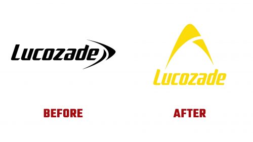
The new logo keeps the essential elements that make Lucozade recognizable but introduces significant refinements. The wordmark has been streamlined, softened, and boldened, creating a more balanced and cohesive presence. The old logo’s spiky notches and italicized font have replaced smoother lines and a more robust typeface, improving readability and modernity.
One of the most notable changes is the separation of the wordmark from the icon, allowing each element to stand out distinctly. Previously, the wordmark and icon blended, causing the icon to appear too small. The updated design has simplified and broadened the icon, creating a more substantial and impactful visual.
The iconic arc, symbolizing Lucozade’s energy, has been redrawn and modernized. It now features a vibrant, optimistic yellow, which enhances the brand’s credibility and adds a dynamic sense of momentum. The arc has been repositioned to radiate upwards, complementing the horizontal placement of the wordmark, which together convey a sense of forward movement and energy.
The new packaging design introduces a flexible graphic system that differentiates between Lucozade’s various product ranges. For the Energy range, the packaging features a background of pure bubbles, emphasizing the drink’s enthusiasm and vitality. The Sport range uses an athletic, mesh-like pattern reminiscent of sportswear, highlighting the product’s association with physical activity and performance. For the Zero range, a white gradient at the top evokes lightness, aligning with the product’s lower calorie content.
This updated design approach ensures that each product range is visually distinct while maintaining consistency under the unifying arc symbol. Using vibrant yellow for the logo across all product variations reinforces brand recognition and ownership of this color within the energy drink category.
The supporting graphics, including bubbles and mesh patterns, complement the arrow icon, enhancing the overall visual impact without overwhelming the design. This commitment to cohesive design elements across different product lines helps maintain a unified brand identity that is both recognizable and appealing.
The revamped packaging incorporates modern textures and graphics that reflect the quick energy boost that Lucozade promises. The new design system is visually striking and functional, allowing flexibility in showcasing different product benefits while maintaining the brand’s energetic essence.
This redesign by Pearlfisher rejuvenates the Lucozade brand, making it more appealing to long-standing fans and new customers. The modernized logo and packaging reflect the brand’s heritage while positioning it at the forefront of the energy drink market. The updated visual identity enhances Lucozade’s shelf presence and strengthens its market position.


