The Mandom logo features an Asian ^^ emoji and a stylized “M” for a Japanese cosmetics brand. The designers filled the emblem with a joyful mood to make it look like an expression of happiness. But the emotional degree of the symbol is somewhat reduced by the black color scheme and a strict inscription at the bottom.
Mandom: Brand overview
| Founded: | December 23, 1927 |
| Founder: | Shinpachiro Nishimura |
| Headquarters: | Osaka, Japan |
| Website: | mandom.co.jp |
Meaning and History
Japanese businessman Shinpachiro Nishimura established the Kintsuru Perfume Corporation in 1927 and began mass-producing cosmetic products. It was made successful by Tancho Stick lipstick, which gained wide popularity. Then, in 1933, the company focused on men’s skincare, but it still wasn’t as popular as lipstick, so management eventually renamed the business Tancho Corporation. This happened in 1959.
However, the second launch of funds for men was more successful. The series was called Mandom and was introduced by a Japanese cosmetics company in 1970, becoming its first product to be released outside the country. Especially for this, the manufacturer launched an advertisement with the participation of Hollywood celebrities. After a few weeks of marketing videos, the line has become the #1 selling men’s grooming brand in Japan.
After receiving high demand for new products, the company changed its name to Mandom. This event is dated 1971. The rapid growth in sales has considerable merit and the original identity. The fact is that the name of the series (and then the corporation) comes from the end of two keywords: huMAN (man) and freeDOM (freedom). Allegorically, this means respect for human dignity and freedom of choice.
Gradually, the Japanese cosmetic manufacturer introduced other lines, which became independent trademarks. It became a public company in 1988 and expanded its international presence in the 2000s. Therefore, its symbolism is well known abroad today. In total, there are three emblems in the brand’s arsenal.
What is Mandom?
Mandom is a Japanese cosmetics corporation with several sub-brands that produce men’s and women’s skin and hair care products. She owns Pucelle, Pixy, Bifesta, Lucido (two lines), and Gatsby. The company was founded by Shinpachiro Nishimura in 1927 and was first called Kintsuru Perfume Corporation and then Tancho Corporation. She received her current name in 1971. Its head office is located in Osaka.
1971 – 1983
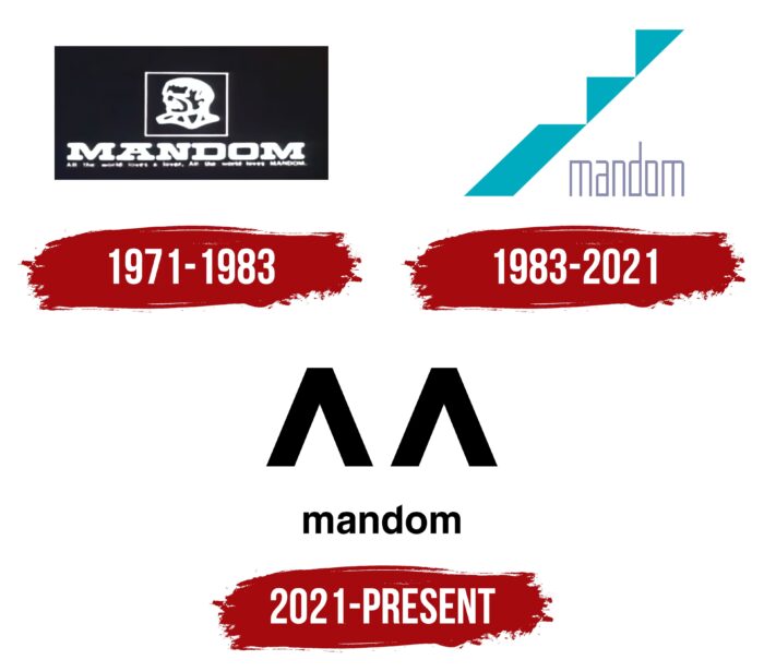
The first logo of the Mandom corporation is associated with a line of men’s cosmetics for maintaining personal hygiene. The sign is designed in a monochrome palette and looks like a silver print on a dark plate. This is the “coat of arms” of the company – a contour portrait of a serious man who looks to the left. His head is located in profile and is composed of thin strokes. The background is a black rectangle with a white border. Below is the name of the company in bold capital letters. The symbols are large, geometric, and decorated with massive serifs.
1983 – 2021
After a redesign in 1983, the cosmetics company received a super modern badge. It conveys the concept of continuous development, improvement, and moving forward. The logo has become minimalistic and abstract, consisting of several shapes in turquoise. These are two triangles and one parallelogram. They are interconnected so that they form the steps of a diagonal staircase leading up. Below them is the corporation’s name, which consists of thin and elongated characters painted in a light gray tint. The Intra-letter space of each of them has the form of a vertical rectangle.
2021 – today
The current version of the logo is even more stylish than the previous one. It is also allegorical and testifies to the constant growth and progress of the cosmetic corporation. The new emblem consists of two elements that resemble arrows upward. They look like victory signs (V) or the letter “M,” with fragments placed at a small distance from each other. The text part is represented by the word “mandom” in lowercase and sans-serif. The lines of the letters are rounded, smooth, and graceful, with a vertical stripe at the “d,” cut diagonally.
Font and Colors
The evolution of the Mandom logos is one of continuous simplification. If earlier the visual identity contained few graphic elements and many written ones (name + slogan), the opposite is true. It consists of several geometric shapes and only one inscription. At the same time, designers focus on combining the concept and identity, which they successfully succeed.
Each of the three logos of this Japanese brand uses its typeface, which is not repeated in any options. So, the inscription is made in bold grotesque in the debut emblem. The Offroad Light font (developed by Grype) is used with rounded outer corners in the second case. The third version favors a typeface reminiscent of Alte Haas Grotesk Bold with a diagonally cut top at the “d.” The corporate logo palette is not numerous: it is dominated by black, gray, white, and turquoise.
Mandom color codes
| Black | Hex color: | #000000 |
|---|---|---|
| RGB: | 0 0 0 | |
| CMYK: | 0 0 0 100 | |
| Pantone: | PMS Process Black C |

