Manulife: Brand overview
In 1887, Toronto was home to a new Canadian life insurance company: the Manufacturers Life Insurance Company, which we call Manulife today. This company was one of Canada’s first life insurance companies. Just ten years later, in 1897, the company went overseas with its first deal in China, signaling the development of its ambitions internationally.
In the early 1930s, targeting the American market, Manulife gained a foothold in the United States through a strategic partnership. This partnership eventually evolved into the renowned John Hancock Financial. As the shadows of war receded, Manulife began to grow, absorbing smaller insurance companies and expanding its Canadian territory.
In 1999, Manulife’s status was elevated by its merger with Dominion of Canada General Insurance Company, further cementing its dominance in the domestic market. At the dawn of the new millennium, Manulife’s aggressive international aspirations materialized. This period was marked by acquisitions in the Asian insurance sector, allowing the company to become a prominent figure on the global financial scene.
A landmark event in 2009 was the merger of Manulife with John Hancock. This move brought together US companies under the broad umbrella of Manulife. Manulife now has a presence in more than 20 regions around the world and serves approximately 30 million clients. The company’s influence is undeniable, with more than $1.2 trillion in assets. And today, the company’s heart beats in Toronto, where it was born. With the title of Canada’s leading insurance organization, Manulife has also carved a niche for itself in Asia and is steadily growing its asset and wealth management operations globally.
Meaning and History
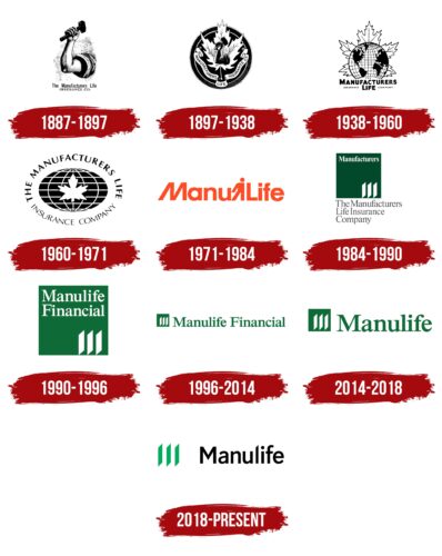
1887 – 1897
1897 – 1938
1938 – 1960
1960 – 1971
1971 – 1984
1984 – 1990
1990 – 1996
1996 – 2014
2014 – 2018
2018 – today
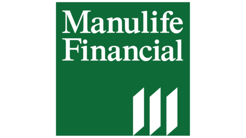
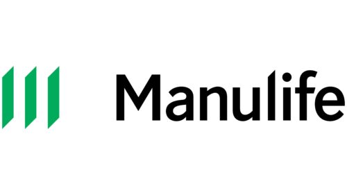
The insurer Manulife is deeply focused on its objectives, which makes its logo businesslike, austere, and practical. Three parallelograms occupy a key place in the design. These shapes actually form a stylized letter “M.” This shape comes from the three philosophical pillars underlying the universe. In this case, the company is referring to its own “inner world,” which is supported by three main factors: reliability, strength, and stability. On the right, the full name of the company is written in lowercase letters in sans-serif font.
The three parallelograms resemble building blocks. They look like parts of a solid foundation, each of which stands for something very important. Besides, they give the letter “M” a unique zest, making it not just another letter but something deeper. The lowercase letters of the full name on the side create a somewhat relaxed feel as if the company doesn’t need to shout to get attention.
Manulife color codes
| Sonoran Sand | Hex color: | #00ac5b |
|---|---|---|
| RGB: | 227 212 173 | |
| CMYK: | 0 4 20 7 | |
| Pantone: | PMS 3405 C |
| Black | Hex color: | #000000 |
|---|---|---|
| RGB: | 0 0 0 | |
| CMYK: | 0 0 0 100 | |
| Pantone: | PMS Process Black C |
