The MARTA logo reflects the scale and significance of the Metropolitan Atlanta Rapid Transit Authority. This company, serving the entire Atlanta area, provides a wide range of public transportation services. Founded in 1971, the agency has never ceased its operations since. From the beginning, MARTA’s main goal was to transport passengers and ensure their maximum safety. This goal has been successfully achieved, and the company’s logistical routes have significantly expanded.
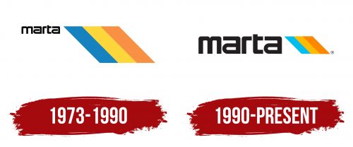
The first logo was introduced in 1973, and an updated version was created in 1990, which is still used today. There is a clear continuity of ideas and themes between these two versions. However, the latest version appears particularly stylish and modern.
The logo’s color palette was chosen successfully, highlighting the company’s reliability. The font emphasizes the agency’s authority and the high level of services provided. The MARTA logo has become a symbol of the stability and trust that the company has earned over the years.
MARTA: Brand overview
In the 1960s, Atlanta, Georgia, confronted the urgent need to establish a cutting-edge public transportation system for its rapidly expanding population. This began the history of MARTA (Metropolitan Atlanta Rapid Transit Authority).
The Georgia State Legislature established MARTA with a bill approved in 1965. The decision was made because the current transportation system could not keep up with the expanding population and rising car traffic. The creation aimed to improve and integrate the public transportation network in the Atlanta area.
The early years were devoted to organizing and preparing to establish a rapid transit network. In 1971, voters in Atlanta, Fulton, and DeKalb counties approved implementing a one-cent sales tax to finance the new system. This vote changed the agency’s history by providing it with a reliable source of revenue.
The first metro line opened in 1979, and construction on the network started in 1975. This line, which connected the Georgia State and Avondale stations, began the construction of Atlanta’s current metro system. City dwellers were ecstatic to see the first line open since they could finally access quick and reliable public transportation.
The system kept growing during the 1980s. A second metro line that connected the city’s east and west debuted in 1981. The Atlanta Transit System was purchased in 1982, opening the door to developing an integrated bus and metro network.
The company experienced substantial expansion during the 1990s. When a line to Hartsfield-Jackson International Airport opened in 1992, Atlanta became one of the few American cities with a direct rail connection between the airport and the downtown area. This greatly increased the accessibility of transit for both business and tourist travelers.
Atlanta’s 1996 Olympic Games served as a crucial trial run for the transportation network. During the Olympics, the system successfully handled the massive inflow of passengers, reaching up to 1.3 million people daily. This experience helped advance the system’s development and showed that the transportation provider could handle large-scale events.
The organization experienced financial difficulties due to decreased state financing and the economic downturn in the early 2000s. Notwithstanding these obstacles, it continued to update its infrastructure and enhance its services.
By building the northern line to North Springs in 2000, the transit network expanded the system’s service area to include the northern Atlanta suburbs. This extension greatly enhanced the northern population’s access to transit.
The Breeze Card system, an electronic fare payment method that replaced outdated tokens and paper tickets, was introduced in 2006. Because of this innovation, passengers found the system more convenient to use, which improved revenue management for the agency.
In the decade of the 2010s, the transit provider kept improving its offerings. The MARTA On The Go mobile app, which offers riders real-time schedule and route information, was introduced in 2014.
When Clayton County voters approved a sales tax to finance services and join the system, a major milestone was accomplished in 2016. This choice opened the door for expansion throughout the city.
The organization revealed its $2.7 billion upgrade and extension plan in 2018. This plan called for modernizing stations, rolling stock upgrades, and line extensions.
The company started its massive expansion plan, which was revealed in 2018. The project included station upgrades, better lighting, new information screens, and stronger security systems.
Additionally, the transit authority revealed plans in 2019 for transit-oriented developments (TOD) encircling several metro stations. These projects aim to build mixed-use complexes, including retail, office, and residential areas, easily accessible via the transportation network.
Notwithstanding worldwide difficulties in 2020, the agency kept enhancing its offerings. The first step toward switching to more ecologically friendly transportation is starting with an electric bus pilot project.
The company built a new light rail route along Campbellton Road in 2021. This $300 million project aims to enhance mobility in Atlanta’s southwest region.
That same year, the agency started a program to modernize its metro train fleet. A deal was made to supply 254 brand-new railcars to replace the fleet’s aging vehicles.
The transit authority began operating a new express bus route on South Avenue in 2022. This initiative, dubbed the “Summerhill Bus Rapid Transit,” was the first in Atlanta and was designed to facilitate better transit between southeast areas and downtown.
The Five Points station, the epicenter of the metro system, saw the first phase of its refurbishment completed in 2023. The redesigned station offers better navigation, contemporary passenger facilities, and a fresh look.
A pilot program introducing contactless fare payment utilizing bank cards and mobile devices was also started in 2023. This innovation aims to give passengers even greater convenience when utilizing the system.
The transit network persisted in growing its alliances with nearby companies and towns, incorporating the public transportation network with the broader growth of the Atlanta area.
The transit provider has been instrumental in Atlanta’s growth, offering citizens and tourists dependable public transit. Notwithstanding several obstacles throughout the years, the transportation provider continues to be an essential part of Georgia’s capital’s transportation network, continuously adjusting to the shifting demands of the expanding city.
Meaning and History
What is MARTA?
It is the primary public transportation provider in the Atlanta, Georgia metropolitan area. The company operates a system of bus and high-speed rail lines serving Clayton, DeKalb, and Fulton counties. Four color-coded lines comprise the brand’s rail network, connecting major city areas – downtown Atlanta, Hartsfield-Jackson Atlanta International Airport, and several suburbs. The company is one of the largest public transportation networks in the country. It is vital to Atlanta’s urban mobility, transporting millions a year and contributing significantly to its transportation network.
1973 – 1990
The precision, brightness, and elegance of MARTA’s identity were already evident in the first version of its logo, which appeared a few years after the Metropolitan Atlanta Rapid Transit Authority began operations. This logo was characterized by minimalism and restraint, reflecting the company’s pragmatism and determination.
The abbreviation “MARTA” was written in large letters in the upper left corner of the white background. The simple and memorable word stood out against the solid background, drawing attention with its concise style. The letters were evenly spaced, each shining with a rich black color contrasting with the light background. Each letter, both vowels and consonants, conveyed an expressive strictness, emphasized by sharp and straight lines.
To the right of the logo, a rainbow was depicted in three harmoniously combined colors. Blue, yellow, and orange merged into a single ensemble, reflecting the company’s wide range of services and the diversity of its transportation fleet. By the time this logo appeared, the agency was already serving the central part of Atlanta and two additional counties—Fulton and DeKalb.
Interestingly, the scale of the text and the image on the logo were disproportionate: the text element was nearly three times smaller than the tricolor lines, making them the central and eye-catching feature. These lines became recognizable and were seen on buses and trains throughout the network. Since its creation in 1971, the organization rapidly expanded its operations, connecting 48 miles of rail and linking counties and neighborhoods in Atlanta, as reflected in this first version of the logo.
1990 – today
In 1990, the conceptual focus of the MARTA logo underwent changes that introduced innovations and improvements aligned with modern trends and the principles of creating recognizable brands. The logo wasn’t completely transformed but enhanced to reflect the company’s status and mission.
One of the key changes was the enlargement of the three-color lines, which are now equal in size to the text. The letters were made larger and now appear more elegant and prominent. Their design features an interesting combination of straight lines and rounded corners, adding dynamism and modernity. The vowels “a” are slightly stretched horizontally, creating a visual 3D effect and drawing attention to the text.
The color palette was also changed. In the previous version, the central tone was a light yellow shade, which has become more saturated and leans towards orange. Dark blue replaced light blue, giving the logo a fresher and more appealing look. Designers paid particular attention to the color scheme, aiming to make it interesting while still restraining and fitting the company’s seriousness.
These changes made the logo relevant and recognizable, reflecting MARTA’s growth and commitment to excellence.


