


![]() Martell Logo PNG
Martell Logo PNG
The emblem of the cognac house combines the past and the present. The Martell logo is a subtle, translucent nod to the company’s ancient history. A foundation from past experiences allows the home to flourish in the present.
Meaning and History
![]()
The cognac house was named after its founder, Jean Martell, who started the family business in 1715, immediately after moving to Cognac, France. At that time, he was barely 21 years old. To develop a profitable business, he married the daughter of a cognac merchant and then her cousin. The eighth generation of Martell now runs the company. It has been part of Pernod Ricard since 2001.
The production technology uses the purest grape spirits obtained by double distillation. They are kept in special cellars and aged in handcrafted oak barrels grown in the Tronçais forest. This gives the drinks a unique taste and aromatic qualities. To emphasize the cognac’s uniqueness, the company bottles it in luxurious, embossed, and printed bottles. The labels are decorated with a logo depicting a flying bird. The current design dates to 2016; before that, the symbol looked completely different.
What is Martell?
This is one of the most famous and historic cognac houses in the heart of the French Cognac region. The house is renowned for its unique method of producing cognacs, which involves aging in fine-grained oak barrels, imparting characteristic fruity and spicy aromas to the spirits. A distinctive aspect of production is the use of grapes from the four top Cognac subregions, including the renowned Borderies, known for its floral notes. The range includes famous varieties such as VS, VSOP, Cordon Bleu, and limited editions, reflecting centuries of French craftsmanship and refinement.
1715 – 2000
The logo in use today dates back to the 18th century when Jean Martell opened a lucrative business making and selling cognac. As was the custom at the time, the company’s founder decided to mark the casks of alcohol with his family’s coat of arms to distinguish them from other export products. And in 1848, this sign first appeared on bottles. It looked like a heraldic shield with an image of a sitting bird (swift) and three hammers. The label was designed in silver-blue color and supplemented with inscriptions designed by a Parisian typographer. The iconic Martell coat of arms has endured through the centuries, adorning bottles, shipping crates, and documents.
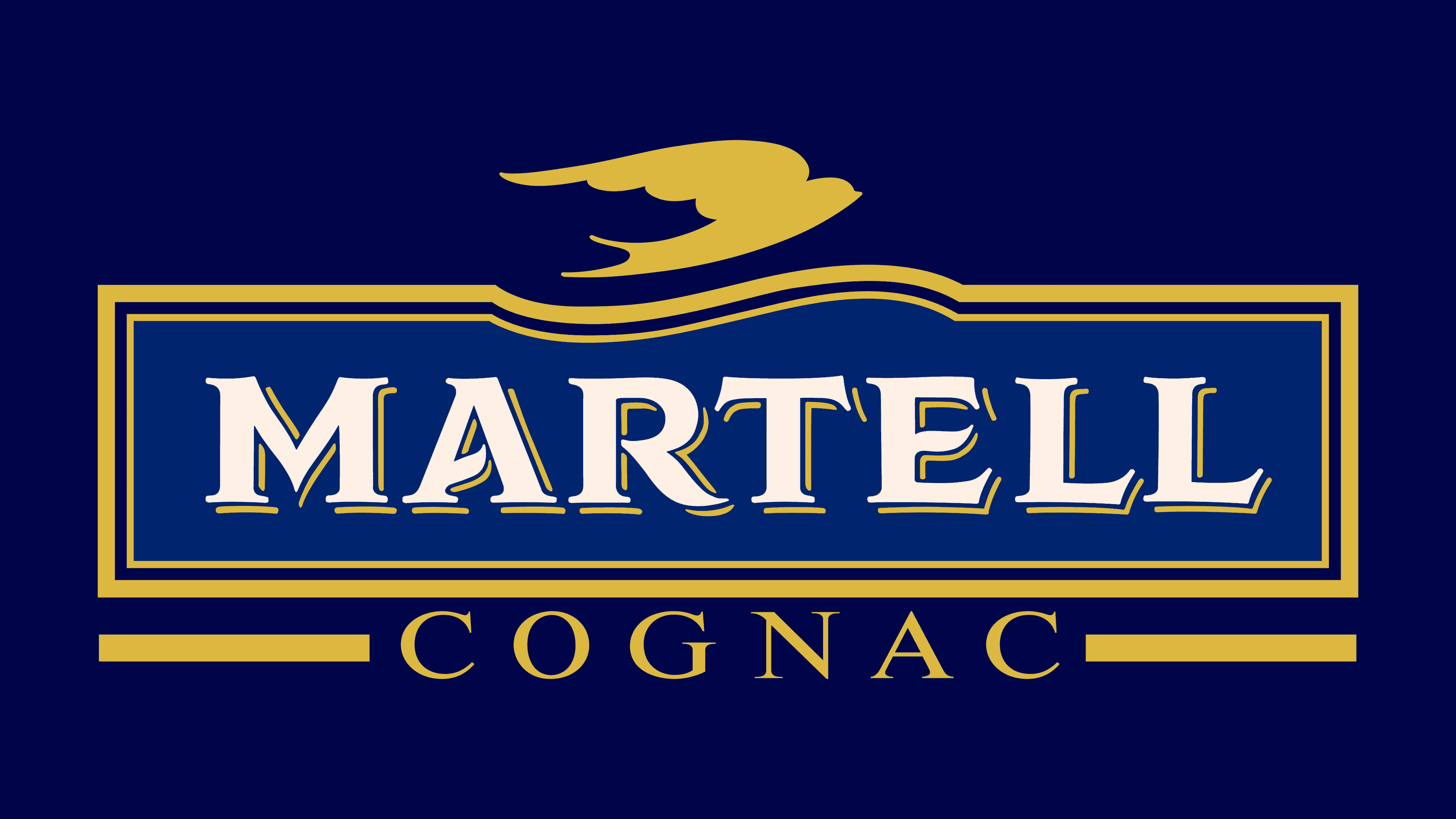
2000s – 2016
![]()
In the early 2000s, the cognac house was acquired by Pernod Ricard. Becoming part of the multinational group was an occasion to update the identity. So an improved version of the logo appeared, which still contained a sword and a shield with three hammers, but in a modern design. The silhouette of a flying bird was at the top, above the white word “MARTELL,” set in a golden frame. Under it was the inscription “FONDÉE EN 1715”, divided into two parts by a coat of arms with hammers. A large blue rectangle served as a common background for all the elements.
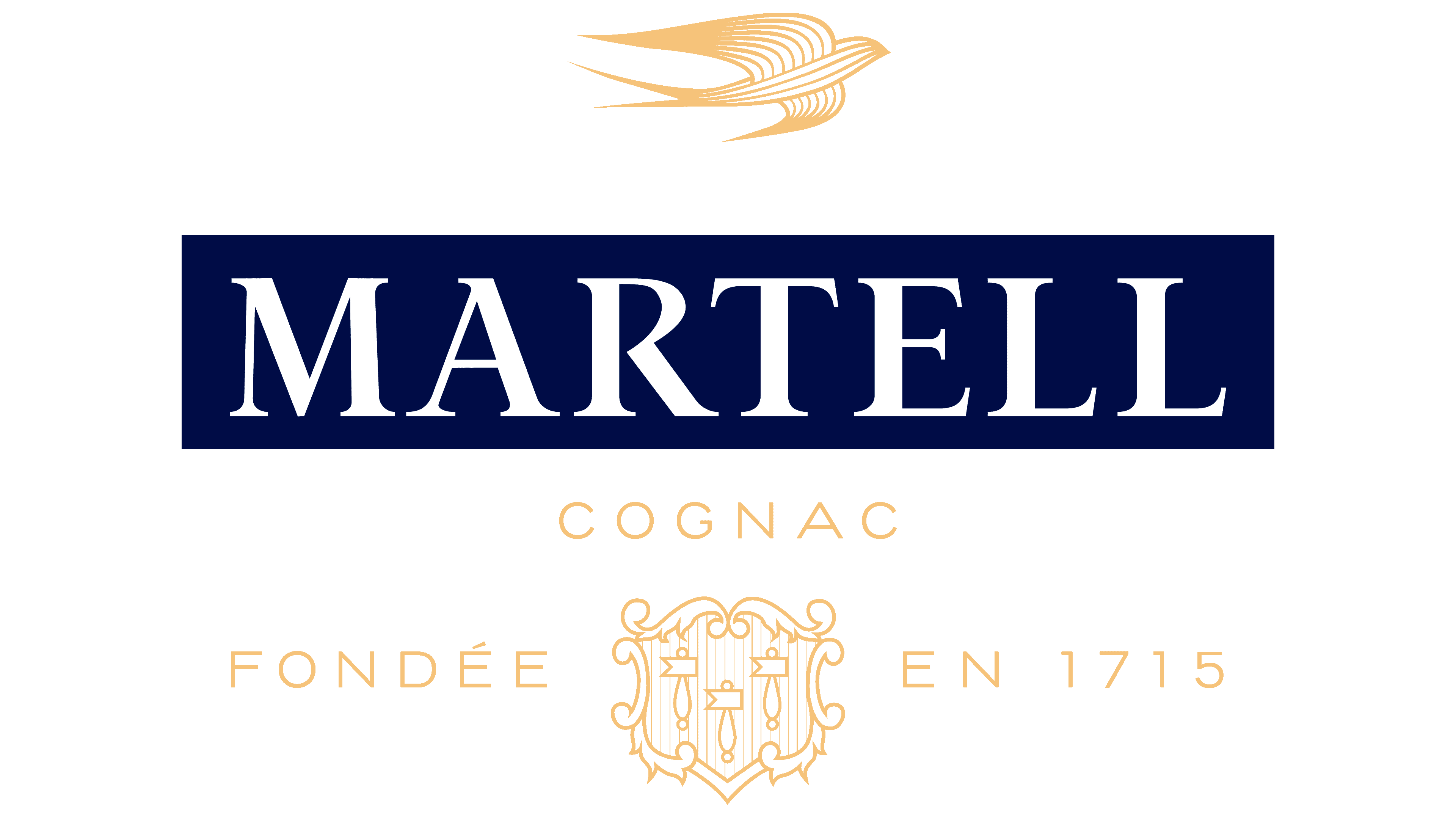
2016 – today
![]()
Shortly before the 300th anniversary, celebrated in the Versailles palace and park ensemble, the cognac company changed its logo again. It entrusted the redesign to the multidisciplinary Parisian studio Yorgo&Co. The specialists kept the bird and the shield with the three hammers and even left them in their usual places, but completely transformed the style. Now the traditional emblem components look elegant and convey exquisite craftsmanship. The shear with clearly traced wings and flowing lines no longer resembles an airplane. The brand name turned blue, and another word appeared under it: “COGNAC.” It is written in thin golden letters. The same font is used for “FONDÉE EN 1715”, which has been around since the turn of the century.
The Martell family coat of arms, the basis of the logo, has several symbolic elements. Both the bird and the hammers are associated with the cognac house’s name because the swift is called “martinet” in French, which is also a diminutive of “marteau.” And “marteau,” in turn, is the name of a special hammer-shaped weapon. So none of the parts of the emblem were chosen by chance.
Later, on the wave of Martell’s success, connoisseurs of alcohol gave the brand’s logo an additional meaning. So the legend was born of the bird that flew over the city of Cognac 300 years ago, saw how beautiful the place was, and began returning there every year until its feathers turned gold. Of course, this tale has nothing to do with reality, but the swift’s ability to fly great distances across the Atlantic Ocean symbolizes perseverance, endurance, and hard work. Hammers have a similar meaning. All of the above qualities can be attributed to Martell.
Font and Colors
Both fonts shown on the logo are custom designs. All the lettering was created by the designers at the Yorgo&Co studio when they were commissioned to completely overhaul the company’s visual identity. For the main name, they chose a non-contracting, long-serif typeface, and a subtle grotesque for the rest of the text.
The combination of gold, blue, and white emphasizes the brand’s sophistication. Blue was used on the very first Martell label in 1848. Gold is a connotation of aged cognac and luxury. White is a symbol of purity.