The toy manufacturer created a positive image of fun, energy, and pleasant surprises. Mattel’s logo also looks joyful. It is the embodiment of children’s enthusiasm and holiday spirit – something that is usually associated with new toys.
Mattel: Brand overview
| Founded: | January 1945 |
| Founder: | Harold Matson, Elliot Handler, Ruth Handler |
| Headquarters: | El Segundo, California, U.S. |
| Website: | mattel.com |
Mattel is one of the oldest American toy manufacturers. The company has been operating in this segment for more than 70 years and has taken a leading position in the international market during this period. Mattel produces popular toy lines, including Fisher-Price, Hot Wheels, Barbie, and Ever After High dolls. The company is managed from its headquarters in California.
The Mattel identity’s visual component accurately conveys the brand’s main message. It combines bright colors and original content in text and a decorative frame. The elements favorably complement each other and carry a special semantic load. Its essence lies in the positive emotions, energy, and fun that Mattel toys give.
Meaning and History
Mattel is one of the most famous toy companies in the world. The brand is popular not only in the United States but also far beyond the country’s borders. Products have been shipped abroad for many years, which has made the company an international leader. Buyers worldwide liked the lines of the iconic Barbie toy and other doll series. Throughout its existence, products were produced under different logos.
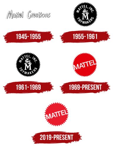
The repeated change of the visual concept is connected with the changes and development of the brand. The company gradually improved its products and technology. She needed a more modern logo with each new stage to convey her essence fully. The current version of the emblem was formed just a few years ago. It has become a stylish and modern continuation of Mattel’s expressive identity.
What is Mattel?
Mattel is a large American toy company. The collection of the famous brand includes Matchbox, Hot Wheels, Barbie dolls, UNO, Polly Pocket, etc. The company also obtained the right to manufacture toys under license from Ferrari, Barney, and Sesame Street. The brand’s main office is located in El Segundo (USA), but the products themselves are also supplied to foreign countries. Entering the foreign market provided the brand with a multi-million dollar profit.
1945 – 1955
The first logo was created when the brand was founded. It started in 1945 when Matson Harold, Elliot Handler, and Ruth Handler decided to start a small children’s toy business. The company’s trademark was a simple, delicate picture created from a frame and a wordmark. The frame was decorated in light cream colors, and the inscription Mattel Creations was inside it.
The letters were made in the same colors as the background but outlined with thin, dark contours. The font was smooth and soft without sharp corners. Such a design conveyed to customers that the company was especially reverent in the production of toys. Mattel not only uses high-quality materials but also pays a lot of attention to the appearance of the products. This made it possible to create incredibly popular toys that are known all over the world.
1955 – 1961
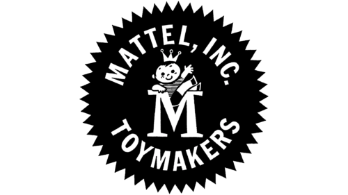
Since 1955, the brand has used a completely new badge radically different from the previous version. Instead of a delicate bright picture, a confident logo appeared, which confirmed the brand’s success. In the presented emblem, a branded element of Mattel appeared—a frame in the form of a stylized sun. The drawing meant joy, fun, and positivity.
These traits were associated with the company’s products. Additional elements of the logo were the words Mattel Inc. toymakers. Expressive white sans-serif letters against a black frame looked very impressive. To dilute the strict picture, the designers placed the letter M with a playful little man in the center of the solar frame. This drawing indicated the direction of the activity—children’s toys.
1961 – 1969
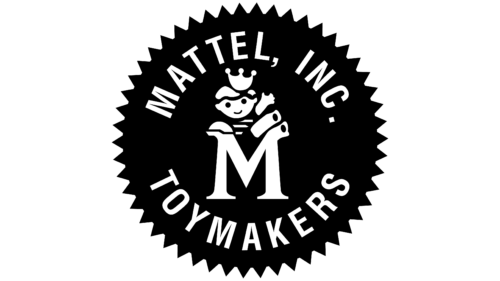
The logo’s design was changed in 1961. The designers updated the font, the drawing of a man, and the letter M. The inscription inside the frame has become more elegant and thin. The spaces between the letters have also increased, making the wordmark more readable. The contours of the letter M have become thicker and softer, and the image of the little man has become softer.
The sun frame and basic achromatic coloring remained the same. In general, the updated emblem looked more stylish and modern. Its basic message has not changed, but the improvements have confirmed the company’s achievement of certain successes.
1969 – 2019
The next rebranding took place in 1969. This time, the visual concept changed significantly. Graphic and text components were completely updated. The new version had no decorative icon in the form of a man. The large letter M also disappeared. The word component now included only the Mattel inscription, which was located inside the corporate frame.
The format of the letters called for straight, thin sans-serif lines to show confidence. The changes also affected the color scheme. Instead of strict black, a bright red color appeared on the emblem, denoting strength, energy, and cheerfulness.
2019 – today
The modern corporate badge, which the company currently uses, was created in 2019. It is a more advanced version of its predecessor. The general concept is very similar to the previous logo, but some changes are noticeable in the details. The wordmark became clearer and more confident, which showed the company’s strength in the market, and the frame was more accurate.
The new frame shape was created by reducing the number of corners, making the icon more stylish and modern. The colors have also changed. The previous version used rich red combined with white. After the rebranding, a muted burgundy color appeared on the picture, harmoniously combining with neutral light letters. All elements created a balanced, playful image that showed warmth, comfort, and friendliness.
Font and Colors
The modern Mattel logo is the result of multiple rebranding and compositional changes. It looks quite bold and expressive. This effect is achieved through contrasting colors: a soft, light burgundy hue and neutral white. The first is used as a background and denotes vigor.
In this context, the trait denotes cheerfulness, playfulness, and a cheerful mood. The brand constantly strives for this, manufacturing original children’s toys for many years. An additional part of the manufacturer’s message is honesty, openness, and reliability. These features are shown through the white color used to decorate the lettering.
The design of the inscription itself is also an important part of the visual identity. The wordmark is made in a simple, strict sans-serif typeface. Even straight letters with identical cuts demonstrate the high quality and constant pursuit of excellence, showing the Mattel brand at its best.
