![]() Midland RockHounds Logo PNG
Midland RockHounds Logo PNG
The Midland RockHounds logo is inspired by Midland’s local characteristics, particularly its oil industry. The design reflects the team’s regional identity and highlights its connection to fans, traditions, and city history.
The Midland RockHounds baseball team began in 1972 in Midland, Texas, when the Double-A affiliate of the Chicago Cubs relocated there, initially known as the Midland Cubs in the Texas League. In 1975, the team first won the league championship, sharing the title with the Lafayette Drillers due to rain.
From 1985 to 1998, the team was known as the Midland Angels, an affiliate of the California Angels. Joe Maddon, later a notable MLB manager, coached the team during this period. Players included future MLB Rookie of the Year Tim Salmon.
In 1999, the team began its ongoing affiliation with the Oakland Athletics, adopting the name Midland RockHounds and moving to Momentum Bank Ballpark. The RockHounds won their first outright Texas League title in 2005, followed by four consecutive championships from 2014 to 2017.
The RockHounds have been affiliated with Oakland for 26 consecutive years, remaining one of the most stable Double-A clubs and an integral part of Texas sports culture.
Meaning and History
![]()
What is Midland RockHounds?
It is a Double-A baseball club from Texas, playing in the Texas League as a farm team for the Oakland Athletics. For many years, the club has maintained a stable affiliation with the Athletics and has been one of the league’s oldest continuous participants. Home games are held at Momentum Bank Ballpark in the heart of a major oil-producing region. Notable players include Barry Zito and Tim Hudson.
1999 – 2021
![]()
The official mark of the Midland RockHounds baseball team appeared after the club was renamed from the Midland Angels and began its affiliation as a farm team of the Oakland Athletics. From that time, the team played under branding that reflected the industrial and geological character of West Texas.
The emblem was designed as a multi-layered composition, with the main character being a rockhound dog named Rocky RockHound. The animal was depicted holding a baseball bat over its shoulder and a crumpled baseball in one paw. The dog was drawn in a cartoon style, with expressive facial features that gave it a mascot look and added a friendly, approachable quality to the team’s image.
The team name, “RockHounds,” appeared in large, sans-serif block letters at the bottom of the logo. The typeface, created specifically for the emblem, featured a cracked surface effect reminiscent of fractured rock, referencing the region’s geological profile. The glyphs were thick and wide, without serifs, and outlined with a thin blue stroke to add visual contrast and depth.
In the upper part of the composition, the word “MIDLAND” was set in white uppercase letters on a blue arc. This arc fits into the emblem’s overall contour, forming a semicircular background that contains oil derricks, a reference to the region’s primary economic resource: hydrocarbon extraction.
The palette included blue, symbolizing the team’s reliability and energy, along with gray and black to reflect the industrial and oil-related nature of West Texas. The brown of the dog’s fur added an association with the earth and the area’s natural resources. The white baseball with its distinctive black stitching stood out against the rest of the design, highlighting the sport itself.
The Midland RockHounds’ emblem deliberately avoided any visual references to the style of the parent club, the Oakland Athletics. Instead, it focused on regional identity, emphasizing Midland’s geological heritage and industrial culture. This approach created a unique and recognizable team image that was fully integrated into the local context.
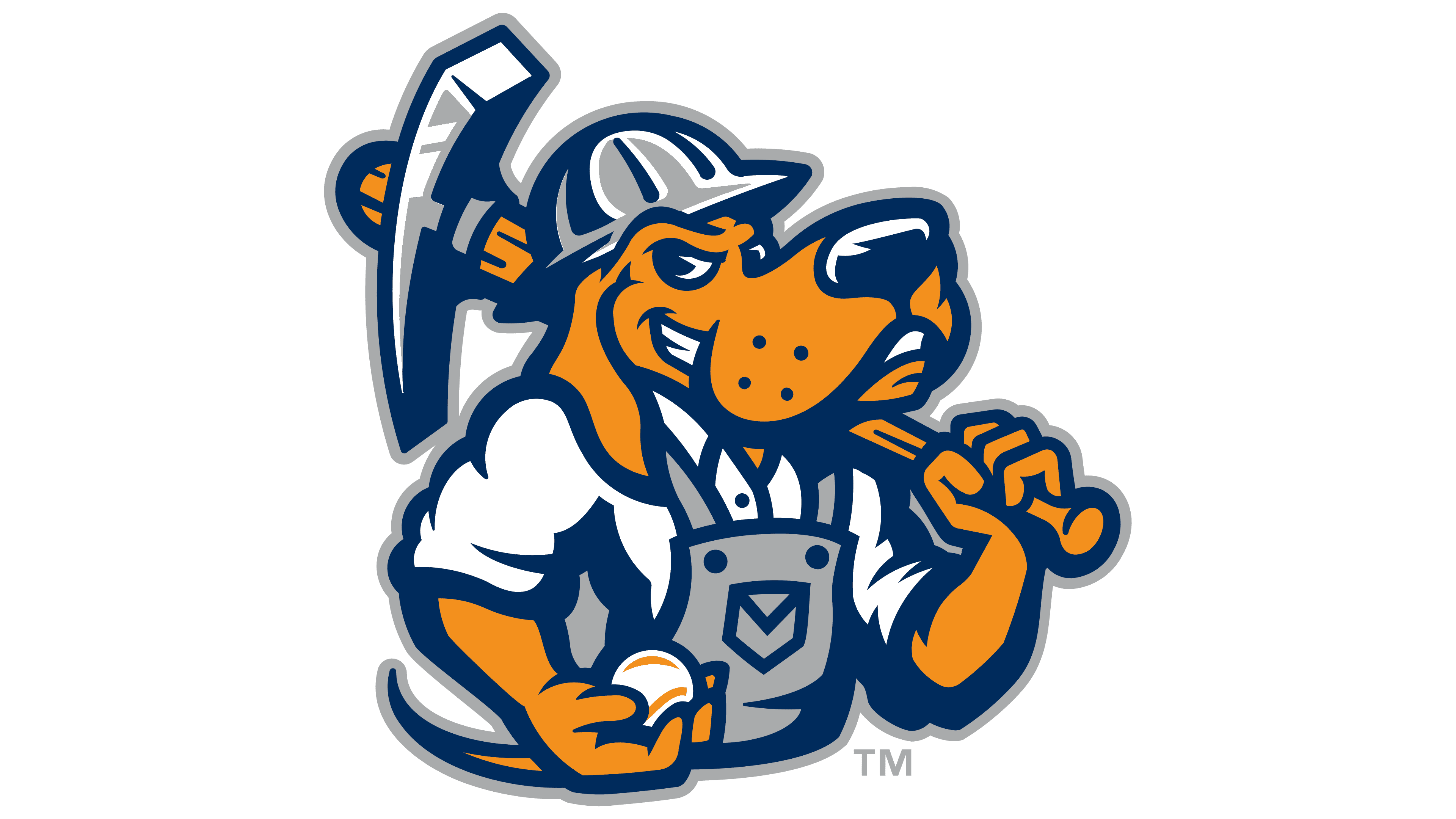
2022 – today
![]()
The updated Midland RockHounds emblem was unveiled to the public on November 17, 2021, as part of an anniversary rebrand celebrating the franchise’s 50th year. Designed by Dallas-based Torch Creative, the new logo has been in official use since the 2022 season.
The team’s traditional mascot, an English pointer named Rocky, remained the central figure. In the new design, Rocky wears a baseball helmet and work overalls. Over his shoulder is a rock hammer, stylized as a baseball bat, symbolically combining the sport with the region’s industrial character.
At the bottom of the emblem, the word “RockHounds” appears in a custom sans-serif typeface in all caps. The font has geometric precision, distinct angular stroke endings, and uniform line thickness, giving the team name a professional and confident appearance.
Below the text is a stylized tag-shaped pendant in the form of an oil drop with a five-pointed star inside, symbolizing the club’s Texas roots and the oil industry of the Permian Basin.
The color palette is limited to four primary shades: navy blue, bright orange, neutral gray, and white. This reduction in colors was intended to improve application on merchandise and team gear by eliminating the previous royal blue shade.
The new visual system also features a series of secondary marks, including Rocky’s pawprint composed of oil drops, a monogram “M” formed by two intersecting rock hammers over a silhouette of Texas, and alternate depictions of the mascot’s head and full figure in work attire.
Despite the extensive modernization, the club’s identity was deliberately preserved. The new logo strengthens the team’s visual ties to the oil industry and enhances its regional connection to West Texas, while maintaining the brand’s historical continuity.