 Midwest Airlines Egypt Logo PNG
The Midwest Airlines logo embodies Eastern luxury and Western speed. Flights with the company provide maximum enjoyment. Passengers don’t have to worry about safety. Comfort and modern technology are features of every aircraft in the brand.
Midwest Airlines Egypt: Brand overview
Based in Cairo, Midwest Airlines operated passenger charter flights from Egypt to Europe.
Founded in 1998 with two Airbus A310-300 aircraft, Midwest Airlines sought to redefine the airline industry by offering exclusive and reliable travel options.
Midwest Airlines quickly gained popularity by offering charter flights to Egypt’s most popular destinations and convenient connecting flights to European cities.
Despite its initial success, Midwest Airlines faced challenges: rising operating costs, increased competition, and changing market dynamics. Despite attempts to adapt, the airline was unable to continue operations.
Meaning and History
What is Midwest Airlines Egypt?
Based in Cairo, Midwest Airlines Egypt played a prominent role in the aviation industry, operating passenger charter flights throughout Egypt and Europe. The company has become known for its charter services aimed at creating memorable experiences for tourists and travelers. Based in the cultural and geographical center of Egypt, the airline has become known for its services that reflect the vibrancy and rich history of its native country.
1998 – today
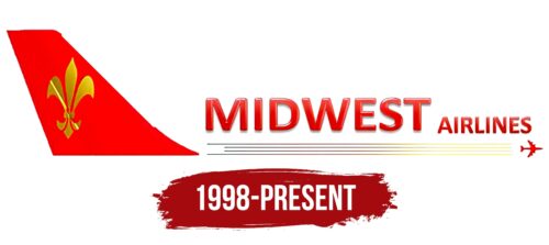
The logo of the Egyptian airline features an important heraldic symbol, the fleur-de-lis. This symbol is colored in gold and placed on a red tail, which creates an elegant look. There are four black and yellow lines around the lower perimeter. These lines are reminiscent of the trail left by a flying airplane, which is actually depicted just ahead of these lines on the right. The name of the airline is presented in red block letters in glossy sans-serif font. Both parts of the name are capitalized and bolded, even though the first word is large and the second word is small.
The gold fleur-de-lis lends elegance and adds a historical touch to the brand’s identity. The black and yellow lines serve a dual purpose: they capture movement and bring an element of excitement to the overall design. The airplane graphic in front of the lines serves as a visual cue, directing the viewer’s attention to all elements of the logo. The use of red, glossy, three-dimensional letters ensures that the name is easy to see and stands out, reinforcing the importance and appeal of the brand. The choice of bold and uppercase font for both parts of the name emphasizes the confidence and authority of the brand.
