The taste of strong dark beer is behind the image of the emblem. The Miller logo represents a company that has made it to the top and ships its products worldwide. The best hops and malt are used for production.
Miller: Brand overview
| Founded: | 1855 |
| Founder: | Frederick Miller |
| Headquarters: | Milwaukee, Wisconsin United States |
| Website: | molsoncoors.com |
Meaning and History
MGD is lager with a golden yellow color. It reminds us of draught beer because it is not pasteurized: a special technology is used in the process of its production, which implies fourfold cold filtration to get a light taste without bitterness of hops. The aroma has notes of herbs, corn, grain, and malt. Due to its characteristics, this drink has won several awards, but recently its popularity has declined, which can be seen in the decrease in market share in the United States.
The first bottles of Miller Genuine Draft appeared on store shelves in 1985. The original concept was invented by a Calle & Company-employee. It came very handily because other beer producers often copy Miller Brewing Company products, and she urgently needed something unique, able to stand out in the market of monotonous alcohol.
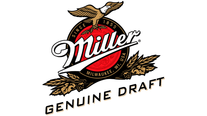
Given the desire of the brewery to make the brand bright and noticeable, the designers decorated the label with a rather complex logo, which consists of many diverse elements. In the foreground, of course, is the white word “Miller,” and it’s designed just like the Miller Brewing Company wordmark. The name is in a font that mimics handwritten text, slightly raised and underlined by a tapered bar.
At the top, a proud white-headed eagle holds spikelets of wheat in its paws. The diagonal inscription “GENUINE DRAFT ” is at the very bottom,” at the same angle as the first word. It is painted black and casts light volume shadows. The base of the logo is a circle with a red seal inside. Since the company name almost completely obscures its contents, only a few details are visible: fragments of awards, laurel wreath leaves, the word “TRADEMARK,” and individual letters.
The circle is placed in a black ring with a gold border and the same gold inscriptions “SINCE 1855” and “MILWAUKEE, WI, USA.” 1855 is the year Miller Brewing Company was founded. That’s when Frederick Edward John Miller renamed his brewery Plank Road, giving it its current name. Milwaukee is the city where the company is headquartered. The ring shows sheaves of wheat mixed with leaves and hops cones below.
The white-headed eagle is known to be the symbol of the United States. It represents courage, strength, national pride, confidence in oneself, and one’s strength. It is a manifestation of the strong character of Americans. The red sun, which is stylized on the Miller Genuine Draft emblem, represents awakening hope. And it is also associated with fertility because it directly affects the growth of herbs and cereals that are part of the brand beer and form its unique taste.
Font and Colors
The logo attracts attention not only with its symbolism but also with its unusual typography. For example, the font for the word “Miller” was made to order and is an example of calligraphy. All other inscriptions are done in low-contrast bold grotesque, while the letters in the phrase “GENUINE DRAFT” have a pronounced slant to the right, which has been added for visual balance.
The classic colors of the brand are red (#e83424), black (#040404), and dark gold (#a39161). The company name and the eagle’s head stand out against them in white.
Miller color codes
| Lust | Hex color: | #e83424 |
|---|---|---|
| RGB: | 232 52 36 | |
| CMYK: | 0 78 84 9 | |
| Pantone: | PMS Bright Red C |
| Dark Tan | Hex color: | #a39161 |
|---|---|---|
| RGB: | 163 145 97 | |
| CMYK: | 0 11 40 36 | |
| Pantone: | PMS 7503 C |
| Black | Hex color: | #040404 |
|---|---|---|
| RGB: | 4 4 4 | |
| CMYK: | 0 0 0 98 | |
| Pantone: | PMS Black 6 C |
