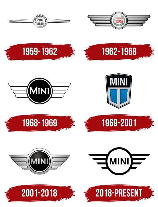
The emblem seems to fly above the ground, illuminating the way with burning headlights. The Mini logo combines a hint of the car’s small size, allowing them to move quickly and maneuver on the roads to reach their goal easily.
Mini: Brand overview
Meaning and History
This automaker has repeatedly changed hands, unwittingly changing owners but retaining its original identity. In 1966, its owner was a new company formed due to BMC’s takeover of several companies. The newly formed structure was named British Motor Holdings.
Then, BMH merged with the Leyland Motors plant and became British Leyland (Rover Group). In 1988, it broke up and passed to British Aerospace, which was subsequently acquired by BMW (in 1994). The new owner retained the Mini brand after the Rover Group’s final disappearance in 2000. During all this time, its emblem has not lost its originality. The conceptual evolution of the logo only began with BMW. She has six brand names in total.
What is Mini?
Mini is a British car brand managed by the German company Bayerische Motoren Werke AG. It was officially registered in 1969 and originally belonged to British Motor Corporation Limited. The first car made under this brand became a legend of the 1960s.
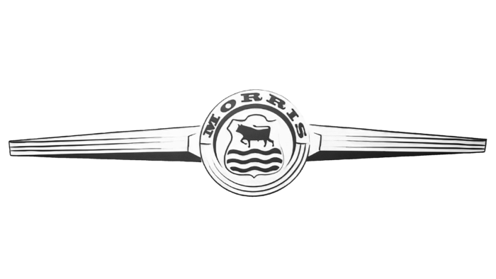
1959 – 1962
The debut logo features a propeller because the subcompact was first produced in several factories, including the Morris Motors aircraft manufacturer in Cowley, near Oxford. The models that emerged from there were called the Morris Mini-Minor and had a label in an aircraft propeller’s form. Subsequently, the link to the aircraft theme was preserved in all emblems. The center is a double circle with a coat of arms depicting a bull and three wavy lines. At the top is the Morris lettering in large serif type.
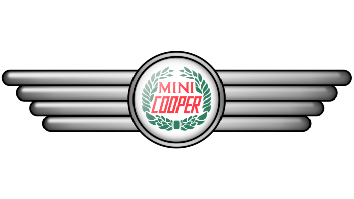
1962 – 1968
In the early 60s of the last century, the company cooperated with the designer John Cooper – the author of the famous Mini Cooper compact car. After the car’s release, a new emblem design with a different inscription was immediately approved. The series’s name is in the circle’s center, made as a wreath of tree branches. Large elongated letters are colored red. The word “Mini” has serifs; “Cooper” does not. To the right and left of the disc, there are four broad lines of different lengths. They personify at the same time two elements – the radiator grille and the aircraft’s wings.
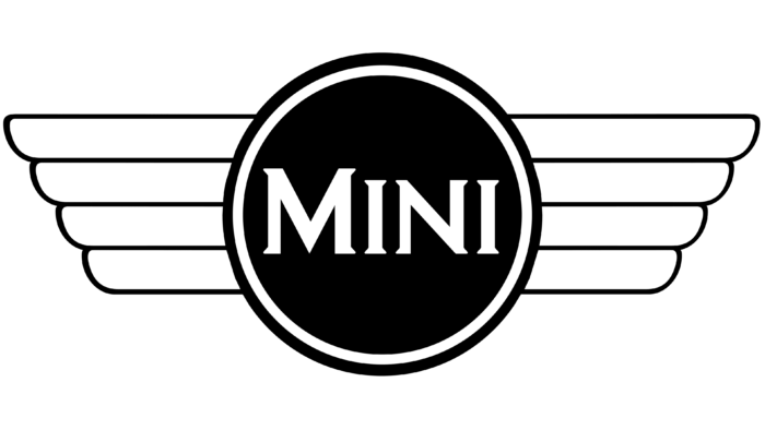
1968 – 1969
For one year, the brand changed its logo to black and white. In style, it resembles a simplified version of the previous emblem, so it retains the most important thing – the structure. But some of the details have disappeared or have been replaced. For example, the inscription has been reduced to the word “Mini,” the wreath of leaves has been removed, and only two lines remain from the triple edging – light and dark. The middle of the badge is now black with a white brand name.
1969 – 2001
After the brand passed to Leyland Motors (Rover Group), the small car series was officially renamed MINI. In parallel with this, an updated emblem appeared. It consists of a hexagonal shield divided into two parts: a gray bottom and a black top. At the bottom are two sky-blue rectangles cut obliquely and thick gray lines along the edges. Above is the name of the car, presented in white.
2001 – 2018
The new owner (BMW) has returned the legendary winged symbol with a circle in the middle to the brand. Moreover, it has undergone modernization to meet modern requirements. The logo features a black circle with chrome trim. From it to the right and the left, the silvery wings of the aircraft are extended. They have sharp corners and a solid fill between the protruding stripes. The word section is made in sans-serif letters with neat and even lines. This makes the emblem austere, stylish, and recognizable, corresponding to the automotive theme.
2018 – today
The current version, the 2D model is used—a flat sign of visual identity simplified and not overloaded with details. This approach is associated with getting a simple logo that looks equally good as a car marking, a legal brand symbol, and a creative advertising element. For this, the designers removed the gray color, leaving the classic combination of black and white. They focused on the brand name and the wings.
Mini: Interesting Facts
The Mini, designed by Alec Issigonis and launched by the British Motor Corporation in 1959, is a celebrated icon in car history, noted for its compactness, unique look, and agile handling.
- Innovative Design: Issigonis introduced a groundbreaking front-wheel-drive layout that maximized space and enhanced the car’s handling.
- 1960s Icon: The Mini embodied the 1960s spirit, attracting celebrities like The Beatles and symbolizing freedom and youth.
- Rally Success: Notably, the Mini won the Monte Carlo Rally three times in the 1960s, proving its mettle against bigger, stronger cars.
- Pop Culture Fame: The Mini starred in the 1969 film The Italian Job, featuring an unforgettable chase scene highlighting its agility.
- Various Producers: Initially produced by BMC, the Mini later saw production under different brands, including Austin and Morris. BMW reimagined the Mini in 2001, maintaining its classic appeal.
- Extended Production: The original Mini was produced from 1959 to 2000, and over 5.3 million units were produced, making it the most popular British car ever.
- Diverse Models: The Mini was offered in various styles and special editions, from vans to the sporty Mini Cooper.
- BMW’s Modern Mini: In the 2000s, BMW revitalized the Mini, blending modern tech with the iconic design. This led to a new line that included the Cooper and Countryman.
- Loyal Fanbase: With fans worldwide, the Mini is celebrated through clubs and events, beloved across generations for its distinctive mix of history, performance, and design.
- Going Electric: The 2020 Mini Electric represents the brand’s shift towards sustainability, offering the Mini’s classic driving enjoyment without emissions.
The Mini has journeyed from a practical solution to fuel shortages to an enduring automotive and cultural icon, showcasing its revolutionary design, significant cultural impact, and lasting popularity.
Font and Colors
The original logo underwent a long modernization process but returned to simple shapes. They convey the most important thing for the car company – freedom and speed, reflected in wide-spread wings. The prototype of the modern logo is the 1968 version. It is also black and white and as simple as possible.
The text was written in a serif typeface reminiscent of Copperplate FS Bold Condensed in early versions. Then, there were chopped variants with smooth and even letters. They have something in common with Barnaul Grotesk Extra Bold and Motiva Sans ExtraBold. A specially designed typeface called MINI Serif is currently being used.
The corporate palette is monochrome and black and white. However, earlier, the logo also featured other colors—red, green, and shades of gray.
FAQ
What is the meaning of the MINI logo?
The logo reflects the brand’s personality and values. It features a pair of stylized wings that symbolize speed, freedom, and strength. These elements highlight the vehicle’s dynamic and agile character. The wings suggest a sense of freedom and the ability to travel easily through various terrains.
BMW has owned the British car brand since 2000. The logo has changed over the years to maintain a modern and elegant look while preserving the brand’s heritage. The circular emblem in the center of the wings contains the brand name, showcasing its strong and recognizable identity.
Why does the MINI logo have wings?
The logo features wings, symbolizing speed, freedom, and agility. Many automakers use wings in their logos to convey these qualities.
The wings in the logo demonstrate the brand’s commitment to creating dynamic and agile cars. The design indicates that these cars are fast and provide an exciting driving experience. This aligns with the brand’s reputation for creating cars that are efficient, stylish, and easy to drive. The company’s wings are associated with its heritage and evolution under BMW’s leadership. The logo maintains a modern look while paying homage to the brand’s history.
Who makes the Mini Cooper?
BMW produces the Mini Cooper. It was originally a model from two Leyland brands, Austin Mini and Morris Mini. In 1969, Mini became its brand. BMW later bought the brand and relaunched the Mini Cooper.
BMW is responsible for the production and development of the Mini Cooper, using modern technology and design. The car retains its iconic and compact styling. The brand is known for its distinctive looks, efficient performance, and driving pleasure.
What is the Mini logo?
The modern logo is simple and stylish. The brand name is displayed in capital letters and a sans-serif font. The name is inside a circular ring. On each side of the ring, there are four horizontal lines of varying lengths. The entire logo is black.
This design keeps the brand’s identity clear and modern. Simplicity makes the logo easily recognizable. The black color adds a touch of elegance, highlighting the brand’s focus on quality and design.

