Minolta’s logo speaks of global reach, structuring, depth, and realization of dreams. The emblem represents a corporation capable of covering the entire world with its products. The symbol reflects the aspiration to meet consumer expectations and grant them the freedom to choose.
Minolta: Brand overview
| Founded: | 1928 – August 5, 2003 |
| Founder: | Kazuo Tashima |
| Headquarters: | Osaka, Japan |
Incepted in 1928 in Osaka, Japan, Minolta was the brainchild of Kazuo Tashima and originally went by the name Nichi-Doku Shashinki Shōten, which translates to Japanese-German camera shop. The entity rebranded itself as Minolta in 1931, the name being a condensed form representing “Mechanism, Instruments, Optics, and Lenses by Tashima.”
Initially, the business concentrated on introducing German camera models to the Japanese market by importing and rebranding them. However, by 1933, Minolta ventured into manufacturing its cameras, starting with a model that mimicked the design of the Plaubel Makina. Over time, the company widened its range to encompass a variety of film formats, spanning from 16mm to medium format.
In a landmark move in 1985, Minolta unveiled the Maxxum 7000, marking it as the world’s inaugural integrated autofocus 35mm SLR camera system. Alongside its core camera business, Minolta expanded into ancillary sectors, such as photocopiers, fax machines, and laser printers. In a strategic development in 2003, the firm fused with Konica Corporation, forming Konica Minolta.
Minolta earned a reputation for being a pioneer in the field of camera technology, most notably for creating the first integrated autofocus SLR system. Its offerings gained a following among various photography enthusiasts, from casual hobbyists to seasoned professionals.
Meaning and History
The company emerged in 1928 under the name Nichi-Doku Shashinki Shoten and focused on camera manufacturing. The Minolta logo from 1937 is connected to the company’s second name, Molta Goshi-gaisha, which Kazuo Tashima led starting in 1931 without German partners. The Japanese businessman renamed previous brands Nichi-Doku and registered a new trademark aligned with the corporation’s name.
The brand name became the logo and remained the calling card of cameras for many years. A turning point in the identity occurred when the founder and his son met American graphic designer Saul Bass, who developed the product logo. The company still uses the symbol to this day.
In 2003, Minolta merged with Konica, forming modern-day Konica Minolta, which inherited the renowned logo.
What is Minolta?
A famous manufacturer of optical products, copiers, and photo-processing devices, established in 1928 in Osaka. It held leading positions in the production of single-lens reflex cameras. It was among the top five major camera manufacturers in Japan. Purchased by Konica for 1.6 billion dollars.
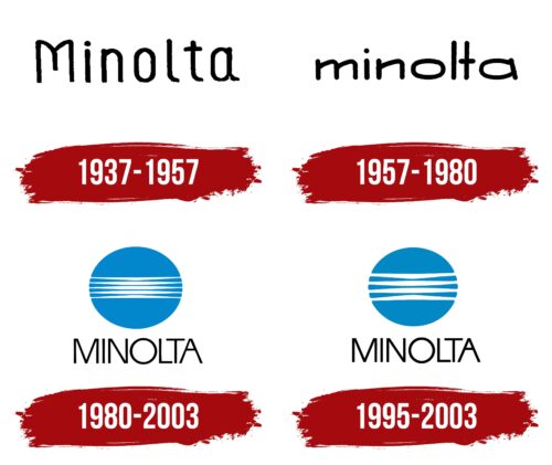
1937 – 1957
The camera emblem consists of the Minolta brand name in thin black letters. The name is an extended derivative from the company Molta: “M” echanismus “O” ptik und “L” insen von “Ta” shima. The word “in” strument is incorporated into the brand name, extending Molta to Minolta, focusing on cameras.
A second origin for the word Minolta combines two Japanese concepts: “small seed” (singular) and “numerous.” The name indicates that the company’s cameras are unique, the best among many options. Compact in size, they stand out and gradually conquer the market.
Thin letters appear as if hand-drawn with a marker. This choice emphasizes the company’s uniqueness. Development ranges from initial designs to the final product. Molta itself manufactured the casings, lenses, and handled assembly.
The emblem indicated that the brand contained the soul of a master who gave the devices unique features. Specifically, Tashima invented synthetic resin for the folding mechanisms of the first Minolta Best, which distinguished the products and significantly increased sales.
The choice of inscription speaks of a beginning. The name, akin to a draft, represents the work of an apprentice, signifying initial steps in the European market and a willingness to learn.
1957 – 1980
1957, the company entered the European market with achromatic lenses with dual coating. Until then, products were sold in Asia and the U.S. In the latter, the opening of the first subsidiary, Minolta Corporation, was in the works. Reaching this coveted Western recognition was marked by rebranding.
The logo’s inscription character changed. Once drawn with a marker, lowercase letters became more perfect and clear, indicating progress and increased skill. Lowercase letters highlighted the difference between the brand and the new corporation’s names. A few years later, the main Japanese company would adopt the name Minolta Camera Co., Ltd. Different cases helped distinguish between the firm and the brand.
1980 – 2003
In 1980, the founder’s son, Hideo Tashima, who took over leadership, initiated rebranding and invited one of the most popular industrial designers, Saul Bass, to develop the design.
Founder Kazuo Tashima believed miniature cameras left no room for a special symbol. Therefore, the maestro suggested placing the image in the central letter O, which symmetrically divides the name into two parts.
Bass believed the symbol would become a “magic point” attracting and focusing attention. Tashima, initially skeptical, agreed to change the logo. Thus, a cult symbol was born, used by the corporation for over 40 years.
The round shape of the emblem resembles a camera lens or optical lens—the company’s main product. A blue background split by five stripes resembles the union of sky and sea at sunset or sunrise. The image hints at beautiful shots captured by the brand’s lenses.
Light glares resembling a pathway of rays indicate the effect of refraction, denoting light manipulation in any environment. This was the definition the company gave to its activities in the 1980s.
Each stripe represents a separate direction. Apart from cameras, the company entered the market of photocopiers, medical equipment, digital watches, calculators, and tape recorders. Unifying all these directions forms a single conglomerate, represented in the image by lines encircling the Earth.
The circle, suggestive of the Sun on Japan’s flag, emphasized the brand’s patriotic orientation. Kazuo Tashima was passionate about producing cameras in his homeland that rivaled European quality. Despite his father’s skepticism regarding this ambitious goal, Tashima brought fame to Japan abroad.
Beneath the sphere was the company’s name, crafted in slender black uppercase letters. The font appeared elegant, highlighting the scope of forthcoming technological innovations that Minolta intended to unveil.
1995 – 2003
After a period of decline and losses, the company managed to recover. This fresh start was marked by rebranding. The primary change was the conversion of five thin stripes at the sphere’s center to four thicker ones.
These stripes alluded to four new facilities opened by the company outside Japan to improve profitability—one in France and three in China.
The breaking of the lines indicated diversification a drive to spin off various sectors into independent subsidiaries. As part of this process, the company dropped the word “camera” from its name, shortening it to Minolta Co., Ltd.
The font for the inscription adopted bolder, more saturated black letters to highlight Minolta’s strengthened position post-crisis.
Font and Colors
White, blue, and black make up the logo’s core palette.
- Black signifies the company’s scale of its global reach.
- Blue is the color of dreams. The company embodies consumer desires by creating convenient and functional devices. The shade represents lenses.
- White speaks of new developments. Starting with German technology, the company later innovated many of its contributions that have shaped the history of photography.
The font of the inscription resembles Diameter Regular, with tall, slender letters that reach skyward, symbolizing growth.
Minolta color codes
| Blue | Hex color: | #0288c5 |
|---|---|---|
| RGB: | 2 136 197 | |
| CMYK: | 99 31 0 23 | |
| Pantone: | PMS 640 C |
| Black | Hex color: | #000000 |
|---|---|---|
| RGB: | 0 0 0 | |
| CMYK: | 0 0 0 100 | |
| Pantone: | PMS Process Black C |


