


Major League Baseball, a titan of the sports industry, is a tapestry of iconic emblems that have evolved over the years. These logos embody the game’s spirit and the essence of individual teams. They are brand identifiers and symbols of regional pride, history, and franchise aspirations.
Each MLB logo is carefully crafted to reflect the nuances and unique culture of the team’s hometown. More than just a design, these emblems resonate deeply with fans, weaving together stories of triumph, heritage, and camaraderie. These intricate emblems, filled with symbolism, offer a glimpse into the essence of the teams and the places they call home.
One team’s emblem may focus on its city’s labor history, while another may be inspired by local landmarks or wildlife. Colors, motifs, and design elements blend and carry multiple layers of meaning, often alluding to historical events, local folklore, or even the region’s geography.
Over time, as the league has expanded and the game has evolved, the logos have changed. Some have retained their classic design, while others have been modernized to fit the times. But regardless of the logo’s trajectory, its goal remains to create a deep sense of ownership and pride among fans.
In the vast panorama of sports branding, MLB emblems are a testament to the power of visual storytelling. They represent baseball teams and chronicle the cities, communities, and countless moments that have shaped the rich tapestry of Major League Baseball.
Major League Baseball’s legacy spans over a century, a testament to the sport’s endurance and pivotal role in American culture. As the league evolved, so did its teams, each immortalized in its personality and history in its respective logos and emblems.
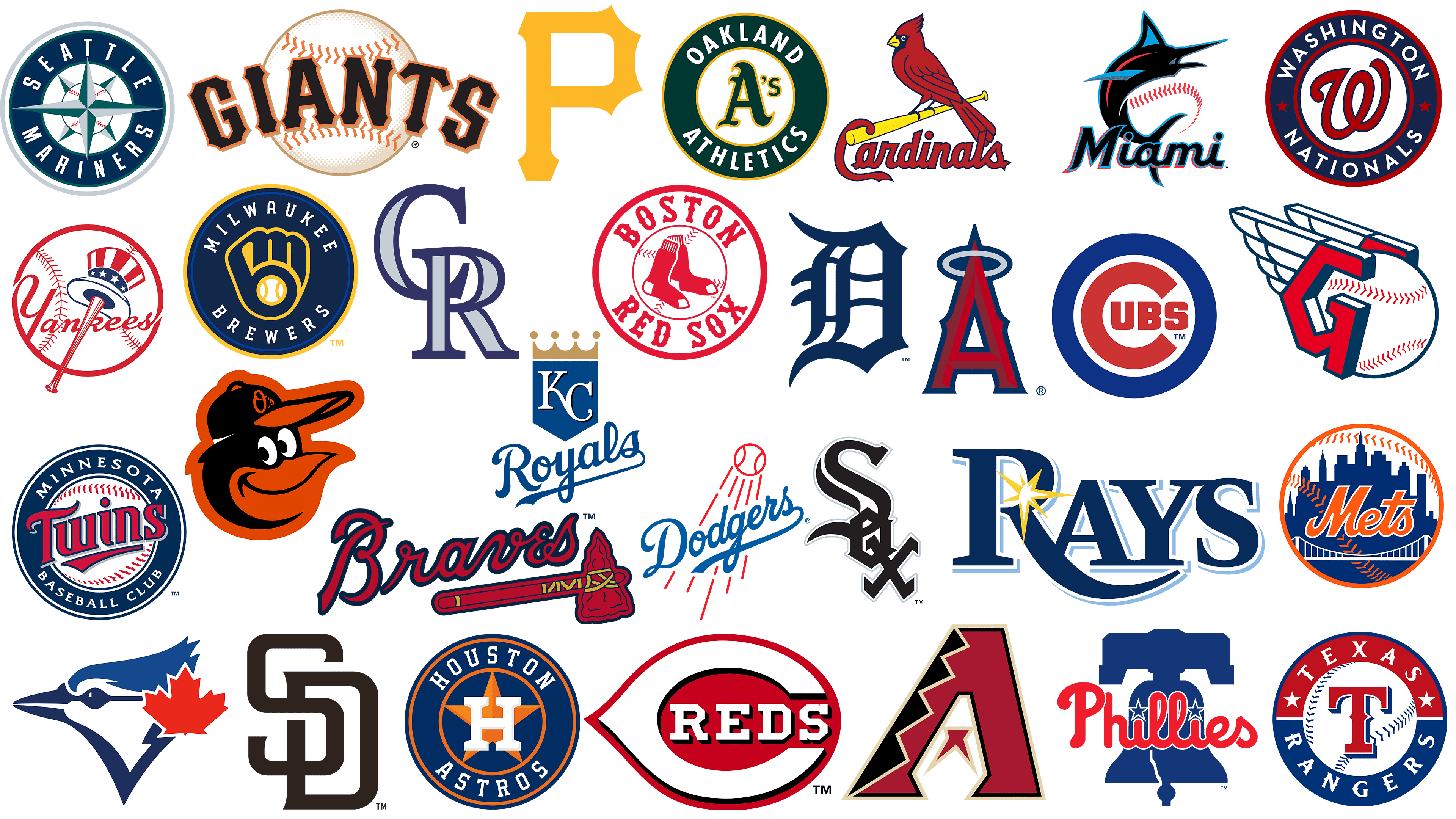
Across the United States and Canada, Major League Baseball’s 30 teams have rich traditions, rivalries, and stories passed down from generation to generation. These stories are reflected in their logos, each carefully crafted to embody the essence and spirit of the team it represents.
From the glittering East Coast to the bustling heartland to the sun-drenched West, each state where an MLB team is based carries its unique story. These stories are reflected in the intricate design of team emblems. Some may reflect the city’s history, while others may symbolize a feature unique to the region.
Teams from coastal cities may use nautical elements in their logos, while teams from industrial centers may use symbols that reflect their manufacturing heritage. The Canadian team, the only representative from outside the United States, proudly displays elements that echo Canada’s national identity, further enriching the league’s diversity.
For nearly a century, the National and American Leagues operated independently. In 2000, they merged, symbolizing the convergence of two distinct baseball traditions under one roof. This historic merger brought together many teams, each with a unique logo telling its story.
New York Yankees
![]()
The New York Yankees, recognized as one of the doyens of Major League Baseball, represent the Eastern Division of the American League. With a history dating back to the league’s inception, the team has developed a distinct identity and a large and loyal fan base over the decades.
The Yankees’ current emblem incorporates elements that resonate deeply with their heritage and the nation they represent. The baseball bat features a hat adorned with the colors of the American flag, symbolizing the unity of the American spirit and the sport itself. The logo’s elegance gives the team name “Yankees” a graceful, smooth font with shimmering effects.
The emblem’s round background, reminiscent of a baseball, adds appeal. This circle is carefully detailed with characteristic baseball stitching, organically connecting the sport’s essence with the team’s symbolism.
Boston Red Sox
![]()
Based in bustling Boston, the Boston Red Sox are one of the most colorful pillars of Major League Baseball. Their legacy in the sport is hard to overstate, as they represent the AL East Division. The team’s pedigree dates back to its original name, the Boston Red Stockings, a testament to its choice of uniforms, ultimately defining its look.
With nine World Series championships under their belt, the Red Sox have consistently demonstrated their prowess on the baseball field, garnering the admiration and support of legions of fans in their hometown and beyond.
At the heart of their visual identity is an emblem as simple as it is iconic: a pair of red socks. Echoing the design of the socks worn by baseball athletes, this emblem captures the team’s name and spirit in a simple yet impactful way.
A more complex version of the logo was developed to further reinforce the branding. The familiar red socks are set against a baseball background in this variant, emphasizing the sport’s essence. In bold serif font, the team’s name frames this image as a declaration and symbol of its high standing in the baseball community.
Los Angeles Angels
![]()
The Angels represent the dynamic city of Los Angeles and are a formidable force in the West Division of the American League of Professional Baseball. Since their inception in 1961, they have reflected the spirit of their city, affectionately known as the “City of Angels.” Their prowess on the field was evident when they won the World Series in 2002, a title that resonated with fans and opponents alike.
The Angels have adopted a symbol that is both colorful and representative. At the heart of the emblem is the red letter “A,” characterized by sharp angles and a modern design. Above this dominant letter, a pure white halo gracefully rises, evoking an angelic image synonymous with the team’s name and the city’s epithet.
In addition to jerseys and paraphernalia, this iconic logo is immortalized in a grand sculpture shaped like the letter “A.” Located inside Angel Stadium, the installation is a testament to the team’s rich history and its fans’ pride.
Chicago White Sox
![]()
Hailing from the heart of Chicago and representing the American League Central Division, the White Sox are a testament to the enduring legacy of baseball’s early years. This team began in 1900 as the Chicago White Stockings and changed its name to the more concise White Sox in 1904.
The team’s emblem is as symbolic as its history. At the heart of the emblem is a distinctive word mark consisting of three staggered letters, eye-catching for their variation. Drawing inspiration from Gothic architectural elements, the letters have sharp, elongated serifs. This gives them a touch of antiquity, echoing the team’s storied past. The choice of a black-and-white color palette for the emblem is not just a reference to the team’s name but also a symbol of the contrast and duality inherent in sports: wins and losses, highs and lows, home runs and strikeouts.
In the tumultuous world of baseball, where logos often change and evolve, the Chicago White Sox have kept their logo consistent and traditional.
Houston Astros
![]()
The Houston Astros, a team representing the American League West Division, have been showcasing their skills since their inception in 1962. Back then, they were not known as the Astros but as the .45 Colts. Their debut coincided with the New York Mets’ emergence; both teams entered the league as newcomers.
The team underwent a metamorphosis. They went from “Colt .45s” to “Astros,” a name that reflects Houston’s significant role in space exploration, particularly as it is home to the famed Johnson Space Center.
Looking at the Houston Astros’ emblem, one can see what their identity is all about. The centerpiece of the emblem is an imposing letter “H,” carefully crafted in the classic serif style. Below it, a shining gold star accentuates the design, hinting at the team’s name and Houston’s interstellar ties. The central image is surrounded by a clear border, with the full team name carved in bold, serif capital letters. Despite the design’s simplicity, the emblem exudes the authority befitting the Astros.
Oakland Athletics
![]()
The Philadelphia Athletics, originally from Oakland and active in the American League West Division, are rooted in baseball history. However, the team found its home in Oakland in 1968 and evolved into the team it is known and revered today.
Their victories on the field are legendary: They have won the World Series nine times, a testament to their skill, determination, and smarts.
The team’s iconic emblem reflects its nickname, “Swingin’ A’s. ” The letters ‘A’s are prominently displayed in Gothic script. Around this central design element, the full name “Oakland Athletics” is carefully inscribed, reaffirming the team’s pride in its history and current home.
Toronto Blue Jays
![]()
Representing Canada in Major League Baseball, the Toronto Blue Jays have proudly held their position since 1977. As the only Canadian team in the MLB, they are prominent in gameplay and symbolic branding.
The team took its name from a North American bird, the Blue Jay. It’s a nod to the feathered species and an homage to the bright blue color often associated with Toronto’s sports and college teams. This distinctive hue is synonymous with the city’s spirit and passion for sports.
The Toronto Blue Jays’ emblem captures this essence in the best possible way. The central figure is a blue jay, rendered with precision and dynamism, conveying the bird’s liveliness and mobility. Next to it is a maple leaf, Canada’s national symbol. More than just a design element, it embodies the team’s deep Canadian heritage and pride in representing their nation. This emblem symbolizes the baseball team and epitomizes Canadian spirit and resilience in the vast MLB arena.
Tampa Bay Rays
![]()
The Tampa Bay Rays, who appeared in the Major League Baseball arena in 1998, represented the American League Eastern Division. Originally known as the Devil Rays, the team’s name was inspired by the sea creature, the manta ray, suggesting associations with the seashore. Over time, a transformation was required to give the team a new vision and renewed spirit.
The decision to rebrand the Rays marked a significant shift in the team’s image. Moving away from the water connotation, the focus was shifted to “ray of light.” This concept was embodied in the team’s updated logo. The logo’s color palette of blue, yellow, and white evokes a vast sky illuminated by the sun. The brightly colored serif font gives the logo an elegant and modern feel. At the same time, the yellow star on the letter “R” further emphasizes the idea of light and shine.
The metamorphosis from “Devil Rays” to “Rays” symbolizes the team’s name change and the evolution of its identity, reflecting its history and aspirations for the future. The new logo embodies hope, vibrancy, and a desire to shine in the competitive world of baseball.
Seattle Mariners
![]()
Founded in 1977, the Seattle Mariners debuted in the American League West Division, a significant event in professional baseball. Over the years, ardent fans and the baseball community began to affectionately refer to them as the ‘M’s. This acronym took pride in the team’s visual style. While the nickname remained, the visual branding changed.
The current logo was developed after the team’s colors changed in 1993. While staying true to the widely used emblem style synonymous with baseball teams, the Mariners added a unique twist by incorporating a compass motif. This emphasizes the team’s nautical theme and indicates that Seattle is an important port city and maritime center.
Texas Rangers
![]()
Since its inception in 1961, the Texas Rangers have been a formidable contender in the American League West Division. Originally the Washington Senators, the team later moved to the dynamic Dallas-Fort Worth center in Texas, where it faced new challenges and new fans.
1972 was a landmark year for the team when it adopted the Rangers name. This choice was not arbitrary but a tribute to the legendary Texas Rangers, an outstanding law enforcement group with deep roots in Texas history.
The Rangers’ emblem stands out from the traditional aesthetics of baseball logos. Central to its design is an artfully crafted letter “T” placed within a baseball-themed badge. This emblem is complemented by a pronounced border that highlights the team’s name, ensuring it remains consistently recognizable in baseball.
Detroit Tigers
![]()
The Detroit Tigers, representing the American League Central Division, are the league’s longest-lived team affiliated with a single city and having a permanent name. The origin of the name “Tigers” is often debated, with many attributing it to the brightly striped design of their socks, which resembles a unique tiger pattern.
Despite its apparent simplicity compared to other Major League logos, the Detroit Tigers’ emblem has an undeniable appeal that leaves an indelible impression. The Gothic letter “D” at the center of the emblem adds detailed nuances and artistic touches to the design. These elements enhance its visual appeal and remind us of the team’s storied heritage and time-honored traditions throughout the league.
Minnesota Twins
![]()
Representing the American League Central Division, the “Minnesota Twins” proudly carry the heritage of the two interconnected cities of St. Paul and Minneapolis. These cities, affectionately called the “Twin Cities,” gave the team its name. The team’s history dates back to 1901, when they were first introduced in Washington, D.C., as the Washington Senators. However, in 1961, the team moved to Minnesota, starting a new page in its history.
Digging deeper into the team’s branding, the Minnesota Twins’ emblem stands out among other Major League Baseball teams. The centerpiece of the emblem is a drawn baseball rendered in bright white and red colors. It is overlaid with a skillfully executed word mark, “Twins,” that immediately identifies the team. A dark blue border surrounds the baseball, giving it depth and contrast. And to leave no doubt about the team’s origins, the border is inscribed with the words “Minnesota Baseball Club.” This clever combination effectively captures the essence of the team and its rich history.
Cleveland Guardians
![]()
The Cleveland Guardians, formed in 1904 in the American League’s Central Division, are firmly in baseball history. Over the years, the team won ten Central Division titles and twice the World Series.
The team’s name, “Guardians,” draws inspiration from the city’s rich history and architectural heritage. In particular, the name pays homage to the “Guardians of Traffic,” the majestic Art Deco sculptures created by renowned sculptor Henry Hering that have adorned the city’s Memorial Bridge since 1932. They stand like sentinels, watching over traffic and embodying the spirit of progress and movement.
The emblem evokes images reminiscent of Norse mythology, primarily because its design resembles a Norse god. Central to the emblem is a stylized letter “G,” flanked by elaborate wings. These wings are not just decorative elements; they surround a three-dimensional baseball, adding depth to the design. The ball’s strategic placement and the wings’ angle give the impression of swift motion, as if the baseball hurtles through the air.
In an era when symbolism is critical to branding and identity, the Cleveland Guardians successfully combined their city’s heritage, baseball energy, and iconic design elements into a cohesive, impactful logo.
Baltimore Orioles
![]()
The Baltimore Orioles, based in the historic city of Baltimore, Maryland, have a rich history dating back to the early 20th century. Part of the vanguard that helped create the American League in 1901, they took their place in baseball’s rich tapestry as one of the pioneering teams.
The decision to choose the Orioles’ name was no accident. In honor of Maryland’s natural heritage, the team’s name incorporates the state’s avian emblem, the oriole. This bird, known for its bright black-and-orange plumage, represents not only the beauty and vibrancy of the region but also evokes a sense of pride in its inhabitants.
The Baltimore Orioles’ emblem accurately captures the essence of the team and its connection to the local community. Dominated by a vibrant image of an oriole, the emblem represents the team’s namesake and symbolizes regional pride. The playful depiction of the bird in a baseball cap adds a touch of whimsy and appeals to young fans and those young at heart. The color palette of black, orange, and white is directly tied to the bird’s natural hues, further strengthening the bond between the team and its feathered counterpart.
Kansas City Royals
![]()
Originally from Kansas City, the Kansas City Royals are an expansion team that proudly competes in the American League’s Central Division. Founded in 1969, this team boasts an impressive record and two World Series titles. The name “Royals” was chosen for a reason: it pays homage to the American Royals, a significant event in Kansas City that includes a livestock show, a thrilling rodeo, and a prestigious championship.
The emblem forms an elegant shield proudly displaying the initials “KC.” It is masterfully crowned, reinforcing the royal theme. A graceful word mark with the team name adds sophistication to the entire design. These elements combine to create a logo that captures the essence of the team and its inextricable connection to Kansas City’s history.
National League Baseball Team Logos
The National League, the older of the two Major League Baseball (MLB) leagues, features a wide range of team logos deeply rooted in each club’s history and identity. These logos often carry significant meaning and become symbols of fan pride.
National League logos range from simple, iconic lettering to complex images that reflect a team’s local culture or heritage. The intersecting letters “LA” of the Los Angeles Dodgers and the “C” in the Chicago Cubs logo are examples of effective letter use to create distinctive, easily recognizable logos.
Animal imagery is also popular in the National League. The St. Louis Cardinals’ logo features a bird perched on a bat, and the Miami Marlins’ logo features a stylized marlin. These examples link the team name to a visual image.
Geographic and cultural references are common in logos. For example, the Arizona Diamondbacks’ logo’s color scheme and design reflect the state’s southwestern flavor, while the Colorado Rockies’ logo reflects the region’s mountainous terrain.
Often, logos reflect historical context as well. For example, the classic Philadelphia Phillies logo, modeled after the Liberty Bell, is a testament to the city’s rich history. In contrast, the San Francisco Giants logo pays homage to the city’s long baseball tradition.
National League baseball team logos are more than just branding symbols. They are visual stories that capture the essence of each team, linking past and present and creating a shared identity that resonates with fans, players, and the communities they represent. Simple or intricate, classic or modern, these emblems are integral to the game and baseball culture.
Los Angeles Dodgers
![]()
The Dodgers, founded in 1883 and with a rich history spanning over a hundred years, have become a cornerstone of baseball. Throughout its early years, the team explored many name options to capture the essence of its game and spirit. By 1932, the name “Dodgers” was chosen to reflect their reputation as fast, agile players on the field.
The Los Angeles Dodgers emblem is iconic and instantly recognizable. At its center is a bright red baseball, followed by stripes that evoke movement and speed, completely in keeping with the team’s name. Complementing this dynamic image is an elegant word mark in a script-style font. This combination gives the emblem a spirit of tradition and energy.
Chicago Cubs
![]()
Located in the heart of the Midwest, the Chicago Cubs have a rich history that dates back to 1876. This iconic National League Central Division team shares the honor of representing the Windy City with its counterpart, the White Sox. The Cubs’ epithet, a legacy that spans more than a century, dates back to the early 20th century. In 1902, the Chicago Daily News gave the team this affectionate nickname, which later became its defining name.
The Chicago Cubs’ emblem holds a special place in baseball branding. While many teams use a circular style for their emblems, the Cubs twist this common design. In the center of the emblem is a clear “C,” symbolizing the city of Chicago and the club’s name. This bold letter anchors the design and is the basis for the entire name, making the logo instantly recognizable.
St Louis Cardinals
![]()
The St. Louis Cardinals, a team in the National League Central Division, have a reputation that precedes them, as evidenced by their impressive 11 World Series championships. The team’s emblem demonstrates a creative approach to baseball branding, featuring the Cardinal as a symbolic mascot.
The team’s terminology dates back to 1899, when it was called the Perfectos. The transition to “Cardinals” was inspired by the bright cardinal-red hue of the jerseys and gaiters worn during the Perfectos era.
The St. Louis Cardinals’ emblem combines tradition and dynamism. It depicts a colorful Cardinal perched confidently on a baseball bat, combining a sporty and naturalistic aesthetic. Complementing this image is the team name, elegantly written in cursive script, which adds a touch of elegance to the entire design. The logo’s overall visual representation resonates with fans and ranks among the most memorable in baseball history.
San Francisco Giants
![]()
The San Francisco Giants, a team in the National League’s West Division, have a rich history dating back to 1883. During their formative years, they were known as the New York Gothams. Their path in the history of professional baseball is quite remarkable, and they have cemented their title as one of the oldest and most prestigious baseball teams.
The Giants have chosen a distinctive emblem that reflects their status. The emblem is based on a pronounced word mark masterfully superimposed on an image of a baseball. The characteristic orange stitching on the ball enhances its detailing and adds vibrancy to the design. In all its grandeur, this emblem reflects the team’s colossal name and accomplishments.
Atlanta Braves
![]()
Located in the heart of Atlanta’s bustling metropolis, the Atlanta Braves proudly represent their city in the National League’s Eastern Division. The intriguing name “Braves” dates back to 1912 and is inspired by the courage and spirit of Native American warriors. In addition to the official name, enthusiasts and team followers often affectionately refer to it as “Bravo,” expressing their devotion and admiration.
The Atlanta Braves’ emblem is distinctive. It is a carefully crafted word mark written in elegant cursive script: “Braves.” Beneath this centerpiece is an emblematic Native American axe, further underscoring the team’s historical connection and its fierce competition on the battlefield.
New York Mets
![]()
Located in the heart of New York City, the New York Mets are one of the two outstanding Major League Baseball clubs. This club’s history dates back to 1962, a testament to its enduring legacy in baseball. “Mets” isn’t just a fancy name; it’s a shorthand representation of the more expansive “The Metropolitan Baseball Club.” This acronym reflects both the urban nature of their location and the team’s extensive history.
The New York Mets logo is iconic and deeply symbolic. The designers seamlessly incorporated a classic baseball pattern to further connect the logo to the world of baseball. This masterful juxtaposition transforms the circular skyline image into a baseball, connecting the city’s urban spirit with America’s favorite pastime.
Philadelphia Phillies
![]()
The Philadelphia Phillies, hailing from culturally rich Philadelphia, have left an indelible mark on the National League’s Eastern Division. Their impressive tenure is due to more than just their play on the field. Their impressive tenure in Philadelphia is not only due to their on-field play but also to their staying true to their city and name longer than any other professional sports franchise in the country. Such a long tenure in the league has been marked by significant accomplishments, including two World Series titles, which have earned them a place of honor in baseball circles.
The name “Phillies” is not just a label for the team. It carries the essence of Philadelphia, reflecting the city’s affectionate nickname. The team’s visual emblem echoes the city’s storied past. The centerpiece of the emblem is the Liberty Bell with its famous crack. Further enriching their brand’s visual representation, the Philadelphia Phillies used a distinctive cursive font in their emblem. This design element, unlike the traditional fonts used by many of their Major League Baseball counterparts, emphasizes their identity and sets them apart from the rest of the league.
Milwaukee Brewers
![]()
Based in Wisconsin, the Milwaukee Brewers team has become synonymous with that city’s rich brewing heritage, a testament to the region’s long-standing connection to beer production. The team began its journey in professional baseball under a different name, the Seattle Pilots. However, the move to Milwaukee led to a name change that embodied the brewing heritage.
The emblem, rendered predominantly blue, white, and yellow, is enclosed in a circular frame. This motif encapsulates the team’s motto, and in the center is an artful depiction of a baseball glove expertly holding a baseball. The design’s combination of elements symbolizes the coming together of the Milwaukee Brewers’ history and the pure essence of baseball.
San Diego Padres
![]()
The San Diego Padres, a prominent team in the National League West Division, have existed since 1969. Unlike many California teams that have relocated elsewhere, the Padres can proudly claim true California origins. Only two Major League Baseball teams can trace their origins to the state. Their heritage and name are closely tied to the Pacific Coast League team from San Diego that existed in 1936.
The San Diego Padres’ emblem design is a study in elegant simplicity. Central to the emblem is the original placement of the letter “S” above the letter “D,” artfully intertwining them. This design choice represents the initials of the team’s hometown and symbolizes unity and cooperation. Overall, the logo harmoniously blends past and present, reflecting the team’s history and modern aspirations.
Washington Nationals
![]()
Representing the vibrant capital city of the United States, the Washington Nationals have been an important team in the National League’s Eastern Division since their inception in 1969. Thanks to the city’s rich baseball history, the Washington Nationals became the eighth Major League team to do so, emphasizing the residents’ deep love for the sport.
The name “Nationals” is more than just a name; it’s a testament to the team’s historical affiliation. The Washington Nationals stick to a classic design. Their iconic emblem fits seamlessly into Major League Baseball’s aesthetics while maintaining their unique identity. The centerpiece of the emblem is a dominant “W,” symbolizing Washington, D.C., surrounded by the full team name. This design choice conveys a sense of authority and prestige, aligning with the city’s status.
Cincinnati Reds
![]()
Located in the vibrant downtown Cincinnati area, the Cincinnati Reds have carved out a unique niche in baseball history. After joining the American Association in the early 1880s, this venerable team moved to the National League by the early 1890s. The name “Reds” is a legacy, echoing an earlier baseball team that bore the same name.
The Cincinnati Reds have chosen a clearer path in their branding. Their emblem is a bold white silhouette that wraps around the word “Reds” and subtly forms the letter “C.” The emblem’s creativity allows it to go unnoticed, even in a league with a rich history and iconic logos.
Colorado Rockies
![]()
The Colorado Rockies, a team in the National League’s Western Division, got their name from the iconic Rocky Mountains, which make up a large part of Colorado’s landscape. These impressive mountains, renowned for their imposing heights and picturesque scenery, symbolize strength and consistency attributes fitting for a baseball team that entered the professional arena in 1993 and reinvigorated the league.
The Colorado Rockies emblem is the perfect blend of minimalism and subtle sophistication. It is based on the artistic fusion of two letters: a dominant “R” atop a pronounced “C.” In a classic serif font, the emblem exudes seriousness and heritage. This symbolic design reflects the Rockies’ dedication to baseball and the enduring splendor of the mountain range that bears their name. Amid a sea of changing emblems, the Colorado Rockies’ evergreen logo emphasizes its enduring legacy and deep connection to the state’s famous mountain scenery.
Miami Marlins
![]()
Located in the bustling city of Miami, the Miami Marlins are a team firmly ensconced in the National League’s Eastern Division. Their journey began in 1993 when they were introduced as an expansion team. The team was originally called the Florida Marlins, but after a rebranding, it became the Miami Marlins. This change was part of a joint decision with the Miami Dolphins, strengthening both teams’ connection to the city.
The team’s emblem features an intricate design depicting a marlin gracefully arching out, capturing the swift, dynamic essence of the sea creature. The elegant yet simple sans-serif font used to spell the team’s name complements the image. To root the logo in baseball, the designers ingeniously utilized the classic stitching seen on baseballs, adding a touch of tradition to the modern design.
Arizona Diamondbacks
![]()
The Arizona Diamondbacks, representing the National League West Division, are affectionately known as the D-Backs. They began their baseball journey in the late 1990s. While many of the league’s teams have a rich history dating back centuries, the Diamondbacks are relatively new, placing them among the league’s newcomers.
The team’s emblem is a model of creative excellence. The emblem is based on the overbearing letter “A.” However, upon closer inspection, a silhouette of a snake’s head can be discerned in the negative space, a reference to the Diamondback rattlesnake that inhabits the region. This fusion of artistry and symbolism echoes the team’s name and creates a unique niche for the Arizona Diamondbacks among the many MLB emblems. This combination of distinctive features creates a logo that resonates with fans, is instantly recognizable, and deeply connects with the team’s geographic roots.
Pittsburgh Pirates
![]()
Founded as a prominent baseball team, the Pittsburgh Pirates have a rich history of outstanding accomplishments, including five World Series wins. The name “Pirates” evokes the intrigue surrounding the team’s controversial early days.
The first thing that catches the eye of the emblem is the golden letter “P.” This lone symbol attracts attention not so much for its simplicity as for its bold font. This thoughtful font choice gives the emblem its character, preventing it from getting lost amid the noise of a baseball game. With this simplicity, the logo reflects the rich heritage and strength of the Pittsburgh Pirates team.
Celebrating Major League Baseball Team Logos
Major League Baseball (MLB) has given sports fans many memorable emblems in its rich history. The logos above are a testament to the combination of craftsmanship and strategy to create symbols that resonate with the public. Despite their diverse designs, these symbols share a common ability to evoke emotion, reflect the team’s heritage, and strengthen the bond between the team and its fans.
The success of these logos depends on more than just their visual appeal. Each emblem tells a story, often deeply rooted in the team or area it represents. Some emblems’ simplicity hides their deep meaning, ensuring longevity and relevance. Their elegance and symbolism serve as a point of reference for fans, fostering unity and anticipation for each game. The combination of history, design, and emotional connection makes MLB logos not just team identifiers but iconic symbols in the world of sports.