The Monsanto logo has long represented the company’s leadership in agricultural and biotechnological innovations, particularly in developing GMOs to increase crop yield and disease resistance. This emblem highlights Monsanto’s dedication to scientific progress and establishes its key role in the global agricultural industry, especially in creating plant protection agents and seeds. Over time, Monsanto has updated its corporate identity to reflect its evolving mission and the changing industry. Initially a discreet emblem, it was replaced with a more modern, themed design that better captured the biotech giant’s essence. The final version, featuring elements of vegetation, symbolized Monsanto’s connection to nature and its efforts to harness natural potential to develop new species. These changes in logo design signify Monsanto’s growth and deepening commitment to innovation in the natural world.
Monsanto: Brand overview
Monsanto is the world leader in biotechnology (agriculture) and the largest multinational corporation. Its main office and research premises were in St. Louis (United States of America). The company’s laboratories produced genetically modified crop products and chemicals (insecticides and herbicides). In 2018, Monsanto sold all its shares to the major German manufacturer Bayer.
In 1901, John Francis Queeny started Monsanto in St. Louis, Missouri. The company began by making food additives like saccharin and vanillin. From these small beginnings, Monsanto became a leading force in global agriculture, known for its innovations and the debates they sparked.
By the 1940s, Monsanto had started producing industrial chemicals and plastics. Its synthetic fibers and the herbicide 2,4-D, crucial for farming, played a vital role in the war effort—the following decades led to the creation of agrochemicals such as DDT and Agent Orange. These products were widely used but also raised concerns about their environmental and health impact.
In the 1980s, Monsanto shifted its focus to biotechnology, especially genetically modified (GM) crops. The introduction of Roundup Ready crops in 1996, resistant to Monsanto’s Roundup herbicide, marked a significant advancement in agricultural technology, offering farmers more efficiency.
However, the 2000s saw growing skepticism and resistance to GM crops over worries about their effects on health, the environment, and traditional farming methods. Despite these challenges, Monsanto continued to grow, acquiring seed companies and becoming a dominant player in the GM seed market by 2015.
A major change occurred in 2018 when the German giant Bayer bought Monsanto for $63 billion, creating the largest agricultural company worldwide. After the merger, Bayer chose to drop the Monsanto name due to its controversial reputation. Still, Monsanto’s legacy, especially its product Roundup, remains a hot topic due to ongoing debates and lawsuits about its possible connection to cancer.
Though Monsanto no longer exists as a separate company, its contributions and technologies are vital to agriculture worldwide. The story of Monsanto is a complex mix of business success, technological breakthroughs, and ongoing controversies, reflecting the challenging balance between innovation and its impacts on society and the environment. This history highlights the company’s significant role in shaping modern agriculture and the continuing discussions around the practices and products it introduced.
Meaning and History
Monsanto was one of the most powerful corporations in the agricultural industry. During its existence, many varieties of seeds were created, as well as the necessary substances that affect the growth and development of crops. The agrochemicals category included fertilizers, insecticides, and a popular Roundup herbicide. The company occupied a leading position in the market for a long time but soon sold all the shares to a large German company operating in several directions simultaneously.
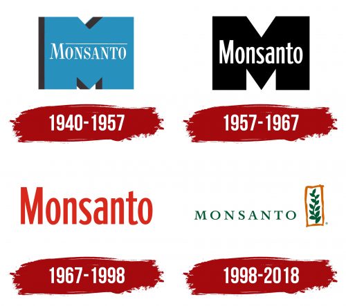
The visual identity of the multi-industry brand was initially based on a minimalist logo that emphasized only certain features but did not reveal the essence. It was a two-piece emblem in achromatic colors. Later, it was replaced by a stylish thematic picture, which fully revealed the company’s message and field of activity. The new version already had a decorative element.
What is Monsanto?
Monsanto is a large multi-industry concern specializing in the manufacture of genetically modified agricultural products and chemicals for plant treatment. The company had modern laboratories where numerous studies and experiments were carried out. The main achievements of the corporation were the herbicide “Roundup” and a particularly resistant variety of cotton “Ballguard.” In 2018, all of the company’s assets were transferred to Bayer.
1940 – 1957
From 1940 to 1957, Monsanto focused on developing innovative herbicides, reflected in its corporate symbol, which has a prominent blue “M.” This “M” symbolizes Monsanto’s commitment to protecting crops from pests and weeds through science and technology.
The blue “M” was set against a white inscription, representing crops protected from weeds and pests by Monsanto’s products. The design used color and shape to highlight the company’s focus on protection and reliability.
The large “M” in the logo also symbolizes Monsanto itself, showing its growth from a small company to an industrial giant influencing agriculture significantly.
The logo included a thin white stripe under the company’s name, representing both protection and the layers of soil and plant surfaces that Monsanto’s chemicals reach to fight weeds. This design captured the essence of Monsanto’s work and its goal to enhance agricultural productivity.
The blue logo was chosen because it is associated with technology, safety, and protection, fitting for a brand dedicated to creating effective agricultural solutions.
1957 – 1967
The company used a strict, concise icon consisting of a large letter M and a full-fledged name on its background. In the presented design, the big ambitions of the owners were noticeable, as well as their desire to create a solid, powerful company that occupies a leading position in the market.
This was manifested in a strict Roman sans-serif, showing progressiveness, reliability, and restrained coloring. Classic black is always a sign of authority and prestige, while neutral white symbolizes timelessness, honesty, and hope. All this conveyed the core philosophy of the brand at the time.
1967 – 1998
After discovering the highly effective herbicide Agent Orange in the mid-20th century, Monsanto underwent significant changes in its strategy, internal policies, and corporate visual identity. These changes marked a new phase in Monsanto’s development, reflecting its achievements and ambitions in the global market.
The updated logo featured bright red letters, chosen for their traditional association with strength, energy, and determination—qualities that matched Agent Orange’s characteristics. This herbicide was highly effective, clearing vegetation in difficult environments like tropical jungles, which marked a significant advancement in the agrochemical industry and strengthened Monsanto’s market position.
The logo’s thin glyphs, reminiscent of plant stems, connected to Monsanto’s core activity of developing plant care and protection products. This design emphasized the company’s agricultural focus.
The logo’s minimalist design underscored Monsanto’s professionalism and reliability. During this period, it was necessary to refresh the brand’s look and feel and demonstrate Monsanto’s commitment to transparency, responsibility, and innovation. The design’s minimalism focused on the essentials: the effectiveness and safety of the company’s products.
1998 – 2018
In 1998, it was decided to update the existing logo, as it did not fully reflect the company’s essence and strategy. The designers were tasked with making the most natural logo to symbolize unity with nature. The result of the work done was an updated version that was radically different from its predecessor.
It was a more stylish and lively emblem, in which the inscription was harmoniously complemented by the main symbol of Monsanto’s activity – a plant. The image of a twig with leaves has been placed in a creative frame created by ornate lines. She seemed to protect the plant from negative external influences. In general, the style of the figure resembled a picture drawn with paints, further emphasizing the line of naturalness.
The wordmark was designed in a clear, expressive font that demonstrated stability, reliability, and professionalism. There were quite large spaces between the letters, which ensured good readability. The overall concept was complemented by natural colors, which were as close as possible to natural colors. She perfectly balanced the main elements.
Font and Colors
The visual identity of Monsanto is a true example of a kind and inspiring style that captures in detail the essence of a large, diversified corporation. Since the main directions of a large company were biotechnology and bioengineering, the designers’ main efforts were directed at selecting thematic elements. In the finished version, a stylized elegant inscription and colors reminiscent of the natural shades of plants are advantageously combined.
The title is the main element. The wordmark was designed with a classic, stylish font that has remained relevant for a long time. Among its features are thin, graceful lines, different thicknesses of letters, compact size, and neat serifs. Such a font favorably emphasizes professionalism, stamina, and authority. In addition, it was distinguished by good readability due to the increased spacing between letters.
The color scheme is an excellent complement to the chosen style solution. It continues the line of nature, which is fixed at the level of a decorative badge in the form of a thin branch. Deep green was used to design the inscription and the plant, closer to the dark shades group. It symbolizes harmony, naturalness, and unity with the outside world. The frame is dark orange. It is associated with energy, growth, and vitality, which were also among the principles of Monsanto.
FAQ
Does the Monsanto brand continue to produce products?
No, the Monsanto brand itself does not continue to produce products. In 2018, Bayer acquired Monsanto, a German pharmaceutical and life sciences company. Following the acquisition, Bayer decided to discontinue using the Monsanto name, integrating Monsanto’s products, technologies, and operations under the Bayer umbrella. While the products and technologies developed by Monsanto, such as the Roundup line of herbicides and genetically modified seeds, are still in production, they are now branded and managed by Bayer. This means that while the legacy and products of Monsanto live on, they do so under the Bayer brand, not Monsanto.
What does Monsanto mean?
John Francis Queeny founded Monsanto in 1901, naming it after his wife Olga Mendez Monsanto. The company became well-known for its work in agricultural chemicals and biotech, notably for creating genetically modified organisms (GMOs) and the popular herbicide Roundup. Monsanto played a significant role in the agricultural sector, introducing many innovations in crop protection and biotech. However, its name also became linked with controversy over its products’ environmental and health effects. In 2018, Bayer acquired Monsanto and decided to drop the Monsanto name because of the associated controversies, ending its run as a separate company.
