


![]() Morrisons Logo PNG
Morrisons Logo PNG
The Morrisons logo represents a huge selection of natural, safe, and pleasant products. Each thing finds its shelf. The emblem depicts the growth and spread of a company dedicated to benefiting its customers.
Morrisons operates more than 490 stores across the UK and employs around 110,000 people. With over 120 years in retail, the chain competes directly with Asda, Aldi, and Lidl, relying on price-led campaigns to retain customers.
The business began in 1899, when William Morrison sold eggs and butter from a market stall in Bradford, Yorkshire. By the 1920s, the operation moved into a permanent shop, shifting from street trading to structured retail. After World War II, leadership passed to Ken Morrison. During the 1950s and 1960s, the company expanded beyond Yorkshire. In 1961, it was listed on the London Stock Exchange, marking a new phase of growth.
Throughout the 1960s and 1970s, Morrisons opened larger supermarkets in Bradford, introducing a wider range of fresh and chilled products that reflected a changing retail format. Expansion continued in the 1980s and 1990s across northern and central England. The acquisition of Whelan Discount in 1978 and Safeway in 2004 transformed Morrisons into a national chain.
The Safeway deal created integration issues that affected profits and market share. Recovery came in the late 2000s through store refurbishments, supply chain changes, and formats like Market Street, which was later linked to Amazon. In the 2010s, Morrisons expanded into online delivery and click-and-collect while focusing on fresh, locally sourced goods. In 2021, Clayton, Dubilier & Rice acquired the company for £7 billion, marking a shift in ownership and strategy.
Meaning and History
![]()
The retail chain takes steps to resist the pressure of growing competition. This is evidenced by her desire for rebranding, especially in recent years. If she did not change her style until the middle of the 20th century, designers now only create new logos for Morrisons. After all, the main way to become a leader is to get customers’ attention.
What is Morrisons?
Morrisons ranks as the UK’s fourth-largest supermarket chain, with a storied past dating to the dawn of the 20th century, and 497 supermarkets (in 2021). It was formed in 1899 by William Morrison, who gave the company his last name.
1899 – 1961
![]()
Originally, the company featured an emblem with the name “MORRISON’S” prominently above the entrances to its shops. This emblem employed a slender, straight-serif font that mirrored the era’s stylistic preferences, closely resembling the letterforms commonly seen on street signs. The design was given a distinctive touch by making the trademark’s first letter slightly bigger than the other characters. This subtle differentiation made the logo stand out and gave the composition a distinctive flair, reflecting the brand’s identity and attention to detail in its public presentation.
1961 – 1979
![]()
In 1961, a more complex logo appeared. It was divided into two disproportionate parts: on the left was an ellipse with a large “M,” and on the right was a rectangle with a two-line inscription “MORRISONS SUPERMARKETS.” A thin black line ran along the outline of the quadrangle. Simultaneously, the text was black and stood out against the dark pink geometric shapes.
1979 – 1985
![]()
After the redesign, the emblem’s general appearance has changed, although the main elements remain the same. A black rectangular frame runs along the border. Inside it, at the very bottom, is the word “MORRISONS” sans serif. A black square occupies the remaining space, with an orange oval and a large “M.”
1985 – 2007
![]()
An attempt to diversify the design yielded no results. The oval went from orange to yellow, and the name of the supermarket chain began to be written in a compact serif typeface. Due to the new font, the rectangular frame’s size has decreased slightly.
2007 – 2016
![]()
The Morrisons’ owners understood that identity development was at a standstill, which could hinder efforts to attract clients from different nationalities. They urgently needed to do something, so they contacted the Landor branding agency for help. The specialists decided to keep the corporate identity but remove some elements. This is how the emblem appeared: a green letter “M” inside a yellow oval, with the same green inscription “MORRISONS” at the bottom. All this was on a blank white background.
It’s worth noting that buyers didn’t like these experiments. Adding a new logo to store signs, employee uniforms, and elite shop windows was always met with negative reactions. Therefore, in 2016, the management was forced to cancel the selected design.
2016 – 2021
![]()
Faced with customers’ conservatism, the retail chain owners decided to prepare them in advance for the next rebranding. The first rumors of a corporate identity change began in 2015 when the company registered the new logo as intellectual property. The badge appeared in a supermarket the same year: the Merrion Center in Leeds became a test site. And only then did David Potts’s head announce the forthcoming “transformation plan.”
The redesign was part of the Fresh Look program. It envisioned a sharp price decline and a renewed corporate identity across all stores, to be completed by 2019. This would unite the entire chain and lure customers from other large discounters.
The plan succeeded, although Morrisons’ owners were deeply afraid of negative customer reactions. The company stopped operating at a loss and even came out on top: its income has grown year over year. Perhaps this is one reason why the retail chain is in no hurry to change the logo again, so as not to shock the unprepared public.
2021 – today
![]()
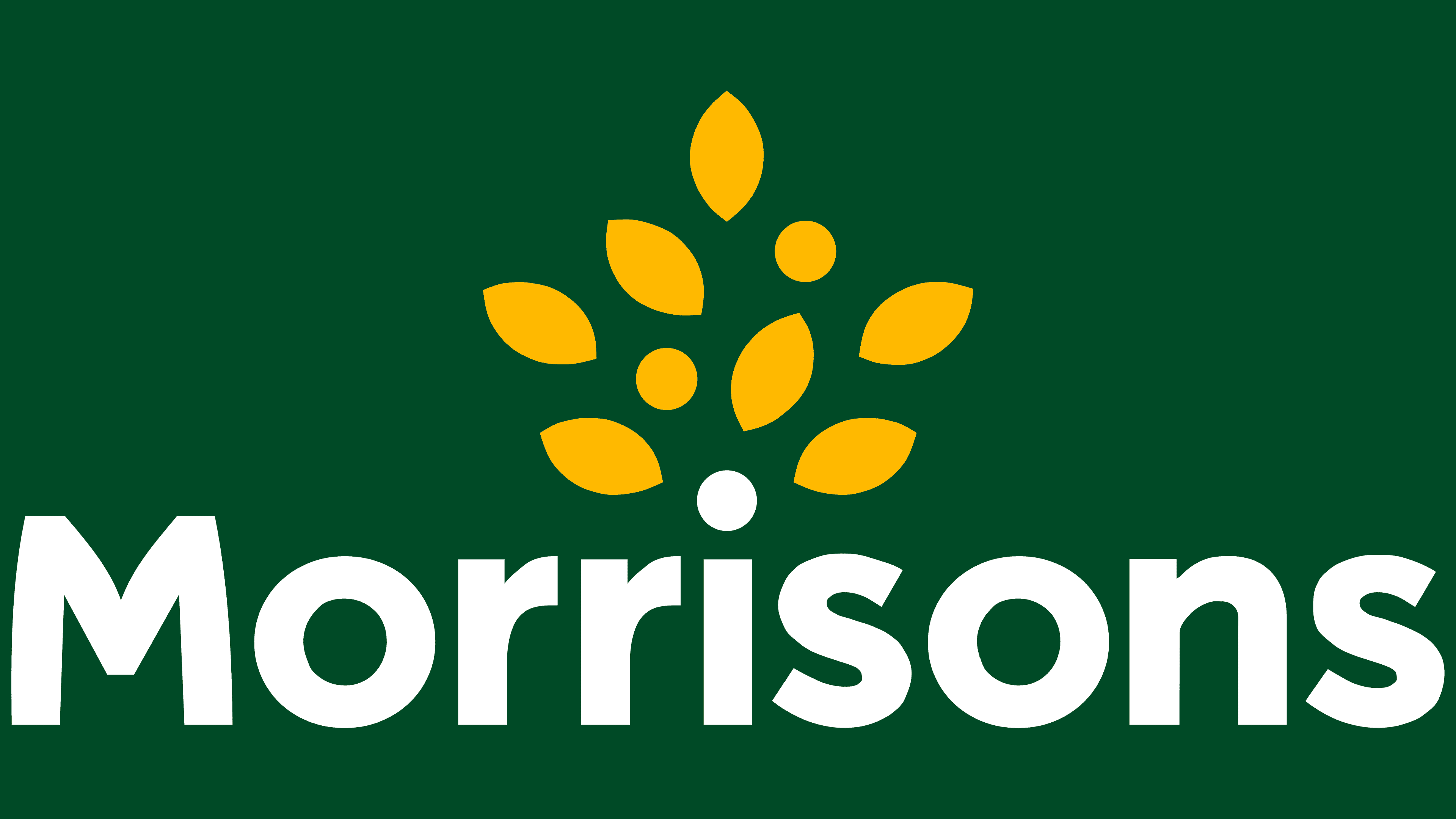
From its humble beginnings in 1899 as a stall selling eggs and butter, Morrisons has evolved into one of the largest supermarket chains in the United Kingdom. Its logo has paralleled this transformation, highlighting the freshness and care for customers that are central to the company’s philosophy.
The 2021 iteration of the Morrisons logo retains much of its previous design, with some notable refinements. The reference to “since 1899” beneath the brand’s main text has been removed, and the green hue has been lightened, lending the logo a more modern, vibrant look.
The logo’s central element, a stylized flower with seven bright yellow petals above the green text, remains unchanged. This flower suggests sunlight, warmth, and positivity, evoking the pleasure of shopping and hinting at the supermarket’s diversity and quality.
The word “Morrisons” is presented in a recognizable sans-serif font that exudes professionalism. The green color of the text is associated with freshness, naturalness, and healthy eating, reflecting the retailer’s commitment to offering quality food products.
This emblem represents Morrisons’ journey from a local market stall to a big British retailer. The revised logo’s cleaner lines and updated color palette signify a forward-looking ethos while maintaining the legacy of a trusted brand.
Font and Colors
The designers found a middle ground, an option that satisfied most of the clients. It does not have geometric shapes, as in the previous emblems, but a pattern of orange leaves. The leaves look like a tree’s crown, and the letter “i” from the word “Morrisons” serves as the trunk. The style is generally similar to the British one; it looks luxurious and confident.
The Morrisons logo stands out for its modern, straightforward look, using a clean, geometric sans-serif font that feels simple yet confident. The font style is friendly and professional, similar to Crossten Bold or Rotunda Bold. A special touch is added to the capital “M” in the logo, making it unique and highlighting the brand’s distinctiveness.
This small tweak to the “M” catches the eye and shows Morrisons’ dedication to standing out in the market. The font’s bold, clear appearance reflects the supermarket’s goal of offering quality service straightforwardly. It shows how Morrisons has grown from a simple market stall into a major retail player in the UK, while keeping its core values and adopting a modern look. The logo’s mix of old and new styles shows Morrisons’ commitment to progress, honoring its past while focusing on today’s customer needs with efficiency and trustworthiness.
The logo update allowed the retailer to increase brand awareness. The font has completely changed: the serifs have disappeared, and all letters except the first “M” have become lowercase. The yellow-green color scheme is the only thing that now reminds us of the old design. But the designers moved away from the classics, opting for darker shades: Mikado Yellow (#FFC20E) for the leaf pattern and Castleton Green (#00563F) for the chain’s name. In 2021, they made the green lighter to better match the bright yellow.
FAQ
What does the Morrisons logo mean?
The Morrisons logo promotes the idea of plenty for everyone, which is important to Morrisons. The logo shows a tree’s top growing from the letter “i.” This tree is special because it’s full of golden leaves or coins, which mean different things to different people.
This design suggests growth, success, and the natural world’s bounty, all things Morrisons wants to be known for. The golden leaves symbolize the high quality and variety found at Morrisons, like discovering a treasure. The coins could represent the good deals and savings you get when you shop there.
Many people recognize the tree as a symbol of life, growth, and environmental care. Morrisons chose this design to demonstrate its commitment to offering fresh, high-quality items and to caring for the environment. It tells the story of how Morrisons supports communities, improves lives, and offers good value, all while being kind to the planet.
What font is the Morrisons logo?
Over time, the Morrisons logo has changed, showing how the brand and its identity have grown. At first, the Morrisons’ name was set in a font like Rockwell Regular, known for its clear, strong look. This font conveyed a sense of reliability and trustworthiness, aligning with Morrisons’ reputation as a long-standing UK retailer.
But Morrisons wanted to update its look to be more modern and appealing, so they switched to a bolder, simpler font that fits the bold, grotesque style. This new font is smooth and even, making the logo look cleaner and more up-to-date. It’s similar to fonts like Crossten Bold or Rotunda Bold, which are straightforward and bold without the detailed edges of older fonts like Rockwell. This makes the logo appear friendly yet professional.
This change aims to make Morrisons seem more inviting and strong as a brand. The new font is efficient and modern, appealing to a broad audience by blending current design trends with Morrisons’ long-standing promise of quality and value.
When was Morrisons founded?
Morrisons, a well-known name in the UK supermarket sector, dates back to 1899. In Bradford, William Morrison laid the foundation for what would become one of the country’s leading retail chains. Initially, the business focused on selling eggs and butter, carving out a niche in the local market. What started as a modest venture evolved over the years into a significant presence in the retail industry.
For a considerable period, Morrisons maintained its status as a family-operated business, deeply rooted in the values and traditions of such an enterprise. The close-knit nature of its operations allowed for a strong sense of identity and purpose, contributing to the company’s steady growth and success.
The turning point came when Morrisons decided to go public, selling its shares and marking a significant transition from its family-owned origins to a publicly traded entity. This move was pivotal in enabling the company to expand its reach and scale up its operations, paving the way for it to become the retail powerhouse it is today.
Who owns Morrisons supermarket?
Morrisons started as a small market stall in Bradford in 1899 and has grown into the UK’s fourth-largest supermarket chain. William Morrison founded the company and has played a significant role in the British grocery market for over a century.
In 2021, after a bidding war, Morrisons was bought by Clayton, Dubilier & Rice (CD&R), a private equity firm. This deal, worth about £7 billion ($9.5 billion), shifted Morrisons from a publicly traded company to a privately owned one. This change is important because it marks a new phase for Morrisons, in which the company might change how it operates, plan for expansion, and aim to improve its financial performance with CD&R’s support.
The buyout by CD&R caught the attention of the business world and shoppers. Morrisons is a key player in the UK grocery scene, employing many people and operating a vast network of stores and supply chains. People are now watching how the change in ownership will affect Morrisons’ market position, what the stores offer, and how they treat their employees.
When did the Morrisons logo change?
The Morrisons logo was significantly redesigned in 2016, resulting in a major change to the brand’s appearance. This redesign aimed to update the brand’s image, making it look more modern and appealing to a wider audience. In 2021, there were some minor updates to the logo. So, it’s fair to say the major change happened in 2016, with the updates in 2021 just polishing and adding to that new look.
What is Morrisons slogan?
In May 2023, Morrisons returned its famous slogan, ‘More Reasons to Shop at Morrisons,’ with a new ad campaign. This was a big deal for the brand, as it revived a slogan and tune that customers loved before. This slogan shows Morrisons’ promise to offer good value, a wide range of products, and high quality, highlighting all the good things about shopping there.
Bringing back this slogan was about connecting with customers through something familiar and showing that Morrisons is still focused on serving them well. It was a way to remind people of Morrisons’ great shopping experience, including good prices, a wide range of products, excellent service, and community support.
This wasn’t just about remembering the past. It also ensured Morrisons’ message stayed fresh and appealing, showing that the store keeps up with the times while still holding on to its core values. This move shows Morrisons’ plan to keep growing and stay a favorite UK supermarket.
What is the history of Morrisons?
Morrisons started as a simple market stall run by William Morrison, an egg and butter merchant, marking the beginning of a major supermarket chain in the UK. With a strong spirit of innovation, William set Morrisons on a path of growth that expanded its offerings and reach. The company didn’t just add more products; it also opened stores nationwide.
Morrisons became known for introducing new ideas to grocery shopping and focusing on quality, value, and customer service. It grew by acquiring other grocery chains and investing in technology and fresh food, improving the shopping experience and making it stand out from other stores.
The story of Morrisons, from one stall to a big chain, shows its commitment to innovation and serving customers well, keeping William Morrison’s entrepreneurial spirit alive. Morrisons has played a big part in changing how people shop for groceries in the UK, which is known for its quality, value, and convenience.
Is Morrisons a brand?
Morrisons is a well-known brand in the British retail market, valued at 2.2 billion U.S. dollars in 2022. This was a significant increase from its 2018 value of 1.98 billion U.S. dollars. “brand value” is important because it shows how much a brand adds to a company’s overall worth. It considers customer loyalty, brand recognition, and the profit it can generate.
The rise in Morrisons’ brand value over the years shows it has expanded its market presence, attracted more customers, and increased its profits. This growth results from effective brand management, marketing strategies, and a commitment to quality, customer service, and innovation. Morrisons has made a strong name in the competitive supermarket sector, winning over consumers and establishing itself as a key player. The increase in its brand value proves that Morrisons continues to evolve and meet its customers’ changing needs, significantly contributing to the company’s value.