


Dinosaurs, ancient inhabitants of our planet who vanished millions of years ago, are symbols that inspire interest and admiration among people of all ages. Their mystery and uniqueness have made these creatures popular visual elements in the branding of certain companies and organizations.
In logos, dinosaurs appear in various ways: realistic, intimidating, friendly, and amusing. Sometimes, this imagery represents strength, aggression, and power, sought after by sports teams and brands associated with extreme activities. Other times, the dinosaur image is presented in a bright, playful style that emphasizes fun, friendliness, and positivity, a choice often made by companies targeting children and families.
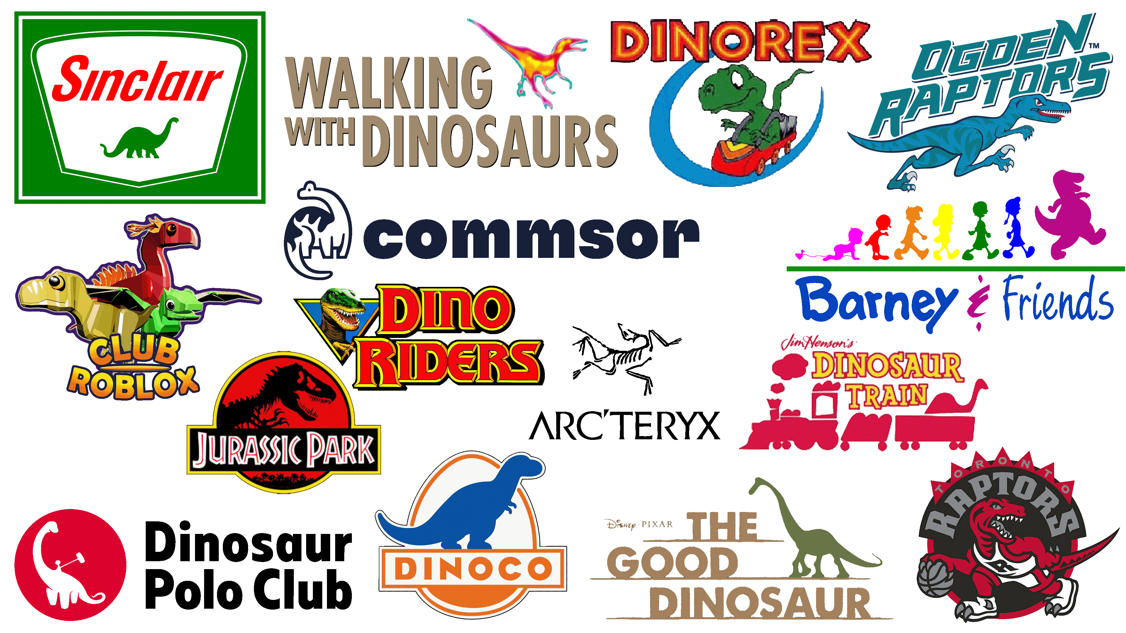
The selection below showcases some of the most interesting and memorable dinosaur logos, revealing the richness and diversity of designers’ approaches to this ancient symbol.
Dinorex Indoor Amusement Park
![]()
The Dinorex logo creates an atmosphere of fun, childhood, and carefree enjoyment at the amusement park. The central character is a green dinosaur with a friendly smile, sitting in a small red car and confidently moving along a blue track. The dinosaur image directly reflects the brand’s name, conveying its playful concept: a journey into a world of adventure and joy.
Dinorex is a chain of family entertainment centers in the USA, offering a variety of rides and games for children of all ages. The dinosaur silhouette was chosen as a symbol because it is perceived positively by children; it does not appear threatening but is a cute, friendly character ready for new adventures. The logo’s graphics resemble cartoon illustrations, perfectly matching the brand’s core audience, children and their families. Bright colors, red, orange, and blue, reflect the joyful spirit of the park, promising visitors many positive experiences and unforgettable moments in the company of the cheerful green dinosaur.
Dinoco
![]()
This brand, created by Pixar Studios, has become a part of modern animation history. The dinosaur depicted in the Dinoco logo alludes to the petroleum-based origin of fuel, referencing the ancient creatures that inhabited Earth millions of years ago. The blue dinosaur silhouette appears calm and confident, conveying the company’s stability and reliability, which aligns perfectly with the storylines of Pixar movies.
The name first appeared in the iconic animated film Toy Story, where the brand’s logo appears at a gas station in a notable scene featuring the characters Woody and Buzz Lightyear. The brand became widely recognized after the release of Cars, becoming a symbol of major sports and success due to its role as a sponsor of the famous racer, Richard Petty, also known as “The King.” The orange and blue palette of the logo reflects optimism, energy, and friendliness. The dinosaur imagery emphasizes a connection to the planet’s past and petroleum, the fictional company’s foundation. It serves as a subtle reference to the real-world Sinclair Oil Corporation, which uses a similar dinosaur image in its emblem.
Toronto Raptors
![]()
The Canadian sports club is famous for its vivid dinosaur imagery on the logo, reflecting basketball’s aggressive spirit and character. The red raptor, depicted in a fighting stance and holding a basketball in its claws, conveys the team’s energy and ambition, emphasizing its readiness to fight for victory in every game.
The raptor symbol emerged from the immense popularity of dinosaur movies during that period and became a memorable element of the club’s identity. The emblem’s black-and-red color palette, gray lettering, and distinct lines create a powerful and memorable image. The Toronto Raptors’ logo conveys the team’s fighting spirit, symbolizing the strength, speed, and determination necessary to win.
Dinosaur Polo Club
![]()
This New Zealand studio chose an original and playful symbol: a dinosaur with a rider holding a polo mallet. This combination highlights the studio’s creative spirit and penchant for unconventional ideas. The dinosaur in the Dinosaur Polo Club logo appears calm and confident, harmoniously blending ancient and modern themes.
The company specializes in creating games with simple designs yet deep gameplay, including the popular titles Mini Metro and Mini Motorways. The red color of the logo reflects energy, enthusiasm, and the creative approach inherent to the development team. The dinosaur image symbolizes originality, ease, and a casual approach to game creation.
Club Roblox
![]()
Club Roblox’s vibrant logo features three stylized dinosaurs: red, green, and yellow, representing three different types of predators, herbivores, and winged dinosaurs. These prehistoric creatures symbolize the diversity of game worlds on the Roblox platform and reflect its core concepts: freedom of choice, adventure, and exploration of new experiences.
The dinosaurs in the logo create a friendly atmosphere, evoking creativity, imagination, and the opportunity to explore various eras and stories. The symbolism of dinosaurs in this logo conveys diversity and interaction among different forms of existence and lifestyles. Designed in a geometric and stylized manner, the dinosaurs harmonize with the logo’s bright letters, highlighting the brand’s active, playful, and positive nature.
Dinosaur Train
![]()
The Dinosaur Train logo is executed in a cheerful and joyful style, reflecting the mood of the children’s series from the renowned Jim Henson studio. The red silhouette of the train creates an atmosphere of travel and adventure, while the dinosaur outline in the last car reminds viewers about the story’s main focus. The train symbolizes curiosity and learning, and the dinosaur links imagination and science, past and present.
The creators specifically chose dinosaurs, making them relatable and understandable characters for children. The logo emphasizes the project’s playful and educational nature, evoking the friendly atmosphere of adventures where children explore the prehistoric world alongside charming dinosaur characters. The text’s red and yellow color scheme adds brightness, enhancing the feeling of warmth and coziness.
Sinclair Oil Corporation
![]()
The dinosaur imagery in the Sinclair Oil Corporation logo refers to the ancient origins of petroleum, dating back millions of years. The green silhouette of a brontosaurus placed in the center of the emblem signifies durability, stability, and the company’s strong connection to the planet’s past.
The company first used the dinosaur imagery in its branding in the 1930s, when the theme of ancient reptiles was actively discussed in American culture, and petroleum was perceived as a “legacy of ancient eras.” By using green for the dinosaur, the brand demonstrates harmony with nature, while the bright red Sinclair lettering emphasizes energy, strength, and activity. Over the decades, the green dinosaur has become an iconic symbol of the company, a recognizable image at gas stations across America that conveys customer confidence in the fuel’s quality and the company’s reliability.
Arc’teryx
![]()
The Canadian brand chose an unusual and mysterious symbol for its logo, the archaeopteryx, an ancient dinosaur considered one of the first creatures to master flight. This image reflects the company’s aspiration for adaptability and constant evolution, much like how this ancient dinosaur transitioned from land to sky.
The Arc’teryx name and logo are directly connected: the archaeopteryx symbolizes evolution, pushing beyond familiar boundaries and conquering new territories. The minimalist dinosaur skeleton, depicted in thin lines, emphasizes strength and lightness, characteristics of the company’s products used in extreme situations.
Dino-Riders
![]()
The dinosaur image in the Dino-Riders logo embodies the spirit of adventure and struggle at the heart of the popular American animated series and toy line created by Tyco in the late 1980s. The vivid, emotional dinosaur on the emblem symbolizes the battles and adventures depicted in the storyline, uniting humans and dinosaurs in an exciting fight against villains.
The Dino-Riders story is associated with a line of realistic toys renowned for their high-quality detailing, which drew the attention of the prestigious Smithsonian Institution. The institution chose to use these models in its educational projects. The brand name appears in bold red-and-yellow letters outlined in gold, evoking a sense of action and fantasy and emphasizing the series’ adventurous nature. In 2020, the brand returned as Mattel released an exclusive figure set dedicated to the series’ classic characters, reminding fans of an exciting universe where dinosaurs serve as partners and allies in the fight for good.
The Good Dinosaur
![]()
The logo for The Good Dinosaur, an animated film created by Disney Pixar, features simplicity of form and gentle color tones. At the center of the composition stands the green dinosaur, Arlo, the main character, positioned atop the movie title, rendered in a pleasing, natural earth tone. The dinosaur appears calm and friendly, highlighting the film’s core idea: kindness, friendship, and mutual assistance.
The dinosaur image in the logo emphasizes not the strength or aggression of ancient creatures but their gentle, harmless nature, illustrating the film’s central concept: a world where dinosaurs never went extinct but became part of life on Earth. The logo’s color palette evokes the natural shades of forests and valleys depicted throughout the film.
Walking with Dinosaurs
![]()
The Walking with Dinosaurs logo features a vivid, lively image of a dinosaur rendered in rich, warm shades of red, yellow, and blue. The contours appear natural, resembling a thermal map highlighting the vitality and realism of the ancient creature’s depiction.
The creators of this documentary series visualized the lives of prehistoric animals with maximum authenticity, and the dinosaur in the emblem appears lifelike and dynamic. The sturdy, stable typography of the title, rendered in soft brown tones, balances the colorful silhouette of the dinosaur. Together, they symbolize the union of science and imagination that became the foundation of the series’ success.
Commsor
![]()
The Commsor logo features an unusual dinosaur image arranged in a circle, symbolizing unity, support, interaction, and the core ideas and objectives that underpin the brand’s platform.
Visually, the logo conveys the importance of fostering interactions between people and maintaining strong relationships within groups. The friendly, simplified dinosaur figure without sharp edges represents accessibility, friendliness, and openness.
Barney & Friends
![]()
The main character of the well-known children’s show Barney & Friends is a bright purple dinosaur named Barney. He is depicted on the logo as a large silhouette walking ahead of a colorful chain of children, symbolizing joy, friendship, and trust, the foundational values of this popular kids’ show. The dinosaur was chosen as a brand symbol to represent a fun and safe companion for children on their journey through knowledge and emotions.
The purple character in the logo was intentionally chosen as a color of imagination and creativity, helping children unlock their creative potential and encouraging them to be open to discoveries. Through Barney the Dinosaur, the brand emphasizes its desire to unite children and support the development of their social skills, understanding, and kindness.
Jurassic Park
![]()
The Jurassic World logo is known for its expressive, powerful silhouette of a Tyrannosaurus rex. The dinosaur is depicted as a black profile on a rich red background, enclosed within a contrasting yellow border. The color scheme creates an atmosphere of tension and anxiety, highlighting the brand’s essence of adventure, danger, and the mystery of prehistoric times.
Using the Tyrannosaurus image aligns with its role in the film, where the predator is one of the key creatures, symbolizing nature’s strength, its unpredictability, and humanity’s limited ability to control it. The font “Jurassic World Dominion,” executed in white outlines, maintains recognizability and continuity. The overall graphics emphasize the emotional perception of the dinosaur, simultaneously terrifying and captivating.
Ogden Raptors
![]()
The Ogden Raptors’ logo features a vibrant, dynamic dinosaur image, rendered in aquamarine shades with expressive details across its body, giving it an aggressive look. The dinosaur lunges forward, demonstrating speed and persistence, reflecting the baseball team’s athletic spirit and determination to win.
The team was named after the famous predatory dinosaurs discovered in Utah. The image was selected to symbolize power, energy, and quick reaction, which is fitting for sports. The diagonally arranged lettering with sharp angles and blue shades complements the dinosaur image, evoking a sense of movement and competition.
Conclusion
The logo’s dinosaur image is one of the most interesting and emotionally charged solutions for brands seeking to convey energy, friendliness, or a sense of adventure. For some companies, it has become a symbol of strength and struggle; for others, it embodies kindness and openness to the world. Despite the variety of approaches, the dinosaur always remains a vivid element of identity, capable of resonating deeply with people of all ages. By using this ancient image, brands connect the distant past and the present, demonstrating uniqueness and character through design.